Meteor App (iOS) Review
(May 2024 Update: The app is no longer available in the App Store)
With the proliferation of badass mobile devices rocking both front- and back-facing cameras, we've naturally made the transition from text messaging to photo messaging. Photography has always been an amazing way of communicating ideas and art throughout its history, and so, too, have words (obviously). So it's inevitable that both of these have found an intersection on mobile devices we carry every day. And while text messages are the reigning champion, photos by themselves, or their use as supplements to text, have seen a significant increase over the last couple years (based on good old empirical evidence.)
Photos seem to be catching on as a fast communication medium because it's oftentimes easier to communicate a thought or physical situation with a visual. It also trumps tapping out a long messages while squished between fat people in a crowded train. Photos are also easier on the brain. But, as it so happens, they also infest your Photos app with implacable, storage-eating fervor.
How are we to combat such unmanageable madness? How do we keep our Photos app from overfilling with temporal imagery that is rendered meaningless after use? Since we don't need those photos gnawing at our limited Photo Streams, it's an admirable thing the folks at Stay Kids did: they built Meteor, a "photo memo" app designed to solve this tragic first world problem.


Single-Serving Goodness
Purpose-built and shy of features, Meteor has two primary views: photo-taking and photo-viewing. In the photo view mode, you can do a couple of things:
- Turn the flash on or off
- Flip to either the front or rear camera
- Tap to focus
- Take a photo
- Switch to the current photo collection in Meteor
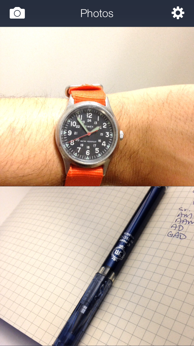
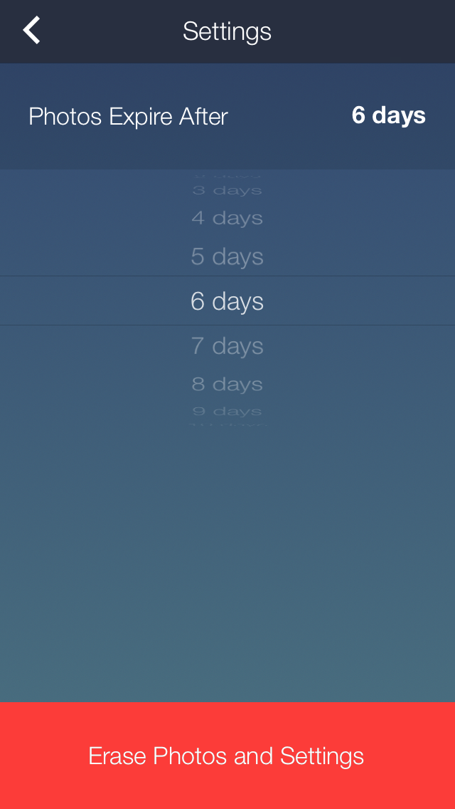
Photo-taking is simple. You have fewer options than even the main Camera app in iOS7, which is a good thing, because remember: the purpose of an app like Meteor is to quickly take a photo, share it, and forget it. The candid design of Meteor allows you to do just. In the photo-viewing area, you have a few more options, but the main interface is largely uncomplicated. Huge cropped photos occupy the main window; you scroll to view them, and tap to expand them. The reason you can only see two per scroll is likely because you won't have many photos gathered here over time (more on that in a bit). Of course, you can easily switch to the camera mode again in the upper left corner (located where the system-wide back buttons are), or to Settings, in the upper-right. The Settings view has only two very clear options:
- Set an expiration period for photos via a scroll selector (this is the timeframe you'd like a photo to be deleted from the app after it's been taken)
- Erase all photos and reset settings to default
Super slick. Like I said -- this app is for taking ephemeral photos and then deleting them for you in a few days' time, just like an AI maid. It's a fretless way of managing quickly usable photos.
The last area to tackle is the individual photo options. When you're in the photo view, you'll see the date stamp at the top, a share button, an option to view the photo's EXIF (location) data, and its expiration timeframe. These are all pretty straightforward actions, but it's important to note some interesting use-case scenarios for them. I do quite a bit of occasional life-logging with Day One, and after extensive use, I've come to appreciate taking or using photos in Meteor that I may have thought ephemeral just two days ago, but now actually would like to use as a visual reminder of that particular day. It's as easy as firing up Meteor, initiating the share screen on a photo, and opening the photo with Day One. Easy. Just dial your auto-delete setting back a bit to give yourself some room if you ever want to revisit a particular photo.
The worst part about this app is the pre-loaded text it associates with a photo when triggering the sharing screen. This happens for all available actions, including sending a photo to Messages, email, or a social media account. Next to the photo, Meteor will place the day of the week and the date it was taken, as well as appending #meteor. This is, unfortunately, bullshit. If there were one feature I'd recommend to the developer it would be to offer a toggle for this. Sure, it might be nice to have a reminder of the day a photo was taken, but in no context would anyone I know use that in a message or tweet. And sorry, but I paid for your app -- I don't need to advertise it via a nonsensical hashtag while messaging my girlfriend a photo of a burrito.
So aside from this flagrant misuse of text clippings, Meteor is a wonderful solution to the issue we all have of the cluttered Camera Rolls and potbellied Photos app. Meteor attempts to arrive at the very acceptable intersection of Messages and Snapchat, and succeeds. Take a photo, share it, forget it.
Right now, it's a dollar on the App Store, so grab it.
Developer: Stay Kids
Originally Released: Nov 20, 2013
Version Reviewed: 1.01