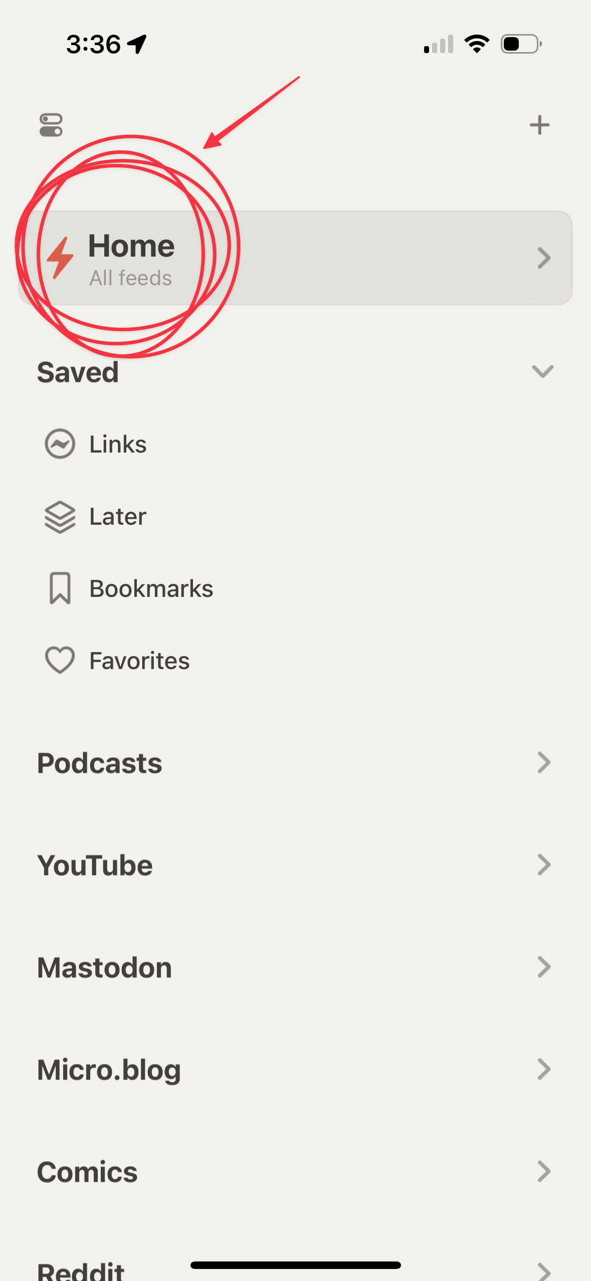
When Silvio Rizzi released the new Reeder app, it didn’t explicitly replace the previous, fourth iteration — that one is now relegated to “Reeder Classic”, with the new version replacing the titular primary app. The experience is a very different departure from every RSS reader design paradigm that came before it. It has become a larger aggregator of feeds beyond just RSS reading material. And... its UX remains top notch.
My thoughts after using it for a week:
- The gist of the new Reeder interface: Add RSS feeds (blogs, audio, video), other selected feed types with APIs (Mastodon, Bluesky, Glass, etc.).
- Reeder breaks feeds into separate streams, including an aggregate everything called ‘Home’
- All posts are synched by scroll position, not unread count.
- You can save individual posts to buckets called Links (saved web links), Later (stack integrated directly into Reeder’s feed), and Bookmarks (not actually sure what this is, to be honest), and Favorites (favorited posts).
- You can also tag posts for organization, and turn them into public links.
- At first, I anxiously worried it would grind against my habitual RSS instincts from 20 years of using reader apps (🫡 NewsFire, my first one in 2004).
- But, after using the primary Home feed for several days, a new habit had formed, and...
- This new method is superior.
- I do not miss seeking out specific feeds (you can still do this, and Reeder syncs your scroll position), and not surprisingly, I have been reading and seeing more from my feeds because I’d usually put off checking Colossal or Kottke until I felt like perusing, and as I realize in retrospect, the draconian ‘unread count’ model became more of a friction point vs an organizational principle. Reeder makes surfing your feeds more streamlined and forces your presence in the content vs resisting immediate consumption and passively adding to an unread pile of misery.
In short, Reeder is the future of RSS as far as I am concerned. I'm sure we'll see other apps copy the main concepts here very shortly. I still love NetNewsWire’s utilitarian design and style, and am keeping it rolling for my work-related RSS feeds (since work is, in many ways, basically a pile of unread counts).
But everything else goes into Reeder.
