The Baldur's Gate II: Enhanced Edition Review


LogBlog App Review

Every day, billions of human beings poop -- unless, of course, you're this guy (apparently). As most of us know, there are few things more self-deprecating than dragging your ass into a stall, dropping your pants, and letting loose a day's worth of stool. If you happen to take light of this awkward situation, you might find it -- of all things -- humorous. I count myself among those that do, and as I expected, so, too, does a whole community of folks on the social network called LogBlog. So come along for a journey through the Willy Wonka design of a poop enthusiast's wet dream. You'll be surprised to find a first-class app that offers a very fine experience far from what I'd call a turd.

The Chicago-based Janitor, Ltd.'s freshman app, LogBlog, is what happens when you have an adolescent appetite for sharing those private memories of spending time by yourself, secluded from the outside world, in a stall or bathroom somewhere, anywhere -- at home, at the office, at a restaurant, in an airport, at school, in an outhouse. Doesn't really matter -- what does matter is that you have an irresistible desire to share with the world that you just took a shit and it was a glorious affair.

<div
    class="
      image-block-outer-wrapper
      layout-caption-below
      design-layout-inline


    "
    data-test="image-block-inline-outer-wrapper"
>


    <figure
        class="
          sqs-block-image-figure
          intrinsic
        "
        style="max-width:640px;"
    >


        <button
            class="
              sqs-block-image-button
              lightbox


            "
            data-description="&lt;p&gt;The Log in/Sign up screen in LogBlog  &lt;/p&gt;"
            data-lightbox-theme="dark"
        >
          <span class="v6-visually-hidden">View fullsize</span>
          
      <div
          
          
          class="image-block-wrapper"
          data-animation-role="image"

data-animation-override

      >
        <div class="sqs-image-shape-container-element


          has-aspect-ratio
        " style="
            position: relative;
            
              padding-bottom:177.5%;
            
            overflow: hidden;-webkit-mask-image: -webkit-radial-gradient(white, black);
          "
          >
            
              <noscript><img src="https://cdn.uploads.micro.blog/25423/2023/50d8f4b12b.jpg" alt="The Log in/Sign up screen in LogBlog  " /></noscript><img class="thumb-image" src="https://cdn.uploads.micro.blog/25423/2023/50d8f4b12b.jpg" data-image="https://cdn.uploads.micro.blog/25423/2023/50d8f4b12b.jpg" data-image-dimensions="640x1136" data-image-focal-point="0.5,0.5" alt="The Log in/Sign up screen in LogBlog  " data-load="false" data-image-id="526f28d2e4b0fa7c5c9a87de" data-type="image" />
            
        </div>
      </div>
    
        </button>


      <figcaption class="image-caption-wrapper">
        <div class="image-caption"><p>The Log in/Sign up screen in LogBlog  </p></div>
      </figcaption>
    
  
    </figure>
  

</div>

The app is well designed. It merely requires you to use an email, pick a clever username, and set password to sign-up. If you desire, you may sync with your Twitter and/or Facebook account to discover other friends on the network (and add your avatar image). Alas, there isn't a way to customize your avatar image other than selecting from the app's pre-established icons or syncing with one of those two social accounts. I'm sure this is a deliberate decision made by the developers -- they tend to keep the interface classy.

Navigation is straightforward, sharing several similar design principles between Twitter and Instagram. The first tab features your personal Roll, a recounting of all the times you've recording pooping in the past. Think of it as a vanity reference to show off to friends and family.

Next is the Public log, which as you can guess, is a refreshable feed of the entire community. It reminds me of Twitter in the early days when they actually let you just stare at the firehose of activity across the world. Only LogBlog isn't quite the same size of Twitter (at least not yet), and so this feed is actually readable. And it's fantastic. You get to unroll some really inspired usernames as well (2stainz, RunsDMC, and FiberMoves are my favorites).

A third tab, titled Me, is more or less your profile section. Settings can be edited (notifications, invite/follow other users, share activity on social networks, edit accounts, and support), historical posts can be viewed, and information about followers and those you follow can be viewed.

Finally, the fourth tab, News, is like the Following/News tab in Instagram, showing you the latest external activity (other people's liking of or comments on your posts) and your own activity (your posts, comments, and likes).

<div
    class="
      image-block-outer-wrapper
      layout-caption-below
      design-layout-inline


    "
    data-test="image-block-inline-outer-wrapper"
>


    <figure
        class="
          sqs-block-image-figure
          intrinsic
        "
        style="max-width:640px;"
    >


        <button
            class="
              sqs-block-image-button
              lightbox


            "
            data-description="&lt;p&gt;The compose (or should I say &quot;flush&quot;?) view.&lt;/p&gt;"
            data-lightbox-theme="dark"
        >
          <span class="v6-visually-hidden">View fullsize</span>
          
      <div
          
          
          class="image-block-wrapper"
          data-animation-role="image"

data-animation-override

      >
        <div class="sqs-image-shape-container-element


          has-aspect-ratio
        " style="
            position: relative;
            
              padding-bottom:177.5%;
            
            overflow: hidden;-webkit-mask-image: -webkit-radial-gradient(white, black);
          "
          >
            
              <noscript><img src="https://cdn.uploads.micro.blog/25423/2023/b544f4b790.jpg" alt="The compose (or should I say &quot;flush&quot;?) view." /></noscript><img class="thumb-image" src="https://cdn.uploads.micro.blog/25423/2023/b544f4b790.jpg" data-image="https://cdn.uploads.micro.blog/25423/2023/b544f4b790.jpg" data-image-dimensions="640x1136" data-image-focal-point="0.5,0.5" alt="The compose (or should I say &quot;flush&quot;?) view." data-load="false" data-image-id="526f2752e4b06312ba3c1d17" data-type="image" />
            
        </div>
      </div>
    
        </button>


      <figcaption class="image-caption-wrapper">
        <div class="image-caption"><p>The compose (or should I say "flush"?) view.</p></div>
      </figcaption>
    
  
    </figure>
  

</div>

There is no feature bloat here -- most everything has its role and place within the app's structure. If anything, there may be too many ways to view your own roll -- perhaps this app could be even leaner and refrain from keeping the Roll tab at all (but I do love that icon). And the ability to post is omnipresent from tab to tab: there is a pretty, teal "flush" icon in the upper-right corner of every screen. Yep, that leads to the compose screen to flush away a post. You can only share text posts, as I'm sure the restraint of permitting images is to keep with the clean approach the developers have taken. (And don't forget to add a colon tag and keep it under 222 characters in length.)

As the "#1 app for #2 news," I'd go so far as to say that, sure, LogBlog could be interpreted as a self-serving mecca for poop enthusiasts to share their most sacred moments, but it also is a harrowing critique of the social networking industry and its participants. We're an unabashedly conceited society who share everything we do and like and want that we might as well have a whole social network dedicated to those magical times on the toilet. Bravo, Janitor, Ltd.

Grab It & Get Poopin'

LogBlog is available on the App Store for a mere dollar. Don't be a pussy -- just fucking buy this. It's what Twitter and Facebook should have done all along -- charge for service. Keep it classy. And think -- several hundred people have already dropped their spare change on an app to discuss their turds. The greatest mistake (or perhaps classiest gesture) Janitor, Ltd. made was resisting the marketing narcissism of pricing their app at $2.

And once you've downloaded it, you can find and follow me on LogBlog with username CustersLastCrap, where I recount the historical movements of Commander George Armstrong Custer with much-needed reporting of his often-overlooked moments in the Montana mountains, relieving himself of several days' build up in excrement.

<div
    class="
      image-block-outer-wrapper
      layout-caption-below
      design-layout-inline


    "
    data-test="image-block-inline-outer-wrapper"
>


    <figure
        class="
          sqs-block-image-figure
          intrinsic
        "
        style="max-width:640px;"
    >


        <button
            class="
              sqs-block-image-button
              lightbox


            "
            data-description=""
            data-lightbox-theme="dark"
        >
          <span class="v6-visually-hidden">View fullsize</span>
          
      <div
          
          
          class="image-block-wrapper"
          data-animation-role="image"

data-animation-override

      >
        <div class="sqs-image-shape-container-element


          has-aspect-ratio
        " style="
            position: relative;
            
              padding-bottom:177.5%;
            
            overflow: hidden;-webkit-mask-image: -webkit-radial-gradient(white, black);
          "
          >
            
              <noscript><img src="https://cdn.uploads.micro.blog/25423/2023/f09d44caa5.jpg" alt="CustersLastCrap-on-LogBlog.PNG" /></noscript><img class="thumb-image" src="https://cdn.uploads.micro.blog/25423/2023/f09d44caa5.jpg" data-image="https://cdn.uploads.micro.blog/25423/2023/f09d44caa5.jpg" data-image-dimensions="640x1136" data-image-focal-point="0.5,0.5" alt="CustersLastCrap-on-LogBlog.PNG" data-load="false" data-image-id="526f27c8e4b0b43cf8da448c" data-type="image" />
            
        </div>
      </div>
    
        </button>


    </figure>
  

</div>

Snapback Slim Wallet Impressions & Review

Here we are, back to wallets. Another minimal, thin, elastic-binding money dumpster. The Snapback Slim. There are nearly as many wallet projects on Kickstarter1 as there are accessories for iOS devices. And this is probably a good thing. Look what Google Reader's death did to the RSS services market -- we have more options than you can add feeds to. But not everyone uses an RSS reader; everyone I know uses a wallet.

<div
    class="
      image-block-outer-wrapper
      layout-caption-below
      design-layout-inline


    "
    data-test="image-block-inline-outer-wrapper"
>


    <figure
        class="
          sqs-block-image-figure
          intrinsic
        "
        style="max-width:2448px;"
    >


        <button
            class="
              sqs-block-image-button
              lightbox


            "
            data-description="&lt;p&gt;Snapback Slim wallet with blue elastic cash strap.&lt;/p&gt;"
            data-lightbox-theme=""
        >
          <span class="v6-visually-hidden">View fullsize</span>
          
      <div
          
          
          class="image-block-wrapper"
          data-animation-role="image"

data-animation-override

      >
        <div class="sqs-image-shape-container-element


        " style="
            position: relative;
            
              padding-bottom:100%;
            
            overflow: hidden;-webkit-mask-image: -webkit-radial-gradient(white, black);
          "
          >
            
              <noscript><img src="https://cdn.uploads.micro.blog/25423/2023/d8e0bef608.jpg" alt="Snapback Slim wallet with blue elastic cash strap." /></noscript><img class="thumb-image" src="https://cdn.uploads.micro.blog/25423/2023/d8e0bef608.jpg" data-image="https://cdn.uploads.micro.blog/25423/2023/d8e0bef608.jpg" data-image-dimensions="2448x2448" data-image-focal-point="0.5,0.5" alt="Snapback Slim wallet with blue elastic cash strap." data-load="false" data-image-id="521e5b5ce4b014d77fadc2f4" data-type="image" />
            
        </div>
      </div>
    
        </button>


      <figcaption class="image-caption-wrapper">
        <div class="image-caption"><p>Snapback Slim wallet with blue elastic cash strap.</p></div>
      </figcaption>
    
  
    </figure>
  

</div>


<div
    class="
      image-block-outer-wrapper
      layout-caption-below
      design-layout-inline


    "
    data-test="image-block-inline-outer-wrapper"
>


    <figure
        class="
          sqs-block-image-figure
          intrinsic
        "
        style="max-width:2448px;"
    >


        <button
            class="
              sqs-block-image-button
              lightbox


            "
            data-description=""
            data-lightbox-theme=""
        >
          <span class="v6-visually-hidden">View fullsize</span>
          
      <div
          
          
          class="image-block-wrapper"
          data-animation-role="image"

data-animation-override

      >
        <div class="sqs-image-shape-container-element


        " style="
            position: relative;
            
              padding-bottom:100%;
            
            overflow: hidden;-webkit-mask-image: -webkit-radial-gradient(white, black);
          "
          >
            
              <noscript><img src="https://cdn.uploads.micro.blog/25423/2023/045b373ed0.jpg" alt="Snapback Slim with Simple and Cash and Keyboard1.jpg" /></noscript><img class="thumb-image" src="https://cdn.uploads.micro.blog/25423/2023/045b373ed0.jpg" data-image="https://cdn.uploads.micro.blog/25423/2023/045b373ed0.jpg" data-image-dimensions="2448x2448" data-image-focal-point="0.5,0.5" alt="Snapback Slim with Simple and Cash and Keyboard1.jpg" data-load="false" data-image-id="521e5b7ee4b0fd87fc8f510c" data-type="image" />
            
        </div>
      </div>
    
        </button>


    </figure>
  

</div>

While I respect the mission for a slimmer, more minimal wallet (I did, after all, review Supr's Slim wallet), I was at first apprehensive with Nick Augeri's approach to the same market of minimized, "hardly-anything-there" design. He was kind enough to send me his wallet for early testing and impressions, and I happily gave it a try. After having spent more than half a year with Supr's Slim, I certainly have a similar product with which to compare.

Snapback Slim's Design

The Supr Slim was ordinarily designed (it's a stitched piece of eslastic with an "X" branded onto it), so it's welcome to see that the Snapback Slim has more panache. The Floridian creator calls it a "slim wallet [that] can handle your cards, cash and receipts", and as you can imagine, it'll hold all those items with the added benefit of separating them -- something the Slim and other cards-only wallets can't do. I know, it's like going backwards to go forwards with wallet design, but bear with me. From just looking at it, you'll notice the Snapback's biggest improvement in design over Supr's simple elastic body is the colored strap attached to its side for wrapping around the wallet itself (measuring 2.5cm in width against the entire wallet's 5cm x 8.5cm size). This, strangely enough, is exactly what I found the design of Supr's needed after a few months of use, especially after having seen the recently successful Kickstarter project for Capsule. And so I did actually modify it with a Field Notes rubber band, which separates my cash and creates friction for any wannabe Apollo Robbins pickpocket. While the Snapback Slim's money band doesn't offer any friction, it does add a useful feature to the political problem of separation between money and card. Its wide strap grips enough surface area to hold contents tightly, regardless of how many cards you have in the main hold. It even doubles as a connected wristband or loop (for a keychain or bag). This is fantastic.

<div
    class="
      image-block-outer-wrapper
      layout-caption-below
      design-layout-inline


    "
    data-test="image-block-inline-outer-wrapper"
>


    <figure
        class="
          sqs-block-image-figure
          intrinsic
        "
        style="max-width:2448px;"
    >


        <button
            class="
              sqs-block-image-button
              lightbox


            "
            data-description="&lt;p&gt;Inside seam of the Supr Slim wallet.&lt;/p&gt;"
            data-lightbox-theme=""
        >
          <span class="v6-visually-hidden">View fullsize</span>
          
      <div
          
          
          class="image-block-wrapper"
          data-animation-role="image"

data-animation-override

      >
        <div class="sqs-image-shape-container-element


        " style="
            position: relative;
            
              padding-bottom:100%;
            
            overflow: hidden;-webkit-mask-image: -webkit-radial-gradient(white, black);
          "
          >
            
              <noscript><img src="https://cdn.uploads.micro.blog/25423/2023/b1140bbab8.jpg" alt="Inside seam of the Supr Slim wallet." /></noscript><img class="thumb-image" src="https://cdn.uploads.micro.blog/25423/2023/b1140bbab8.jpg" data-image="https://cdn.uploads.micro.blog/25423/2023/b1140bbab8.jpg" data-image-dimensions="2448x2448" data-image-focal-point="0.5,0.5" alt="Inside seam of the Supr Slim wallet." data-load="false" data-image-id="521d0ee8e4b0aa7639f30682" data-type="image" />
            
        </div>
      </div>
    
        </button>


      <figcaption class="image-caption-wrapper">
        <div class="image-caption"><p>Inside seam of the Supr Slim wallet.</p></div>
      </figcaption>
    
  
    </figure>
  

</div>


<div
    class="
      image-block-outer-wrapper
      layout-caption-below
      design-layout-inline


    "
    data-test="image-block-inline-outer-wrapper"
>


    <figure
        class="
          sqs-block-image-figure
          intrinsic
        "
        style="max-width:2448px;"
    >


        <button
            class="
              sqs-block-image-button
              lightbox


            "
            data-description="&lt;p&gt;Inside seam of the Snapback Slim wallet.&lt;/p&gt;"
            data-lightbox-theme=""
        >
          <span class="v6-visually-hidden">View fullsize</span>
          
      <div
          
          
          class="image-block-wrapper"
          data-animation-role="image"

data-animation-override

      >
        <div class="sqs-image-shape-container-element


        " style="
            position: relative;
            
              padding-bottom:100%;
            
            overflow: hidden;-webkit-mask-image: -webkit-radial-gradient(white, black);
          "
          >
            
              <noscript><img src="https://cdn.uploads.micro.blog/25423/2023/36a72c4757.jpg" alt="Inside seam of the Snapback Slim wallet." /></noscript><img class="thumb-image" src="https://cdn.uploads.micro.blog/25423/2023/36a72c4757.jpg" data-image="https://cdn.uploads.micro.blog/25423/2023/36a72c4757.jpg" data-image-dimensions="2448x2448" data-image-focal-point="0.5,0.5" alt="Inside seam of the Snapback Slim wallet." data-load="false" data-image-id="521d0f23e4b0f8db8fafc74c" data-type="image" />
            
        </div>
      </div>
    
        </button>


      <figcaption class="image-caption-wrapper">
        <div class="image-caption"><p>Inside seam of the Snapback Slim wallet.</p></div>
      </figcaption>
    
  
    </figure>
  

</div>

The only slight annoyance I have with the design of the Snapback Slim's design is the inseam of the elastic band. Whereas Supr slyly hid it by splitting and situating it in the middle of the body, Snackback Slim positioned it on its side. In loading the wallet with cards, the creator calls it a "safety tab," but I'd regard it as more of a misplaced stub. Once you have a couple cards inside the wallet it isn't much of a problem, although I have found its placement causes a bit of resistance extracting and depositing a card on the side that the safety tab rests. If anything, I recommend using the clean side to keep your most used card.

<div
    class="
      image-block-outer-wrapper
      layout-caption-below
      design-layout-inline


    "
    data-test="image-block-inline-outer-wrapper"
>


    <figure
        class="
          sqs-block-image-figure
          intrinsic
        "
        style="max-width:2019px;"
    >


        <button
            class="
              sqs-block-image-button
              lightbox


            "
            data-description="&lt;p&gt;Side without safety tab seam. (5 cards inside.)&lt;/p&gt;"
            data-lightbox-theme=""
        >
          <span class="v6-visually-hidden">View fullsize</span>
          
      <div
          
          
          class="image-block-wrapper"
          data-animation-role="image"

data-animation-override

      >
        <div class="sqs-image-shape-container-element


        " style="
            position: relative;
            
              padding-bottom:100%;
            
            overflow: hidden;-webkit-mask-image: -webkit-radial-gradient(white, black);
          "
          >
            
              <noscript><img src="https://cdn.uploads.micro.blog/25423/2023/4a17b5f51c.jpg" alt="Side without safety tab seam. (5 cards inside.)" /></noscript><img class="thumb-image" src="https://cdn.uploads.micro.blog/25423/2023/4a17b5f51c.jpg" data-image="https://cdn.uploads.micro.blog/25423/2023/4a17b5f51c.jpg" data-image-dimensions="2019x2019" data-image-focal-point="0.5,0.5" alt="Side without safety tab seam. (5 cards inside.)" data-load="false" data-image-id="521d03c1e4b0f75230d4ed00" data-type="image" />
            
        </div>
      </div>
    
        </button>


      <figcaption class="image-caption-wrapper">
        <div class="image-caption"><p>Side without safety tab seam. (5 cards inside.)</p></div>
      </figcaption>
    
  
    </figure>
  

</div>


<div
    class="
      image-block-outer-wrapper
      layout-caption-below
      design-layout-inline


    "
    data-test="image-block-inline-outer-wrapper"
>


    <figure
        class="
          sqs-block-image-figure
          intrinsic
        "
        style="max-width:2246px;"
    >


        <button
            class="
              sqs-block-image-button
              lightbox


            "
            data-description="&lt;p&gt;Side with &quot;safety tab&quot; seam. (5 cards inside.)&lt;/p&gt;"
            data-lightbox-theme=""
        >
          <span class="v6-visually-hidden">View fullsize</span>
          
      <div
          
          
          class="image-block-wrapper"
          data-animation-role="image"

data-animation-override

      >
        <div class="sqs-image-shape-container-element


        " style="
            position: relative;
            
              padding-bottom:100%;
            
            overflow: hidden;-webkit-mask-image: -webkit-radial-gradient(white, black);
          "
          >
            
              <noscript><img src="https://cdn.uploads.micro.blog/25423/2023/3aa8e3652f.jpg" alt="Side with &quot;safety tab&quot; seam. (5 cards inside.)" /></noscript><img class="thumb-image" src="https://cdn.uploads.micro.blog/25423/2023/3aa8e3652f.jpg" data-image="https://cdn.uploads.micro.blog/25423/2023/3aa8e3652f.jpg" data-image-dimensions="2246x2246" data-image-focal-point="0.5,0.5" alt="Side with &quot;safety tab&quot; seam. (5 cards inside.)" data-load="false" data-image-id="521d03f2e4b0f31b9ff6346a" data-type="image" />
            
        </div>
      </div>
    
        </button>


      <figcaption class="image-caption-wrapper">
        <div class="image-caption"><p>Side with "safety tab" seam. (5 cards inside.)</p></div>
      </figcaption>
    
  
    </figure>
  

</div>

Initial Impressions in Daily Use

I've only just begun to use the Snapback Slim Wallet, so of course I'll update this review in a few months to weigh in on the longer term durability of its build, but as of now, the wallet's elastic material feels crisply taut, sturdily adhering to any number of cards you load into it. It also feels strong enough to reassure against any uncertainty regarding sewing quality. And the product is manufactured in the USA. Hurrah.

While material is important, my bigger concern with elastic-band wallets is the lack of reinforcement for stored items. While I haven't sat awkwardly or violently enough to irrevocably bend my cards, it's still a possibility with any of these kinds of wallets. If you wear it in your front pocket, of course, there are no worries about this (just this). The elastic used for this wallet seems durable, but I'm no materials expert. My other elastic wallet has lasted in perfectly good shape for over seven months, and still flexes perfectly with the number of items held -- the most negative aspect of slim, leather-bound wallets. Perhaps the only risk of bending or crippling your cards is if you only pack one or two in there -- with at least four or five, the wallet as a whole seems more than sturdy enough to ward against mishaps.

Using the additional colored band to store loose cash has been more than helpful. I only ever have a single bill or two at a time (until I break that twenty with a cup of coffee), and so my time with the Snapback Slim has mostly been with a $20 bill and a couple singles, all folded together into fourths. This method tucks the bills neatly under the colored band and they sit flush with the height of the wallet itself. It looks neato.

The Kickstarter Project

There are few things I appreciate about the way Nick Augeri set up his Kickstarter project for the Snapback Slim.

  1. Prototypes
  2. Detailed production schedule post-project success with risks and challenges
  3. Pricing and reward tiers are practical and efficient

Tracing the history of a product’s development helps put the final product into context. The creator shares how the wallet evolved from an iteration with a much smaller, secondary elastic band, to several versions of a thicker, wider one. It’s a good thing he went with wider, because the Field Notes rubberband I jerry-rigged on my other wallet is way too small to securely hold cash without it flopping about. It also appears that he had tested out different material lengths, likely testing the elasticity of having a different number of cards inside. With this kind of backstory, the Snapback Slim’s quality is reinforced to prospective investors.

<div
    class="
      image-block-outer-wrapper
      layout-caption-below
      design-layout-inline


    "
    data-test="image-block-inline-outer-wrapper"
>


    <figure
        class="
          sqs-block-image-figure
          intrinsic
        "
        style="max-width:700px;"
    >


        <button
            class="
              sqs-block-image-button
              lightbox


            "
            data-description="&lt;p&gt;Snapback Slim prototypes (from the Kickstarter page)&lt;/p&gt;"
            data-lightbox-theme=""
        >
          <span class="v6-visually-hidden">View fullsize</span>
          
      <div
          
          
          class="image-block-wrapper"
          data-animation-role="image"

data-animation-override

      >
        <div class="sqs-image-shape-container-element


        " style="
            position: relative;
            
              padding-bottom:100%;
            
            overflow: hidden;-webkit-mask-image: -webkit-radial-gradient(white, black);
          "
          >
            
              <noscript><img src="https://cdn.uploads.micro.blog/25423/2023/259f467884.jpg" alt="Snapback Slim prototypes (from the Kickstarter page)" /></noscript><img class="thumb-image" src="https://cdn.uploads.micro.blog/25423/2023/259f467884.jpg" data-image="https://cdn.uploads.micro.blog/25423/2023/259f467884.jpg" data-image-dimensions="700x700" data-image-focal-point="0.5,0.5" alt="Snapback Slim prototypes (from the Kickstarter page)" data-load="false" data-image-id="521d067ce4b02858a1a1cc31" data-type="image" />
            
        </div>
      </div>
    
        </button>


      <figcaption class="image-caption-wrapper">
        <div class="image-caption"><p>Snapback Slim prototypes (from the Kickstarter page)</p></div>
      </figcaption>
    
  
    </figure>
  

</div>

Likewise, providing a comprehensive post-project schedule of how he plans on handling production and delivery gauges the complexity of the product, the thought and resources behind manufacturers, and risks associated therein. There have been several Kickstarter projects that stumbled after enormously successful investment runs, and Nick Augeri acknowledges that he has established a close relationship with his manufacturer to assure a speedy run of the now-completed and tested product. I know Kickstarter requires a delivery date for submission of any project, so at least he’s kind enough to warn against a few weeks’ delay if indeed there is a higher quantity ordered than hedged against.

Finally, the pricing and reward tiers are straightforward. You’re investing in a product line, not a series of distractions (for both you and the creator). I’ve never been swayed to invest in a higher tier to spend an evening at a fancy dinner with the creator, or to wear a t-shirt that says I backed a project, or to don a few branded stickers on my notebook. I’m investing in your product because I want to see that product line successfully manufactured and sold, along with owning one myself. Snapback Slim’s sane four options for investment should be the standard moving forward.

<div
    class="
      image-block-outer-wrapper
      layout-caption-below
      design-layout-inline


    "
    data-test="image-block-inline-outer-wrapper"
>


    <figure
        class="
          sqs-block-image-figure
          intrinsic
        "
        style="max-width:2348px;"
    >


        <button
            class="
              sqs-block-image-button
              lightbox


            "
            data-description=""
            data-lightbox-theme=""
        >
          <span class="v6-visually-hidden">View fullsize</span>
          
      <div
          
          
          class="image-block-wrapper"
          data-animation-role="image"

data-animation-override

      >
        <div class="sqs-image-shape-container-element


        " style="
            position: relative;
            
              padding-bottom:100%;
            
            overflow: hidden;-webkit-mask-image: -webkit-radial-gradient(white, black);
          "
          >
            
              <noscript><img src="https://cdn.uploads.micro.blog/25423/2023/dd926d5c7f.jpg" alt="Snapback Slim gray with simple.jpg" /></noscript><img class="thumb-image" src="https://cdn.uploads.micro.blog/25423/2023/dd926d5c7f.jpg" data-image="https://cdn.uploads.micro.blog/25423/2023/dd926d5c7f.jpg" data-image-dimensions="2348x2348" data-image-focal-point="0.5,0.5" alt="Snapback Slim gray with simple.jpg" data-load="false" data-image-id="521d06ede4b0206305a3e9b6" data-type="image" />
            
        </div>
      </div>
    
        </button>


    </figure>
  

</div>

Elasticity in the Year of Wallets

Does the Snapback Slim set itself apart? I won't hold back from comparing it to Supr's Slim wallet or the British elastic wallet, Flip, but I'll do so in a progressive way: the Snapback Slim evolves minimized wallet design with the addition of a functional colored strap, improving the thinnest wallet you can own. If that appeals to you, it's an obvious choice to invest in the project on Kickstarter. I wish the best for the Snapback Slim -- it'll round out the Year of Wallets quite well.

You can view and fund the Kickstarter project, or follow the company's updates on Twitter


  1. Okay, I actually counted. There are more iOS accessories, but there are over 90 wallets that are either currently running as projects or were successfully funded in the past year and a half.


Pret's American Grapefruit Juice: A Notable Review

Have I completely lost my mind? A review of a grapefruit juice from Pret a Manger, of all places? No. I haven't. Even the lowly, everyday juice deserves a moment in the spotlight. And today, that juice is Pret's American Grapefruit Juice, an all-natural, preservative-free celebration of summertime.

<div
    class="
      image-block-outer-wrapper
      layout-caption-below
      design-layout-inline


    "
    data-test="image-block-inline-outer-wrapper"
>


    <figure
        class="
          sqs-block-image-figure
          intrinsic
        "
        style="max-width:2448px;"
    >


        <button
            class="
              sqs-block-image-button
              lightbox


            "
            data-description="&lt;p&gt;Freshly prepared (apparently) and freshly purchased: Pret's American Grapefruit Jucie&lt;/p&gt;"
            data-lightbox-theme="dark"
        >
          <span class="v6-visually-hidden">View fullsize</span>
          
      <div
          
          
          class="image-block-wrapper"
          data-animation-role="image"

data-animation-override

      >
        <div class="sqs-image-shape-container-element


          has-aspect-ratio
        " style="
            position: relative;
            
              padding-bottom:100%;
            
            overflow: hidden;-webkit-mask-image: -webkit-radial-gradient(white, black);
          "
          >
            
              <noscript><img src="https://cdn.uploads.micro.blog/25423/2023/e8224b9cb0.jpg" alt="Freshly prepared (apparently) and freshly purchased: Pret's American Grapefruit Jucie" /></noscript><img class="thumb-image" src="https://cdn.uploads.micro.blog/25423/2023/e8224b9cb0.jpg" data-image="https://cdn.uploads.micro.blog/25423/2023/e8224b9cb0.jpg" data-image-dimensions="2448x2448" data-image-focal-point="0.5,0.5" alt="Freshly prepared (apparently) and freshly purchased: Pret's American Grapefruit Jucie" data-load="false" data-image-id="52014431e4b0ebb2d2a89f4f" data-type="image" />
            
        </div>
      </div>
    
        </button>


      <figcaption class="image-caption-wrapper">
        <div class="image-caption"><p>Freshly prepared (apparently) and freshly purchased: Pret's American Grapefruit Jucie</p></div>
      </figcaption>
    
  
    </figure>
  

</div>

I've consistently stopped into Pret a few times a week since it opened at the base of our building complex last year. The coffee isn't half bad, the yogurts are great in the morning, and the lines are way more welcome than the intolerable ones at Starbucks next door. They also have a nearly monotone outfit of juices for purchase: honey tangerine juice, lemonade, orange juice, orange & pineapple juice, and, what we've come here for, grapefruit juice. When I say to the friendliest manager this side of your industry job fantasy, "just the juice, here", he says: "that'll be $3.30, please". This guy, whoever he is, runs an amazing check-out experience, always jumping in to ring folks when the other clerks are overwhelmed by a rush of customers. And he always thanks you, wishes you a good day, and welcomes you back the next.

So I've got this grapefruit juice in my hands, avoiding the outside world on a steamy 84-degree day, ready to march back upstairs and sit at my desk and type more stuff on the computer and do this and do that while trying to savor this delicate reminder of childhood under a warm, tender sun. And then I think about all those breakfasts and afternoon snacks where my mother prepared her two sons' grapefruit bowls the only way I'll ever know: halved with each half's fruit segments lightly propped out of their uterine cavities, membrane-free with a dash of powdered sugar.

Does Pret's grapefruit juice always send me down memory lane? Probably not. But shake that bottle well and you, too, will be tugged back to a cheery memory at least once. Few things other than a really good IPA could beat the strikingly tart and pulpy thirty-sip seranade of Pret's American Grapefruit Juice nirvana on a hot day (even if I wasn't ever outside). I know, it's 100% pure Florida grapefruit juice, so it's really just the product of a damn good juicing machine with a competent driver, but pure juice can be brilliantly rich, and in my mind, this one definitely fills a hole in my stomach.

Is Pret's masterpiece the juice-making apogee of all human sweat, blood, and agony? I can't say for certain, but I will admit it's a pretty good 430 mL plastic bottle of GFJ. Seeing as how it's 100% juice (and "nothing else"), pulp to juice ratio is the game to play here. There is a low-level of grapefruit pulp that gracefully clumps together at the bottom fifth of an unshaken bottle. Once shaken (note: shake carefully, the zip-tops have been known to weep sticky leakage from aggressive forearms), the pulp disperses evenly and stays put. If you like a little fruit flesh in your juice, you'll like this. If you despise anything floating around in your liquids, stay away. (Pret neglects to mention the presence of pulp anywhere on the bottle, an unfortunately poor and unfriendly design decision, so this is your warning, trepid buyer.) Regardless, the pulp isn't overwhelming, the tartness of the grapefruit feels like a 7 on a scale of 10, and the volume (14.5 fl oz if you didn't convert earlier) is just enough to hold you back until your next meal.

What have we learned today? Grapefruit juice is a good choice of beverage, especially in the summer, and especially as a stand-alone snack at mid-day. Pret's take on the classic (which, let me remind you, is just pure juice) is an overwhelmingly intelligent choice. You may wonder -- my, there are a lot of juices and beverages to choose from at 3:00pm on any given day, so why grapefruit? Besides it simply tasting better than other, lesser reincarnations of citrus fruits, grapefruit has gnarly benefits as a vessel for orally-taken drugs -- like alcohol. What? Yeah. Not only is the juice great for you (a delicious source of vitamin C, A, B complex, E, and K), but according to a Group of Canadian researchers, grapefruit juice interferes with an enzyme that "metabolizes many drugs, and toxins as well, into substances that are less potent or more easily excreted." So if you want to tastefully disguise a few shots of vodka or gin with that bottle of grapefruit juice, you'll likely get the funnies before 5:00.

Find your nearest Pret a Manger and enjoy.


Kairo - A Minimalist Exercise in Puzzle Gaming

Grainy, misty monolithic landmasses hovering in a field of white. Ethereal music droning like a waterfall sucked into the vacuum of space. You're alone. You don't know who you are, or where you are. The only gameplay prompt is another island of stone in the distance. Your movements are limited. There is no narrative, no introduction, and no weapon.

This is how the computer and iOS game, Kairo, begins.

<div
    class="
      image-block-outer-wrapper
      layout-caption-overlay-hover
      design-layout-inline


    "
    data-test="image-block-inline-outer-wrapper"
>


    <figure
        class="
          sqs-block-image-figure
          intrinsic
        "
        style="max-width:1440px;"
    >


        <button
            class="
              sqs-block-image-button
              lightbox


            "
            data-description="&lt;p&gt;Looking to the Skies of &lt;em&gt;Kairo&lt;/em&gt;&lt;/p&gt;"
            data-lightbox-theme="dark"
        >
          <span class="v6-visually-hidden">View fullsize</span>
          
      <div
          
          
          class="image-block-wrapper"
          data-animation-role="image"

data-animation-override

      >
        <div class="sqs-image-shape-container-element


          has-aspect-ratio
        " style="
            position: relative;
            
              padding-bottom:62.5%;
            
            overflow: hidden;-webkit-mask-image: -webkit-radial-gradient(white, black);
          "
          >
            
              <noscript><img src="https://cdn.uploads.micro.blog/25423/2023/cc8bda2b6b.jpg" alt="Looking to the Skies of Kairo" /></noscript><img class="thumb-image" src="https://cdn.uploads.micro.blog/25423/2023/cc8bda2b6b.jpg" data-image="https://cdn.uploads.micro.blog/25423/2023/cc8bda2b6b.jpg" data-image-dimensions="1440x900" data-image-focal-point="0.5,0.5" alt="Looking to the Skies of Kairo" data-load="false" data-image-id="5189127ee4b0cac36dbadb77" data-type="image" />
            
        </div>
      </div>
    
        </button>


      <figcaption class="image-caption-wrapper">
        <div class="image-caption"><p>Looking to the Skies of <em>Kairo</em></p></div>
      </figcaption>
    
  
    </figure>
  

</div>

Game developer Locked Door Puzzle (run by Richard Perrin in London) cunningly forges stark, minimalist canvases upon which sounds, music, and visuals coerce you to apply a haunting narrative. It's a game you experience on your own, justifying what you see around you with your imagination until some carefully planted cue suggests otherwise. Very few gaming experiences permit you to draw upon blank environments to summon your own narrative -- not even the “anti-game” Dear Esther does this, for its insufferable narrator blathers throughout the experience. Kairo offers no clear answers. One area, for instance, encourages you to slowly trot along a winding, concrete stairwell that hovers ominously amid black infinite. While you continue downward (although why you'd want to do this is somwhat suspect, seeing as how it is just floating there in total darkness...), you hear a broken radio frequency flicker beneath the bellowing sounds of Wounds’ impressive, glacial soundtrack. You soon realize the radio is emanating from a white obelisk, splintering through the black sky. You can't make out the transmission, and you don't see any discernable antenna, so nothing of meaning can be derived from this. You aren't certain if you should stay there a while longer to see if the transmission clears, or if you ought to continue forward (obviously, you have to continue forward). But there is never a sense of urgency in Kairo -- it is a place out of time, out of context.

Where narrative reinforcement may be missing, moving through and exploring the world of Kairo is stunning with rich -- if, in actuality, stark -- world-building. Soon after the first minor puzzle of the game, you proceed along a bridge that tapers off into darkness. As you move across it, bracing for some ghastly surprise, the scarce sound effects dim as great pillars slice through the underground sky and bury their endpoints into the unseen ground. This effect implies your movement across the bridge is actively morphing the landscape, bringing structure to the bridge as you proceed to the other side. It's a beautifully scripted sequence -- the kind of thing that burrows in your consciousness and creeps back out in dreams. Furthermore, soundscapes and environmental elements are oftentimes mystically disconnected to your expectations that add to the game’s intrigue. At one point, I found myself entering a room with what sounded like a waterfall echoing along stone somewhere around the bend in a corridor. Upon turning and entering the cavern of this sound's origin, the environment betrayed my expectation of water. Instead, I found a high stone edifice with cascading rectangular sheets. As an experience that builds upon its foundation of simple geometric designs, I continued to enjoy these optical-audial tricks.

At its heart, Kairo is a first-person puzzle game. As the game progresses, you pass through several puzzles, none of which are game-breakingly obtuse like the classic series Myst (for which I absolutely needed the hand-holding of a game guide). With the suggestion of mechanics involved in Kairo’s strange world, I began to understand the world it presented to me as some kind of infrastructure for awaking... Something. Sparks spill out from an illuminating panel high above my field of view, tiles on the ground “ding” with life as I pass over them, movable lanterns active beams of energy when positioned just right -- these operational components kept me interested. So only after meandering through the first leg of puzzles does the game begin to reveal itself, and as you complete them, the game continues to quench your thirst for answers. (It also helps that the completion animations and sound verifications for completing these puzzles is very self-aggrandizing -- so of course that makes you feel good).

If you're at all interested in puzzle games, Kairo is a terrific experience. But it really shines as a game stripped down to its essence, allowing the player to move freely and unburdened with excessive gameplay baggage. The visuals, the sounds, and the music -- as bare as they are -- help you imagine and place your importance in this world. Perhaps it's best to understand the game behind the name's meaning -- likely derived from the Greek word kairos, which implies "the right, opportune moment". In the word's context of time, Kairo is a theater designed for the player to perform an action at the right time to initaite something special. On a high level, every game designed is like this, but in Kairo's world, you believe you're really contributing to something grand, something that, in the end, may reward your efforts in bringing meaning to it.


Gaslight Coffee Roasters

Gaslight Coffee Roasters is the latest entrant near Milwaukee Ave in Logan Square, the street that is slowly becoming a coffee mecca for Chicago. I finally got around to visiting it on a dreary Sunday in January, right around the time the weather decided to shit both snow and sleet intermittently on my walk up Humboldt Blvd. Thankfully, Gaslight sits comfortably at Fullerton and Milwaukee, so the sticky ice didn’t have long to cling unwanted atop my mop of hair.

iphone-(null)-0.jpg

Seated at this pointed corner of the intersection permits Gaslight to receive a welcome bloom of natural light along its wall of glass. This draws you into the open, breathable spacing of tables and coffee bar — enough to detract you from mistaking the place for a prohibition-era speakeasy. Gaslight’s stark, brick-on-wood aesthetic with sparingly hung taxidermy reinforces a notion of both minimalism and straight business -- the baristas here aren't screwing around, and neither is their coffee. Without the slightest whiff of pretentious1 bullshit (leave that to Cafe Mustache, a stone's throw south), the staff bustles behind the horseshoe-shaped coffee bar: ringing at the iPad register, scurrying to-go cups to commuters, channeling the Strada espresso machine, measuring freshly roasted beans into brown bags, shuttling plates of charcuterie, holstering readily accessible smiles. You get it. And all the while they bustle, crooning tunes waft over the place from an LP spinner in the far corner.

But let's not get distracted. I came here to buy beans. Freshly roasted beans. For the last few months, I'd been getting my fill from Tonx (specialty roasters with an online-only business that ships out bi-weekly, single origin beans to subscribers), but I was right on the edge of my next shipment, so I needed a fix. Zak Rye (former Metropolis roaster) and Tristan Coulter's new coffee shop seemed like a good enough answer. And so I took the bait.

All of Gaslight's beans are roasted in the back of the space, and come from a few different origins: Guatemala, El Salvador, and Rwanda. Not sure if these will rotate throughout the year, but as of January 2013, this is it. The rear roasting space is appararently communal, as the beans also get used by Wormhole, which is located much father down Milwaukee just south of North Ave in Wicker Park. I like Wormhole, and I already dig the new Gaslight. Let's support these local players with a purchase, shall we?

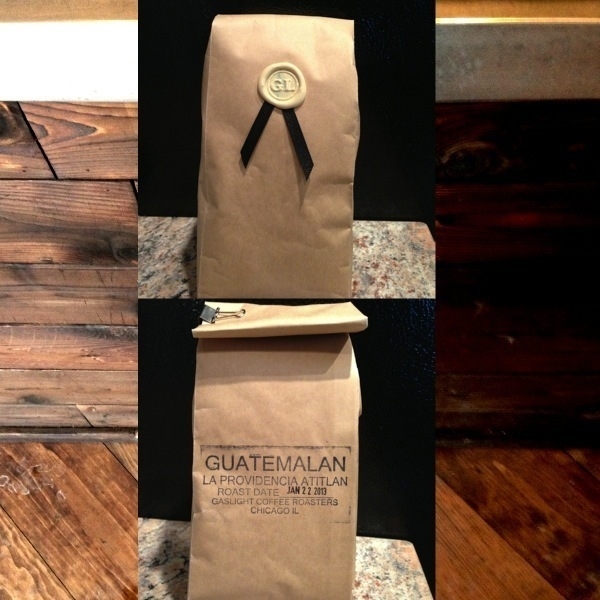
You pay $15 for a 12oz bag. This is standard fare for anything above the oily shit Starbucks and Dunkin Donuts stuff into retail packaging. It's even less expensive than the slightly inflated Tonx, so I have no problem paying this for locally roasted beans. To reinforce buyer's satisfaction, the packaging is beautifully done up in brown paper, sealed with an office-grade paper binder, and decorated with an insignia-pressed wax badge.2

Fighting the elements back home, I fired up the kettle with 340g of water and coarse-ground 25g of the newly acquired Guatemalan coffee. Figured the best way to try this new batch was with a pour-over method (in this case a Chemex), so that's exactly how I did it.

And it was delicious.

Since my nose is always stuffy, I can't rightly claim to detect the nuances of flavor like some self-aggrandizing connoisseur, but of what I could discern: pleasant hints of nut and wood, neither of which took a backseat to an unsuspecting cocoa veil. This is really good coffee, such that I could easily live off this for my evening cup. I'll no doubt return to Gaslight Coffee Roasters on more occasion than this (and ideally in less deplorable weather). And if you know what’s good for you, your health, your metabolism, your libido, and your sanity, you'll do the same.


  1. Aren't too pretentious, either. As stated in an interview with the owners on DailyCandy, Zak reinforces this notion: "We’ll do whatever customers want: pour over, siphon, cowboy coffee. You want a shot of espresso in a bowl of soup? Done." If only they served soup.
  2. I suppose at this point I should share one last thing about presentation -- they wrap scarves around their Chemex beakers (or perhaps these are beakers topped with V60s, I can't rightly say). Quite pointless, aside from probably keeping the brewed coffee a degree warmer during the cold months. Gaslight takes presentation and detail seriously, and so we must commend their efforts.

Supr Slim Wallet Review

The Minimal Wallet that Gets it Right

Twenty-twelve seems to have been the year of minimalism across lifestyles, products, and software -- wallets notwithstanding. As one of the holy carrying trifecta for men (phone and keys being the other two, natch), the wallet holds the necessary things for buying and identifying. In an increasing modern world where cash is carried less and less, designers have moved towards minimizing the grossly over-sized everyday carry to accommodate only the necessaries. Supr's Slim Kickstarter project was one such endeavor.

Supr pitched their Slim wallet with a goal of $10,000 for production assistance. Their manifesto:

We believe that all you really need in your wallet are your essential cards. Supr Slim was created with this in mind - to be a super-thin, card-carrying over-achiever.

Six thousand, two hundred and thirty-seven backers later, Supr exploded that goal by reaching $203,488. Obviously there is a market for this kind of thing.

<div
    class="
      image-block-outer-wrapper
      layout-caption-below
      design-layout-inline


    "
    data-test="image-block-inline-outer-wrapper"
>


    <figure
        class="
          sqs-block-image-figure
          intrinsic
        "
        style="max-width:2500px;"
    >


        <button
            class="
              sqs-block-image-button
              lightbox


            "
            data-description="&lt;p&gt;Supr Slim Wallet compared to iPhone 5 and pen.&lt;/p&gt;"
            data-lightbox-theme="dark"
        >
          <span class="v6-visually-hidden">View fullsize</span>
          
      <div
          
          
          class="image-block-wrapper"
          data-animation-role="image"

data-animation-override

      >
        <div class="sqs-image-shape-container-element


          has-aspect-ratio
        " style="
            position: relative;
            
              padding-bottom:75%;
            
            overflow: hidden;-webkit-mask-image: -webkit-radial-gradient(white, black);
          "
          >
            
              <noscript><img src="https://cdn.uploads.micro.blog/25423/2023/690dcedc24.jpg" alt="Supr Slim Wallet compared to iPhone 5 and pen." /></noscript><img class="thumb-image" src="https://cdn.uploads.micro.blog/25423/2023/690dcedc24.jpg" data-image="https://cdn.uploads.micro.blog/25423/2023/690dcedc24.jpg" data-image-dimensions="2500x1875" data-image-focal-point="0.4749090421530016,0.4669137734905697" alt="Supr Slim Wallet compared to iPhone 5 and pen." data-load="false" data-image-id="50ee1482e4b0be5191e7f7a1" data-type="image" />
            
        </div>
      </div>
    
        </button>


      <figcaption class="image-caption-wrapper">
        <div class="image-caption"><p>Supr Slim Wallet compared to iPhone 5 and pen.</p></div>
      </figcaption>
    
  
    </figure>
  

</div>

Based on Supr's project, the qualifications for a minimal, slim wallet seem to be the following:

  • Ability to hold 5-10 credit card-sized items
  • Ability to hold cash, but likely only a few bills folded into thirds
  • Adds very little additional weight, girth to the items you carry
  • Ableness to move easily through RFID scanners (office buildings, public transportation)
  • Durability of materials
  • Built in the USA

Build

The Supr Slim wallet is minimally built for its minimal purpose. Its body is comprised of durable elastic band, designed to stretch and wrap around its contents, but smart enough to unwind tightly to adjust to the load. They claim (and I can attest to with previous wallets) that leather materials stretch to accommodate larger loads, but do not gracefully shrink back when you remove a card or two. This leaves an undesirable gap between cards and their thresholds. The Supr Slim wallet solves this [possibly] critical predicement: it "will never stretch out or lose its ability to grip your cards". Since we are just talking about a nice piece of elastic stiched together to holds things in, it should measure up to these expansion/deflation expectations.

Build quality that touts these features, including manufacture in the USA, should excell. After only a week of use, the Super Slim does seem to have durability, though it's too early to say how long a piece of elastic fabric will last. The hand-stiched "X" is also of suspect quality. According to their updates, mid-way through production:

"We lost our embroidery team who had been doing all the hand-stitching of our X detail. As a consequence, we experienced a bit of a slowdown in production for the past couple weeks as a new team is being trained. One of the lessons for us throughout this process has been how difficult it is to find skilled people to perform this kind of fine handwork here in the USA at this scale."

This kind of thing is bound to happen, and it's not the embroidery team I'm worried about -- it's simply the durability of a very simple X with four piercings through the elastic. It is the one unique identifying detail about the wallet, and I doubt it will withstand the daily use of a wallet from tight pockets and varying fabrics. (Though it could be argued that the wallet becomes more minimal by losing such an embellishment.) And lastly, the elastic surface does tend to attract small pocket stuffs, like lint. I may notice more often than most because my elastic color is a dark navy, but this would never happen with leather material. Go figure.

Use

I'd grown accostomed to carrying around a simple card wallet for over several years, so I knew what to expect with something like the Supr Slim wallet's sleeve design. You squeeze some cards in, maybe a folded bill, and that's it. The trick is positioning frequently used cards on the outer ends of the interior "stack" so that they are easily to pull out. These are typically my CTA (public transportation) pass 1 and my ID. This layout may change with the Supr Slim wallet, but the point is it's actually a bit difficult to get to some of those cards in the middle of the stack. The Supr Slim wallet doesn't make this any easier -- in fact, it creates more difficulty than the Saddleback Wallet Sleeve I'd previously been using. The Saddleback has a finger-cut bottom for pushing up the cards vertically (the design is vertical whereas the Supr Slim is horizontal) and easily sifting through the tight stack, Supr's has a rather thick, 2mm stitched binding at the bottom of the elastic bay. If you want to get something out of the stack, you're going to have to pull everything out, or pick at it with your fingernails.

When empty, the wallet is surprisingly smaller than the size of a credit card -- this is obviously by design, but it actually adds a bit of friction during use. Since the elastic bay is smaller than its typical contents, when you are depositing and withdrawing cards, it takes a bit more time to get the stack back inside than a typical card wallet made of credit-card sized leather.

Overall, however, it's functional -- but not necessarily utilitarian for everyday use. Of the positives: it has a very small footprint in your pocket, adds little to no weight to the items you use it for, and works exceptionally well with RFID scanners. It isn't so great, however, when it comes to the elastic material holding cash, packing more than 6 cards, and easily accessing cards in the middle of the stack. After a few more weeks, I'd probably get a quick system down for extracting cards in the middle of the stack, so the last point might be moot. And since I've only given it a test run of a week, I can't speak to its long-term durability, but I'll likely update this review at the 6-month mark with results.

Competition

Supr certainly wasn't the first out of the gate for a product filling these qualifications. Several other great brands have designed slim, sturdy little card-carrying wallets that work just great. Granted, you could take any product designed to carry business cards and call it a slim wallet, but these are exemplar of what we're talking about with Supr's project.

A few examples:

While I haven't tried the Gus, the other two operate as advertised. I found the Slimmy wallet to actually be a bit thicker than the Saddleback because of its three-panel design, but the separated sections do help with organization. Saddleback's is made of amazingly durable real leather, but it's just a glorified card case, so you'll have to pull out everything to get cards in the middle of the "stack". Both work with my office building's security gates, but fail to properly work with my public transportation's stalls (CTA). Either leather must not help with the RFID scanners they employ, or my office building's stronger card interferes.

The Experience of Kickstarting

I've kickstarted several projects, a few of which have been hardware. As with most Kickstarter projects, there were a few delays in getting the wallet into production and finalized for shipment, but I received mine three and a half months after the project was funded. This is one of the better turnarounds for hardware funded through Kickstarter (the Pen Type-A, for instance, was notoriously late to ship -- 6-10 months after the estimate). As noted, designers claimed there were issues with stitching their little "X" on the front of the wallets, an explanation I'm fine with. But as an investor in a product, like most of these Kickstarter things go, I'm entitled to know what's going on -- challenges, solutions, and requests for input. Luckily, the Supr team did a fairly good job with all this, and the experience funding this particular project has been notably good:

  • Backers received frequent enough updates that didn't inundate our inboxes with unnecessary banter
  • Updates often came with well-designed photo cards with a splash of typography, giving the whole process a stylized methodology
  • Production was smartly planned, and for the most part, proceeded without any derailments (aside from the aforementioned loss of their embroidery team) 2

In summary: the Supr Slim wallet is a nice piece of stitched elastic that happens to conform nicely with credit cards. That's it. And that's all it's suppose to be. So call it minimal, or call it dumb. If you like removing all the excess from your pockets and your life, you'll probably like the Supr Slim wallet.

You can sign up for a notification for when it is available at the Supr Good store.


Updated - June 2013

2013-03-19

It's been a few months since I wrote this review of the Supr Slim wallet. To call it a review is somewhat dishonest -- it operated as more of a one week impression of using the product. Now that I've been using the wallet daily, I can provide a much better interpretation of how it operates in the real world and holds up as an object.

The Supr Slim wallet has surprised me in its usability. It really is the slimmest thing you can buy to keep your credit cards (or business cards) somewhat protected from the elements. I tried going back to my Saddleback wallet for a few days on a trip back to Minnesota and as slim as it is, it felt thicker and heavier than what I'd grown accustomed to with the Supr Slim. Definitely wasn't expecting that -- it's so awesomely lightweight, you forget it's in your pocket.

The quality concerns I had, while not unfounded, have proved moot. The stitched 'X' remains in tact with the slightest of threading (eventually this will fuzz up or get snagged on something), remaining visually intact. The elastic material has held up perfectly fine, too, and I can presume will do so for quite some time. As thin as it is, it still feels sturdy and tight, and adjusts dandily to my set of six cards.

Overall, I still recommend it for the minimalist wallet carrier.


  1. For some reason the RFID reader for the CTA can't pierce through my Saddleback wallet, so I have to scoot the card out a little in order to successfully pass through the turnstyle.

  2. As of this writing, they have only shipped the black and navy wallets, while backers of other colors still wait. Whether this was planned or not, I can't recall.


Updated - July 2014

2014-07-11

Here we are, over a year since the last update. I've still been using the Supr Slim wallet frequently (more so than other wallets, aside from the few months of trying a new one for a review), and it has held up remarkably well. Still perfectly functioning, still in great shape. A few notable observations (with a new photo below):

  • The "x" stitching is still fully intact (and hasn't ripped or broke)
  • The elastic is still super sturdy and hasn't lost a bit of grip/tightness
  • The only issue I've encountered is the unraveling of a very small elastic lining in one of the bottom-corners of the wallet. Wear and tear, most likely, and it hasn't affectly anything. Only worry is accidentally aggravating this by pulling it out -- it could unravel the integrity of the bottom enclosure.

Otherwise, I still recommend the hell out of this wallet.

<div
    class="
      image-block-outer-wrapper
      layout-caption-below
      design-layout-inline


    "
    data-test="image-block-inline-outer-wrapper"
>


    <figure
        class="
          sqs-block-image-figure
          intrinsic
        "
        style="max-width:1500px;"
    >


        <button
            class="
              sqs-block-image-button
              lightbox


            "
            data-description=""
            data-lightbox-theme="dark"
        >
          <span class="v6-visually-hidden">View fullsize</span>
          
      <div
          
          
          class="image-block-wrapper"
          data-animation-role="image"

data-animation-override

      >
        <div class="sqs-image-shape-container-element


          has-aspect-ratio
        " style="
            position: relative;
            
              padding-bottom:75%;
            
            overflow: hidden;-webkit-mask-image: -webkit-radial-gradient(white, black);
          "
          >
            
              <noscript><img src="https://cdn.uploads.micro.blog/25423/2023/7535bd539a.jpg" alt="Supr Slim Wallet After Two Years" /></noscript><img class="thumb-image" src="https://cdn.uploads.micro.blog/25423/2023/7535bd539a.jpg" data-image="https://cdn.uploads.micro.blog/25423/2023/7535bd539a.jpg" data-image-dimensions="1500x1125" data-image-focal-point="0.5,0.5" alt="Supr Slim Wallet After Two Years" data-load="false" data-image-id="53c06b3de4b04e59c5efe7f7" data-type="image" />
            
        </div>
      </div>
    
        </button>


    </figure>
  

</div>

Also refer to my review of the Snapback Slim Wallet, a simliar elastic-bound wallet with an additional strap to hold cash and receipts. It's also been updated with a version 2.0 with very notable improvements.


Dishonored: Honoring the Genre Looking Glass Studio Built

Long dismissed as mere entertainment (as most mediums, like literature and film were in their own eras), games have manifested into the pinnacle of all art forms: they are the culmination of story telling, dialogue, cinematography, animation, sound design, musical scoring, voice acting, hardware interaction -- even mathematics. Because of this, a breadth of genres exist more so than in any other medium. Over the last several decades, these genres have mutated and blended into one another, spawning new directions based on the maturity of the medium, improvements in hardware, and the ambitions of project scope.

One such genre I was exposed to back in the mid-late 1990s has since become my favorite. It's one of the few genres I care to take interest in anymore, so when games of this type are released -- which is, unfortunately, far rarer than its fans would like -- it's a momentous occasion. Luckily, 2012 has seen Dishonored released, an exemplary title for the genre.

Built from the heritage of exploration/interactive fiction/choose-your-method game series like Deus Ex, Thief, System Shock, Half-Life, and Bioshock, Dishonored plays like a tightly crafted love letter to the game studio (and contributors) that started it all: Looking Glass Studio.

The Genre Traits

To glean the most insight into this genre, it's important to start with the efforts and innovations of Looking Glass Studios. The game studio had a prolific ten-year life during which it cranked out memorable, immensely influential titles until its unraveling in 2000 when parent company Eidos Interactive had to pull back on spending. Luckily, many of the great contributors moved into other shops, including Ion Storm, Valve, Irrational Games, and Arkane Studios. These folks (including game designers Warren Spector, Ken Levine, Seamus Blackley, Harvey Smith) have woven their influence over titles that have stood the course of twenty years' technological progression. And their inventive gameplay mechanics continue to seep into modern games -- Dishonored included (from Arkane Studios).

Their earliest works -- Ultima Underworld II and System Shock-- broke new ground for role-playing gameplay rendered in the first-person perspective)). Remember, back in the early 1990s (when these two were released), American PC gamers played RPGs from a "top-down" isometric view (an angled, bird's-eye perspective of miniature characters on-screen); first-person perspectives were reserved for the shooter genre (like id Studio's Doom). Ultima Underworld II and System Shock defied the assumptions behind this type of perspective. The first-person perspective, of course, permits an immersion into the gaming environment that no other point of view can yield. And immersion is one of the critical components to this genre. Tom Bissel's essay, Looking at the Uncertain Fate of Single Player Narrative Videogames Like Arkane Studies' Dishonored, explains the kind of immersion I'm talking about:

Game design that allows the player’s decisions not only to bypass but actually foreclose important narrative or gameplay beats isn't just a way to make the player feel like he or she matters; it’s a way to make gameplay itself feel like something deeper, stranger, and more irrevocable than play.

The releases of Thief: The Dark Project (1998), System Shock 2 (1999, co-developed by Irrational Games studio), and Deus Ex (2000, produced by Ion Storm) continued -- as well as improved -- this trend of immersive gaming. These games benefited from three critical components1:

  1. The inclusion of customization to character through inventories of items, weapons, and modifications (but with limitations to inventory storage capacity)
  2. Environmental narrative, whereby story is implied or shown through conversations/encounters with non-playable characters and world-building notes/books/audio/log devices dispersed through the games' areas (in a sense: direct and indirect world-building)
  3. Choices and paths of level/puzzle completion so that there is never truly one "best" way to complete a task, but many different routes that the game permits. Oftentimes certain choices made have a dramatic influence on how the game continues to unravel (in the same spirit of "choose-your-own-adventure")

In the case of point #1, System Shock 2 employed an interesting training concept that slowly segues you into the world by having you choose and qualify in a career at the "interstellar space organization" of the game world before on-boarding you to the setting on which the remainder of the game plays. These career choices (of which you may only choose one) specifies your skills, weaponry, and/or psionic powers -- in a sense, informing the context of your play style.

Likewise in System Shock 2 for point #2, as the player moves throughout the areas of the game world, the discovery (by choice, of course) of audio logs hosted in small computational devices (eerily like the modern tablet) and ghostly apparitions (yes, it's a bit of a mutation of role-playing and horror genres) reveal rich narrative, slowly building on the backstory of what happened to the two space ships and bringing the player closer to the reality of the mysterious person communicating and guiding you throughout.

Thief and Deus Ex are good examples for point #3. Both games offer areas of play that present environmental and narrative puzzles that the player may address in a number of different ways. In Thief, for instance, you play as a stealth-based character (as the title implies) who moves through environments to the chorus of a light indicator -- if you're in a well-lit area, you can be seen by enemies; if you're in the shadows, you can move unnoticed. So when you're presented with infiltrating a well-guarded mansion to steal a valuable item from the owner's safe, you can either sneak up behind the guards' on their patrol routes, knock them out, and hide their bodies; or, you may wander around the back of the mansion, shoot a rope arrow2 near the balcony and grapple in without harming anyone. (Or, if you're inclining towards role-playing the homicidal type, you can kill everybody.)

Arkane's Take on the Genre

A few games that have trickled out in the past several years that continue this legacy include Half-Life 2, Bioshock (spiritual successor to System Shock), and Deus Ex: Human Revolution. Dishonored -- the most recent title in this blended genre -- reminds me most of the inventiveness of Thief and Bioshock. One-part stealth game (as an option, of course), and all-parts customizable character, the game has so many wonderful design successes that it's hard to be critical towards it. The game is, unfortunately, far from perfect, but its play mechanics far outshine the blemishes.

The game satisfies each of the three main components of the Looking Glass Studio genre. You're presented with an established character within the game world (Corvo Attano, lord protector of the Empress), and after a fatal incident that triggers the main story arc of the game, you're on your way to becoming a supernatural assassin. (You may argue that bestowing nonsensical powers upon the playable character is an effort by the game developers to satisfy every "wouldn't it be cool" urge they had while producing the game, but this worked to excellent extent in Bioshock and System Shock, and since this is a videogame, it fits perfectly into the aspirational fulfillment of the medium.)

As the player, you're presented with several ability and weapon choices. Abilities include passive forms, such as an increase in health, agility, and/or adrenaline; or, they may include active forms, such as an enhanced vision for seeing through walls, possession of other life forms, and teleportation of short distances. The active abilities present very unique gameplay opportunities, and the blink ability specifically (which allowing short bursts of teleportation horizontally or vertically) really opens up the playable environments. I quickly upgraded this ability to move slightly farther early in the game, and enjoyed the reachability of roofs, crawling along pipes that hugged building walls, and drop-assassinating from above. The developers allow you to upgrade any ability at any time in the game -- a testament to the game's flexible environment design. Often games prevent you from affording or acquiring certain abilities until late in the game, but you're free to use whichever ones whenever you want.3 The ability choices build successfully upon themselves throughout the acts of the game, rewarding investments in different types depending on the situation. It's also neat that the acts become much more vertical later in the game, and even if you don't invest in upgrading the blink ability (teleporting), for instance, you still can navigate these heights with other options (like possessing a rat and scurrying through air ducts, a whimsical nod to Deus Ex's endless air duct sneaking).

Narrative is handled through several different methods: non-player character (NPC) interactions (required or otherwise), notes/letters/books/materials scattered throughout the acts' environments, rides with Samuel (the boatman who segues you from finished act to hub to next act), and the Heart, which is by far the most unique. A couple notable games in this genre employ a sort of sidekick narrator that is assisting you throughout parts of the game, communicating through an audio device (Atlas in Bioshock, Janice Polito in System Shock). The Heart is a bit different -- it's an object you may use, but is entirely optional. It can be used in a number of ways:

  1. To identify and home in on a rune's hidden location in an act
  2. To guide you to an act's objective
  3. To extrapolate information and backstory on buildings, areas, and people

Unlike other games, the Heart isn't necessarily stringing you along to different objectives within the game; instead, you're choosing to unearth information about the world around you to either better understand it or assist you in making decisions. I've debated whether or not to knock out a guard or assassinate him on a number of occasions, and by learning his backstory through the Heart, it's much easier to choose how to handle him. It's details like these that improve the immersion element of playing the game as a morally-conscious character instead of an apathetic one.

Finally, the game environments are designed for multiple paths and access points to completing any given objective. Need to enter a building? Think Thief or Deus Ex, but with several more methods of infiltration with all the abilities from which to choose. And as with moral decision-making like assassination vs. non-violence, your choices have a direct effect on the changing environments and narrative of the game. The city of Dunwall, which is the game's over-arching environment, is slowly being overrun with a plague seemingly catapulted by a rat infestation. Rats attack the living in destructive packs, and feast on the dead whenever a corpse is exposed. By setting this stage early in the game, you feel slightly duped into thinking you'll play the game as a relentless, revenge-seeking assassin; rather, you must now make choices about how you want to play out the game. More corpses mean more rats, more plague, more violence. Fewer deaths (or none at all) could mean a more peaceful playing environment (and, subsequently, game world).

As of this writing, the next game to build on this heritage is Irrational Games' Bioshock Infinite, set for release in early 2013. Though it is not directly related to the other two games in the Bioshock series, it is thematically and spiritually related -- much in the same way that Bioshock is related to System Shock 2. How this genre will continue to improve and transform in the future is anyone's guess, but the current crop of games are moving in a promising direction whilst retaining what made the original Looking Glass Studio games so fascinating: a sense of discovery, wonderment, and reward through gameplay and narrative.


  1. There is a fourth consistency between several of their games that few other games in different genres have. Perhaps it's just coincidence, perchance it's thematic -- but each of Looking Glass Studios' main narrative games come with some form of betrayal. At some point in these games you're lead to believe you're accomplishing or moving towards a goal when *you*, as the player, are taken off-guard and betrayed. One of the most memorable gaming moments I've had is the System Shock 2 betrayal. It was so well-orchestrated, so well-conceived that the way it was done lead me to believe -- for one brief, dramatic moment -- there was a glitch in the game. Goes to show the power of video game narrative and the immersion inherent in the medium's version of a "plot twist".

  2. Rope arrows: once loosed from your bow, these arrows home in on a penetrable surface and a rope drops for you to climb.

  3. Granted, you must find and accumulate "rune" objects hidden around the gameplay environments, but these are relatively easy to find and the purchase price of an ability is always reasonable.


Dredd 3D: A Film Review (Really)

Though it should be obvious to the intrepid filmgoer, pretentiousness should be avoided when enjoying motion pictures (and reading literature). So often can one be abhorrently judgmental to the tastes of mainstream audiences that your enjoyment of well-crafted entertainment can be compromised. Such is the case for Pete Travis's excellent film, Dredd 3D. It's one of those films you could so easily dismiss by glancing at its emblematic poster for presumably mindless action. But you'd be doing your movie night a disservice with such premature judgement. You see, as hard as is it to imagine, every once and a while an action movie miraculously sneaks through Hollywood unblemished. And here we have one that is savage, comic, and unabashedly strutting in B-movie glory. It shines with future-smacking dissolution and hard-boiled totalitarianism mockery.

So, does it matter what the film is about? Likely not, but the plot isn’t half bad. Narcotic gangsters of a broken future American city - one in which 800 million people live in the ironic sanctuary of a megalopolis, barring exit to the grand post-apocalyptic wasteland -- trap two of the film's law enforcement agents inside an immense, towering residential complex. The place is like a decaying, hell-spawn version of a futuristic Mall of America. It is here that the stage is set for our heroes to evade annihilation by every malevolent being in the building. The heroes of this grim world are heavy-leather garbed law enforcement agents equipped with an all-in-one super pistol. No need for elaboration on the costumes or weaponry, because it doesn't matter. It just works. (Lucas, take note, you fool.) Their hard-lined perspective on world order is enough to garner the backing of the audience, I presume. I mean, they operate as judge, jury, and executioner -- what's not to like?

Dialogue is spartan, and holy shit does it feel perfect in its minimal fulfillment for this kind of action flick. The sets and characters inhabiting the world are also top-notch -- they function just right, whereby we can unobtrusively understand the complications of this future populace, the buckling of an over-saturated city, the poverty, the crime, the instability. Whether it's being prophetic or cheeky, it doesn't matter; it's fluid world building that doesn't get in the way of the narrative, and doesn't digress into any political shenanigans.

The film speeds along to a crunching soundtrack and competently-executed scenes. This is important: here's an action film that finally isn't shot with maddening quarter-second cuts and drunken hand-held camera men. You have no idea just how relieving this is in 2012.

Now, what could be potentially off-putting is that Dredd’s viewing is required in 3D. At first, this is an annoyance, especially when I've long held to the opinion that 3D is the bane of this new era in moviemaking. But Dredd 3D follows in the footsteps of Prometheus whereby the extra dimensionality is smartly employed. It is actually better used in Dredd 3D -- almost, dare I say, to the brilliance of Wizard of Oz's use of color 73 years ago -- through the film world's inventive drug, "slow-mo" (with which its users experience life at one percent speed). When the drug is used in the film, color saturation and details intensify on the screen in ultra-slow motion (my guess is they used the Phantom camera and shot at 1,000+ frames per second). Travis cleverly uses these opportunities for grand action sequences, ones that end in bloody splashes of rainbow-blasted brutality. Only with 3D do you feel the extra punctuality of the scenes, so much so that watching it without glasses would be a disservice to the film’s integrity.

I would call Dredd 3D a film with self-actualization: it is completely conscious of itself but never stands still to explain itself to the audience. It just keeps moving. And so it's enormously enjoyable as an action-blockbuster that requires very little thinking but plenty of genre appreciation. Perhaps the film is so enjoyable because we forget how nice it is to watch something like this; it’s been so long since we've have a fun spectacle that isn't stupid that we welcome it heartily, no questions asked. So: see it.