Boludo Pizza - Re-Posting my Review
A “short” review of the best pizza place in the Twin Cities
Parked on a worthy block at the corner of Nicollet and E 38th sits an Argentinian pizzeria called Boludo. It’s flanked by Five Watt (if you need coffee) and Fine Meats (if you need meat). But if you want pizza, Boludo is the place.
I don’t live in Minneapolis, but I do live in St. Paul. The problem with living across the river from Minneapolis is delivery services – sometimes they just don’t deliver over here, and sometimes they do. Regardless, in the hopes of trying to wean myself off a reliance of DoorDash to mitigate restaurants needing to pay their ecosystem fees, I decided to pick this Boludo order up myself. Who better to trust.
When I arrive at Boludo (from which I’ve ordered delivery before, but never stepped foot in), I see that the interior of the place is small and utilitarian. A row of hightop chairs against a window table shelf, a few small tables, an open-air fridge with beverages in the corner, and an ordering counter. They also keep pre-made empanadas in a glass display, which is cool. Very bakery-like.
Anyway, this is a review of the food, not the location. It takes less than a minute to announce myself and take my pick up order.
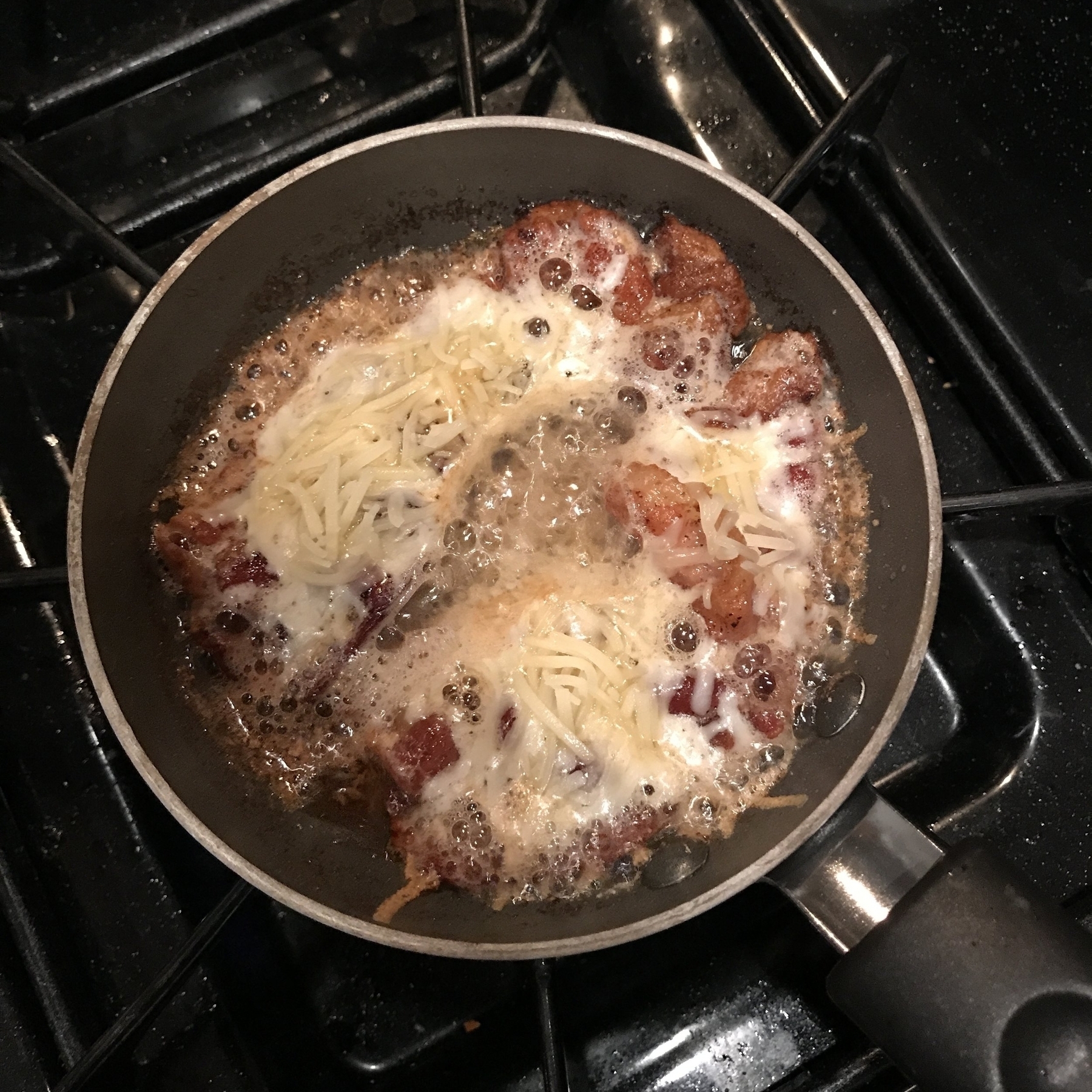
Back in St. Paul, I heat up the oven. I know, it’s probably not purist of me to do this, but I like my pizza warm when I’m getting it fresh. I use a carbon steel pan to heat up a few slices for a couple of minutes, while also dropping some cheese to my dog’s bowl, because she should be able to enjoy this as much as me. Right.
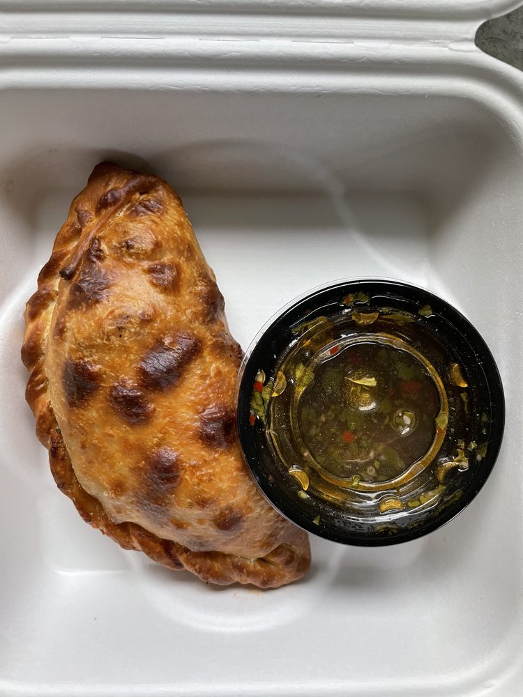
First, I eat the empanada I ordered as a companion to the main feast. I chose what they call the Carne. It’s a buttery soft (but not that buttery, I don’t even know if they use butter in the dough) encasing of beef picadillo, ají molido, and olives. Yes, this sounds like my kind of order. It also comes with a ramekin of chimichurri, so yes, this will be good. And it is. The mix is a perfectly umami, meat-wet amalgamation, and when dipped in chimichurri, the zing of olive oil, cilantro, and pepper elevate it even further. Let’s be honest, anything with chimichurri is going to be good. Anything. Especially an empanada. But the empanada can stand on its own, too.
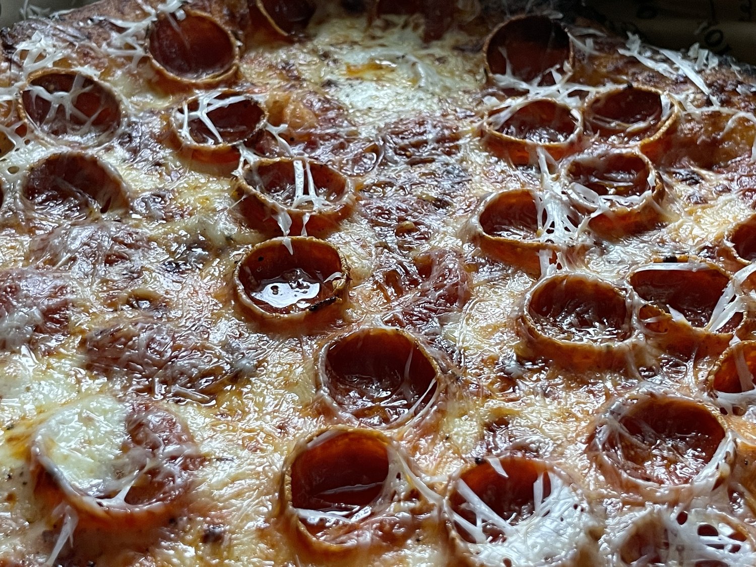
Okay, moving on to the pizza. I got the Pepperoni Pizza because I’m not going to pass up the opportunity to order my favorite pizza. My favorite, simple ingredient pizza. I mean, look at those pepperonis. If you see them cupping grease like that, you’ve made the right choice.
Now, I’ve had this pizza before. It’s good every time. I think it actually might get better every time.
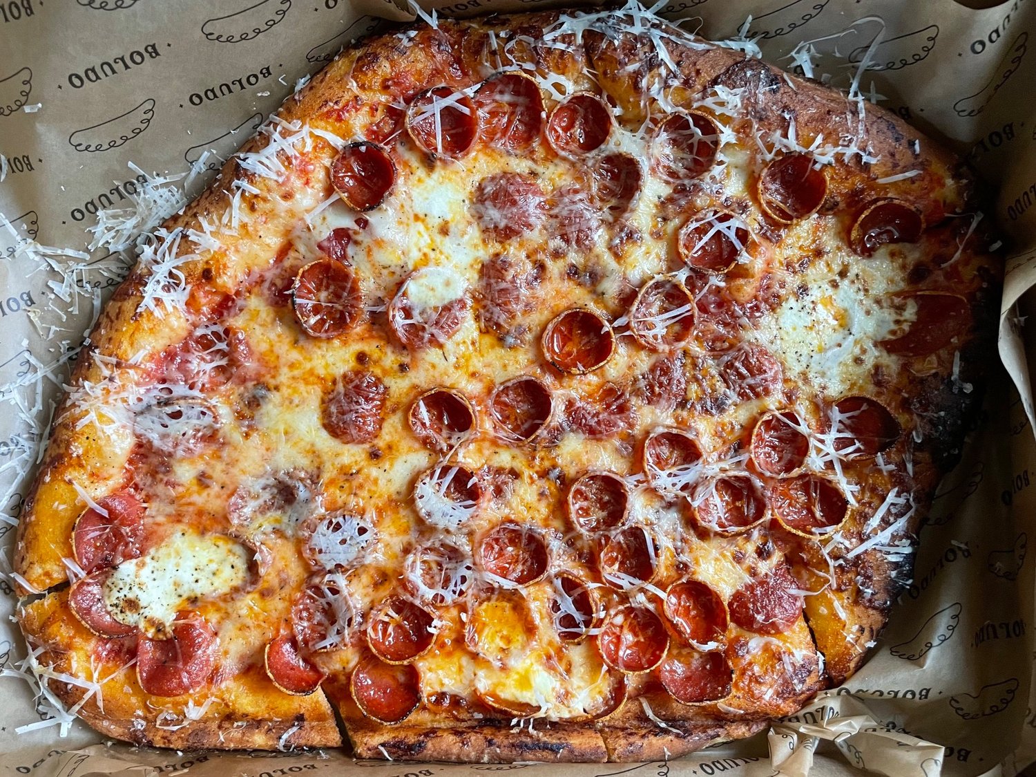
But first… just look at that pizza. It’s got a hell of a shape. Kind of like a horizontally-stretched quadrilateral. I don’t know why it’s like this. But it’s no matter, because it’s sliced in a way that makes sense and provides tangible pieces to eat (you probably get four good-sized slices out of this). For context, it’s a perfect size for two people who also might be eating an empanada or salad with it. Or for one very hungry person. After I gave it a little heat-up, I dug in and enjoyed every, single, bite. The sauce is amazing – a bright, light San Marzano tomato spread that sits right under a thinly shredded smattering of mozzarella. And I don’t mean a thin amount of cheese – there is a generous portion lopped on the base, but you can see the shredded pieces of mozzarella flung around the box and hanging off the sides of the crust. It’s a masterpiece of design. Lastly, atop the throne, are those small, curled pucks of pepperoni. Grease reservoirs in the best way. No, I’m not patting this down with a napkin – I’m eating it all.
The first few bites reaffirm why this pizza is great – sweet, but not acidic; the soft, precious crust looks charred but tastes like clouds; the cheese apparently isn’t a blend, but fools me into thinking there are ten different shades of mozzarellas immaculately tossed together; and, of course, the pepperoni just seals the flavor trap. A trifecta of genius.
Chef Facundo DeFraia, who according to the Boludo website, spent time in Buenos Aires learning the cooking trade in his grandmother’s kitchen. Whatever time he spent there is now yielding unfathomable joy from anyone who consumes his dishes. He also helped his friend open Martina, whose sister shop next door is also a very, very good pizza spot called Rosalia. They’re all top tier, and I’d have difficulty casting a vote for either Rosalia or Boludo as the king of pizza in the Twin Cities (but there are so many other contenders… I just won’t go there).
Recommended if you live here or are in the area.