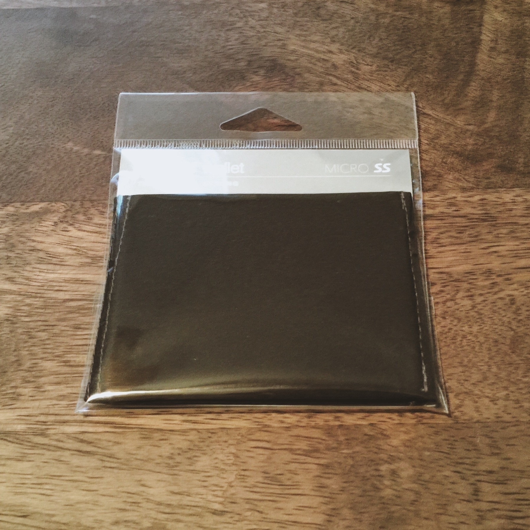
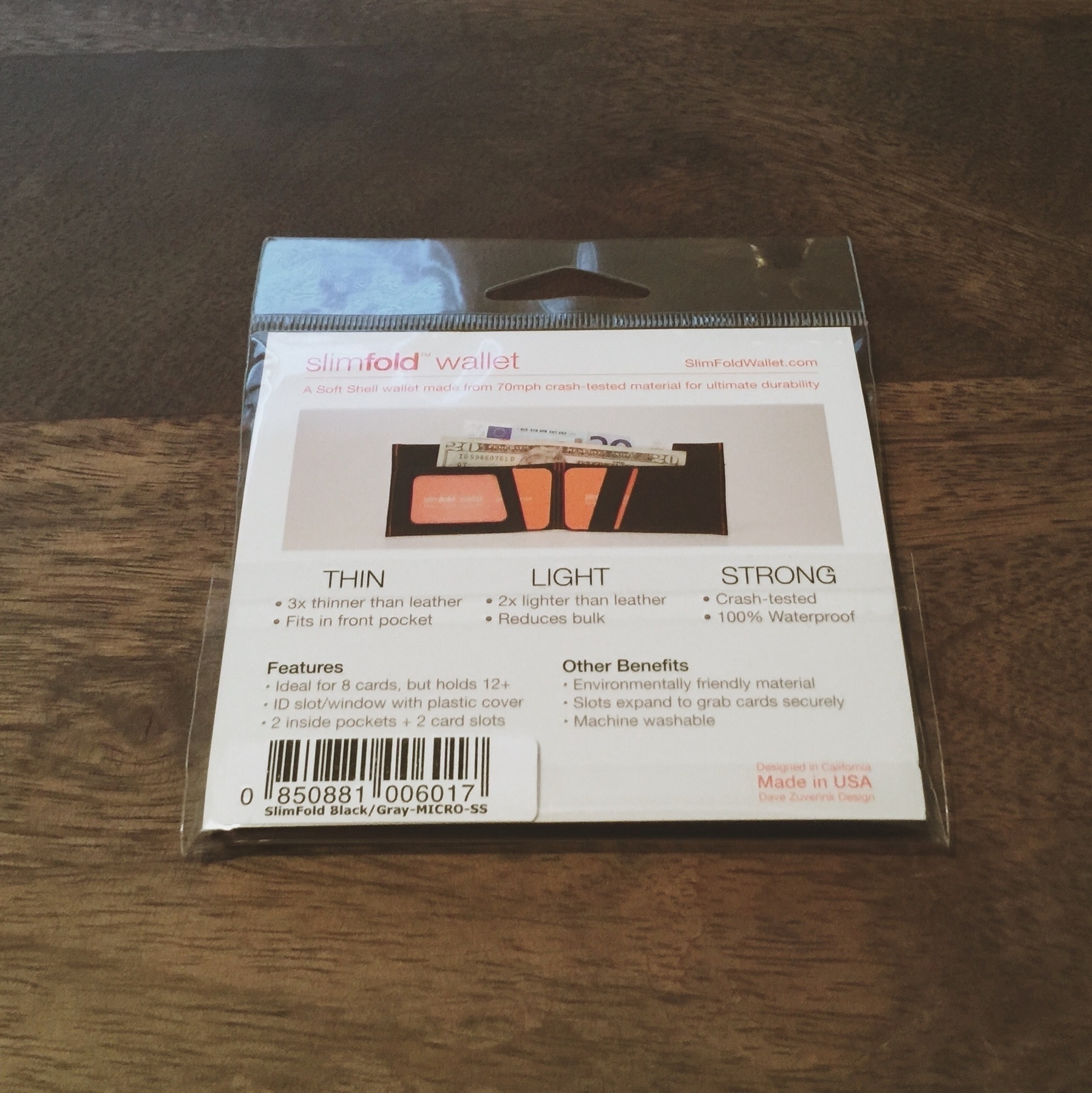
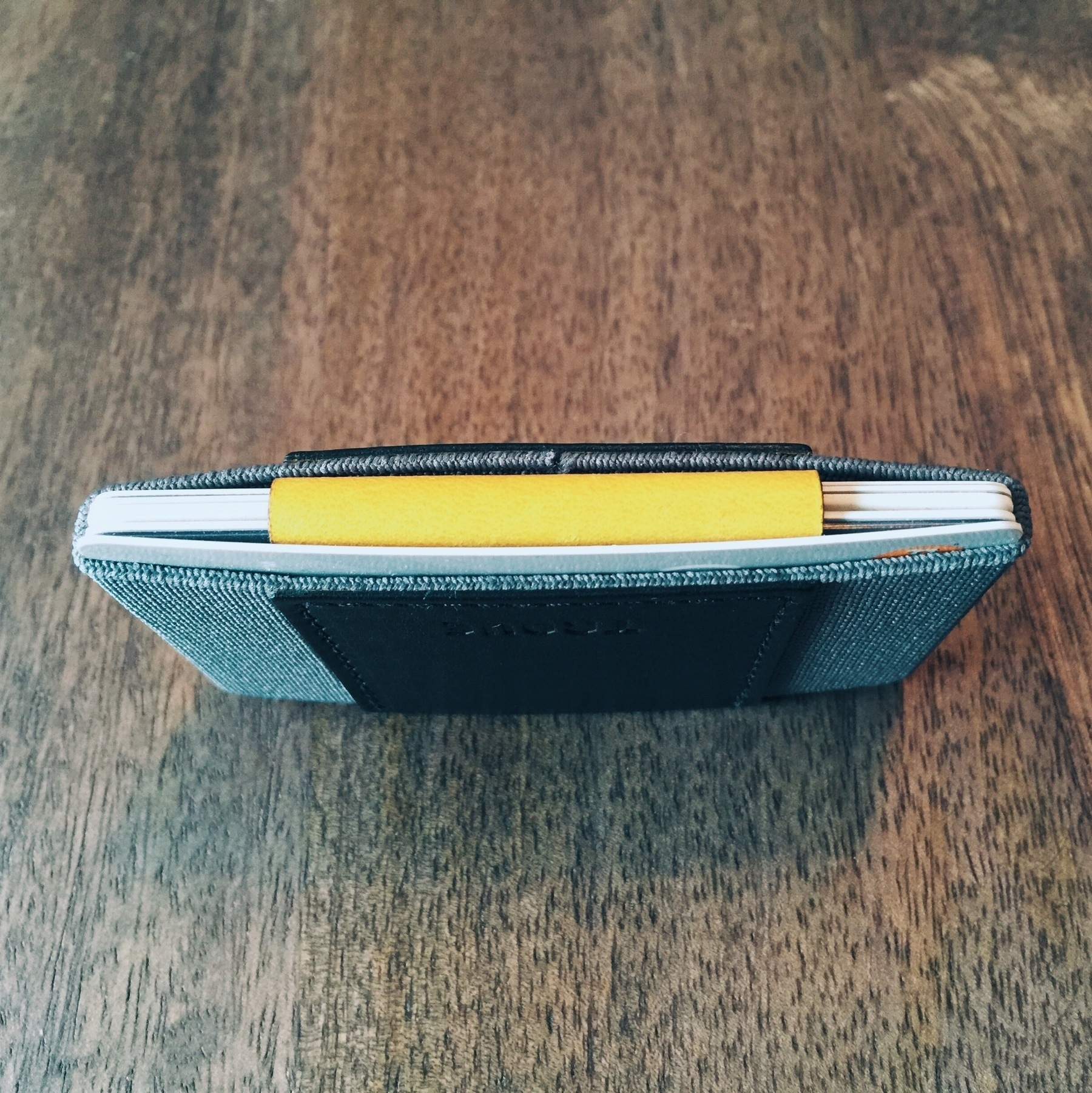
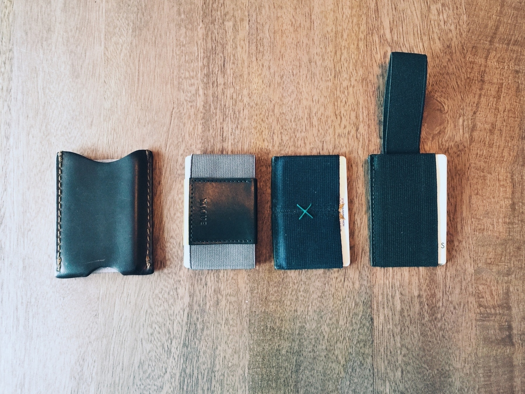
Defiant Sloth

Analog <> Digital

An easy guess would be to assume there will be an outcry over the big change when iOS 7 hits Apple devices in a few months. But anyone paying attention to the challenging states of designing for digital canvases should know that this was inevitable. Skeumorphism (digital assets that draw likeness to real-world counterparts) was a decided method in the early days of iOS to guide people into using a device that was so digitally malleable it could manifest into nearly any kind of object or operation -- many of which had physical equivalents (like a calculator or notebook). Sure, we've had digital representaions of calculators and notebooks before, but we've never been able to interact with them through a sophisticated touch interface.

While digital skeumorphism is top of mind right now, Smashing Magazine takes a look back at the history of design ornamentations across mediums in their essay, Authentic Design. I remember when I first bought my way into the iOS ecosystem with an iPod touch in the fall of 2007. I'd grown accostomed to Apple's flourishes with photorealistic icon design in Mac OS X (which still holds up functionally and appropriately today), so the Braun-inspired calculator definitely looked and felt good to use on the iPod touch's surface. We all have to remember that iOS (or iPhone OS back then) was a magical thing -- a multi-touch interface on a powerful, pocket computer was way ahead of its time. And maybe, as an unexpected side effect, no one cared that the applications we were using on it ludicrously mimicked physical world objects. I mean, the Notes app is a damn tacky looking thing (and was even worse when it used the Marker Felt typeface by default).1

If you TLDR-the-article, let me take you through the motions, starting with the beginning: the history of mass-produced ornamentation can be blamed on over-zealous capitalists using steam-powered manufacturing to their impulsive fantasies.

Historically, handcrafted decoration has been expensive to produce, serving as a symbol of wealth and luxury. With the advent of mechanization, imitations of those same sought-after ornaments could be stamped out cheaply and quickly. Rather than stop and think about what sort of design would be best suited for mass production, manufacturers jumped at the opportunity to copy historicized styles at low cost. The result was the flood of garish, low-quality products that Adolf Loos, along with other pioneers of modern design, railed against.

Makes you think twice about that Braun-inspired iOS calculator app.

Instead of attacking ornament, other pioneers of modern design focused on elevating functional form on a pedestal. In 1934, an exhibition curated by modernist architect Philip Johnson was held at New York’s Museum of Modern Art, titled Machine Art. On display were various pieces of mechanical equipment, such as airplane propellers and industrial insulators. The idea was to highlight beauty of form in objects that were purely functional. For the modern design movement, decoration was not necessary. Beauty and elegance were to emerge from the design of the content itself, not from a superficial coat of decoration.

The transition into digital canvases afforded designers to do whatever they wanted. Rendering ornamentation back in the early days of Windows and Mac OS was possible, and "real-world metaphors were used where they could be, such as for images of folders to denote file directories and buttons with bevels to let the user know they could click on them -- But the overall aesthetic was fairly flat and restrained." The strange transition into full-on skeumorphism in iOS was a curious choice, likely stemming from Jobs's wish to showcase the fun mechanics of operating a touch device.

So, the real kicker of the article: while skeumorphic designs "provide visual interest, they are also relics of another time, relics that tie an interface to static real-life objects that are incompatible with the fluidity and dynamism of digital interfaces". Drenching iOS in a new coat of paint and under-the-hood mechanics will enable designers to continue shedding ornamentation and focus on the content of their apps. This fall's release of iOS 7 is going to be grand.


  1. As John Gruber originally wrote": "The weakest app on the iPhone. Cosmetically, it’s a train wreck. The entire iPhone UI is set in one typeface — Helvetica — and it’s gorgeous. But Notes, in a lame attempt to be “friendly”, displays a UI that looks like a pad of yellow legal paper, and uses the handwriting-esque Marker Felt as the font for note text. This is not adjustable. Marker Felt is silly, ugly, and worst of all, hard to read."


For What Shall It Profit

An informed follow-up piece to the Verge's article prematurely proclaiming Pocket as the victor and future of "Internet DVR" by The Magazine's Glenn Fleishman.

I don’t see how [Pocket's] current situation with 9m free users is “beating” anyone. If Instapaper has millions of free users and 100,000s of who have paid for the app or for a Web subscription, has it been “beaten”? And if so, is it “beaten” at this point in time when it is cash-flow positive and Pocket is not? These questions aren’t asked nor answered in the Pocket profile.


Free & Pro Options for Services

Devir Kahan evaluates the merits of pricing digital services with free and paid options, using Dropbox as the evaluative lens. While Dropbox is a private company and does not release financial information, he's pieced together what has been made publicly available (e.g., "Dropbox manages to bring in upwards of $500 million in revenue a year, no doubt from their Pro accounts", and "96% of Dropbox users stick with the free account") and makes the following assessment:

"Dropbox seems to be doing fine financially bringing in half a billion dollars every year, but most people are not paying anything at all. Most people are using the product for free, just as they would any other free product. And yet the company is chugging along just fine. They might not be making as much money as they could if they charged every costumer, but as a whole, they are bringing in cash and are doing just fine. But again, to their average customer, they are a free product. And this makes Dropbox a rather interesting example."

Doing it Right

Would other services -- could other services -- do the same? Why doesn't Instagram do this, or Twitter, or Facebook, or Flipboard, or __? Dropbox has positioned itself as an exemplary product that exhibits a model of free and pro/paid versions, existing and working well (or so we can assume based on the revenue number unearthed by GigaOm; revenue of $2mm per employee isn't shabby). Following the 96/4 logic of Dropbox's reported paid userbase, other services could assess a monthly or yearly subscription fee for pro users that earns them "more" or "better" of something, incentivizing them to stay within the ecosystem (after all, they would be helping fund it). If only other companies that current do this would come out and state (I'd hope) successful numbers, we'd have a genuine case for larger companies to do the same (and perhaps pull back from their reliance on advertising). Additionally, services (or products -- because let's face it, the news industry could really use a rejuvenation shock with compelling paid subscriptions) could establish a baseline expectation of worth instead of offering everything perceptively free.

A few examples of other companies that, I'll assume, do this well and successfully:

  • Checkvist (free service and pro version at $20/6 months)
  • Simplenote (free service with ads and pro version at $20/year)
  • Instapaper (free service with paid app and pro version at $1/month)
  • Letterboxd (free service with paid version at $19/year)
  • Rdio (limited free service with paid version at $10/month)

These services all allow free usage of their products for anyone willing to sign up. While some of the free versions of the service are limited (Rdio has limited play sessions per month, and Checkvist doesn't allow for automatic backups of outlines, for instance), they are still very functional variations of the full product. Dropbox is aligned in a similar way -- it allows for full functionality and usage of its service for free but has a limited amount of space available for free users: 2GB. The paid service is priced at $99/year for 100GB (a massive hike in storage). Apparently there are enough paying users for Dropbox to sustain its service for the non-paying userbase.

So what would the revenue numbers look like if Facebook, Twitter, or Tumblr would have charged for a pro version beginning today? I've compiled a little table showcasing this based on the Dropbox 96/4 model, and assuming a relatively nominal charge of $1/month for a pro version for each service.

<div
    class="
      image-block-outer-wrapper
      layout-caption-below
      design-layout-inline


    "
    data-test="image-block-inline-outer-wrapper"
>


    <figure
        class="
          sqs-block-image-figure
          intrinsic
        "
        style="max-width:833px;"
    >


        <button
            class="
              sqs-block-image-button
              lightbox


            "
            data-description="&lt;p&gt;Service &amp;amp; Revenue Estimates for Paid Subscriptions Based on 96/4 Model&lt;/p&gt;"
            data-lightbox-theme=""
        >
          <span class="v6-visually-hidden">View fullsize</span>
          
      <div
          
          
          class="image-block-wrapper"
          data-animation-role="image"

data-animation-override

      >
        <div class="sqs-image-shape-container-element


        " style="
            position: relative;
            
              padding-bottom:11.644658088684082%;
            
            overflow: hidden;-webkit-mask-image: -webkit-radial-gradient(white, black);
          "
          >
            
              <noscript><img src="https://cdn.uploads.micro.blog/25423/2023/b5f47a9b49.jpg" alt="Service &amp;amp; Revenue Estimates for Paid Subscriptions Based on 96/4 Model" /></noscript><img class="thumb-image" src="https://cdn.uploads.micro.blog/25423/2023/b5f47a9b49.jpg" data-image="https://cdn.uploads.micro.blog/25423/2023/b5f47a9b49.jpg" data-image-dimensions="833x97" data-image-focal-point="0.5,0.5" alt="Service &amp;amp; Revenue Estimates for Paid Subscriptions Based on 96/4 Model" data-load="false" data-image-id="51b36f1de4b07e1f027f0b53" data-type="image" />
            
        </div>
      </div>
    
        </button>


      <figcaption class="image-caption-wrapper">
        <div class="image-caption"><p>Service &amp; Revenue Estimates for Paid Subscriptions Based on 96/4 Model</p></div>
      </figcaption>
    
  
    </figure>
  

</div>

As you can see, both Twitter and Tumblr would exceed their current annual revenues by successfully charging for a pro version of their services. Sure, they could charge more (or less), or even offer tiered pricing. If the need is only for 4% of the userbase to pay, I'm sure these numbers are absolutely achievable. For some users, a meatier version of a service they use everyday or rely on is worth the cost.

Doing it Wrong

There are ways to do this model wrong, however. Apple's iCloud service is one such example. Since launching iCloud, most users have unknowingly relied on the service to backup their data every night, as well as sync various data between apps and servers. The storage available for free (5GB and the ambiguously free Photo Stream of 1,000 photos) to iOS users is paltry for 2013 standards, especially when you consider that many Apple users own more than one iOS device (say, an iPhone and iPad). Pricing for "pro" versions of iCloud are as follows:

  • 10GB: $20/year
  • 20GB: $40/year
  • 50GB: $100/year

Not only are these prices absurd, they also grind against the goodwill of Apple customers purchasing and relying on the iOS device software ecosystem. They're taking photos and videos as part of their expectation of the device, and little do they perhaps know that the Photos app is weighing heavily on their iCloud storage at 4.8GB alone. And let's not forget that the use of Apple's @me/@icloud mail service is also tied to iCloud storage. So 5GB can fuck itself -- my iPhone alone has a 7.5GB backup.

The reason Apple is perceivably doing this wrong is because of the intrinsic nature of iCloud and its oblivious reliance by owners. If several iOS owners have Gmail -- and let's assume a great number use Google's mail service -- they know never have to worry about space (Google offers 15GB+ of free space across Gmail, Google Drive, and Google+ Photos). But to be harassed by the device you bought because you're creeping on the backup limit that you may not even know how to deactivate is a frustrating friction that is a dangerous misstep. If you're using Dropbox to backup all your photos and videos, you are well aware you're a freeloader riding on 2GB. If you value the service that you chose to sign up for, and begin to rely on it, you'll likely upgrade to a paying user for more space. iCloud was never positioned this way.

The Way Forward

While I doubt many, if any, of the social platforms will offer a paid tier to their service anytime soon, it's worth contemplating for smaller products moving forward. There is no harm in offering a better version of your service for a price, especially if you can garner a large enough percentage of users to pay and sustain your entire business (including the free users). Some products, like Basecamp, probably don't work well enough to permit a free and paid option (their free option is ludicrously limited). Then again, they really aren't appealing to freeloaders to begin with -- it's positioned as a paid SaaS, and the owners won't let you argue about it. But other services most certainly should offer something compelling (hello IFTTT?).

What happens when you start paying for too many things and can't reasonably afford it? Pay for the services with the best paid options and use the other ones for free. Someone else out there will value each service in their own way and likely pick up your slack.


Sources


Instapaper vs. Pocket

Updated: Sept. 25, 2013

--> Jump to Scorecard

Bookmarking has been part of Internet browsing since nearly the beginning of the browser. For a long while, bookmarking was tied to client-side storage in the application, and could only be accessed at a user's computer. As technology advanced, services like Yahoo's Delicious caught on to the idea of enabling pages on the Internet to be saved server-side, therefore being accessible wherever you could reach the bookmarking website.

But circa 2007, in the booming age of mobile devices and the changing behaviors of readers, bookmarking a full web page and loading it up on the train into work isn't as convenient a reading experience as it could have been. So, in the year of the iPhone, this whole "read it later" thing began. Pocket (formerly known as Read It Later) started life as a single-platform Firefox extension that didn't do much beyond saving articles for later (without device sync); Instapaper, a bookmarklet and text parser for the iPhone (which had just debuted), focused on parsing article text and having a synchronized list between platforms (the app launched when the App Store did in 2008). Both have evolved into more realized products of their original visions, and have refined their services and ecosystems. Today, the read-it-later economy is strong, and even traditional bookmarking/note-taking services like Delicious and Evernote have attempted to enter it.

What I hope to do with this evaluation is score each service on several integral components of what a read later service should ideally comprise. Obviously both of these services are self-referential for the read later service, and so they've helped shape what a service like this should look like (in addition to how it should function). But there are several other considerations that can be included as well -- expectations of a multi-platform user, design philosophies of servicing websites and apps in 2013, the speed and ease of use of a product. I've grouped these evaluations into the following:

  • Speed
  • Website Design
  • Text Parser Quality
  • Mobile App Design & Functionality
  • App Ecosystem Integration
  • Desktop App Design & Functionality
  • Ease of Use

These are weighted in no particular order, with several evaluated subjectively on a scale of Poor, Okay, Good, Great, and Excellent, other binarily as Yes/No. The full scorecard is located at the tail-end of this evaluation.

<div
    class="
      image-block-outer-wrapper
      layout-caption-below
      design-layout-inline


    "
    data-test="image-block-inline-outer-wrapper"
>


    <figure
        class="
          sqs-block-image-figure
          intrinsic
        "
        style="max-width:589px;"
    >


        <button
            class="
              sqs-block-image-button
              lightbox


            "
            data-description="&lt;p&gt;Pocket's in-article settings (left) vs. Instapaper's (right)&lt;/p&gt;&lt;p&gt;&lt;/p&gt;"
            data-lightbox-theme=""
        >
          <span class="v6-visually-hidden">View fullsize</span>
          
      <div
          
          
          class="image-block-wrapper"
          data-animation-role="image"

data-animation-override

      >
        <div class="sqs-image-shape-container-element


        " style="
            position: relative;
            
              padding-bottom:88.79456329345703%;
            
            overflow: hidden;-webkit-mask-image: -webkit-radial-gradient(white, black);
          "
          >
            
              <noscript><img src="https://cdn.uploads.micro.blog/25423/2023/a3093816b8.jpg" alt="Pocket's in-article settings (left) vs. Instapaper's (right)" /></noscript><img class="thumb-image" src="https://cdn.uploads.micro.blog/25423/2023/a3093816b8.jpg" data-image="https://cdn.uploads.micro.blog/25423/2023/a3093816b8.jpg" data-image-dimensions="589x523" data-image-focal-point="0.5,0.5" alt="Pocket's in-article settings (left) vs. Instapaper's (right)" data-load="false" data-image-id="51aa3ce9e4b070cc6c9374c4" data-type="image" />
            
        </div>
      </div>
    
        </button>


      <figcaption class="image-caption-wrapper">
        <div class="image-caption"><p>Pocket's in-article settings (left) vs. Instapaper's (right)</p><p></p></div>
      </figcaption>
    
  
    </figure>
  

</div>

A Quick Bit of History

Pocket

Originally intended only for desktop computers (as a browser extension for Firefox), Read It Later was first started in August 2007 by Nathan Weiner. It ran alonside Instapaper in the early days as an alternative once it had its app and syncing service up and running. In its more mature days, Read It Later earned venture capital investments) of $2.5 million in 2011, and in 2012, an additional round of $5.0 million. To put all that money to use, I suppose Read It Later needed to be renamed Pocket (which happened in 2012) to shed its one-trick name to accommodate a larger spread of users by aiming to be the premier Internet collection service.

Today, Pocket is available for free on iOS, Android, and BlackBerry OS, as well as multiple web browsers (with official, smart extensions) and on desktop OSes.

Instapaper

Humbly founded by Marco Arment in 2008 to scratch his itch for an easier way to save and read articles while commuting, Instapaper never received any rounds of investment and was completely self-funded. Instapaper as an app launched at the commencement of the Apple App Store with two options: one Pro version at $10, another free version with a limitation on the number of articles a user could save.

Now, Instapaper has switched ownership -- Marco sold Instapaper to Betaworks in April 2013 -- and app prices/have changed. Instapaper is now a $4.99 iOS app with an optional $1.00/month subscription for advanced features such as full-text search, API hook-up with third-party apps, better Kindle article integration (like higher Kindle article limits and a “Send to Kindle” bookmarklet), and the ability to disable ads on the instapaper.com site. It is also available on Android, and can be accessed through various apps on desktop computers like ReadKit (subscription required).

Saving Articles for Reading Later

When we want to read something, we want the experience to be distraction-free. The traditional book format is a fine example of this. You are given text, you read that text -- no fuss. Some periodicals are great examples of this, too -- The New Yorker, for instance, has clean typographic layouts that focus on the body of text for a given article, and sprinkle in relatively dsitractionless column ads and cartoon panels. The Internet, however, is a minefield. If you read anything I've written in the past, you know my stance on it. For instance: just gawk at the hostile reading experiences exhibit I've been building. It isn't pretty reading things on websites, and it's even harder to read things when you have several other tasks to complete at any given moment you've accidentally stumbled upon something great. In these circumstances, a read-it-later service is undeniably useful.

When you come to an article you'd like to save, both Instapaper and Pocket have several options for triggering their services' text parsers to crawl it (or a paginated series of pages). These parsers will scrape the page's code and pull out only the text pertinent to the article, eschewing ads/navigation/miscellaneous media/etc., and bring that text into your user account for storage (and, obviously, reading later when you when the time). Triggers and places for parsing include:

  • Bookmarklets for Desktop and Mobile Browsers
  • Browser Extensions (Pocket has an official one, Instapaper unofficial ones)
  • Send Link Via Email (by which both services will then go out and capture the page's article relatively quickly -- usually within a few minutes)
  • In-App Browser (only via Instapaper can you navigate in an in-app browser to then save articles for later)
  • Via Other Apps (both Instapaper and Pocket have rich app ecosystem integrations, whereby you can save a shared link in a Twitter app, for instance, with either service -- Pocket has a public list available)
  • Built-in on Websites (certain websites leverage the APIs for one or both services, like qz.com and thefeature.net)

By having so many seamless options to save articles, neither service has an upperhand. While there are some minor advantages to Pocket's current capabilities in this area, like its official extension that does a great job of identifying certain websites -- like Twitter and Hacker News -- and adding a "save to pocket" link next to identified articles, it isn't strong enough to vouch entirely for Pocket. Since Marco's sale of Instapaper, perhaps we'll see feature parity between them in this area soon.

The quality of the parsed text, however, is still uneven. Instapaper has historically done a fantastic job with pagination, but I've seen it fail on a few complicated websites. It also struggles with login/paywall sites like NSFWCorp. Pocket handles this kind of thing elegantly by acknowledging the presence of a paywall and prompting for a username/password. This kind of smart integration gives Pocket an edge in accessibility to certain kinds of sites -- certainly worth consideration in your choice of service use.

Functionality & Aesthetics

I'll break this down into two sections, as most users will likely engage with the services on their websites and apps:

Apps (iOS)

Instapaper has historically had a spartan, clean interface, and to this day it still is succinct and functional -- it focuses on the text, and that's it. Its 4.0 version in 2012 was a big update adding new functionality and menus, but the app usage was never negatively impacted. Pocket is equally as clean, though, and visually it identifies different media better (videos are indicated with overlay icon). Instapaper infrequently will correctly identify video and do something similar, but it was never designed to filter precisely for videos like Pocket can.

Reading is the big draw for these apps, and while both services tend to match one another for options, there are glaring differences in crucial areas like fonts. Instapaper's reading canvas has a default setting of black text on white with text rendered in left-aligned only. You can set spacing and margin/width customizations as you see fit, though (which is especially nice on the iPad), and text colors can vary between dark, sepia, light, as well as an intelligent function for auto-detecting sunset based on location to dim from light to sepia to dark (and vice versa) at the right time of day. Pocket has these same tonal options (sans the "change of day" feature), and both services allow for text sizing to be scaled as well as access to the brightness controls.

Instapaper, however, has the upper-hand for customization. For instance, how you actually read an article can be switched from page-flipping to tilt-scrolling, and regular scrolling (tilt-scrolling, which has been around for years in Instapaper, permits you to literally tilt the device to cascade the text like an inverse waterfall; While it seems like a neat idea, in practice I find normal scrolling the best method of reading). Pocket can only scroll and page flip, and the latter is strangely designed -- there is no activation for it, you just perform a "flip" finger gesture against the screen and it turns on, but scrolling vertically again turns it off. (While this seems nice and simple, being in page-flipping doesn't lock you into the method of reading, so it seems flimsy.) Additionally, while Instapaper offers several fonts from which to choose -- including the beautiful, default Elena by Process Type Foundry, and even a Dyslexia-formatted font called Dyslexie -- Pocket is limited to a sans-serif and serif font selection.

Users tend to take action with their reading materials after they're done -- Sharing on a social platform or via email may be one such action, or perhaps saving quotes from an article into another app. Neither service misses in this department. Both Instapaper and Pocket allow a user to favorite an article, archive it, or organize it either by folder (Instapaper) or tag (Pocket). Sharing is extensive, with Instapaper edging out Pocket on the quality and variety of actions. In Instapaper, you can email an article to someone (either an email link or full text -- it uses the original article URL but does provide a "via Instapaper" in the email template); take actions to post to the usual suspects of social platforms; take actions to copy an article link, full article text, and/or post or create an item to several different apps, including Tweetbot, OmniFocus, Due, Drafts, and Simplenote (it will auto-detect which apps you have that are compatible). Pocket similarly shares many of these functions albeit with small differences, like missing out on the full article shares.

Interacting with articles in-app is also a bit different between the services. Both apps use the Tweetbot-inspired (or was it original Loren Brichter Tweetie?) item-swipe for performing actions like adding tags/adding to folder, archiving, favoriting (Pocket-only), trashing, or sharing. Pocket may be a bit assumptive in allowing you to favorite an article without even reading it, but it's a minor design fallacy. Favoriting in Instapaper allows for some permutations aside from merely having a "folder" for your prized collection. In version 4.0, Instapaper added a subtle social network feature that allows its users to anonymously (and secretly) follow friends' or other users' favorites (called "Liked") collections. It also pulls in shared links from Twitter users you follow and curates them in the same section in the app, called Friends. It's a neat function that isn't distracting or too entrenched in social media (you can't comment or like what yours friends are reading, it's simply a straight-forward curation service). Instapaper also has a section called The Feature that updates frequently with the most Instapapered articles across all its users. Pocket misses out on these added features, and while it doesn't impact the overall product's purpose, it does feel inadequate next to Instapaper's rich ecosystem.

Lastly: article state sync. I forget when Instapaper introduced this, but it's fantastic. While it currently only works on across apps, Instapaper will remember where you are in any saved article and sync that state between devices (but not the website). Surprisingly, Pocket does not yet do this. The holy grail is getting that sync up to the website-level (for both services), so we'll see what happens as they continue to evolve the products.

Overall, Instapaper provides a more compelling app and reading experience.

Websites

While the apps are an integral part of the reading wherever experience, reading and managing your account at the website-level still needs to be a suitable option. Pocket has a much stronger design and functionality for its website than Instapaper offers (note as of August 2013: Instapaper is undergoing a website update currently available for beta use; this evaluation will be updated to reflect the new site design). Pocket has a flexible grid that allows articles to be viewed as a list or summary card, with sorting options for article type and switching between lists/tags. It'll even animate GIFs in the preview cards if it is contained within the article. Whereas Pocket's site design seems roomier, crisper, and fluid, Instapaper's still seems stuck in a design that would've been antiquated even five years ago. Folder settings are clumsy, the article list is very static, and there are inconsistencies in button styles, layout, and pop-up tools that distract. At least both services' reading component on-site is minimal and distraction-free.

Searching articles is also slightly different between services. On Pocket, search is surprisingly slow for what it ought to be -- testing a two-article inbox with contextual search (I'd presume?) of a single word found in one of the article's titles took over five seconds. The same thing re-enacted in Instapaper took only two. Granted, Instapaper's full-text search functionality is only available to paying subscribers, so Pocket does do a better job with its accessibility.

Overall, Pocket is better at the website stuff thus far.

In Summary

I can't readily recommend one service over another by suggesting you try both -- Instapaper has a $4.99 entry fee whereas Pocket does not -- but my evaluation and experience using both of these services suggests that Instapaper is the superior service as of today. Its terrific apps, tight article syncing, breadth of article actions, and external app integrations make it the smartest choice. You also pay for the app and can support it via a subscription which -- while not entirely a guarantee of sustained business -- is at least indicative of long-term viability. While it's anyone's guess how Betaworks will handle the ownership transition, I trust Mr. Arment made an informed decision.

Either service is worth using, and they both far exceed other read-it-later solutions out there (nice try with the Reading List, Apple). If you're looking for something specific between the two feature-wise, reference the scorecard that follows.

iOS 7 Updates

Sept. 25, 2013

September 18 brought a new version of iOS to Apple devices, heralding a drastically different direction in design and functionality. As such, both Instapaper and Pocket updated their app versions (5.0 and 4.6 respectively) to accommodate.

These changes do not impact my original review of the two apps back in June, but features and UI direction are worth noting:

  • New, subtly-changed icons have replaced the old ones. Instapaper's is notably brighter and leaner, Pocket's looks slightly less dimensional but retains much of its original design
  • Both now support iOS 7's background sync, a notably awesome addition for not having to worry about launching the app to sync (or setting a location trigger to sync)
  • Adjustments to reading views (Pocket made the most progress here, only because they had -- and still have -- catching up to do with Instapaper's numerous reading options; fonts are still limited in Pocket)
  • Swipe from left-to-right to return to list view (both apps have this now, even though Instapaper had this option from previous incarnations); this is a great move for consistency and to oblige Apple's lead on the new gesture as standard fare

There are new features Instapaper added to earn that 5.0 mark, which are worth pointing out here. As these are new features for read-it-later apps, I've actually gone ahead and updated the Scorecard to accommodate a few of them as new checkpoints (because, yes, they are fabulously useful).

  • Sorting/Filtering: You can now sort by newest, oldest, longest, shortest, popularity, and shuffle. Additionally, you may filter by reading time (e.g., "less than 5 minutes" or "over an hour")
  • InstaRank: The popularity sort mentioned above is powered by InstaRank, an algorithmic ranking and sorting system to filter articles according to various attributes. According to their blog post on this, some of these attributes include the number of overall saves/reads/likes, age of the link, popularity of the domain compared to other domains in the Instapaper world, and so forth.
  • Separate video category: Pocket was the first to identify and separate videos saved for later, and Instapaper has finally caught up.
  • Language translations: Instapaper now supports 13 languages

Scorecard: Instapaper vs. Pocket

Updated Sept 25, 2013

Evaluation Instapaper Pocket
Speed Excellent Good
Customization Excellent Good
Page Turn x x
Page Tilt x
Font Selection x
Page Tones (Light, Dark, Sepia) x x
Brightness Controls x x
Margin/Width Controls x
Line Spacing Controls x
Organization (folders, tags) x x
Media Handling x
Favorites x x
External Login x
App Actions Excellent Good
Share Actual Article Link x
Share Actual Article Text x
Email Article x x
Share Link with Other App x x
Website Design/Functionality Okay Great
App Design/Functionality Great Great
Parser Quality Great Great
Ease of Use Great Great
Bookmarklet x x
Send Via Email x x
Filtering/Sorting x
Video Separation x x
Multi-Language Support x
App Integration: Quantity Great Excellent
iPhone App x x
iPad App x x
Android App x x
Windows Phone App No No
Mac App x
Windows App Website Website

Kairo - A Minimalist Exercise in Puzzle Gaming

Grainy, misty monolithic landmasses hovering in a field of white. Ethereal music droning like a waterfall sucked into the vacuum of space. You're alone. You don't know who you are, or where you are. The only gameplay prompt is another island of stone in the distance. Your movements are limited. There is no narrative, no introduction, and no weapon.

This is how the computer and iOS game, Kairo, begins.

<div
    class="
      image-block-outer-wrapper
      layout-caption-overlay-hover
      design-layout-inline


    "
    data-test="image-block-inline-outer-wrapper"
>


    <figure
        class="
          sqs-block-image-figure
          intrinsic
        "
        style="max-width:1440px;"
    >


        <button
            class="
              sqs-block-image-button
              lightbox


            "
            data-description="&lt;p&gt;Looking to the Skies of &lt;em&gt;Kairo&lt;/em&gt;&lt;/p&gt;"
            data-lightbox-theme="dark"
        >
          <span class="v6-visually-hidden">View fullsize</span>
          
      <div
          
          
          class="image-block-wrapper"
          data-animation-role="image"

data-animation-override

      >
        <div class="sqs-image-shape-container-element


          has-aspect-ratio
        " style="
            position: relative;
            
              padding-bottom:62.5%;
            
            overflow: hidden;-webkit-mask-image: -webkit-radial-gradient(white, black);
          "
          >
            
              <noscript><img src="https://cdn.uploads.micro.blog/25423/2023/cc8bda2b6b.jpg" alt="Looking to the Skies of Kairo" /></noscript><img class="thumb-image" src="https://cdn.uploads.micro.blog/25423/2023/cc8bda2b6b.jpg" data-image="https://cdn.uploads.micro.blog/25423/2023/cc8bda2b6b.jpg" data-image-dimensions="1440x900" data-image-focal-point="0.5,0.5" alt="Looking to the Skies of Kairo" data-load="false" data-image-id="5189127ee4b0cac36dbadb77" data-type="image" />
            
        </div>
      </div>
    
        </button>


      <figcaption class="image-caption-wrapper">
        <div class="image-caption"><p>Looking to the Skies of <em>Kairo</em></p></div>
      </figcaption>
    
  
    </figure>
  

</div>

Game developer Locked Door Puzzle (run by Richard Perrin in London) cunningly forges stark, minimalist canvases upon which sounds, music, and visuals coerce you to apply a haunting narrative. It's a game you experience on your own, justifying what you see around you with your imagination until some carefully planted cue suggests otherwise. Very few gaming experiences permit you to draw upon blank environments to summon your own narrative -- not even the “anti-game” Dear Esther does this, for its insufferable narrator blathers throughout the experience. Kairo offers no clear answers. One area, for instance, encourages you to slowly trot along a winding, concrete stairwell that hovers ominously amid black infinite. While you continue downward (although why you'd want to do this is somwhat suspect, seeing as how it is just floating there in total darkness...), you hear a broken radio frequency flicker beneath the bellowing sounds of Wounds’ impressive, glacial soundtrack. You soon realize the radio is emanating from a white obelisk, splintering through the black sky. You can't make out the transmission, and you don't see any discernable antenna, so nothing of meaning can be derived from this. You aren't certain if you should stay there a while longer to see if the transmission clears, or if you ought to continue forward (obviously, you have to continue forward). But there is never a sense of urgency in Kairo -- it is a place out of time, out of context.

Where narrative reinforcement may be missing, moving through and exploring the world of Kairo is stunning with rich -- if, in actuality, stark -- world-building. Soon after the first minor puzzle of the game, you proceed along a bridge that tapers off into darkness. As you move across it, bracing for some ghastly surprise, the scarce sound effects dim as great pillars slice through the underground sky and bury their endpoints into the unseen ground. This effect implies your movement across the bridge is actively morphing the landscape, bringing structure to the bridge as you proceed to the other side. It's a beautifully scripted sequence -- the kind of thing that burrows in your consciousness and creeps back out in dreams. Furthermore, soundscapes and environmental elements are oftentimes mystically disconnected to your expectations that add to the game’s intrigue. At one point, I found myself entering a room with what sounded like a waterfall echoing along stone somewhere around the bend in a corridor. Upon turning and entering the cavern of this sound's origin, the environment betrayed my expectation of water. Instead, I found a high stone edifice with cascading rectangular sheets. As an experience that builds upon its foundation of simple geometric designs, I continued to enjoy these optical-audial tricks.

At its heart, Kairo is a first-person puzzle game. As the game progresses, you pass through several puzzles, none of which are game-breakingly obtuse like the classic series Myst (for which I absolutely needed the hand-holding of a game guide). With the suggestion of mechanics involved in Kairo’s strange world, I began to understand the world it presented to me as some kind of infrastructure for awaking... Something. Sparks spill out from an illuminating panel high above my field of view, tiles on the ground “ding” with life as I pass over them, movable lanterns active beams of energy when positioned just right -- these operational components kept me interested. So only after meandering through the first leg of puzzles does the game begin to reveal itself, and as you complete them, the game continues to quench your thirst for answers. (It also helps that the completion animations and sound verifications for completing these puzzles is very self-aggrandizing -- so of course that makes you feel good).

If you're at all interested in puzzle games, Kairo is a terrific experience. But it really shines as a game stripped down to its essence, allowing the player to move freely and unburdened with excessive gameplay baggage. The visuals, the sounds, and the music -- as bare as they are -- help you imagine and place your importance in this world. Perhaps it's best to understand the game behind the name's meaning -- likely derived from the Greek word kairos, which implies "the right, opportune moment". In the word's context of time, Kairo is a theater designed for the player to perform an action at the right time to initaite something special. On a high level, every game designed is like this, but in Kairo's world, you believe you're really contributing to something grand, something that, in the end, may reward your efforts in bringing meaning to it.


Introducing an Exhibit on Hostile Reading Experiences

If you grew up reading newspapers and magazines in their analog formats, you know quite well the picnic is over and the only place to subscribe and read them will be online in the next few years. We all hoped publishers could transition to the digital age with elegance, but they instead chose to arrive to the party overdosed on Google AdSense and drunk off Flash banners. Typical of major industry shifts, it's been a horrific ordeal for the incumbents, and we -- their customers -- have suffered as a result of their obtuse efforts. With the advertising industry and content management systems of the Internet simultaneously changing alongside this movement from ink to pixel, we've been left with an exercise in frustration over what should be a simple operation: reading words.

As such, I'm introducing an on-going project that curates the worst, most hostile reading experiences on the Internet: Hostile Reading Experiences: A Public Exhibit. It'll permanently reside under the Projects section.

While online publications are often hit or miss in areas of layout, distraction, and readability, these sites' ill-advised designs will most likely discourage you from attempting to read any more than the headline -- if you can even locate it.

In our trendy era of animated display banners, social media buttons, Google AdSense links, related story widgets, scrolling navigation bars, and amateur typeface settings, it's no wonder people prefer watching videos. I've compiled a list of sites that currently violate reasonable reading expectations online, and will continue to add examples as I cruise the net.

I mean, really: Large publishers can meet a reasonable balance between ad-generating revenue and readable content. They have all along with their print product -- why does the digital version fall so far from the tree? In lieu of these publishers' oversights, smaller, leaner content foundries (like The Magazine, NSFWCorp, Svbtle, The Morning News, The Bygone Bureau, and The Brief), have grasped the opportunity to improve reading experiences for their own subscribers while shaming the treachery of their elders. Designing and providing great reading experiences shouldn't be a trend with the nerd periodicals -- it should be the expectation. It's dispiriting to know that so few of the major publishers realize this.


NSFWCorp Tentatively Squats Over Modern Journalism with a Solution

"NSFWCorp is the future of journalism with jokes, which basically means we tell you what's going on in the world in a way that makes you actually give a fuck about what's going on in the world. Everybody is building an app that is making news smaller and smaller and smaller. What we're trying to do is make news big again. And what that means is we're hiring really, really good journalists -- supernaturally good journalists -- and sending them out into the world to find really big stories. And then we're making the job even harder by insisting that when they come back, they make those stories funny."

Paul Carr, editor in chief, nsfwcorp (from the NSFWCorp Movie)

NSFWCorp is a relatively new journalism shop testing the future of the business with new monetary solutions. Slugging it out in Las Vegas, these guys have hired great writers, encouraged travel budgets, afforded fact checkers, and never forget their editors. They hope by generating quality content and charging money (!) for their efforts, NSFWCorp will operate a sustainable business in an increasingly hostile world for news and journalism.

While NSFWCorp has been digital-only since I've joined, they've recently sold out of their new print run of an ancillary magazine being released March 25th. That's right -- they have the balls to publish a printed product in 2013. The plan calls for a monthly periodical that rides alongside digital content, featuring two 10-12 thousand word "A-side" stories sandwiching a set of unique interior features. (It's been revealed that the first featured story is called “Iraqipedia”, an illustrated A-Z guide to the war in Iraq.) Their rationale? "Not only does print provide a far better experience for reading long form but it also offers true platform agnosticism (available to anyone with v1 of “eyes”) and for a variety of complicated human reasons, it improves data retention and adds more credibility and heft to serious reporting." How are they going to sustain such a bold initiative when they only make three bucks a month for their online journalism from memberS? Charge a few bills more: $7/month for both the print and digital editions whilst keeping the option for digital-only at $3/month.

The print edition's first issue, limited to 5,000 copies, hasn't been without hurdles, though. The outfit planned on distributing 1,000 issues in Vegas, but the distributers outright banned it from sale. I don't know what kind of inane bullshit is fueling this publishing doctrine, but it sounds as if distributers are the ones adding gasoline the burning hand that feeds them. It sounds like NSFWCorp will offer a backup eBook in any event, but my fingers are tingling for something physical after having taken my reading habits into the pixel age.

If you're interested in perusing NSFWCorp's back-catalog of essays before subscribing, a few recommendations:


Defending & Deflating the Use of the Oxford Comma

If you know me at all, you know that I'm a stickler for the Oxford comma. Why be a stickler for a punctuation method? Why does it matter? And what is the Oxford comma, you may be Googling right now? Let me explain.

In elementary school, I was taught to write using the Oxford comma1. If you're wondering what this esoteric grammatical rule is all about, you may find self-referential treatment by its other name: the serial comma. This particular comma is used to identify and separate three or more items listed in a sentence, and is placed before the coordinating conjunction (such as "and", "or"). Depending on how much of a dick you want to be, you can throw around its credentials, which include usage support by prestigious style guides like The Chicago Manual of Style, Strunk and White's Elements of Style, Oxford University Press, Fowler's Modern English Usage, and the U.S. Government Printing Office Style Manual. So far, it seems like my poor, struggling elementary school was correct. But of course, other grammatical miscreants will disagree.

There are innumerable examples of how the Oxford comma is the most effective and clearest way to communicate a sequence of things, but up until reading this Oxford Comma article by Angus Croll, I hadn't thought about how it could be used to confound the very thing it was attempting to clarify.

Here's his example:

...it turns out that for every phrase that the Oxford comma clarifies, there's another for which it obfuscates. “Through the window she saw George, a policeman and several onlookers” clearly refers to two people and some onlookers. Throw in the Oxford comma and George has become a policeman: “Through the window she saw George, a policeman, and several onlookers”.

Okay, point taken, even if this sentence was rigged to surface the very problem (hello all textbook examples2). Croll uses the Oxford comma as an example to contextualize the ease of writing casually on the Internet, whether it be blog posts, articles, tweets -- whatever. His essay trails off at the end, but there are some good ideas to point out:

  • Is language and writing becoming less structured because of new mediums through which they are used?
  • If so, do grammatical rules matter as much in 2013 as they did in the 1913?
  • Do grammatical rules apply as specifically in one medium versus another, or because of technological progress (as stated above)?

While I'm not in an academic enough position to answer these questions outright, it can at least be posited before an astute readership and a changing world that continues to use different technologies to write and communicate. Regardless of which side of the line you stand on, it is reasonable enough to assume that because of the changes in technology (of which electronic technology is now our primary method for communicating and writing), brevity is ever more important. Status updates aren't getting any longer, news articles are getting shorter, and emails are increasingly tapped on mobile devices. But there still remains a distinction between brevity and clarity, and if the Oxford comma prevents confusion in a succinct message, then by all means, we should continue to endorse it.

Clarity, Brevity, and Aesthetics

So how do we address Croll's example, which does provide an instance where the Oxford comma prevents clarity? Well, the example sentence itself is written unclearly. If I were an editor-type, I'd suggest a revision as such:

Through the window she saw a policeman, several onlookers, and George.

Or, I suppose:

Through the window she saw George, several onlookers, and a policeman.

Clarity. Brevity. The Oxford comma.

But any bit of nitpicking in sentence structure will yield arguments around the use of something like the Oxford comma. It is the responsibility of the author to write a sentence with clarity in mind. Ridiculous lists like the ones I mention are structurally unclear by nature. If we are defending the Oxford comma's use in serial lists, we need to make sure that those lists can be clearly written. If there is confusion around identifiying a policeman with commas, and listing another person (or persons) thereafter, there should be a better way to write the sentence and forego the use of a serial list altogether.

Perhaps in defending the Oxford comma I've merely reinforced the notion that it is actually an aesthetic punctuation choice, and not one that operates exclusively for clarity. You can use it or disregard it. If used properly in the right sentence, it can assist with clarity, but is not by its high and mighty self the reason for the sentence being any clearer. In the business of online copy and PowerPoint presentations, I'll remove the Oxford comma for aesthetic reasons:

  • The title or header will be shorter without it (brevity)
  • The title or header is more punctual without it (aesthetic)
  • The title or sentence is reduced by one character (when those characters really count, such as in paid search ads or META description tags)

Depending on the context of the serial list, sometimes breaking up the paragraph and using a bulleted list is a welcome choice. But while this is a recommended direction for business emails, presentations, and -- if appropriate -- articles, it doesn't work so well in long-form writing and prose.

How you decide, if at all, to use the Oxford comma should be more about sentence aesthetics and supporting clarity rather than pretentiousness. In a communication world increasingly focused on writing (the Internet is, after all, still about words), brevity becomes more and more important. If the Oxford comma ends up adding complexion to a succinct sentence, then avoid it. I happen to think it's a nice little bit of punctuation that helps more than harms. As long as sentence brevity and slang don't override contraction apostrophes, we should be good.


  1. And using two spaces after periods, I may add -- but due to aesthetic reasons, I couldn't comply.
  2. Yeah, about those written textbook examples: I want that job.

Gaslight Coffee Roasters

Gaslight Coffee Roasters is the latest entrant near Milwaukee Ave in Logan Square, the street that is slowly becoming a coffee mecca for Chicago. I finally got around to visiting it on a dreary Sunday in January, right around the time the weather decided to shit both snow and sleet intermittently on my walk up Humboldt Blvd. Thankfully, Gaslight sits comfortably at Fullerton and Milwaukee, so the sticky ice didn’t have long to cling unwanted atop my mop of hair.

iphone-(null)-0.jpg

Seated at this pointed corner of the intersection permits Gaslight to receive a welcome bloom of natural light along its wall of glass. This draws you into the open, breathable spacing of tables and coffee bar — enough to detract you from mistaking the place for a prohibition-era speakeasy. Gaslight’s stark, brick-on-wood aesthetic with sparingly hung taxidermy reinforces a notion of both minimalism and straight business -- the baristas here aren't screwing around, and neither is their coffee. Without the slightest whiff of pretentious1 bullshit (leave that to Cafe Mustache, a stone's throw south), the staff bustles behind the horseshoe-shaped coffee bar: ringing at the iPad register, scurrying to-go cups to commuters, channeling the Strada espresso machine, measuring freshly roasted beans into brown bags, shuttling plates of charcuterie, holstering readily accessible smiles. You get it. And all the while they bustle, crooning tunes waft over the place from an LP spinner in the far corner.

But let's not get distracted. I came here to buy beans. Freshly roasted beans. For the last few months, I'd been getting my fill from Tonx (specialty roasters with an online-only business that ships out bi-weekly, single origin beans to subscribers), but I was right on the edge of my next shipment, so I needed a fix. Zak Rye (former Metropolis roaster) and Tristan Coulter's new coffee shop seemed like a good enough answer. And so I took the bait.

All of Gaslight's beans are roasted in the back of the space, and come from a few different origins: Guatemala, El Salvador, and Rwanda. Not sure if these will rotate throughout the year, but as of January 2013, this is it. The rear roasting space is appararently communal, as the beans also get used by Wormhole, which is located much father down Milwaukee just south of North Ave in Wicker Park. I like Wormhole, and I already dig the new Gaslight. Let's support these local players with a purchase, shall we?

You pay $15 for a 12oz bag. This is standard fare for anything above the oily shit Starbucks and Dunkin Donuts stuff into retail packaging. It's even less expensive than the slightly inflated Tonx, so I have no problem paying this for locally roasted beans. To reinforce buyer's satisfaction, the packaging is beautifully done up in brown paper, sealed with an office-grade paper binder, and decorated with an insignia-pressed wax badge.2

Fighting the elements back home, I fired up the kettle with 340g of water and coarse-ground 25g of the newly acquired Guatemalan coffee. Figured the best way to try this new batch was with a pour-over method (in this case a Chemex), so that's exactly how I did it.

And it was delicious.

Since my nose is always stuffy, I can't rightly claim to detect the nuances of flavor like some self-aggrandizing connoisseur, but of what I could discern: pleasant hints of nut and wood, neither of which took a backseat to an unsuspecting cocoa veil. This is really good coffee, such that I could easily live off this for my evening cup. I'll no doubt return to Gaslight Coffee Roasters on more occasion than this (and ideally in less deplorable weather). And if you know what’s good for you, your health, your metabolism, your libido, and your sanity, you'll do the same.


  1. Aren't too pretentious, either. As stated in an interview with the owners on DailyCandy, Zak reinforces this notion: "We’ll do whatever customers want: pour over, siphon, cowboy coffee. You want a shot of espresso in a bowl of soup? Done." If only they served soup.
  2. I suppose at this point I should share one last thing about presentation -- they wrap scarves around their Chemex beakers (or perhaps these are beakers topped with V60s, I can't rightly say). Quite pointless, aside from probably keeping the brewed coffee a degree warmer during the cold months. Gaslight takes presentation and detail seriously, and so we must commend their efforts.

Words, Words, Words

The Web, years later, is still about words.

(via 37signals)


Supr Slim Wallet Review

The Minimal Wallet that Gets it Right

Twenty-twelve seems to have been the year of minimalism across lifestyles, products, and software -- wallets notwithstanding. As one of the holy carrying trifecta for men (phone and keys being the other two, natch), the wallet holds the necessary things for buying and identifying. In an increasing modern world where cash is carried less and less, designers have moved towards minimizing the grossly over-sized everyday carry to accommodate only the necessaries. Supr's Slim Kickstarter project was one such endeavor.

Supr pitched their Slim wallet with a goal of $10,000 for production assistance. Their manifesto:

We believe that all you really need in your wallet are your essential cards. Supr Slim was created with this in mind - to be a super-thin, card-carrying over-achiever.

Six thousand, two hundred and thirty-seven backers later, Supr exploded that goal by reaching $203,488. Obviously there is a market for this kind of thing.

<div
    class="
      image-block-outer-wrapper
      layout-caption-below
      design-layout-inline


    "
    data-test="image-block-inline-outer-wrapper"
>


    <figure
        class="
          sqs-block-image-figure
          intrinsic
        "
        style="max-width:2500px;"
    >


        <button
            class="
              sqs-block-image-button
              lightbox


            "
            data-description="&lt;p&gt;Supr Slim Wallet compared to iPhone 5 and pen.&lt;/p&gt;"
            data-lightbox-theme="dark"
        >
          <span class="v6-visually-hidden">View fullsize</span>
          
      <div
          
          
          class="image-block-wrapper"
          data-animation-role="image"

data-animation-override

      >
        <div class="sqs-image-shape-container-element


          has-aspect-ratio
        " style="
            position: relative;
            
              padding-bottom:75%;
            
            overflow: hidden;-webkit-mask-image: -webkit-radial-gradient(white, black);
          "
          >
            
              <noscript><img src="https://cdn.uploads.micro.blog/25423/2023/690dcedc24.jpg" alt="Supr Slim Wallet compared to iPhone 5 and pen." /></noscript><img class="thumb-image" src="https://cdn.uploads.micro.blog/25423/2023/690dcedc24.jpg" data-image="https://cdn.uploads.micro.blog/25423/2023/690dcedc24.jpg" data-image-dimensions="2500x1875" data-image-focal-point="0.4749090421530016,0.4669137734905697" alt="Supr Slim Wallet compared to iPhone 5 and pen." data-load="false" data-image-id="50ee1482e4b0be5191e7f7a1" data-type="image" />
            
        </div>
      </div>
    
        </button>


      <figcaption class="image-caption-wrapper">
        <div class="image-caption"><p>Supr Slim Wallet compared to iPhone 5 and pen.</p></div>
      </figcaption>
    
  
    </figure>
  

</div>

Based on Supr's project, the qualifications for a minimal, slim wallet seem to be the following:

  • Ability to hold 5-10 credit card-sized items
  • Ability to hold cash, but likely only a few bills folded into thirds
  • Adds very little additional weight, girth to the items you carry
  • Ableness to move easily through RFID scanners (office buildings, public transportation)
  • Durability of materials
  • Built in the USA

Build

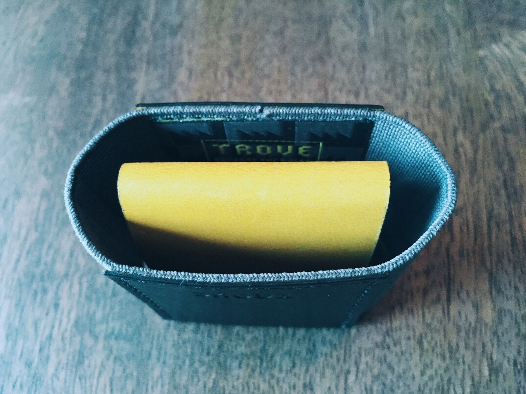
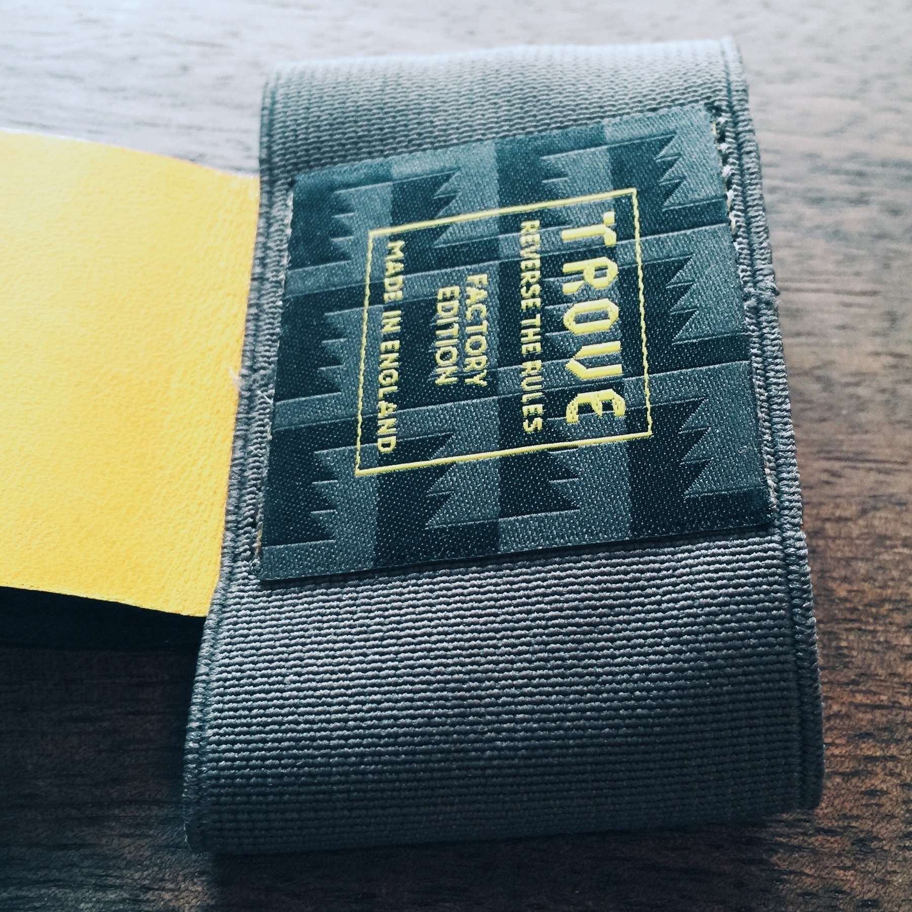
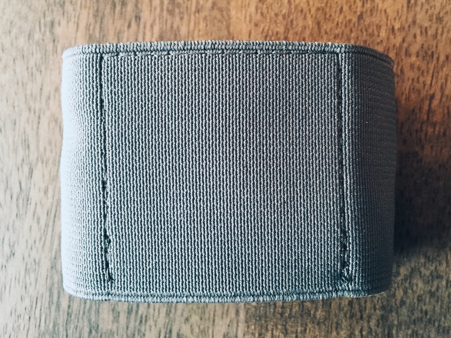
The Supr Slim wallet is minimally built for its minimal purpose. Its body is comprised of durable elastic band, designed to stretch and wrap around its contents, but smart enough to unwind tightly to adjust to the load. They claim (and I can attest to with previous wallets) that leather materials stretch to accommodate larger loads, but do not gracefully shrink back when you remove a card or two. This leaves an undesirable gap between cards and their thresholds. The Supr Slim wallet solves this [possibly] critical predicement: it "will never stretch out or lose its ability to grip your cards". Since we are just talking about a nice piece of elastic stiched together to holds things in, it should measure up to these expansion/deflation expectations.

Build quality that touts these features, including manufacture in the USA, should excell. After only a week of use, the Super Slim does seem to have durability, though it's too early to say how long a piece of elastic fabric will last. The hand-stiched "X" is also of suspect quality. According to their updates, mid-way through production:

"We lost our embroidery team who had been doing all the hand-stitching of our X detail. As a consequence, we experienced a bit of a slowdown in production for the past couple weeks as a new team is being trained. One of the lessons for us throughout this process has been how difficult it is to find skilled people to perform this kind of fine handwork here in the USA at this scale."

This kind of thing is bound to happen, and it's not the embroidery team I'm worried about -- it's simply the durability of a very simple X with four piercings through the elastic. It is the one unique identifying detail about the wallet, and I doubt it will withstand the daily use of a wallet from tight pockets and varying fabrics. (Though it could be argued that the wallet becomes more minimal by losing such an embellishment.) And lastly, the elastic surface does tend to attract small pocket stuffs, like lint. I may notice more often than most because my elastic color is a dark navy, but this would never happen with leather material. Go figure.

Use

I'd grown accostomed to carrying around a simple card wallet for over several years, so I knew what to expect with something like the Supr Slim wallet's sleeve design. You squeeze some cards in, maybe a folded bill, and that's it. The trick is positioning frequently used cards on the outer ends of the interior "stack" so that they are easily to pull out. These are typically my CTA (public transportation) pass 1 and my ID. This layout may change with the Supr Slim wallet, but the point is it's actually a bit difficult to get to some of those cards in the middle of the stack. The Supr Slim wallet doesn't make this any easier -- in fact, it creates more difficulty than the Saddleback Wallet Sleeve I'd previously been using. The Saddleback has a finger-cut bottom for pushing up the cards vertically (the design is vertical whereas the Supr Slim is horizontal) and easily sifting through the tight stack, Supr's has a rather thick, 2mm stitched binding at the bottom of the elastic bay. If you want to get something out of the stack, you're going to have to pull everything out, or pick at it with your fingernails.

When empty, the wallet is surprisingly smaller than the size of a credit card -- this is obviously by design, but it actually adds a bit of friction during use. Since the elastic bay is smaller than its typical contents, when you are depositing and withdrawing cards, it takes a bit more time to get the stack back inside than a typical card wallet made of credit-card sized leather.

Overall, however, it's functional -- but not necessarily utilitarian for everyday use. Of the positives: it has a very small footprint in your pocket, adds little to no weight to the items you use it for, and works exceptionally well with RFID scanners. It isn't so great, however, when it comes to the elastic material holding cash, packing more than 6 cards, and easily accessing cards in the middle of the stack. After a few more weeks, I'd probably get a quick system down for extracting cards in the middle of the stack, so the last point might be moot. And since I've only given it a test run of a week, I can't speak to its long-term durability, but I'll likely update this review at the 6-month mark with results.

Competition

Supr certainly wasn't the first out of the gate for a product filling these qualifications. Several other great brands have designed slim, sturdy little card-carrying wallets that work just great. Granted, you could take any product designed to carry business cards and call it a slim wallet, but these are exemplar of what we're talking about with Supr's project.

A few examples:

While I haven't tried the Gus, the other two operate as advertised. I found the Slimmy wallet to actually be a bit thicker than the Saddleback because of its three-panel design, but the separated sections do help with organization. Saddleback's is made of amazingly durable real leather, but it's just a glorified card case, so you'll have to pull out everything to get cards in the middle of the "stack". Both work with my office building's security gates, but fail to properly work with my public transportation's stalls (CTA). Either leather must not help with the RFID scanners they employ, or my office building's stronger card interferes.

The Experience of Kickstarting

I've kickstarted several projects, a few of which have been hardware. As with most Kickstarter projects, there were a few delays in getting the wallet into production and finalized for shipment, but I received mine three and a half months after the project was funded. This is one of the better turnarounds for hardware funded through Kickstarter (the Pen Type-A, for instance, was notoriously late to ship -- 6-10 months after the estimate). As noted, designers claimed there were issues with stitching their little "X" on the front of the wallets, an explanation I'm fine with. But as an investor in a product, like most of these Kickstarter things go, I'm entitled to know what's going on -- challenges, solutions, and requests for input. Luckily, the Supr team did a fairly good job with all this, and the experience funding this particular project has been notably good:

  • Backers received frequent enough updates that didn't inundate our inboxes with unnecessary banter
  • Updates often came with well-designed photo cards with a splash of typography, giving the whole process a stylized methodology
  • Production was smartly planned, and for the most part, proceeded without any derailments (aside from the aforementioned loss of their embroidery team) 2

In summary: the Supr Slim wallet is a nice piece of stitched elastic that happens to conform nicely with credit cards. That's it. And that's all it's suppose to be. So call it minimal, or call it dumb. If you like removing all the excess from your pockets and your life, you'll probably like the Supr Slim wallet.

You can sign up for a notification for when it is available at the Supr Good store.


Updated - June 2013

2013-03-19

It's been a few months since I wrote this review of the Supr Slim wallet. To call it a review is somewhat dishonest -- it operated as more of a one week impression of using the product. Now that I've been using the wallet daily, I can provide a much better interpretation of how it operates in the real world and holds up as an object.

The Supr Slim wallet has surprised me in its usability. It really is the slimmest thing you can buy to keep your credit cards (or business cards) somewhat protected from the elements. I tried going back to my Saddleback wallet for a few days on a trip back to Minnesota and as slim as it is, it felt thicker and heavier than what I'd grown accustomed to with the Supr Slim. Definitely wasn't expecting that -- it's so awesomely lightweight, you forget it's in your pocket.

The quality concerns I had, while not unfounded, have proved moot. The stitched 'X' remains in tact with the slightest of threading (eventually this will fuzz up or get snagged on something), remaining visually intact. The elastic material has held up perfectly fine, too, and I can presume will do so for quite some time. As thin as it is, it still feels sturdy and tight, and adjusts dandily to my set of six cards.

Overall, I still recommend it for the minimalist wallet carrier.


  1. For some reason the RFID reader for the CTA can't pierce through my Saddleback wallet, so I have to scoot the card out a little in order to successfully pass through the turnstyle.

  2. As of this writing, they have only shipped the black and navy wallets, while backers of other colors still wait. Whether this was planned or not, I can't recall.


Updated - July 2014

2014-07-11

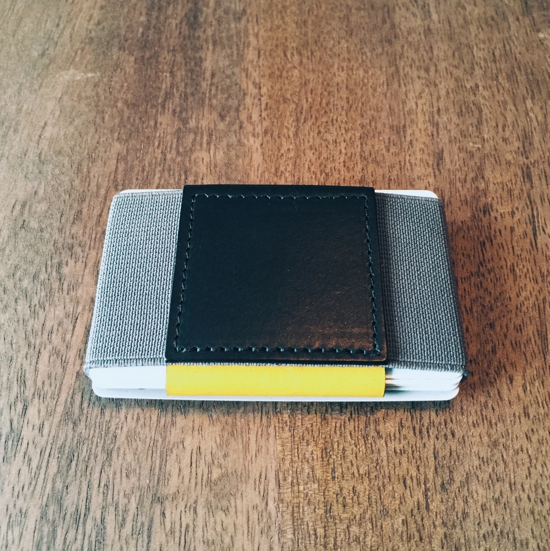
Here we are, over a year since the last update. I've still been using the Supr Slim wallet frequently (more so than other wallets, aside from the few months of trying a new one for a review), and it has held up remarkably well. Still perfectly functioning, still in great shape. A few notable observations (with a new photo below):

  • The "x" stitching is still fully intact (and hasn't ripped or broke)
  • The elastic is still super sturdy and hasn't lost a bit of grip/tightness
  • The only issue I've encountered is the unraveling of a very small elastic lining in one of the bottom-corners of the wallet. Wear and tear, most likely, and it hasn't affectly anything. Only worry is accidentally aggravating this by pulling it out -- it could unravel the integrity of the bottom enclosure.

Otherwise, I still recommend the hell out of this wallet.

<div
    class="
      image-block-outer-wrapper
      layout-caption-below
      design-layout-inline


    "
    data-test="image-block-inline-outer-wrapper"
>


    <figure
        class="
          sqs-block-image-figure
          intrinsic
        "
        style="max-width:1500px;"
    >


        <button
            class="
              sqs-block-image-button
              lightbox


            "
            data-description=""
            data-lightbox-theme="dark"
        >
          <span class="v6-visually-hidden">View fullsize</span>
          
      <div
          
          
          class="image-block-wrapper"
          data-animation-role="image"

data-animation-override

      >
        <div class="sqs-image-shape-container-element


          has-aspect-ratio
        " style="
            position: relative;
            
              padding-bottom:75%;
            
            overflow: hidden;-webkit-mask-image: -webkit-radial-gradient(white, black);
          "
          >
            
              <noscript><img src="https://cdn.uploads.micro.blog/25423/2023/7535bd539a.jpg" alt="Supr Slim Wallet After Two Years" /></noscript><img class="thumb-image" src="https://cdn.uploads.micro.blog/25423/2023/7535bd539a.jpg" data-image="https://cdn.uploads.micro.blog/25423/2023/7535bd539a.jpg" data-image-dimensions="1500x1125" data-image-focal-point="0.5,0.5" alt="Supr Slim Wallet After Two Years" data-load="false" data-image-id="53c06b3de4b04e59c5efe7f7" data-type="image" />
            
        </div>
      </div>
    
        </button>


    </figure>
  

</div>

Also refer to my review of the Snapback Slim Wallet, a simliar elastic-bound wallet with an additional strap to hold cash and receipts. It's also been updated with a version 2.0 with very notable improvements.


Favorite Stuff in 2012

But Not Necessarily Made in 2012

It's a series of lists. But they're good lists.

Favorite Films Viewed

While these may not be the best films of the year, they certainly were favorites. Note that not all were released in 2012, and they were viewed across a variety of formats: in the theater, or rented/streamed via Netflix, iTunes, or MUBI.

  • Shame (dir: Steve McQueen, theater)
  • The Cabin in the Woods (dir: Drew Goddard, theater)
  • Dredd [2012] (dir: Pete Travis, theater)
  • Looper (dir: Rain Johnson, theater)
  • Hugo (dir: Martin Scorsese, Netflix)
  • Tinker Tailor Soldier Spy (dir: Tomas Alfredson, iTunes)
  • Time Crimes (dir: Nacho Vigalondo, Netflix)
  • Fantasmagorie (dir: Emile Cohl, MUBI)
  • Time to Leave (dir: François Ozon, MUBI)
  • Yojimbo (dir: Akira Kurosawa, iTunes)
  • The Mirror (dir: Andrei Tarkovsky, MUBI)

Favorite Novels Read (Fiction/Non-Fiction)

  • Hard-Boiled Wonderland and the End of the World (Haruki Murakami)
  • A Special Providence (Richard Yates)
  • It Will Be Exhilarating (Studio Neat)
  • The Orchard Keeper (McCarthy)
  • Childhood's End (Arthur C. Clarke)

Favorite Games Played (Cross-platforms)

  • Thief II: The Metal Age (Windows)
  • FTL: Faster Than Light (Mac)
  • Limbo (Mac)
  • King of Dragon Pass (iOS)
  • Dishonored (Xbox)
  • Witcher 2 (Windows)
  • Chivalry (Windows)

Bonus! Worst Films Viewed in 2012

Who doesn't like condemning the worst shit produced every year, regardless of your distaste of "lists"? I certainly do. These are the worst films I've seen in the past year. B-movies are a great style of filmmaking, but several of these were pitched as A-class releases and completely bombed on pacing, script, production, and overall enjoyment. Thank me later. (Again, not all were released in 2012.)

  • John Carter
  • Immortals
  • Cowboys & Aliens

Everyone does the "best-of" lists around this time of year. If you're interested in a list of the best grammatical films, AV Club has a great compilation.


Dishonored: Honoring the Genre Looking Glass Studio Built

Long dismissed as mere entertainment (as most mediums, like literature and film were in their own eras), games have manifested into the pinnacle of all art forms: they are the culmination of story telling, dialogue, cinematography, animation, sound design, musical scoring, voice acting, hardware interaction -- even mathematics. Because of this, a breadth of genres exist more so than in any other medium. Over the last several decades, these genres have mutated and blended into one another, spawning new directions based on the maturity of the medium, improvements in hardware, and the ambitions of project scope.

One such genre I was exposed to back in the mid-late 1990s has since become my favorite. It's one of the few genres I care to take interest in anymore, so when games of this type are released -- which is, unfortunately, far rarer than its fans would like -- it's a momentous occasion. Luckily, 2012 has seen Dishonored released, an exemplary title for the genre.

Built from the heritage of exploration/interactive fiction/choose-your-method game series like Deus Ex, Thief, System Shock, Half-Life, and Bioshock, Dishonored plays like a tightly crafted love letter to the game studio (and contributors) that started it all: Looking Glass Studio.

The Genre Traits

To glean the most insight into this genre, it's important to start with the efforts and innovations of Looking Glass Studios. The game studio had a prolific ten-year life during which it cranked out memorable, immensely influential titles until its unraveling in 2000 when parent company Eidos Interactive had to pull back on spending. Luckily, many of the great contributors moved into other shops, including Ion Storm, Valve, Irrational Games, and Arkane Studios. These folks (including game designers Warren Spector, Ken Levine, Seamus Blackley, Harvey Smith) have woven their influence over titles that have stood the course of twenty years' technological progression. And their inventive gameplay mechanics continue to seep into modern games -- Dishonored included (from Arkane Studios).

Their earliest works -- Ultima Underworld II and System Shock-- broke new ground for role-playing gameplay rendered in the first-person perspective)). Remember, back in the early 1990s (when these two were released), American PC gamers played RPGs from a "top-down" isometric view (an angled, bird's-eye perspective of miniature characters on-screen); first-person perspectives were reserved for the shooter genre (like id Studio's Doom). Ultima Underworld II and System Shock defied the assumptions behind this type of perspective. The first-person perspective, of course, permits an immersion into the gaming environment that no other point of view can yield. And immersion is one of the critical components to this genre. Tom Bissel's essay, Looking at the Uncertain Fate of Single Player Narrative Videogames Like Arkane Studies' Dishonored, explains the kind of immersion I'm talking about:

Game design that allows the player’s decisions not only to bypass but actually foreclose important narrative or gameplay beats isn't just a way to make the player feel like he or she matters; it’s a way to make gameplay itself feel like something deeper, stranger, and more irrevocable than play.

The releases of Thief: The Dark Project (1998), System Shock 2 (1999, co-developed by Irrational Games studio), and Deus Ex (2000, produced by Ion Storm) continued -- as well as improved -- this trend of immersive gaming. These games benefited from three critical components1:

  1. The inclusion of customization to character through inventories of items, weapons, and modifications (but with limitations to inventory storage capacity)
  2. Environmental narrative, whereby story is implied or shown through conversations/encounters with non-playable characters and world-building notes/books/audio/log devices dispersed through the games' areas (in a sense: direct and indirect world-building)
  3. Choices and paths of level/puzzle completion so that there is never truly one "best" way to complete a task, but many different routes that the game permits. Oftentimes certain choices made have a dramatic influence on how the game continues to unravel (in the same spirit of "choose-your-own-adventure")

In the case of point #1, System Shock 2 employed an interesting training concept that slowly segues you into the world by having you choose and qualify in a career at the "interstellar space organization" of the game world before on-boarding you to the setting on which the remainder of the game plays. These career choices (of which you may only choose one) specifies your skills, weaponry, and/or psionic powers -- in a sense, informing the context of your play style.

Likewise in System Shock 2 for point #2, as the player moves throughout the areas of the game world, the discovery (by choice, of course) of audio logs hosted in small computational devices (eerily like the modern tablet) and ghostly apparitions (yes, it's a bit of a mutation of role-playing and horror genres) reveal rich narrative, slowly building on the backstory of what happened to the two space ships and bringing the player closer to the reality of the mysterious person communicating and guiding you throughout.

Thief and Deus Ex are good examples for point #3. Both games offer areas of play that present environmental and narrative puzzles that the player may address in a number of different ways. In Thief, for instance, you play as a stealth-based character (as the title implies) who moves through environments to the chorus of a light indicator -- if you're in a well-lit area, you can be seen by enemies; if you're in the shadows, you can move unnoticed. So when you're presented with infiltrating a well-guarded mansion to steal a valuable item from the owner's safe, you can either sneak up behind the guards' on their patrol routes, knock them out, and hide their bodies; or, you may wander around the back of the mansion, shoot a rope arrow2 near the balcony and grapple in without harming anyone. (Or, if you're inclining towards role-playing the homicidal type, you can kill everybody.)

Arkane's Take on the Genre

A few games that have trickled out in the past several years that continue this legacy include Half-Life 2, Bioshock (spiritual successor to System Shock), and Deus Ex: Human Revolution. Dishonored -- the most recent title in this blended genre -- reminds me most of the inventiveness of Thief and Bioshock. One-part stealth game (as an option, of course), and all-parts customizable character, the game has so many wonderful design successes that it's hard to be critical towards it. The game is, unfortunately, far from perfect, but its play mechanics far outshine the blemishes.

The game satisfies each of the three main components of the Looking Glass Studio genre. You're presented with an established character within the game world (Corvo Attano, lord protector of the Empress), and after a fatal incident that triggers the main story arc of the game, you're on your way to becoming a supernatural assassin. (You may argue that bestowing nonsensical powers upon the playable character is an effort by the game developers to satisfy every "wouldn't it be cool" urge they had while producing the game, but this worked to excellent extent in Bioshock and System Shock, and since this is a videogame, it fits perfectly into the aspirational fulfillment of the medium.)

As the player, you're presented with several ability and weapon choices. Abilities include passive forms, such as an increase in health, agility, and/or adrenaline; or, they may include active forms, such as an enhanced vision for seeing through walls, possession of other life forms, and teleportation of short distances. The active abilities present very unique gameplay opportunities, and the blink ability specifically (which allowing short bursts of teleportation horizontally or vertically) really opens up the playable environments. I quickly upgraded this ability to move slightly farther early in the game, and enjoyed the reachability of roofs, crawling along pipes that hugged building walls, and drop-assassinating from above. The developers allow you to upgrade any ability at any time in the game -- a testament to the game's flexible environment design. Often games prevent you from affording or acquiring certain abilities until late in the game, but you're free to use whichever ones whenever you want.3 The ability choices build successfully upon themselves throughout the acts of the game, rewarding investments in different types depending on the situation. It's also neat that the acts become much more vertical later in the game, and even if you don't invest in upgrading the blink ability (teleporting), for instance, you still can navigate these heights with other options (like possessing a rat and scurrying through air ducts, a whimsical nod to Deus Ex's endless air duct sneaking).

Narrative is handled through several different methods: non-player character (NPC) interactions (required or otherwise), notes/letters/books/materials scattered throughout the acts' environments, rides with Samuel (the boatman who segues you from finished act to hub to next act), and the Heart, which is by far the most unique. A couple notable games in this genre employ a sort of sidekick narrator that is assisting you throughout parts of the game, communicating through an audio device (Atlas in Bioshock, Janice Polito in System Shock). The Heart is a bit different -- it's an object you may use, but is entirely optional. It can be used in a number of ways:

  1. To identify and home in on a rune's hidden location in an act
  2. To guide you to an act's objective
  3. To extrapolate information and backstory on buildings, areas, and people

Unlike other games, the Heart isn't necessarily stringing you along to different objectives within the game; instead, you're choosing to unearth information about the world around you to either better understand it or assist you in making decisions. I've debated whether or not to knock out a guard or assassinate him on a number of occasions, and by learning his backstory through the Heart, it's much easier to choose how to handle him. It's details like these that improve the immersion element of playing the game as a morally-conscious character instead of an apathetic one.

Finally, the game environments are designed for multiple paths and access points to completing any given objective. Need to enter a building? Think Thief or Deus Ex, but with several more methods of infiltration with all the abilities from which to choose. And as with moral decision-making like assassination vs. non-violence, your choices have a direct effect on the changing environments and narrative of the game. The city of Dunwall, which is the game's over-arching environment, is slowly being overrun with a plague seemingly catapulted by a rat infestation. Rats attack the living in destructive packs, and feast on the dead whenever a corpse is exposed. By setting this stage early in the game, you feel slightly duped into thinking you'll play the game as a relentless, revenge-seeking assassin; rather, you must now make choices about how you want to play out the game. More corpses mean more rats, more plague, more violence. Fewer deaths (or none at all) could mean a more peaceful playing environment (and, subsequently, game world).

As of this writing, the next game to build on this heritage is Irrational Games' Bioshock Infinite, set for release in early 2013. Though it is not directly related to the other two games in the Bioshock series, it is thematically and spiritually related -- much in the same way that Bioshock is related to System Shock 2. How this genre will continue to improve and transform in the future is anyone's guess, but the current crop of games are moving in a promising direction whilst retaining what made the original Looking Glass Studio games so fascinating: a sense of discovery, wonderment, and reward through gameplay and narrative.


  1. There is a fourth consistency between several of their games that few other games in different genres have. Perhaps it's just coincidence, perchance it's thematic -- but each of Looking Glass Studios' main narrative games come with some form of betrayal. At some point in these games you're lead to believe you're accomplishing or moving towards a goal when *you*, as the player, are taken off-guard and betrayed. One of the most memorable gaming moments I've had is the System Shock 2 betrayal. It was so well-orchestrated, so well-conceived that the way it was done lead me to believe -- for one brief, dramatic moment -- there was a glitch in the game. Goes to show the power of video game narrative and the immersion inherent in the medium's version of a "plot twist".

  2. Rope arrows: once loosed from your bow, these arrows home in on a penetrable surface and a rope drops for you to climb.

  3. Granted, you must find and accumulate "rune" objects hidden around the gameplay environments, but these are relatively easy to find and the purchase price of an ability is always reasonable.


Room 237 & Immersion Criticism

Chuck Kolsterman's documentary review of Room 237 has me itching to see it at the Chicago Film Festival before it lapses into hibernation until, apparently, March 2013. Sounds like an inventive, critical film analyzing Kubrick's The Shining through five different critics' lenses.

Regardless of whether you're interested in the film or not, Kolsterman's essay focuses more about his idea about a style of film (or, frankly, art) criticism he's coining Immersion Criticism:

It’s based on the belief that symbolic, ancillary details inside a film are infinitely more important than the surface dialogue or the superficial narrative. And it’s not just a matter of noticing things other people miss, because that can be done by anyone who’s perceptive; it’s a matter of noticing things that the director included to indicate his true, undisclosed intention. In other words, it’s not an interpretive reading — it’s an inflexible, clandestine reality that matters way more than anything else. And it’s usually insane.

I'm all about this insane, irrational way of perceiving any kind of art. I've played and completed Super Metroid over a dozen times. If I could analyze that experience with Immersion Criticism, I'd likely be fanatically claiming its underlying notions as analogies to WWII missions of recovering enigma machines across the earth.

Applying the criticism to the movie that I actually did see at the film festival this year -- Franck Khalfoun's Maniac, starring Elijah Wood -- would be quite a challenge. That film left me dangling at the fault line between horror and unease.


As Dusty and Torn a Map as Possible

Slate has a fantastic essay on Cormac McCarthy's writing style and production. The man is a literary legend in a similar way that Terrance Malick or Stanely Kubrick are film ones: He is a master of his own craft with deliberate, hardened prose.

In particular, I love this glimpse into his editing process during the post-production window of his grandest achievement, Blood Meridian:

In drafts, he writes sentences that make the contemporary reader sit up straight in his chair in revelation—“the kid could have shot the judge … His fatal weakness” or “The kid gives his own moral stand”—only to omit them in the next draft. It’s as if McCarthy writes these expository moments only for his own reference, knowing that later he’ll erase them and leave the reader to navigate by as dusty and torn a map as possible.

(Via @michaelpnoga)


Siri's Humor is Charming

From the The Verge's Siri detective work.

<div
    class="
      image-block-outer-wrapper
      layout-caption-below
      design-layout-inline


    "
    data-test="image-block-inline-outer-wrapper"
>


    <figure
        class="
          sqs-block-image-figure
          intrinsic
        "
        style="max-width:281px;"
    >


        <button
            class="
              sqs-block-image-button
              lightbox


            "
            data-description=""
            data-lightbox-theme=""
        >
          <span class="v6-visually-hidden">View fullsize</span>
          
      <div
          
          
          class="image-block-wrapper"
          data-animation-role="image"

data-animation-override

      >
        <div class="sqs-image-shape-container-element


        " style="
            position: relative;
            
              padding-bottom:177.93594360351562%;
            
            overflow: hidden;-webkit-mask-image: -webkit-radial-gradient(white, black);
          "
          >
            
              <noscript><img src="https://cdn.uploads.micro.blog/25423/2023/bf71bcf6a3.jpg" alt="IMG_4284.PNG" /></noscript><img class="thumb-image" src="https://cdn.uploads.micro.blog/25423/2023/bf71bcf6a3.jpg" data-image="https://cdn.uploads.micro.blog/25423/2023/bf71bcf6a3.jpg" data-image-dimensions="281x500" data-image-focal-point="0.5,0.5" alt="IMG_4284.PNG" data-load="false" data-image-id="506cdcf8c4aad36897c073d3" data-type="image" />
            
        </div>
      </div>
    
        </button>


    </figure>
  

</div>

Dredd 3D: A Film Review (Really)

Though it should be obvious to the intrepid filmgoer, pretentiousness should be avoided when enjoying motion pictures (and reading literature). So often can one be abhorrently judgmental to the tastes of mainstream audiences that your enjoyment of well-crafted entertainment can be compromised. Such is the case for Pete Travis's excellent film, Dredd 3D. It's one of those films you could so easily dismiss by glancing at its emblematic poster for presumably mindless action. But you'd be doing your movie night a disservice with such premature judgement. You see, as hard as is it to imagine, every once and a while an action movie miraculously sneaks through Hollywood unblemished. And here we have one that is savage, comic, and unabashedly strutting in B-movie glory. It shines with future-smacking dissolution and hard-boiled totalitarianism mockery.

So, does it matter what the film is about? Likely not, but the plot isn’t half bad. Narcotic gangsters of a broken future American city - one in which 800 million people live in the ironic sanctuary of a megalopolis, barring exit to the grand post-apocalyptic wasteland -- trap two of the film's law enforcement agents inside an immense, towering residential complex. The place is like a decaying, hell-spawn version of a futuristic Mall of America. It is here that the stage is set for our heroes to evade annihilation by every malevolent being in the building. The heroes of this grim world are heavy-leather garbed law enforcement agents equipped with an all-in-one super pistol. No need for elaboration on the costumes or weaponry, because it doesn't matter. It just works. (Lucas, take note, you fool.) Their hard-lined perspective on world order is enough to garner the backing of the audience, I presume. I mean, they operate as judge, jury, and executioner -- what's not to like?

Dialogue is spartan, and holy shit does it feel perfect in its minimal fulfillment for this kind of action flick. The sets and characters inhabiting the world are also top-notch -- they function just right, whereby we can unobtrusively understand the complications of this future populace, the buckling of an over-saturated city, the poverty, the crime, the instability. Whether it's being prophetic or cheeky, it doesn't matter; it's fluid world building that doesn't get in the way of the narrative, and doesn't digress into any political shenanigans.

The film speeds along to a crunching soundtrack and competently-executed scenes. This is important: here's an action film that finally isn't shot with maddening quarter-second cuts and drunken hand-held camera men. You have no idea just how relieving this is in 2012.

Now, what could be potentially off-putting is that Dredd’s viewing is required in 3D. At first, this is an annoyance, especially when I've long held to the opinion that 3D is the bane of this new era in moviemaking. But Dredd 3D follows in the footsteps of Prometheus whereby the extra dimensionality is smartly employed. It is actually better used in Dredd 3D -- almost, dare I say, to the brilliance of Wizard of Oz's use of color 73 years ago -- through the film world's inventive drug, "slow-mo" (with which its users experience life at one percent speed). When the drug is used in the film, color saturation and details intensify on the screen in ultra-slow motion (my guess is they used the Phantom camera and shot at 1,000+ frames per second). Travis cleverly uses these opportunities for grand action sequences, ones that end in bloody splashes of rainbow-blasted brutality. Only with 3D do you feel the extra punctuality of the scenes, so much so that watching it without glasses would be a disservice to the film’s integrity.

I would call Dredd 3D a film with self-actualization: it is completely conscious of itself but never stands still to explain itself to the audience. It just keeps moving. And so it's enormously enjoyable as an action-blockbuster that requires very little thinking but plenty of genre appreciation. Perhaps the film is so enjoyable because we forget how nice it is to watch something like this; it’s been so long since we've have a fun spectacle that isn't stupid that we welcome it heartily, no questions asked. So: see it.


I Finally Understand ADD

Kudos to xkcd's ADD.


Milwaukee 2012

If you happen to be interested in my recent jaunt to the northern lands of Wisconsin (specifically, Milwaukee), I've published a few photos to peruse at your leisure.

Our dinner at Hinterland was unmatched during the entire trip. This self-proclaimed gastropub has incredible food and drinks. Their scallops melt in the mouth while lightly brushing your tastebuds with blackened spices -- a notch above Longman & Eagle's back here in Chicago (which is really the only appropriate comparison). The Andouille-crusted halibut defied expectations: sitting in a bed of Spanish chorizo, potato-pepper hash, cilantro aioli, and red hot butter sauce, this was just as succulent as the scallops -- incalculably soft and palatable. I also decided to destroy my esophagus with the cocktail battering ram that is Robo's Antifogmatic, a devlish concoction of house-infused Thai chili vodka, coconut water, lime, and ginger. The waiter kept telling me that the chef just makes the stuff in the back; after two sips, "you should be accustomed to it". Yeah, well, it took a few more than that. But I did order two glasses of it, so that counts for something.

I've also begun cranking away at a uniform series of photographs tentatively called Intimidating Beverages. Wide-angled but intense -- you get the idea below. Only have one that really expounds upon the idea, but I hope to accumulate several more over the remainder of the year.

<div
    class="
      image-block-outer-wrapper
      layout-caption-below
      design-layout-inline


    "
    data-test="image-block-inline-outer-wrapper"
>


    <figure
        class="
          sqs-block-image-figure
          intrinsic
        "
        style="max-width:2500px;"
    >


        <button
            class="
              sqs-block-image-button
              lightbox


            "
            data-description="&lt;p&gt;Intimidation: Coffee. (Milwaukee Public Market)&lt;/p&gt;"
            data-lightbox-theme=""
        >
          <span class="v6-visually-hidden">View fullsize</span>
          
      <div
          
          
          class="image-block-wrapper"
          data-animation-role="image"

data-animation-override

      >
        <div class="sqs-image-shape-container-element


        " style="
            position: relative;
            
              padding-bottom:42.519996643066406%;
            
            overflow: hidden;-webkit-mask-image: -webkit-radial-gradient(white, black);
          "
          >
            
              <noscript><img src="https://cdn.uploads.micro.blog/25423/2023/8053f58ded.jpg" alt="Intimidation: Coffee. (Milwaukee Public Market)" /></noscript><img class="thumb-image" src="https://cdn.uploads.micro.blog/25423/2023/8053f58ded.jpg" data-image="https://cdn.uploads.micro.blog/25423/2023/8053f58ded.jpg" data-image-dimensions="2500x1063" data-image-focal-point="0.5,0.5" alt="Intimidation: Coffee. (Milwaukee Public Market)" data-load="false" data-image-id="505101dbe4b0b2bc7caf0afe" data-type="image" />
            
        </div>
      </div>
    
        </button>


      <figcaption class="image-caption-wrapper">
        <div class="image-caption"><p>Intimidation: Coffee. (Milwaukee Public Market)</p></div>
      </figcaption>
    
  
    </figure>
  

</div>

Defiance

Tumblr has been a fantastic writing platform that I used -- admittedly, infrequently -- since September 2009. My first post was the declarant Economist Goes On-Demand. I stated about the publication's digital transformation:

Sounds like it would have been a useful service about three years ago, but now that you can get your news hot-wired via Kindles, iPhones, and computers, it hardly seems as important. And… the news industry rages on in attempting to figure out what it is, exactly, they want to do to save themselves.

Three years later and the news industry still hasn't figured themselves out. In the marketing world, we were talking about fragmentation with devices and broswers and laptops three years ago -- a sickly, ill-defined word then and now -- but it could just as easily describe the state of publications. Print, digital, e-ink -- all with various pricing schemes. This is an unfortunate condition of the news world that will go on for some time, but it's clear that some publications are finally wringing sense out of it. I can now subscribe to the New Yorker via print and choose to read issues on my iPhone or iPad. Same goes for the Economist (finally having adopted this version of subscription-pricing). There's promise, to be sure.

But there is another area of the digital world that grows more convoluted and broken than even the news industry: social media. Though the Internet has always been social, things like discussion forums never got trendy -- it took timing, modern development standards, and (an initial) network exclusivity to bring it to a boil. When Facebook first set itself against wicked college students at the beginning of the new millenium, it likely had no idea what kind of travesty into which this party would turn. At first, it was sharing photos from the night before, throwing sarcastic insults at someone's profile, and digitally poking a student. It was fun while it lasted. But here we are, nearly a decade later, and everyone is sharing their immediate thoughts, sharing their immediate thoughts about their lunch, commenting on their lunch, liking their friends' lunches, taking photos of their friends' lunches, commenting on photos of lunches -- they may even be declaring their love for the brand of a ketchup used at lunch. It's happening. It's strange. It's incoherent. And, actually, that's fine.

The Internet has always been incoherent and strange. We're talking about the deranged digital universe that was built with the hard work of reddit, Something Awful, the pre-dickbar Digg, YTMND, The Best Page in the Universe, 4chan, Ebaum's World -- even Angelfire sites. While several of these have degraded into corporate drudgery, some still press on as modern Walls of Curiosity. But social media sites -- and we're really just talking about a few notables, like Facebook, Twiter, Tumblr, Pinterest, and LinkedIn -- are here to stay. At least in some form. They'll evolve. They'll need to monotize. They'll need to stay competitive. New platforms will rise and erode old ones (Evan Williams's new blogging project, Medium, just launched, for instance, and we all know what happened to MySpace). It's an on-going saga with faddy, shiny things.

For these reasons, it was imperative to move away from a free, fairly socialized platform and use something more solid and true to form. I want to focus on writing, with or without an audience. So here's my defiant stab against the incurable social media fatigue and egomaniacal poison that runs thick throughout the Internet: A website, owned and operated! How daring and defiant.