Throwing this out here again – ooh.directory is a magical place to find writers, bloggers, and Internet folk that aren’t as visible on social stages like Instagram, YouTube, etc. Drop a dozen new URLs into your RSS reader, and you’re set for a revamped reading curriculum.
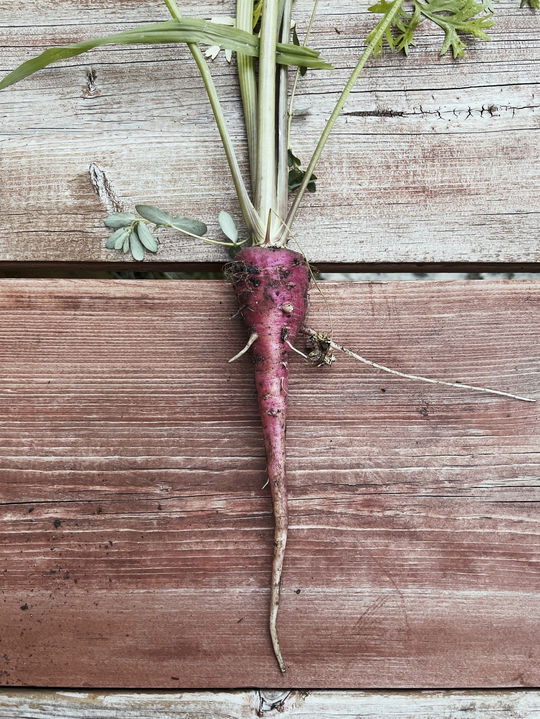
🌱 Not sure what kind of carrot we grew here…
Jason Fried has an encouraging piece about who and why you do business with selective companies, and not others. Locality should continue to play an integral role in these decisions as well, obviously!
Reworked the fence gates with very direct instructions.
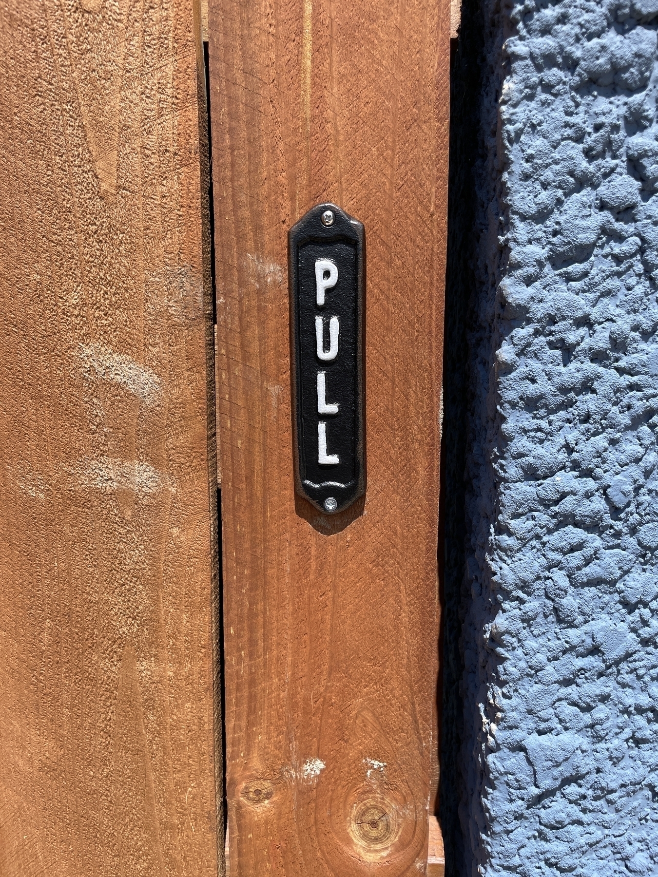
(If you’re interested in these, you can get the Pull on here, and Push one here.)
Willamette Valley Wine Country is Worth the Trip
One of the first forays into our Pacific Northwest trip last month was Willamette Valley, sprawling out just south of Portland. It was a beautiful stretch of rolling hillsides, valleys, farmland, easily escapable territory from the urban cityscape in less than 40 minutes. (Having lived in Chicago for 15 years before migrating to a smaller city, I appreciate every time the speed at which you get to countryside in smaller urban environments.) It doesn't hurt that you've got the mountainous terrain in the horizon as you weave up and down the dusty roads -- it's peak west coast picturesque.
But First, the 'Fruit Loop'
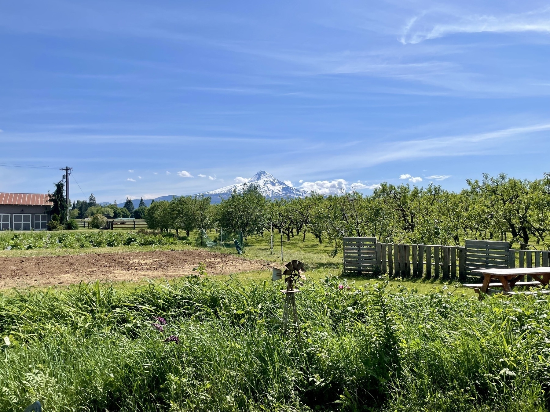
Before we hit wine country, though, we did a circular jaunt around what's referred to as the 'Fruit Loop', a trail of farms and orchards (and some vineyards) that run up along the Washington-Oregon border, mainly running a southern trail from Hood River. I won't write like I know anything about this area, but... it was a very pleasant drive along the massive borderline trench that is the Columbia River -- truly stunning, and worth the drive alone.
The Fruit Loop itself was slightly underwhelming, apart from Mt. Hood lurking in the distance and a few pretty farm scenes at the two stops we made (Draper Girls for cider, and Packer Orchards for a milkshake and crackers). We appreciated the strong Oregonian agritourism present and thriving at these farms, and if anything else, this short trip functioned as a teaser to Willamette Valley.
Willamette Valley Wine & Hospitality
I don't know what I was expecting with a proper wine valley excursion, but I definitely loved what it was: dozens of vineyards weaving in and around lovely spots like the Dundee Hills and charming towns like Newberg, McMinnville, and Carlton (obviously calling out the ones we visited). There's just nothing like this out in the midwest (and yes, we have vineyards out here).
From the little knowledge I have of wine regions, Willamette Valley is highly concentrated (and perfect for) Chardonnays and Pinot Noirs, much of what this region is known for. I've over-indexed on heavier wines in my diet, so this was certainly going to be an exploratory experience for my taste buds. And I was pleasantly surprised by the variety and depth of what I had erroneously dismissed as lighter fare — there is plenty to love here.
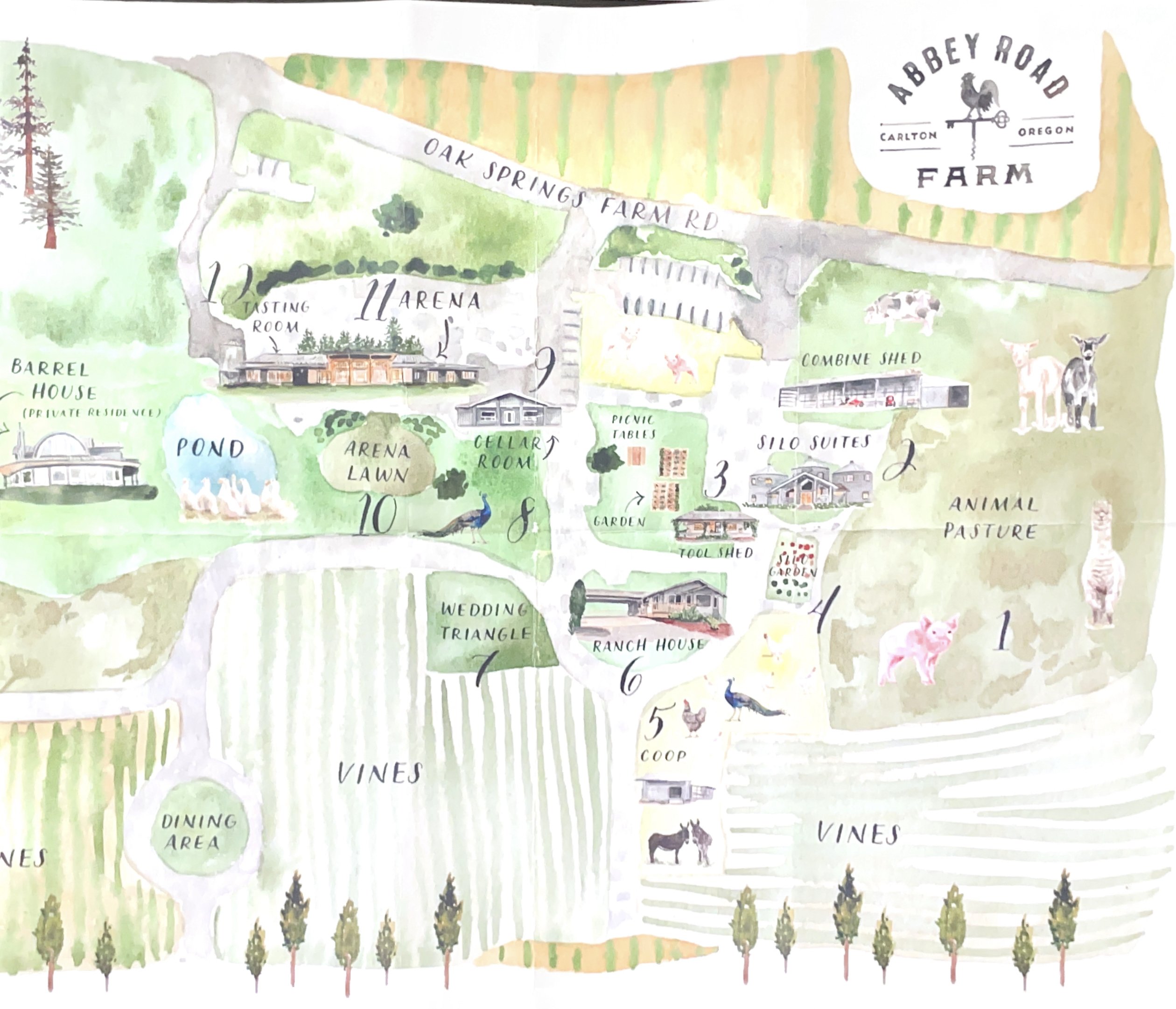
Abby Road Farm, Argyle, Domain Serene
Our first stay was Abby Road Farm, a multi-acre beauty accessible by dirt road that reused three silos to fit in a half dozen or so very comfortable rooms. Pigs, chickens, goats, birds (even peacocks!) roamed the campus, which also included dining patio, wine tasting room (with their own wine, which also is complementary with a stay), and plenty of well-designed settings to explore where they host weddings and other events.
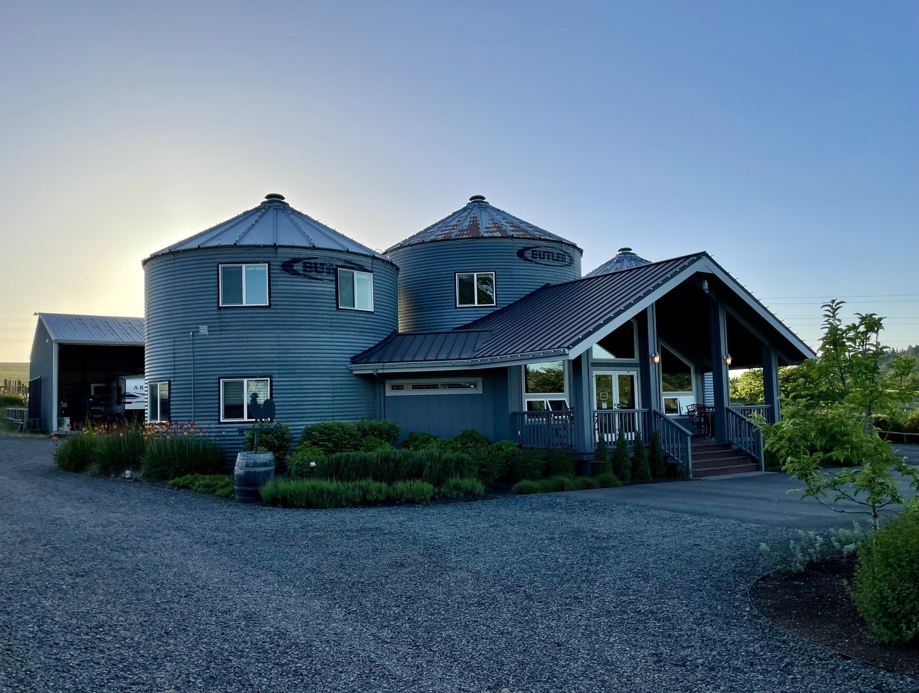
It was remarkably well-tended, and notably served an excellent multi-course breakfast that shouldn't be missed. We spent time wandering around the campus, visiting animals, tasting wine, taking a few Polaroids, and enjoying the sunset. The night we stayed here was preceded by a few vineyard appointments, so we were feeling delightfully buzzed.
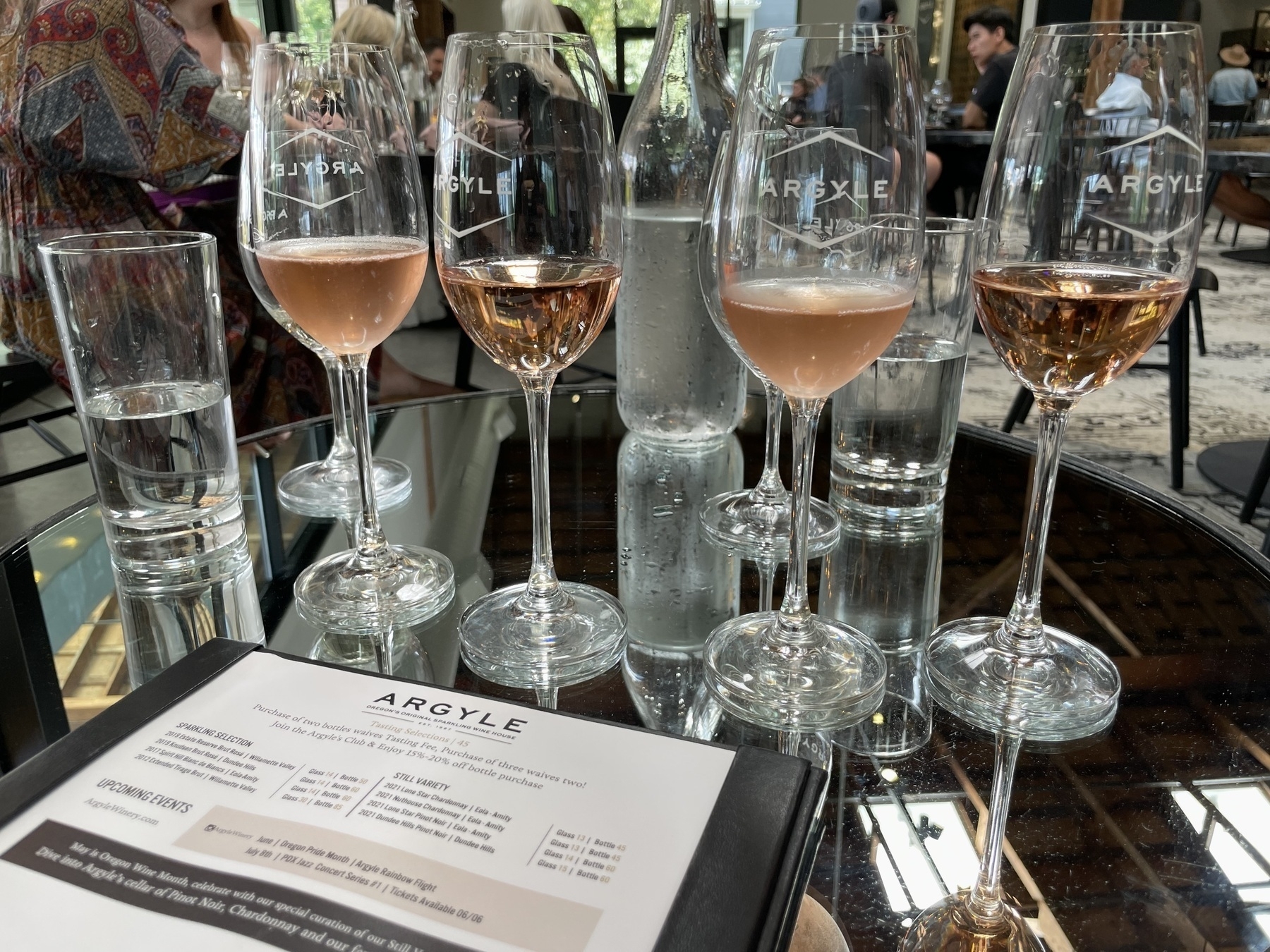
Our first stop had been Argyle, cabbed in by an Uber driver who also happened to have worked the reception at Argyle prior. This place felt corporate right off the landing: bustling with patrons, well-run operations, tightly curated menu, but overall, the tasting felt rushed and without much guidance or attention (which was fine to start out our foray into tastings).
We were placed in a nice corner spot and tried four glasses of bubbles, only a couple of which popped off exceptionally well — the other two came off a bit flat (but I argue my crappy taste buds aren't exactly forgiving, so bear with me).
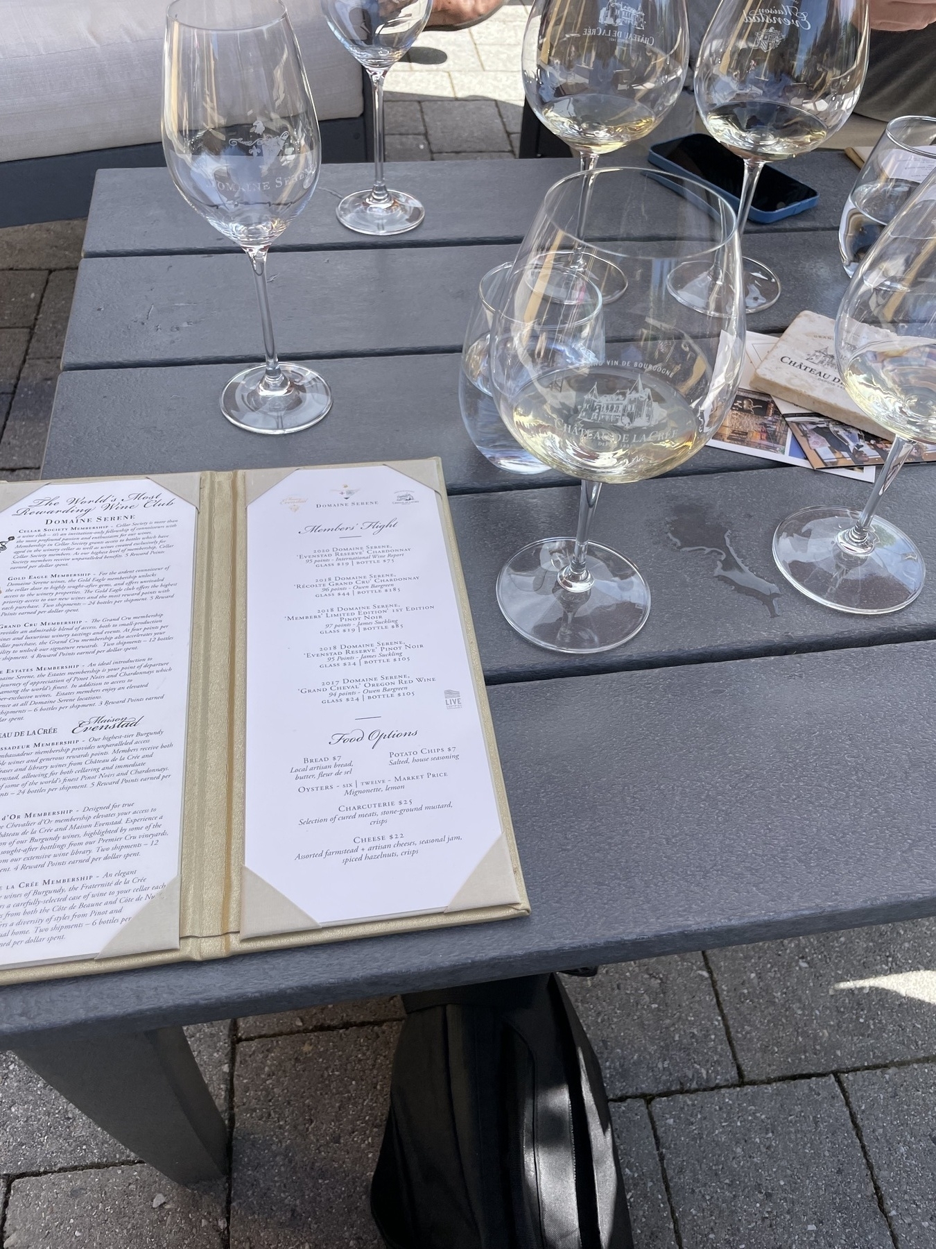
We picked up a couple bottles to go before getting scooped up by our friend, who proceeded to take us to Domain Serene.
As we approached the Tuscan-inspired clubhouse at the summit of a Dundee hill, we felt this place much better reflected our vision for what wine country would feel like (comparatively... Argyle, as nice as the facility was, is seated on a bustling street in downtown Dundee).
Admittedly, this place was an amazing, much more attentive experience. Extraordinary wines, the sommelier (Alex) was perfectly on point for walking us through pairings (two at a time, gave us context, let us taste ourselves). We moved through several (several) glasses of wine accompanied by kumamoto oysters and house-made potato chips, a near-perfect combination.
Afterwards, we wandered the surrounding campus, sipping a glass (I can't rightly remember what of) before heading back to Abby Farm Road.
The Black Walnut, Roco Winery
The second stay in the area was the up-high, breezy Black Walnut, a stately grouping of a dozen or so units atop one of the highest Dundee hills overlooking a swath of wine county. Quite a different vibe than Abby Farm Road, but not in any way more ostentatious — it flexed a broad courtyard dividing the primary hotel housing from a steeped double-unit building (in which we stayed), flexed plenty of seats and a fire pit overlooking a vista view in the back, and a sizable dining area instead with seat-yourself casualness in the mornings for breakfast.
And breakfast here was equally great: choose what you want from a tight menu of farm-focused meals, or set a time for a tasting menu (lunch/dinner), which unfortunately wasn't available during the days of the week we were there. Though it's stated in the name of the place that it's a vineyard, they don't actually produce wine at Black Walnut, but rather supply the grapes to a sister winery, The Four Graces.
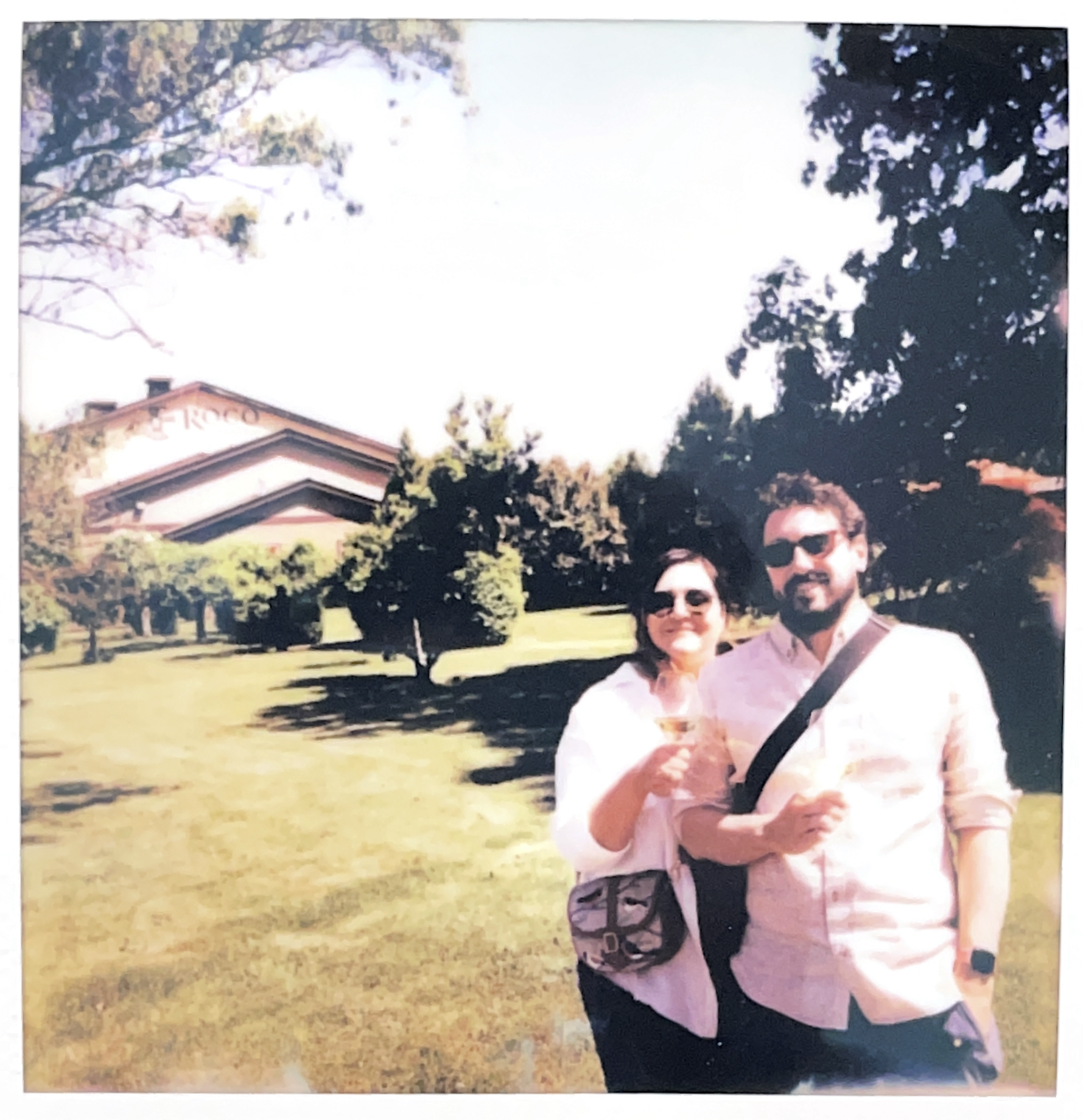
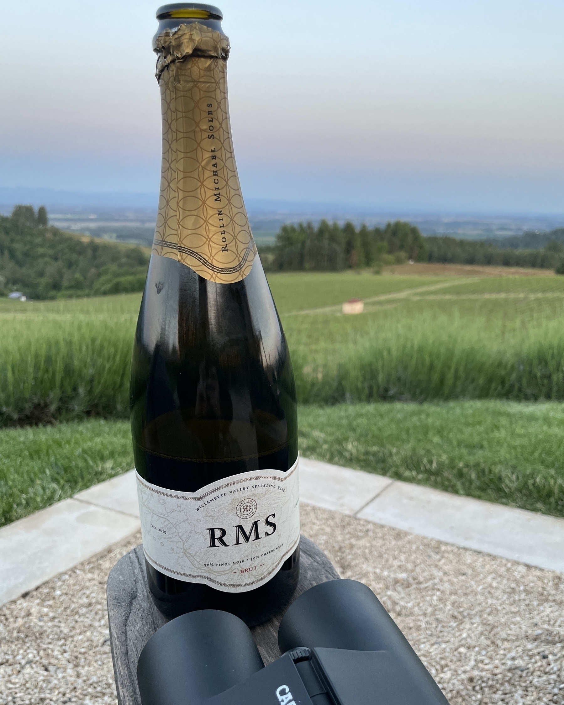
Next, we visited Roco Winery as our only appointment for the day, but we really liked this one. A much smaller, but exceptionally genuine spot that had a "visiting your neighbor's vineyard" feel. A few tables out on a cozy patio under a perfect afternoon sun was the right way to spend a few hours.
After roving through a solid set of tastings, we scooped up a couple bottles (including a favorite Pinot called The Stalker), and headed out to prep for the evening dinner over at Earth & Sea in Carlton, following by enjoying a bottle of Roco bubbles up top the hill at Black Walnut while the sun set.
Willamette Valley was enjoyed a tremendous amount more than we anticipated, and setting wine appointments in the future as part of our vow for more intentional traveling is going to play out nicely, though it'll be key to ship back the bottles we get instead of draining them all on the trip as we go, but...
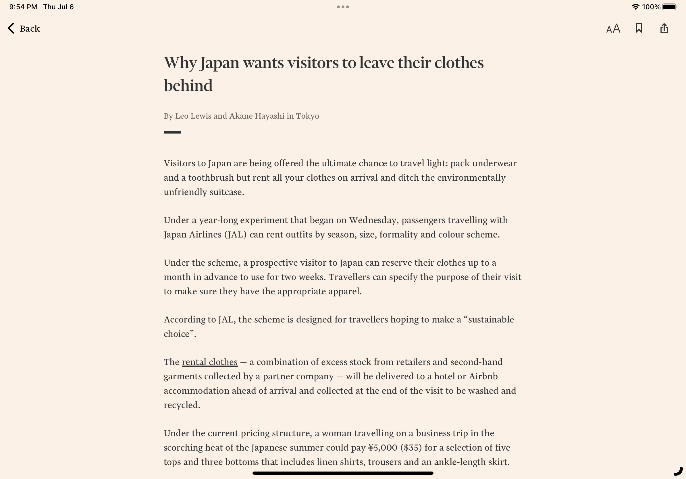
Nice to see Japan Airlines’ sustainable traveling push (by way of carbon reduction) by encouraging passengers bring only essentials and rent their wardrobe upon arrival, which is sourced by second-hand stores and excess retailer inventory.
The Tom Bihn Store
When we were planning our Pacific Northwest crawl and decided to head into Seattle for a few days to visit family, it was an inevitability that there would be a stop into the manufacturing facility (plus embedded retail store) of one my favorite bag brands, Tom Bihn.
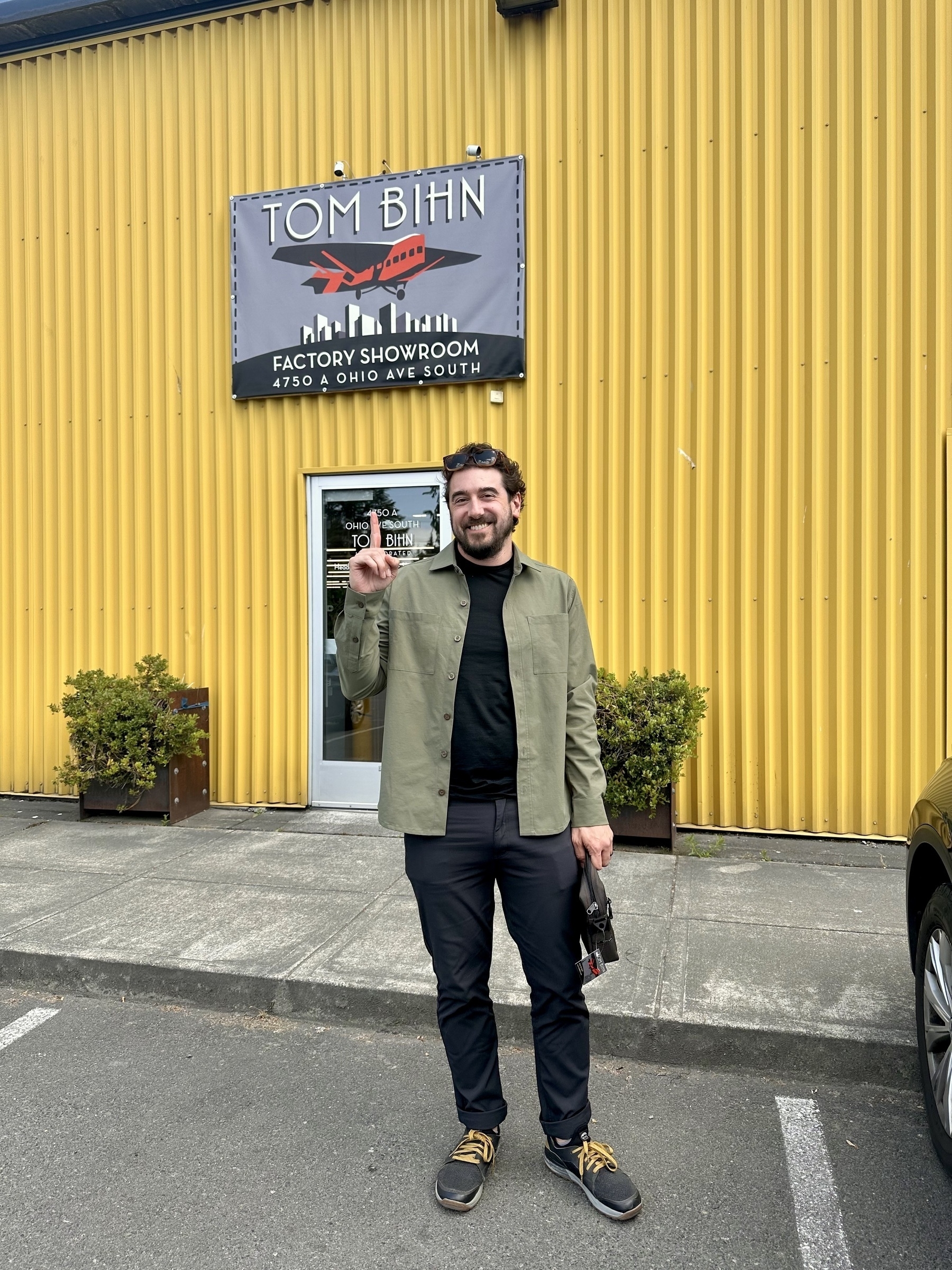
Located south of downtown Seattle in the Industrial District, Tom Bihn sits inside a long building housing a number of other functions, like Two Beers Brewing Co., Fulcrum Coffee Roasters, and Seattle Cider. It's a quiet little spot amidst the bustle of trucks moving in and out of the area. All of Tom Bihn's bag manufacturing happens here, so there's significant space in the building to accommodate the materials and sewing of products. But they're also open Monday through Friday from 6:30 am - 3:00pm ("more or less") for walk-ins to check the place out and peruse available goods. All the items in the corner shop are the same ones tied to their website inventory, so you know exactly what to expect.
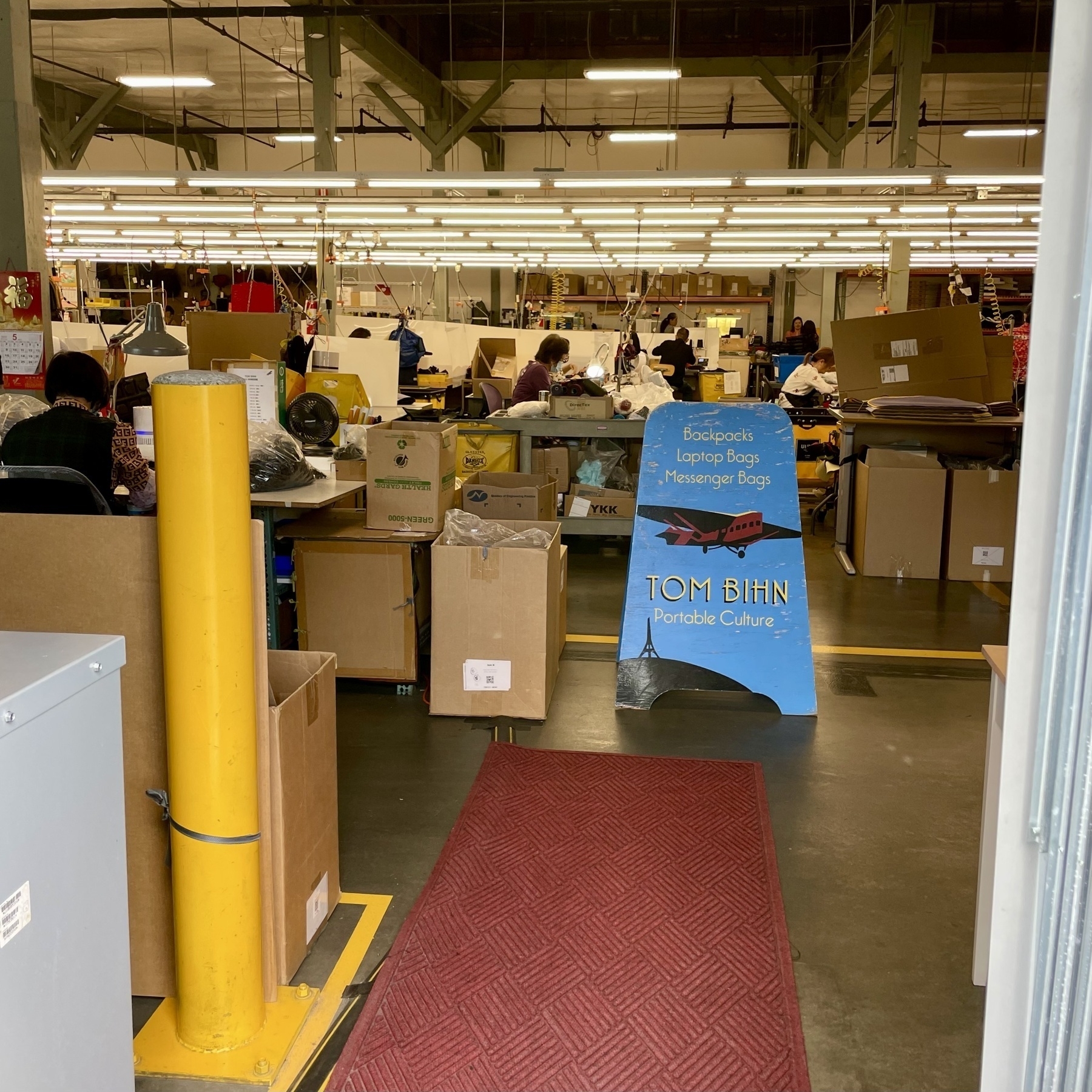
When we stepped inside, a fellow named Cody emerged from the manufacturing floor and greeted us. He happened to the same person who helped my wife get a faster delivery of her new Synik 30 bag in time for this very trip, so it was perfect that he was there the day we visited. The store is really just a few peg walls and a long table cutting through the middle of the space, where Cody brought in and laid out a few items in which we were interested in seeing various colors.
They've also set up a vertical mirror for you to check the fit and style on your person, and covered the border of it with customers' submitted photos of sporting their bags all around the world. Felt very restaurant 90s, and I loved it.
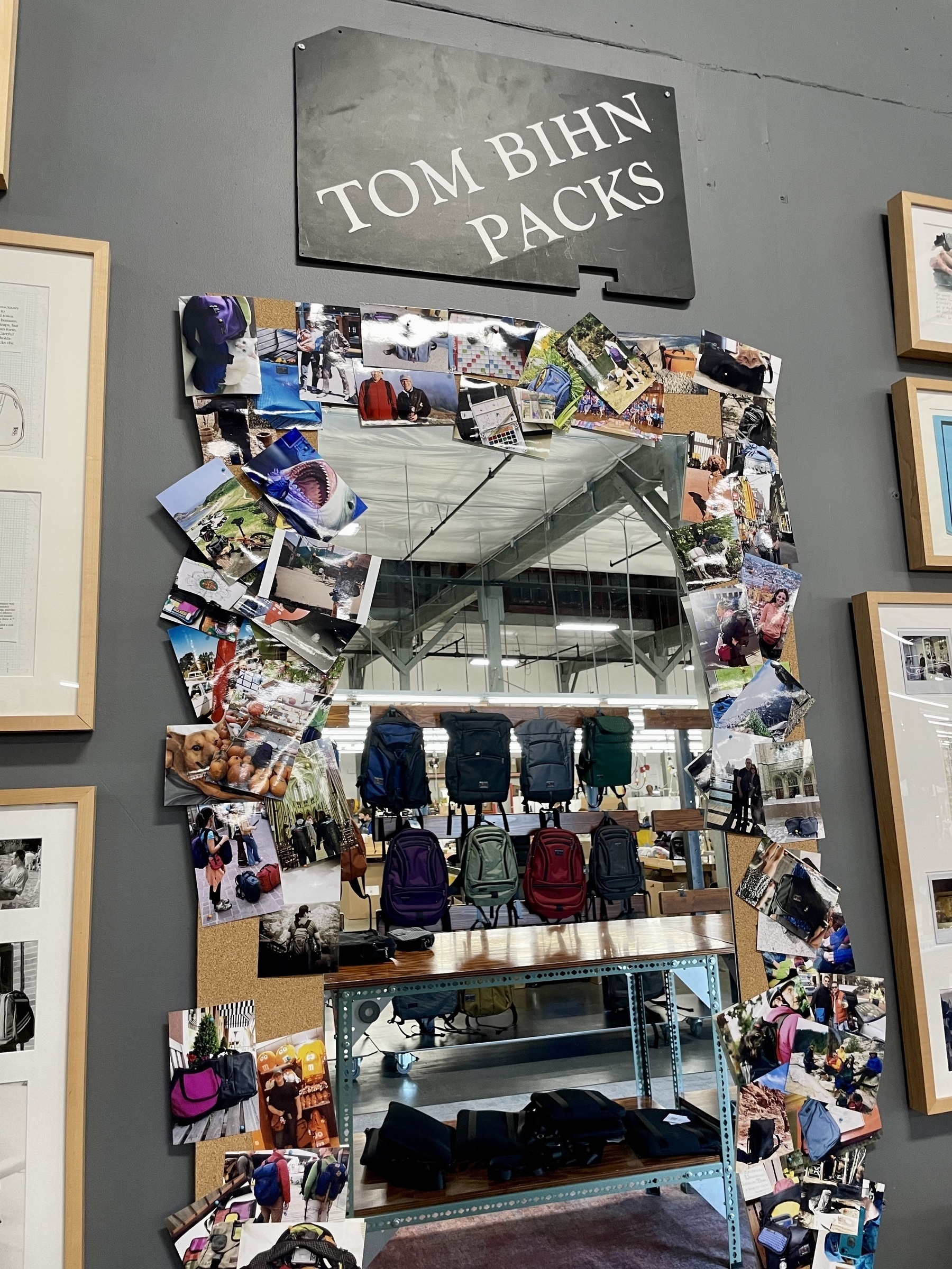
Ashley decided on picking up a Side Hustle in Ursa Ballistic, which ended up as a perfect travel companion as we marauded up the rest of the west coast into British Columbia. If you're a Tom Bihn fan, it's absolutely worth the trip into their HQ, even if you end up just getting a few more of their endlessly useful swivel double-carabiners. And if you're in the area, curious about quality, USA-built bags for almost any context, it's definitely worth the visit. I only wish we had more time to ask for a full tour of the facility and to check out the really neat fabrics/materials they have on deck (like Halcyon).
A vastly important federal push for reducing reliance on foreign sources for battery materials by mining here in the US could prove key during the election cycle, plus ensuring self-reliance as we pace to an EV-dominated future. I just hope they thread the needle on environmental regulation.
Curious to see how this pans out in court, but the FTC suing Amazon for “allegedly duping millions into enrolling in its Prime service” appears to be the most significant (and first?) trial of ‘dark pattern design’ on the Internet.
Negotiating with AI companies for licensing IP to be fed into LLMs is a slippery slope, especially since fundamental components of those models were already informed by mass website data scraping. I’d be quite surprised to see this shake out in anyone’s favor other than for AI tech.
Truly, a masterful multi-year run as not only the best, accessible gateway into Reddit, but also an exemplary designed app experience — Apollo will be missed.
Om’s darkly acute perspective on the future:
…as a society, the idea of what a human-to-human social fabric is has been breaking down for quite a while — especially as our idea of work has been redefined. Whether it is a lack of permanence or changing economic reality, work is a reality that triggers change. As uncertainty increases, we rearrange the jigsaw pieces of our lives.
Plenty to say and share (in the coming weeks) on the incredible wine country, seafood, and natural beauty of the Pacific Northwest as we head into the last stretch of our trip.
Until then… here’s North Arm Farm up in Whistler, B.C.
Charming Newberg town in Willamette Valley. This caught our eye while passing through on the search for coffee before the wines started to pour.
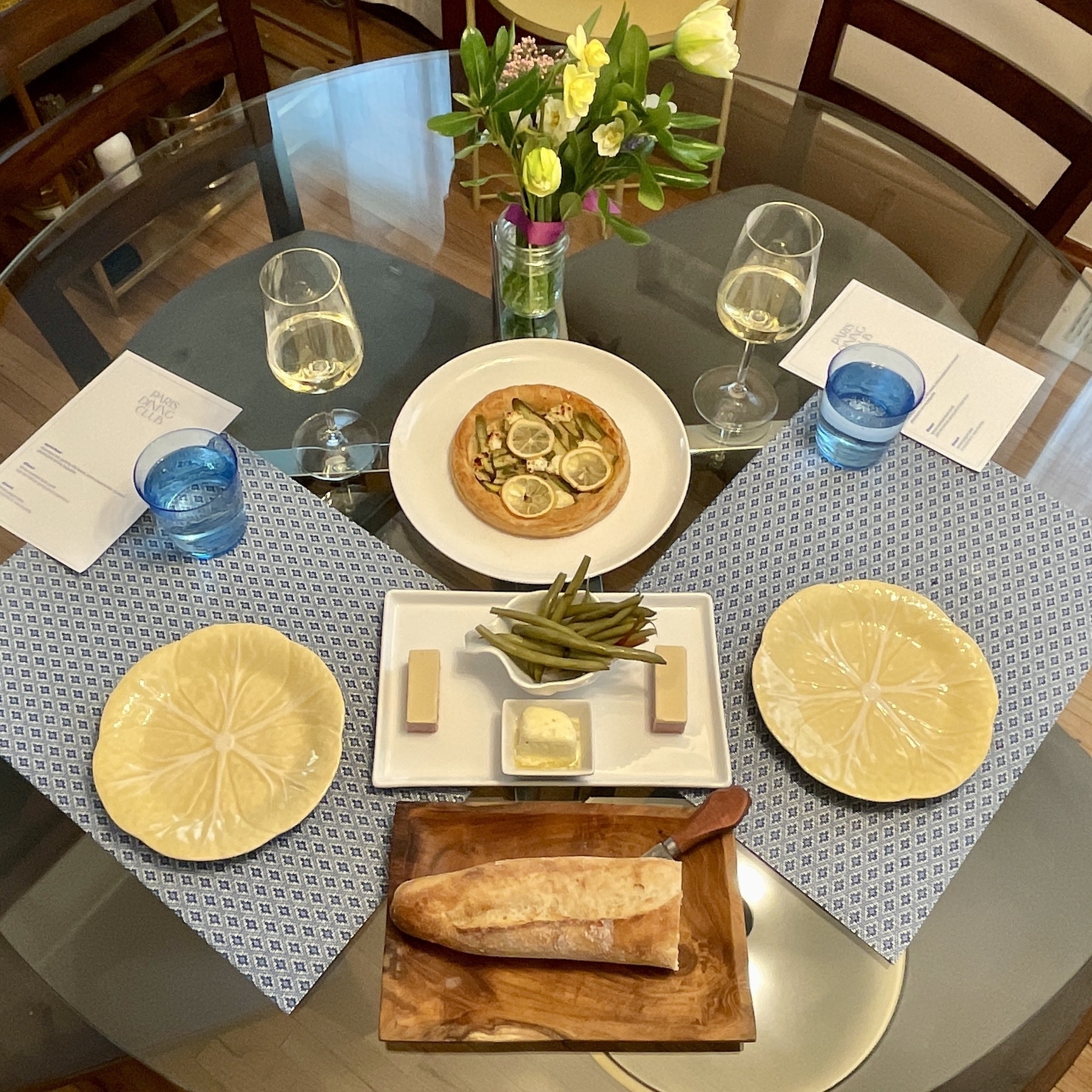
Paris Dining Club is the Meal Delivery Service to Rule Them All
We only had one opportunity to try Jamie Malone's Grand Cafe in Minneapolis, a well-regarded spot steeped in French culinary expertise and aesthetics. As I noted back in August 2018, we "had a smorgasbord of stuff, including tartar, pate, mussels (best of the choices), a spinach salad, and diced scallops, finishing with a chicken liver donut and a bourbon moist bread with cream, plus, of course, glasses of amaro".

And I took a shot of this parting espresso cup, too lovely not to remember.
In 2020, however, Ms. Malone closed down Grand Cafe. While I would have loved to try it again, she had a much more grandiose idea in mind, and some time afterwards, out of the pandemic bloomed Paris Dining Club, a Twin Cities-only meal delivery subscription based on an eclectic, opinionated prepare-at-home model. The menus, the attitude, the vibes all hit the right mark, and we subscribed to at the time what was called "date night" (enough food for two people), which has since transformed into the Grand subscription tier.
Pick your preferred Friday of the month, and delivery of a seasonal three course dinner arrives at your door for a decadent evening at home. This isn't Blue Apron bullshit, this is a meal to cherish. Sure, we're learning the ropes on a few classic French dishes (and don't even get me started on the epicurean butter hacks they sling), but Ms. Malone and team do the heavy lifting here, and at most, you're reheating a few things and splashing the pre-prepped sauces or accouterments atop a heated set of duck thighs or clay-oven fish (yes, that one was fun).
Paris Dining Club supplies crisply printed menus, instructions, a music playlist, and usually wine pairing notes. You can also add on a la carte supplementals like additional plates or even flowers to really set the table right. There's nothing to complain about, and everything to enjoy.
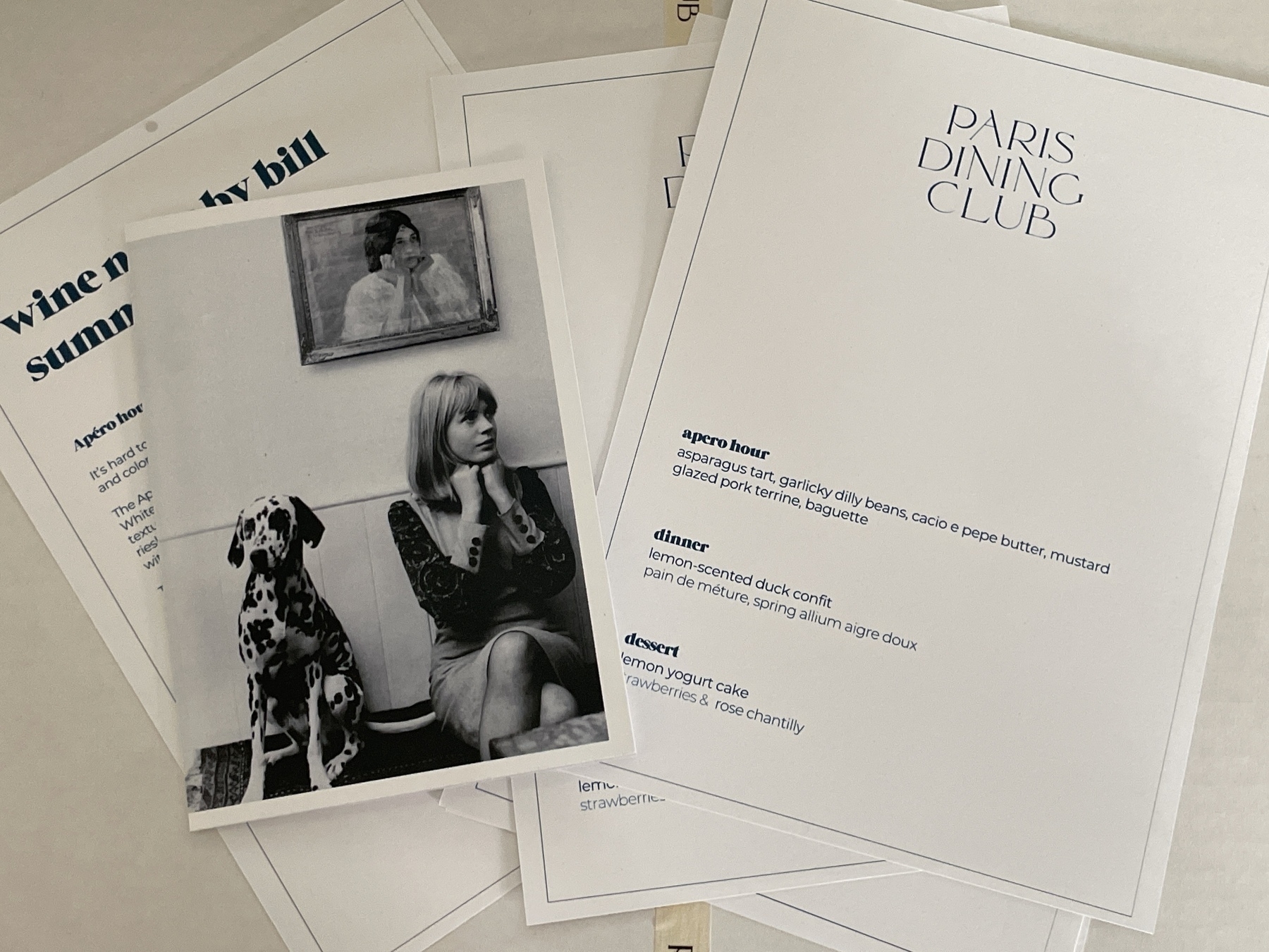
So what's a meal like? We just enjoyed the May one, which included the following:
- Apero Hour: Asparagus tart, garlicky dilly beans, cacio e pepe butter (goddamn was this good), mustard glazed pork terrine, and baguette
- Dinner: Lemon-scented duck confit, pain de méture, spring allium aigre doux
- Dessert: Lemon yogurt cake with strawberries and rose chantilly (don't judge me for saying this, but... it was an amazing strawberry "shortcake-like" experience)
This one also came with a nice floral gift that we set up center stage at the table. Very nice, very stylish.
Most recently, Paris Dining Club has also launched a digital supplemental (included on a few of the delivery tiers) called Butter Club. As they note, this is a:
A monthly compound butter recipe & simple dinner recipes released weekly with demo videos by Chef Jamie Malone. Our recipes won’t require more than 5 ingredients & 15 minutes.
Well let me tell you, the recently featured pepperoni compound butter is heaven-sent, and I will be using this for a lot of dishes. It's gaudy and godly.
I also dig how this type of digital "cooking meal" club is different than other try-hards out there -- it's anchored against the butter as a center of gravity for the dish tutorials, and it's fun to learn a core ingredient that can augment an endless number of dishes, inside and outside their purview.
Overall, Paris Dining Club has come out kicking with a distinct service that we are definitely keeping running in this household, and encourage any Twin Cities residents at least consider to try for a few months (or, perhaps, the Summer Series). Besides, it's so much better to support local business and local food ecosystems than go with the big national solutions, especially when it's so thoughtfully rendered.
Love this bit by Philip Mallegol-Hansen:
As the ecosystem of blogs have moved between the various hot technology stacks du jour, the support for RSS has slowly made its way into most of them.
RSS is still good bones all these decades later, albeit boring ones.
There have been a flurry of great 📺 shows dropping. Controversial timing as the weather warms here in the midwest, but appreciate having something great to watch in the evenings — White House Plumbers, Mrs. Davis, Silo, and Perry Mason are choice. And obviously Succession, which ends soon.
Fantastic sale on Micro.blog, an exceptional, independently-run content management system for short and long form blogging. It’s everything you need in a minimally rich product.
Resale is shorthand for not knowing the true joy of ownership.
SK Coffee in St Paul
You never really stop seeking out the best a locale has to offer when it comes to coffee. Ever since moving to Minneapolis-St. Paul nearly five years ago, I'd been enjoying — but also on the hunt for — the best coffee the Twin Cities has to offer.
The good news is there's plenty to choose from, whether it be Spyhouse Coffee (the original craft coffee roaster here, from my understanding), the stellar Five Watt (extraordinaires of funky, delicious coffee cocktails), Dogwood (the stalwart choice when you're spending time in a great neighborhood drag), Claddagh Coffee and their old-school trusty vibes, Wildflyer Coffee (with their humane mission to employ and end youth homelessness), or hey, even Bootstrap (well, 'Backstory' now) when you're in St.Paul's west side.
The better news is, when it comes to craft, there is a good argument to be made about SK Coffee being the best.
SK Coffee has something magical going for them. They opened their first spot in the Vandalia Tower in St. Paul (kudos to them for choosing St. Paul to start their franchise), located right in the middle of both cities. They also recently opened a Whittier location in Minneapolis, but I haven't had a chance to visit it yet.
Its St. Paul cafe is a bright, breezy space that operates as the preferred entrance into the commercial building, punctured by an 'SK' neon sign, lounge chairs, long tables, and colorful bar stools tucked cozily at its counter. They also stock house plants in a corner (that you can buy), and feature a rotating bakeries program from some of the best in the Twin Cities (I've seen them sport Marc Heu, and more recently, Vikings & Goddesses). The intentional inclusion of great bakeries should tell you that they take exceptional care in not only the servicing of coffee, but equally in the supplemental fika that pairs alongside it.
In short, it's a cafe that definitely has a more "stay awhile and sip" vs "get a quick fix and leave".
Of course, we came for the coffee, so let's talk coffee.
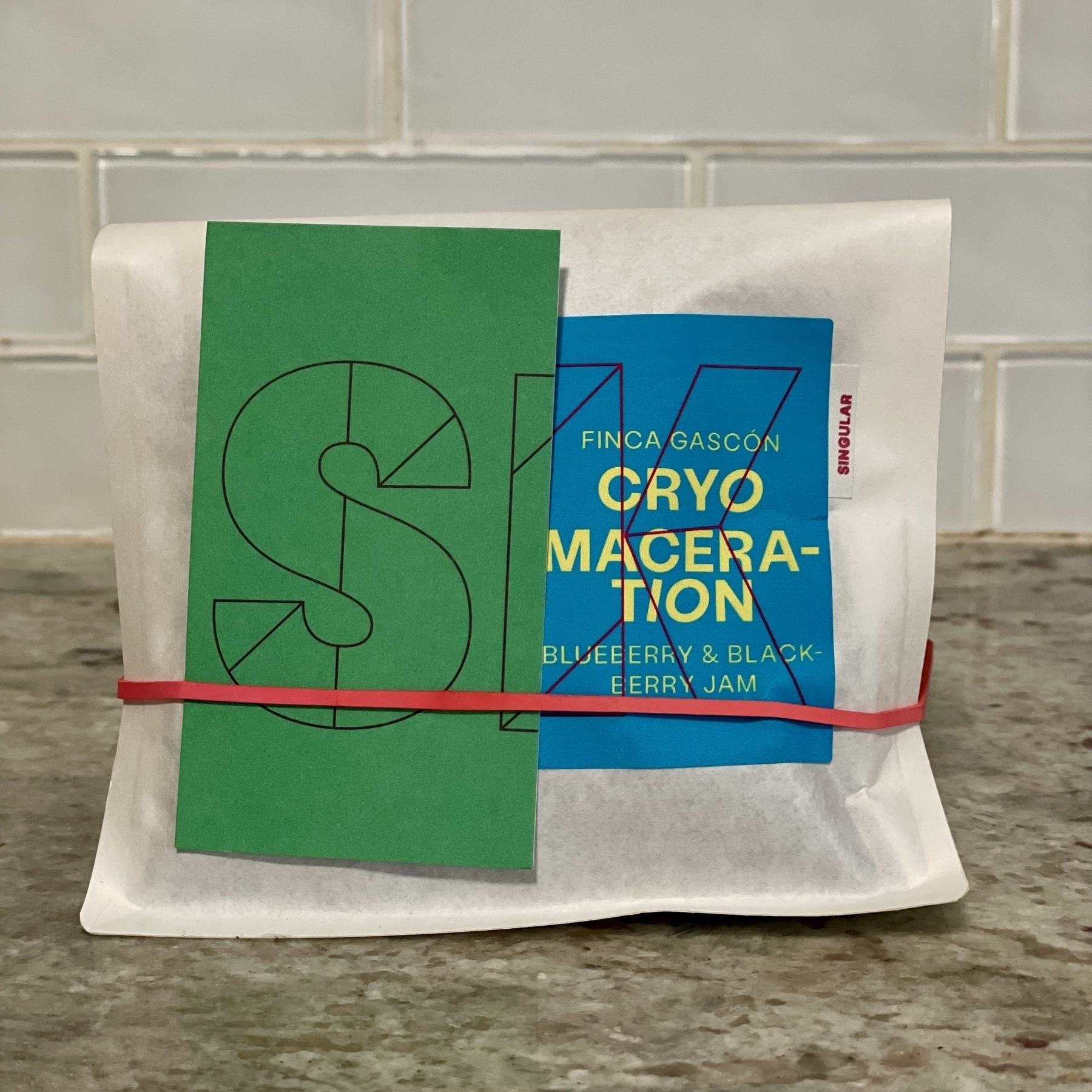
Owners Sam Kjellberg and Nate Broadbridge bring serious experience and meticulous roasting to the table, cut only by a colorful casualness that's accentuated by their delightfully off-kilter packaging. (Also, I love that they highlight the whole team on their Team page -- great to see the whole crew that brings this brand to life.) They hold a fantastic line-up of default, standby coffees and craft, limited releases, which I feel is a great balance of simplicity for go-to reliability of options, ranging from the stellar, chocolatey washed Peruvian bag, to the fun, passionately collaborated farm releases like the recently sold out Cryomaceration from Finca Gascón that bangs with jammy flavors I've honestly never tasted in a coffee before.
Part of what makes them special is a great flavor profile series that they plug into as they refresh and roast their beans, which include smooth, sweet, bold, unique, and rare. Sure, other coffee shops categorize similarly, but the accurate descriptions that accompany several of the bags (as an attached card) really do reflect the intricacies — those unique, fruity ones are so surprising and smell so incredibly good in the morning, it's irresistible to order them again and again. This was the first line up of coffee that had me intentionally drifting away from my usual light roasts (mostly nutty in favor) in favor of the more fruit-forward options.
With such a deliberate approach to inventories and selection, they of course offer a few great ways to indulge their varietals in the form of "clubs":
- Membership: An annual fee-based option that grants the member a percentage off their manually-placed orders, and also grants first pick for special coffee projects, events, and micro-lots.
- Subscription: More of the traditional direct-to-consumer model of a monthly fee that nets you an automatic quantity of coffee bag(s) delivered to your door.
There's also a third option they are exploring (as of May 2023) called Farm Gate Club, which they explain:
"Farm Gate Value" refers to the market value of an agricultural product minus the selling costs (shipping, tariffs, etc.). Our vision is to create a "buying club" or CSA, of sorts. This club will connect the "consumer" more directly to the source. In addition to experiencing economic intimacy with the producers, we will explore producers' most experimental lots, encouraging continued development in the industry.
Overall, SK Coffee provides tremendous value on all fronts -- cafe, food curation, coffee product, and membership clubs. These demonstrate competency and confidence in what they're putting together, providing something truly unique in the midwest, and delivering consistency that encourages continued investment in their coffee program.
You can visit their locations below, their site here, and follow them on Instagram here.
- Bar/Roastery - 550 Vandalia St
- Whittier - 2401 Lyndale Ave S
☕
The Future of Search & Engagement Imperils the Notion of 'Websites'
I spent a great deal of my early career working towards he betterment of website experiences for users, providing useful content to answer queries, and assisting with findability for brands that struggled to gain traction across the myriad of attention gateways on the Internet. A major connector to these experiences has been search engines like Google and Bing. But over the last decade, as mobile computing and, subsequently, app ecosystems, have taken significant land share away from traditional content venues, the dynamics of finding what you’re looking for have changed forever. And the rise of AI-based conversational language models will continue to erode what we all once knew as a traditional search engine.
Microsoft’s Bing had an early lead when it invested in OpenAI — organization known for the ChatGPT product and GPT-4 LLM (large language model) — last year, sending Google into its deepest lairs of AI experimentation to catalyze a faster approach to the inevitable: the metamorphosis of its core IP, the search results page.
Miles Kruppa’s WSJ piece deliciously delves into this predicament, and buried halfway through is this important tidbit:
Google executives have stressed to employees that the number of active websites has plateaued in recent years, said people familiar with the discussions. Internet users are increasingly turning to other apps to find information on every-thing from popular local restaurants to advice on how to be more productive.
Sure, face value: incredibly obvious. But when the entire backbone of your product has been the crawling, indexing, and displaying of website links and page content, this could be troublesome. We talk a lot of about “walled gardens” within the commerce and app space for data and content usage, as retailers, news organizations, and social media sites have guarded and deflected the ability to see certain elements, posts, and/or data collecting. Google still relies significantly on crawling these components with scripted “bots”, and while I’m sure they’re one of the few companies paying for the newly priced Twitter APIs, relying on pipe integration with platforms puts them at the behest of different content owners. After 20+ years, Google is a in a more vulnerable position with search, but has aimed to build a robust set of owned properties to retain visitors on its domain – their future in this space will hinge entirely on how well they can maintain that content and user engagement.
As noted in the article, “Google has the opportunity to lead a change in consumer behavior around internet search, but people will turn to other services if the company doesn’t move fast enough.” (Credit: John Battelle.) If you were betting on what happens next, it wouldn’t be so hard to wager on OpenAI taking the lead with productizing a better, more accessible version of ChatGPT (Microsoft is literally doing this through Bing), and there it is: the replacement gateway to content, answers, and conversational enterprising.
Ben Thompson dropped such a theory earlier this year, and it’s mostly been right — particularly on the Bing front:
At the same time, part of what made ChatGPT a big surprise is that OpenAI has seemed much more focused on research and providing an API than in making products. Meanwhile, Microsoft is sitting at both ends: on one side the company is basically paying for OpenAI’s costs via Azure credits; on the other it is Microsoft that made what is probably the most used AI product in the market currently (GitHub CoPilot) and which is, according to The Information’s recent reporting, moving aggressively to incorporate OpenAI into Bing and its productivity products.
Well, it has.
Whether the OpenAI language modeling evolves as more of a data pipe vs a product matters quite a bit when we are looking at the battleground for attention and query servicing. Can’t forget about Apple, either, though reports recently have deciphered that they are taking an intentional, longer-term approach to any kind of further incorporation of AI into its Siri/OS ecosystem (which probably means they’re doing something and will release it when they’re ready):
Apple has an absolutely massive platform on which it could deploy generative AI, including hardware products such as the iPhone, which comes with the virtual, AI-based assistant Siri, as well as software such as Safari and Maps. But the company doesn’t seem to be in a rush to integrate a language-based AI model like ChatGPT into its products, instead relying on AI for very specific features.
Siri is already an integrated search platform, and in one swift update, Apple could close out Google as the default (if they wager to give up the multi-billion dollar gravy train of revenue) and replace with a licensed, modified language model to build into its Siri search database, and they’d immediately have significant search coverage and engagement. Without a monetization plan, though, it’s doubtful the choice would involve a full replacement — rather, it may just be an amalgamation of Siri, LLM, and one of the search engines as a backbone. As much as I celebrate Apple’s intentional, reserved decision-making, it’s doubtful they’ll make aggressive (or early) strides here.
This all is to say that websites (or the linking to them) as the core form of content gravity may soon be a bygone collateral for integrated systems of query, answer, apps, and embedded experiences within the threads of larger, Big Tech-owned platforms. Sure, I’ll stick to RSS for keeping apace with the websites I regularly enjoy reading, but look, that’s not much different from a very aggregated future of findability and engagement. It also prompts the question of how much of our collective content becomes woven into the fabric of these LLMs (which has been and will continue to be debated endlessly), but that’s another topic entirely.
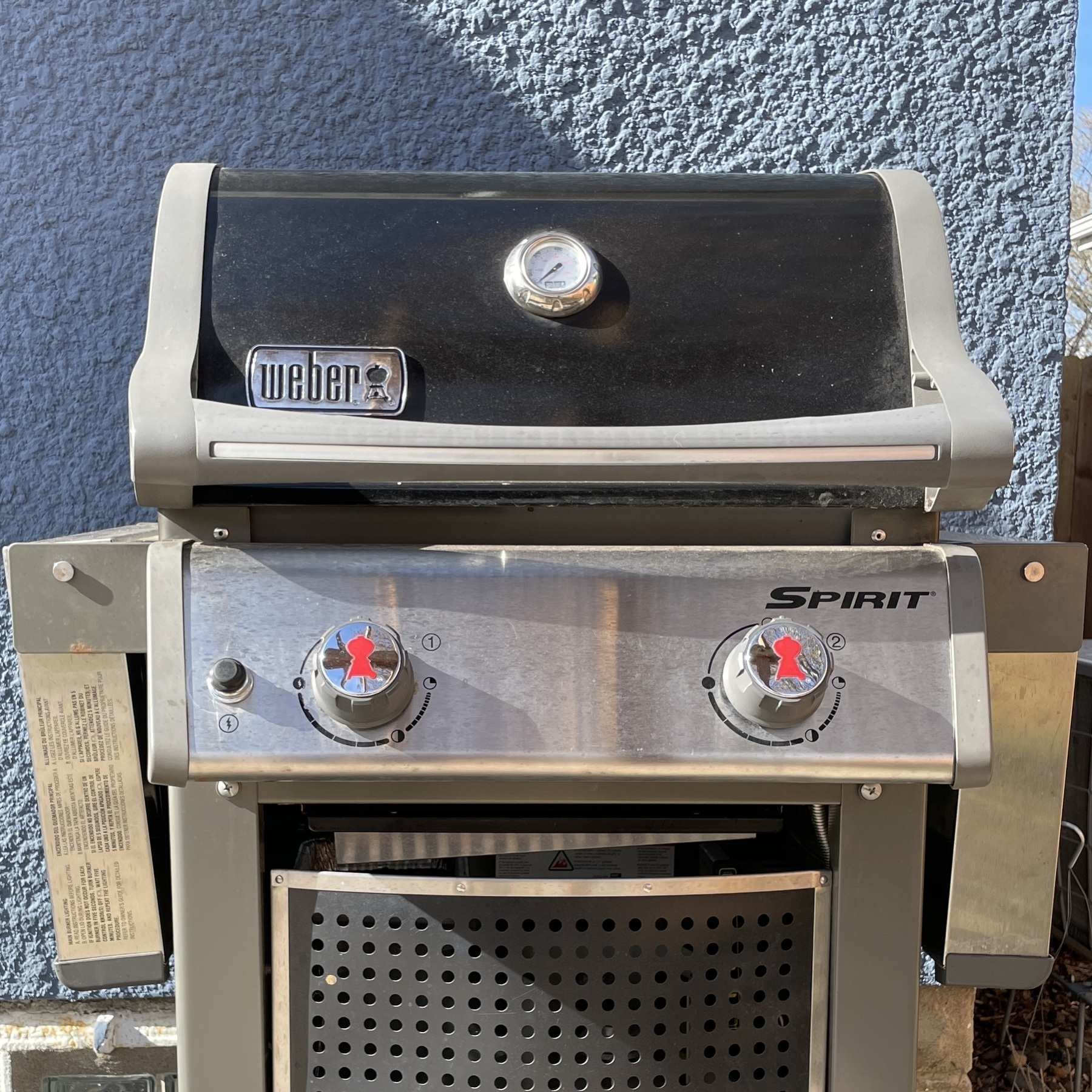
The Weber Spirit E-210 Seven Years Later
It's been seven years since I started grilling on this beast, and it has held up remarkably well. The Weber Spirit E-210 is reliable, sturdy hardware that works just like the day I fired it up for the first time.
The Good:
- Still works amazingly well, operates like it should without any degradation of intrinsic components/operating elements
- The modularity of this grill is exceptional -- there are several great additions, add-ons, and readily available replacement parts because it's such a standardized, long-running model
- This thing can typically exceed 500º degrees F if you let the burners roll at the highest setting, which suits 100% of my grilling needs
- It's easy to clean. Grill takes apart in three pieces, flavorizer bars (three) are very easy to pull out, and you can spray/wipe just about everything inside and out without worry of ruining anything critical.
The So-So:
- Speaking of the flavorizer bars, I've done the due diligence of replacing them twice over the course of my ownership. They're easy to buy and replace, and will set you back about $40-50. I probably could have cleaned them, but they really got butchered by dripping cheeses and all kind of other nasty bits where it seemed more appropriate to just replace.
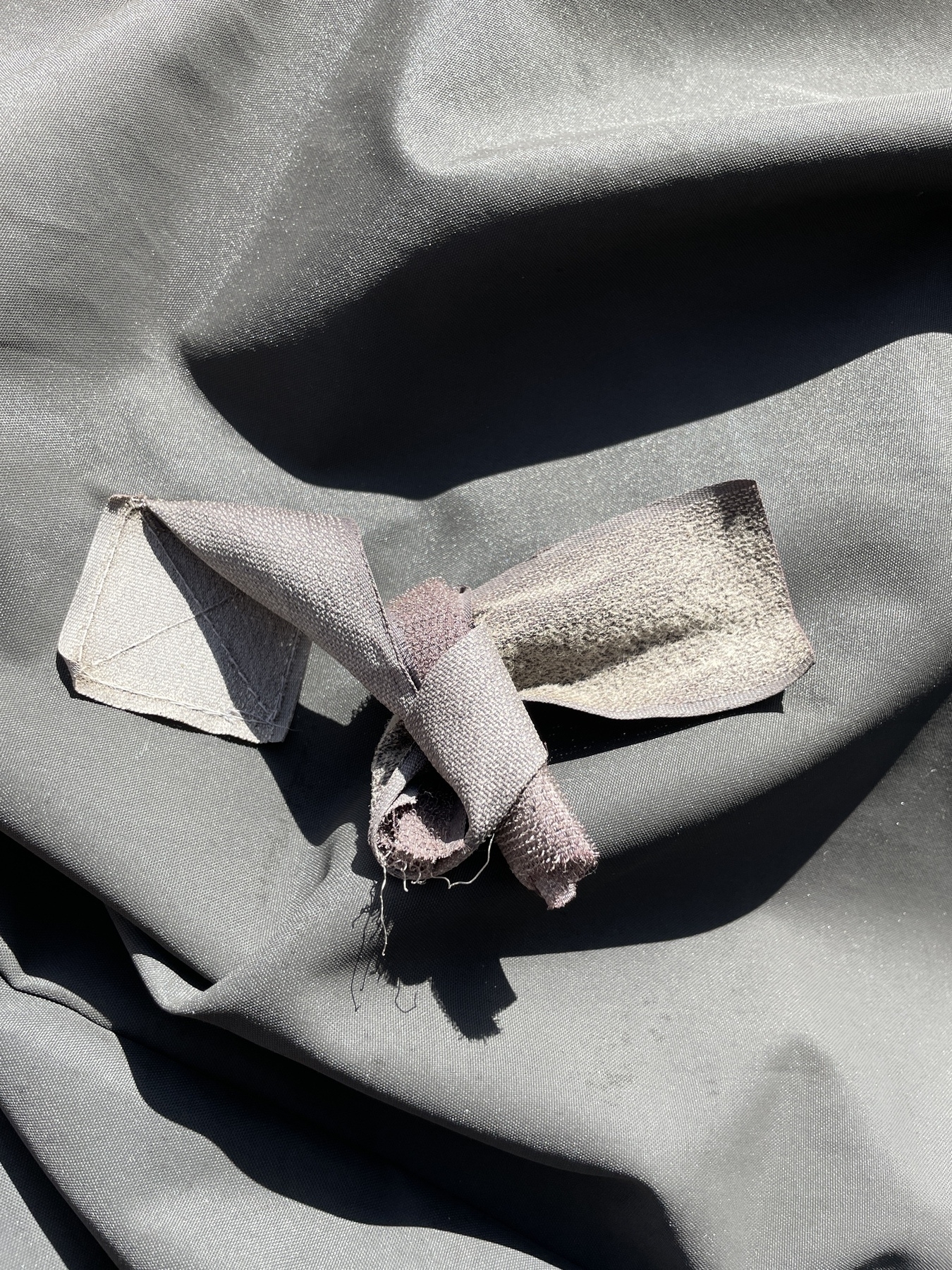
- The grill cover. For the cost of this thing, you'd think it would have better hardware, but alas, the velcro (hook and loop) to tie the sides against the grill itself do deteriorate over time (maybe the elements?), and I now resort to just tying the two straps in a soft knot. And trust me, if it's windy, I've had this thing blow off the grill before, so keep it tight. Other than this small issue, it hasn't ripped at all, and still perfectly protects the grill.
Is It Still Worth It?
Still kicks ass. Still highly recommended.
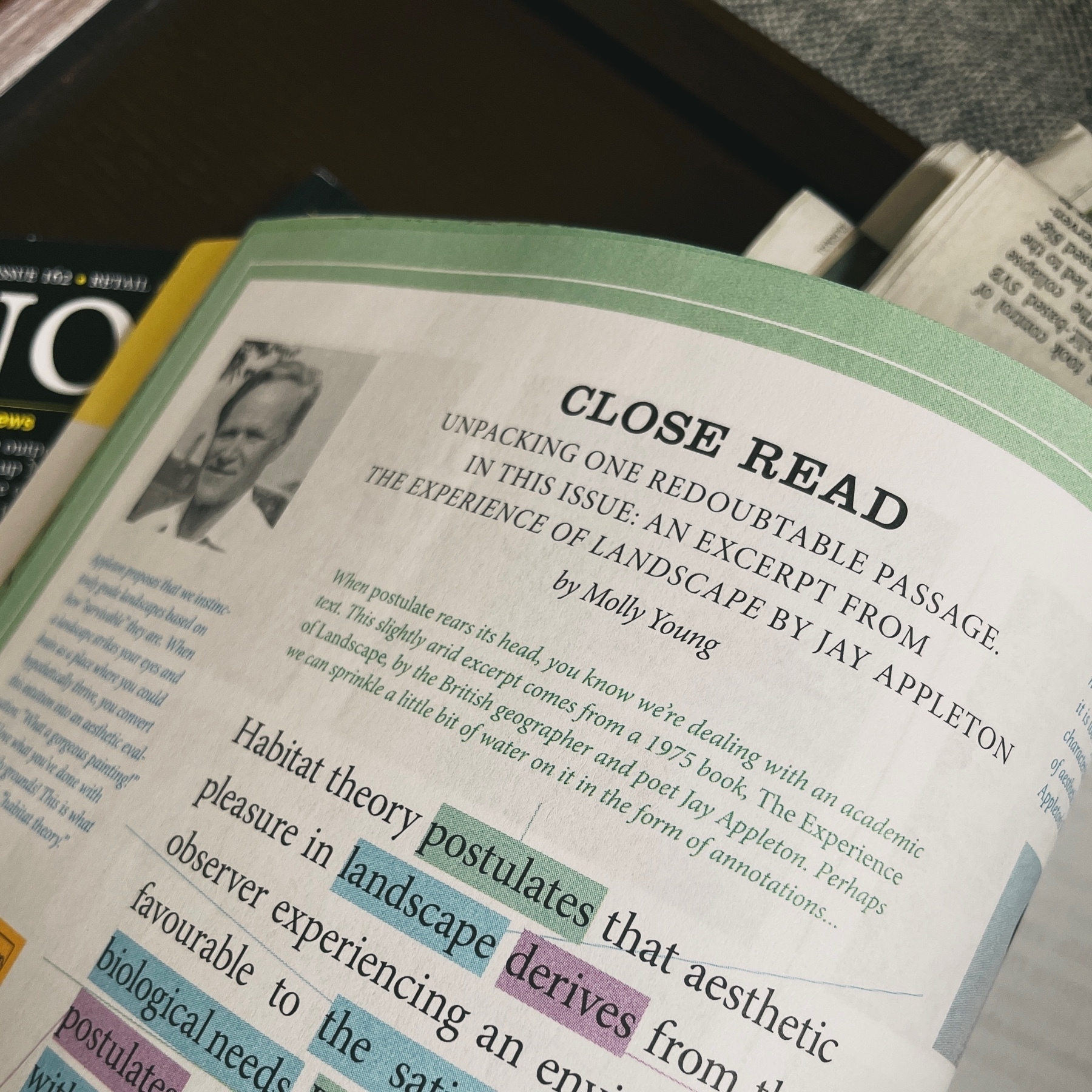
“When ‘postulates’ rears its head…” — fun ‘Close Read’ in the latest Believer (@believermag) mag by Molly Young (the literature sage whose wisdom I follow without question).
Haven’t read this magazine in a while, and it’s been a delight getting back into it.
Tom Leighton’s (@tomleightonart) Geomorphology photo series is stunning.
All I could think about after reading Maggie Appleton’s cogent case on the ‘expanding dark forest of generative AI’ (@mappletons) is how this would impact mass creation of NPCs within game/virtual environments:
The tiny sim language models had some key features, such as a long-term memory database they could read and write to, the ability to reflect on their experiences, plan what to do next, and interact with other sim agents in the game.