Heggies, the GOAT.
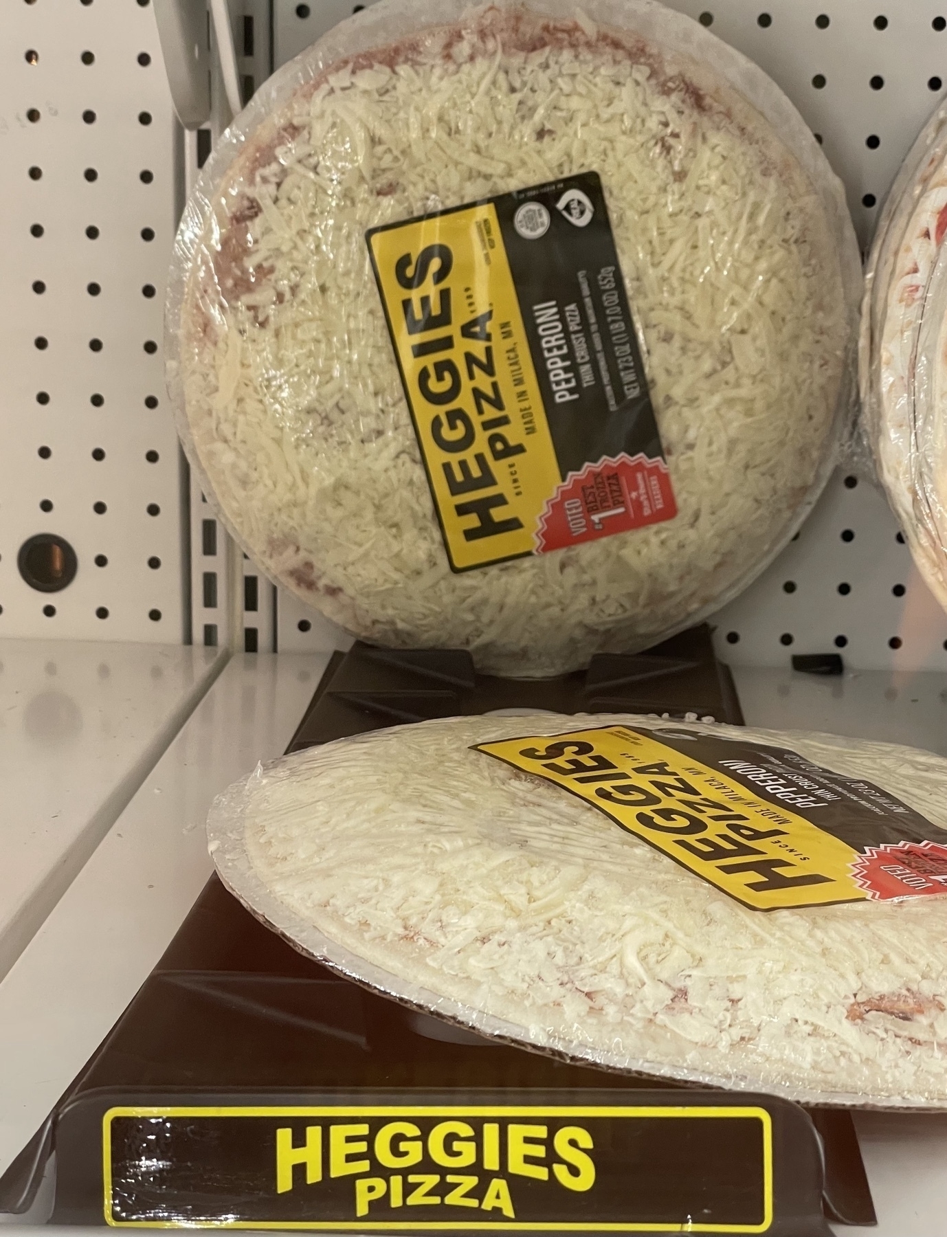
Heggies, the GOAT.
Stepping through mirrors for short-distance transportation? Count me in.
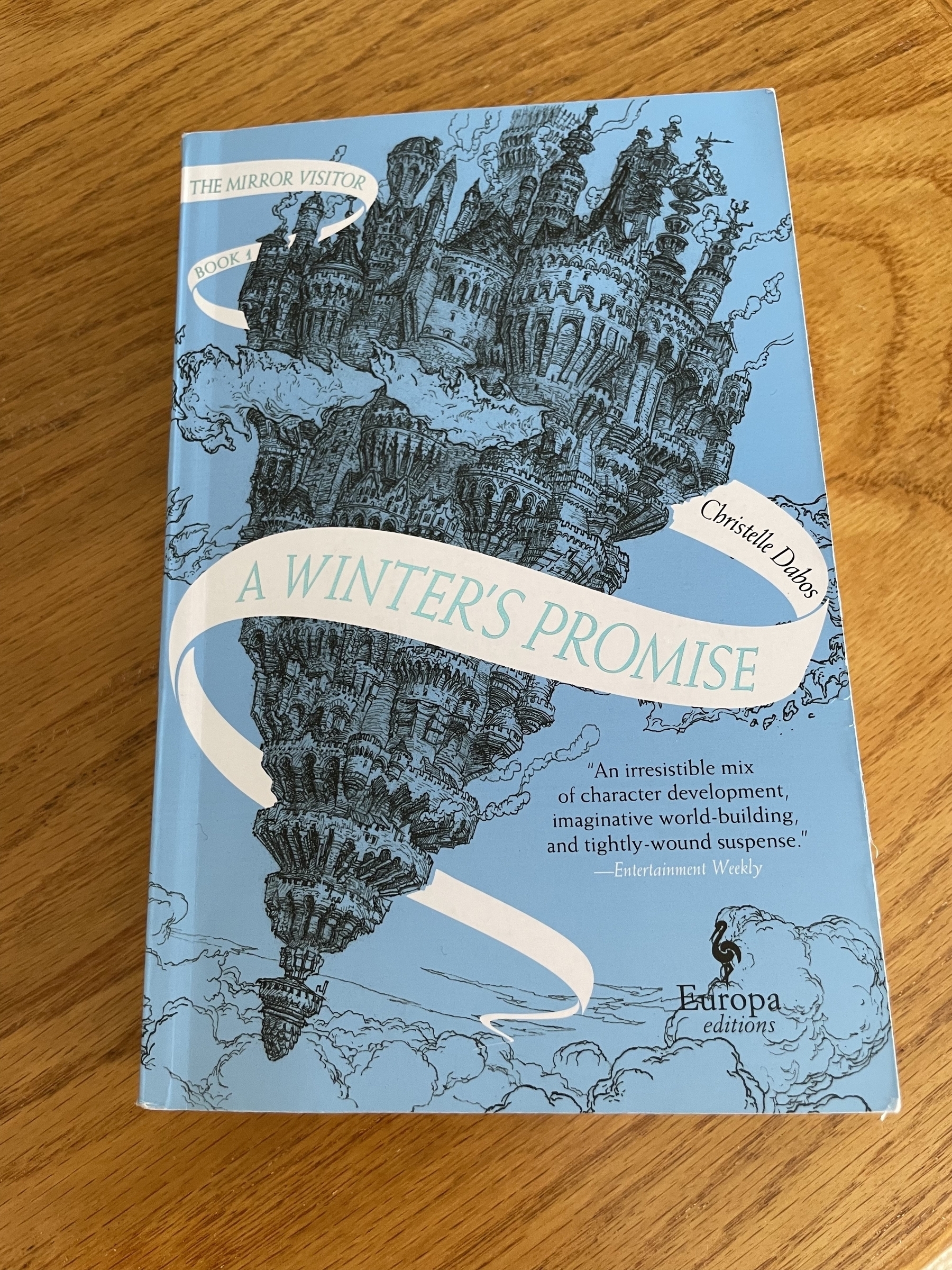
After just forty pages, I’m tremendously enjoying this first entry in the Mirror Visitor series 📚 by Christelle Dabos.
You have to love the Tom Bihn brand of bags and accessories. They make a great portfolio of products here in the USA (Seattle), all produced with a high level of quality, thoughtful design, material options, many many colors, and, of course, have the brilliant O-ring connected ecosystem.
One of their products shines in its utilitarian genius: the Zip-Top Shop Bag. Like you, I've tried a dozen shop totes that either cost me a couple bucks or were handed out free at some event/magazine subscription. I absolutely advocate for deploying re-usable bags for shopping of any kind. But the bag has to be good to be usable. And most tote bags are complete shit. The Zip-Top Shop Bag is not shit. In fact, it is the best tote bag ever made.
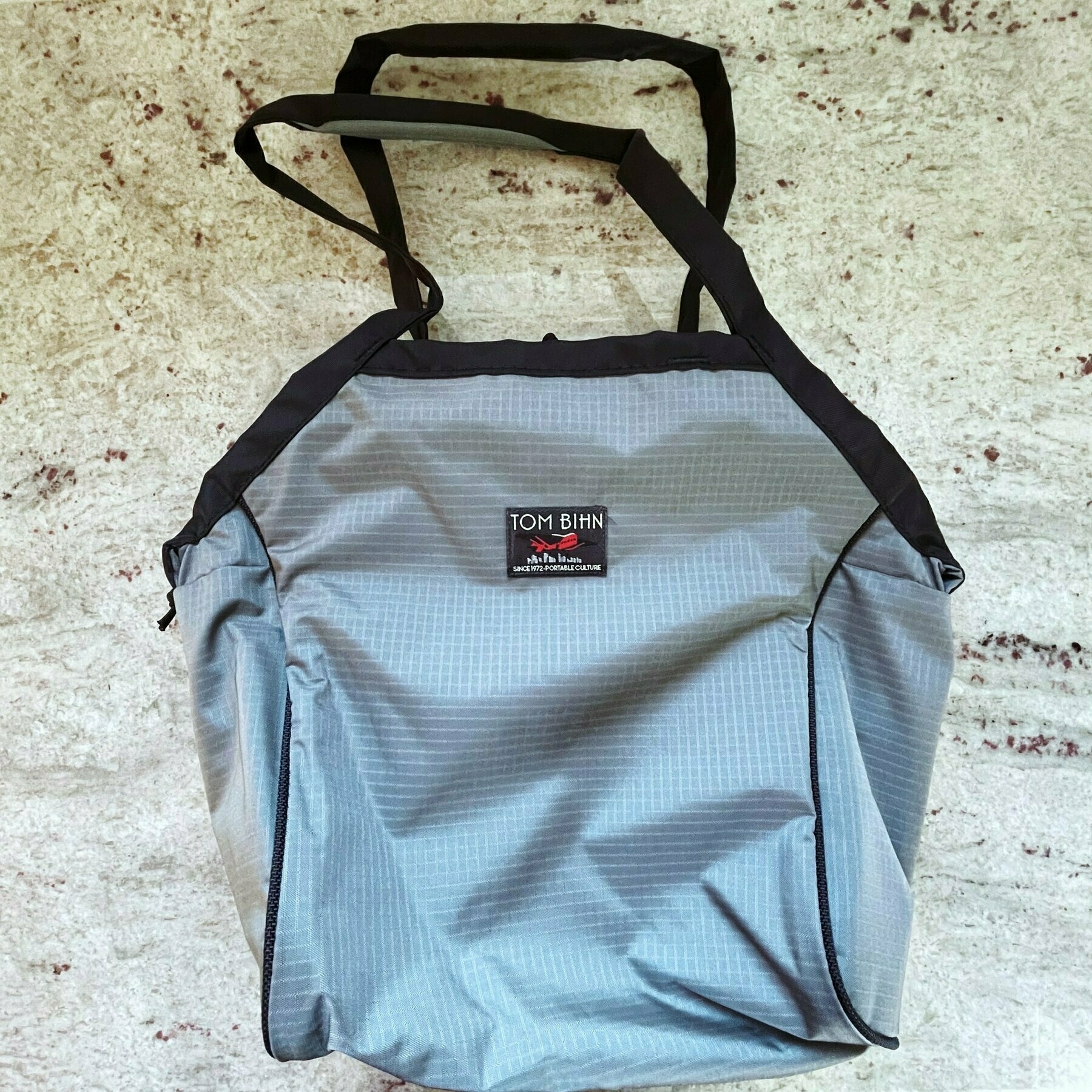
The biggest issue most generic tote bags have is the handle. This critical feature of the bag is often the most poorly designed part of the bag. So often are companies fixated on having their logo or some kind of visual slapped on the side of the bag that they forget you're actually going to be using the bag to tote items around from their store (or other stores). Oftentimes you're loading things into this bag, and then commuting with it a short distance back to your car, or a longer distance on a bus or bike. Thus, the handle needs to be comfortable at all times. It shouldn't dig into your palms like it wants to cut them off when you've aptly used the bag and stuffed it full of groceries. It shouldn't feel flimsy, like it's going to shred off its stitches if the load is too much for its inadequately-constructed purpose. It should work like a dream.
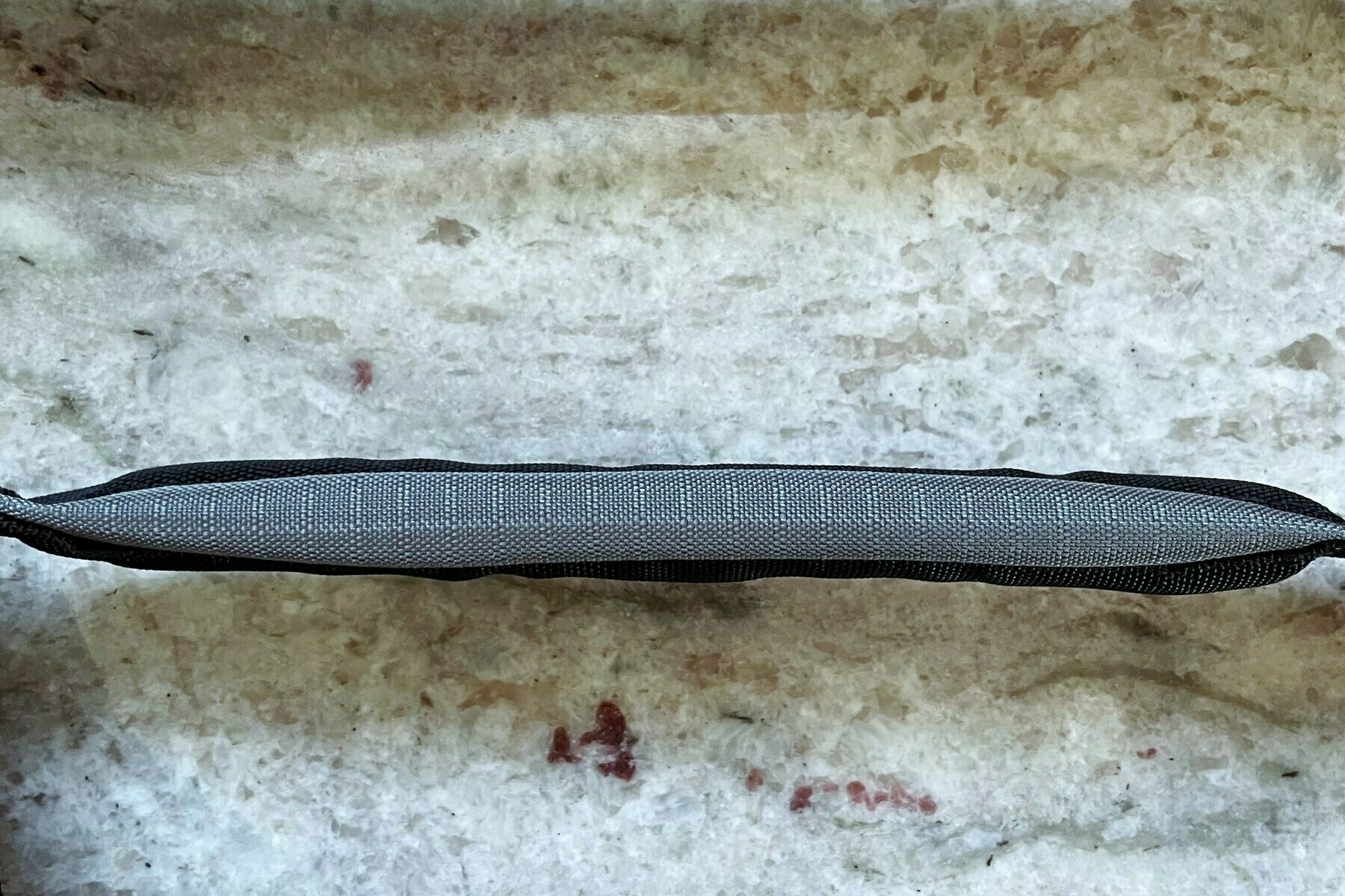
You know what works like a dream? The Tom Bihn Zip-Top Shop Bag. Just look at those handles. They are C-U-S-H-I-O-N-E-D. Brilliant idea. Why did no else thing of that? I wish I knew. Most don't care about your enjoyment or ease of use in toting their tote bag around. But Tom Bihn cares. It cares so much that it designed one of the best handles ever made for a bag. What's crazy is that Tom Bihn pitches the bag with the following, simple bullet-point:
"Has comfortable padded handles"
What an understatement. What modesty. This bag's handles do not disappoint in anyway. No matter the load, it feels like you're holding air -- it does some kind of magic in making you feel like the weight is lessened, and you could carry it forever. I would score them a perfect rating. For the purposes of a tote bag, look no further -- the Zip-Top Shop Bag is the best one on the market.
What else is great about it? It has a plethora of other amazing features that elevate it to god-like status.
So those are the main features of the Zip-Top Shop Bag. It's the best tote bag on the market. Buy one if you truly want to give those other incompetent tote bags a rest, and have this truly be the last tote bag you own. That way, you can finally stop collecting random ones that end up in a landfill.
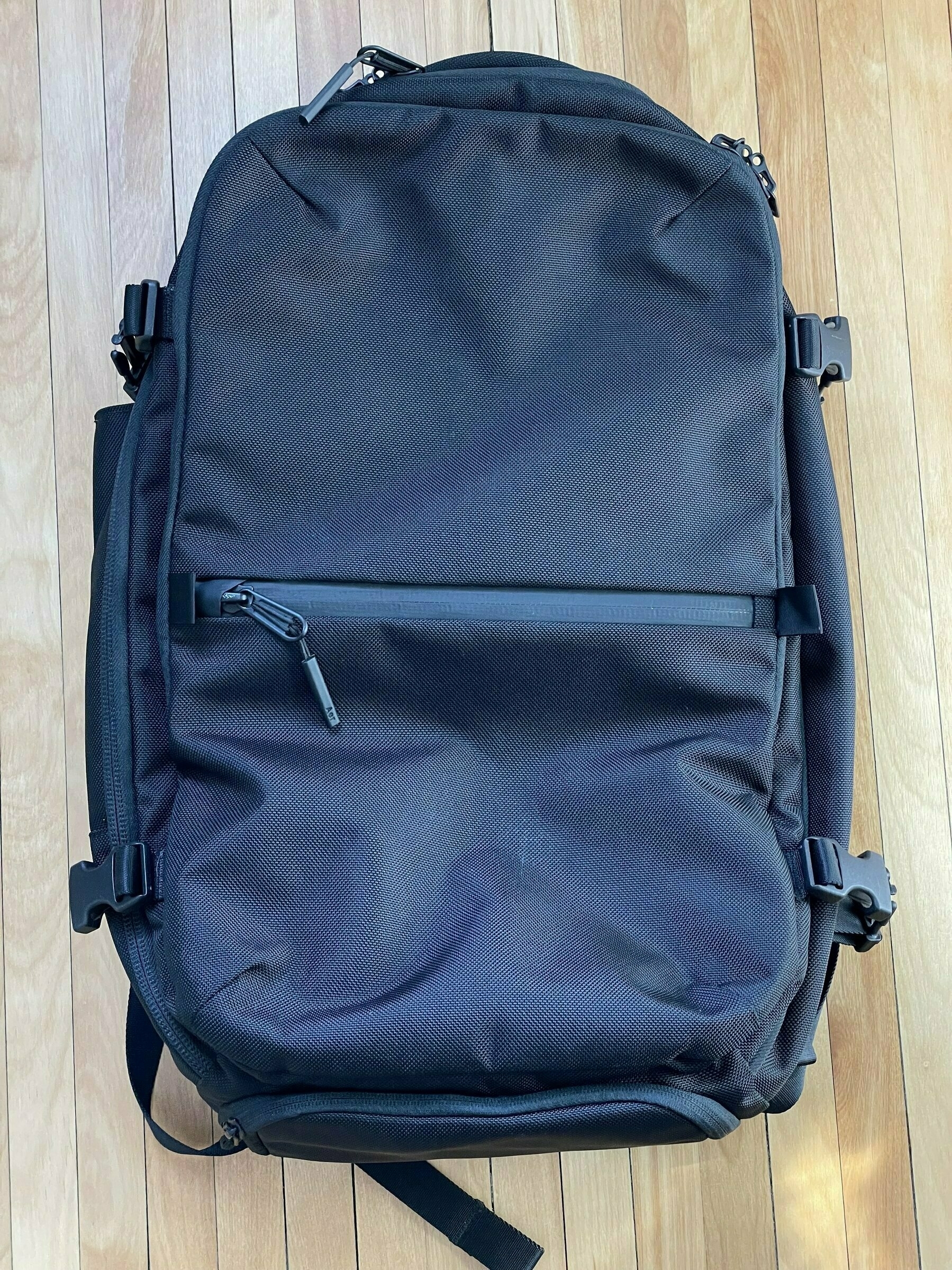
I picked up Aer's flagship product, the Travel Pack 2, last year in preparation of work travel ramping up (note - that link goes to the just-released Travel Pack 3, as they just retired their second version of this bag). Nearly two years into the pandemic, but with waning restrictions (alas, pre-Omicron thinking at the time), I figured I'd want an even more streamlined travel operation than I had prior (usually my Evergoods CPL24 paired with a Goruck Kit, or if I'm ambitious, just the Evergoods CPL24).
As usual, I spent an inordinate amount of time researching my options — and there are a shocking number of options. No longer is the technical material/hardcore design/one-bagging niche a small industry anymore; from my pattern of research, it's massive. There are dedicated bloggers/vloggers, endless kickstarter projects or post-kickstart projects that grew into huge successes, there are niches within niches, and there is shortage of intricate viewpoints on what the preferred array of attributes should be, from size, capacity, opening style, pocket placement, zipper pulls, weight, shoulder strap padding, grab handles/locations, on and on, it's overwhelming. I knew this. You probably knew this. But I continued to research anyway.
Good news, I have a few perspectives on this subject, and in particular, the subject of this review — I selected the Aer Travel Pack 2. Curiously enough, about 6 months later, I'm selling this bag to double-down on the Evergoods CPL version 2, but let me not get ahead of myself. The Aer Travel Pack 2 is an excellent, satisfying choice for being a de facto one bag solution for travel. Let me tell you why.
At 33 liters, this is a few liters short of many similar-sized "carry on" backpacks in the space. Usually you see 35L or 40L. 45L seemed to large, and even 40L was pushing it. 33L is a sweet spot. If you can't set yourself up for a week's travel within the confines of 33-35 liters, you're doing it wrong.
I comfortably fit two loaded Tom Bihn shoulder bag packing cubes, a Peak Design small travel cube, Tom Bihn grab bag (for toiletries), a tech kit, extra batteries, notebook, hardcover book, MacBook Pro, and iPad 11 in in there without a problem, and had plenty of room to cinch the bag with its compression straps. This is my usual 3-4 day load out for work travel or personal travel (in autumn/winter months, given weather conditions), so if it can be accomplished in the bag, we're good. As part of this experiment in using this larger bag, I also had been packing a Tom Bihn briefcase rolled up so I could deploy as my laptop bag upon arrival. This system works well, since you do not want to lug the Aer around as your daily bag upon your destination — it's too big for that.
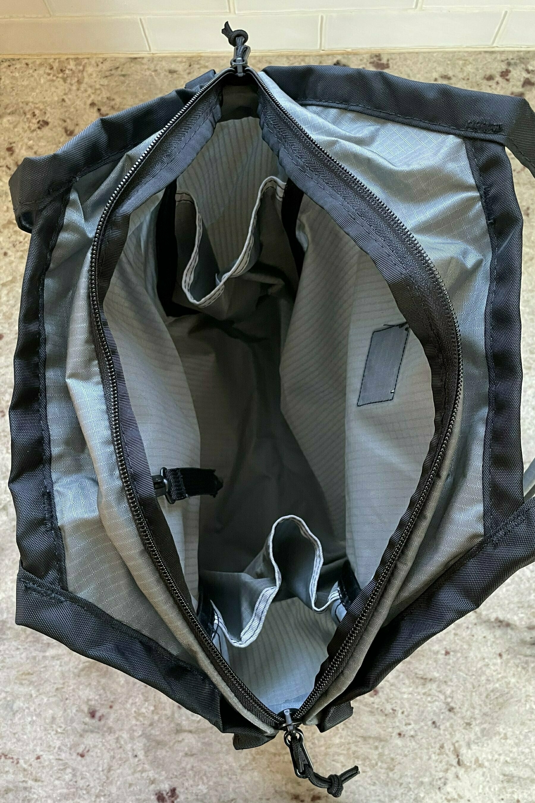
This is an Aer bag, so you likely know what to expect if you've seen or used their hardware before. It's a very sleek, slick, tough ballistic nylon exterior that deflects lint, pet hair, and debris of any kind. Inner materials and organizing pockets are the same cookie-cutter layouts and style from other Aer bags, but that isn't a bad thing -- it's functional. And there are plenty of pockets and places to stash your stuff.
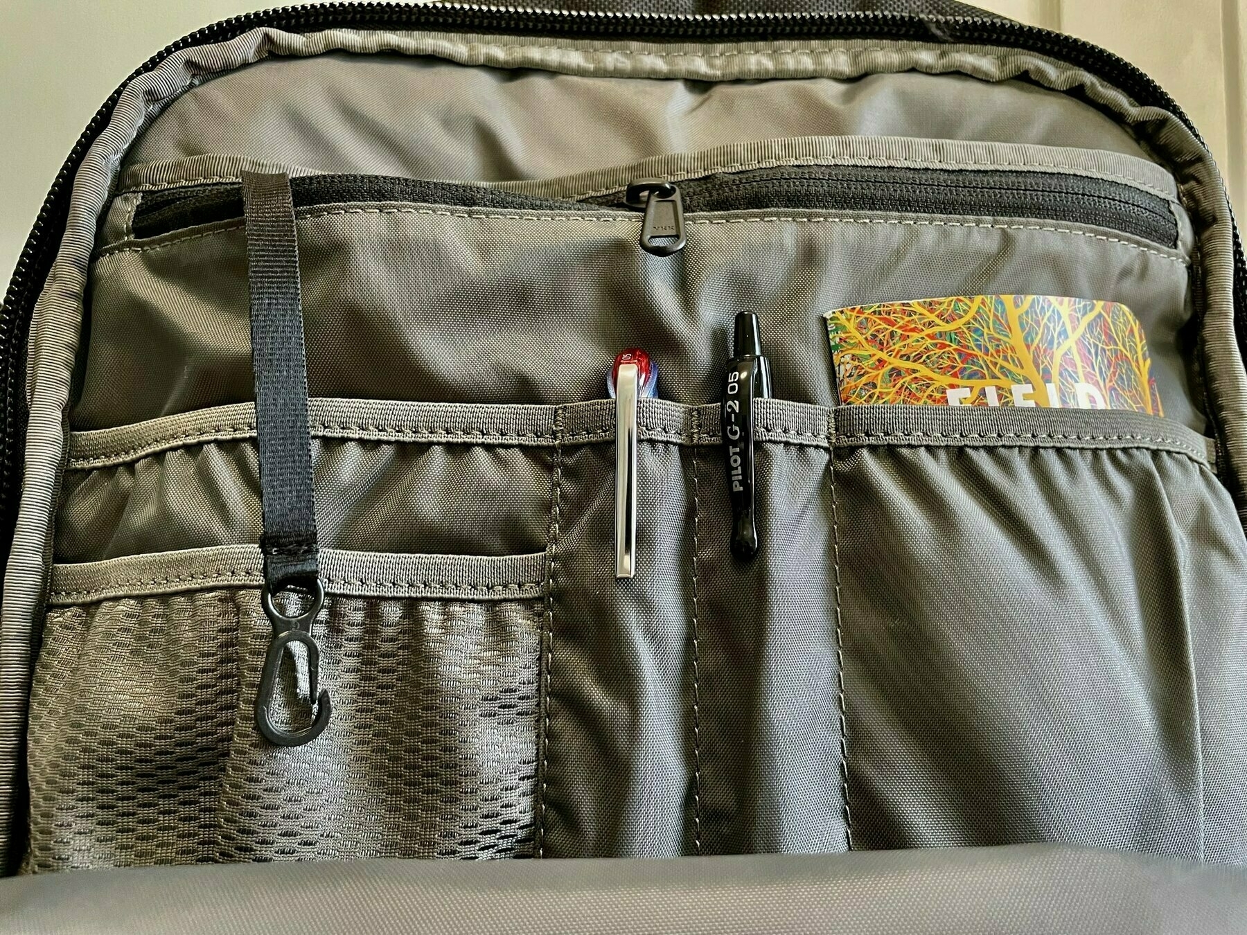
The best, most thoughtful pocket is the top "access" one right next to the primary handle. The worst, most disappointing pocket is the outer-lower pocket that defines the middle zipline when facing the bag. Another disappointment is the pockets lacking their own capacities. Once you have the luxury of pockets offering individual capacities in Evergoods products, it's hard to adjust to anything but.
Lastly, the zippers are chunky YKKs, and they rule. Aquaguard ziplines on most of the main openings.
The bag opens clamshell, like all good travel bags (or honestly, EDC bags). So, like a suitcase, if you've never used a bag like this before. It's the best way to load and organize your carry. That's all.
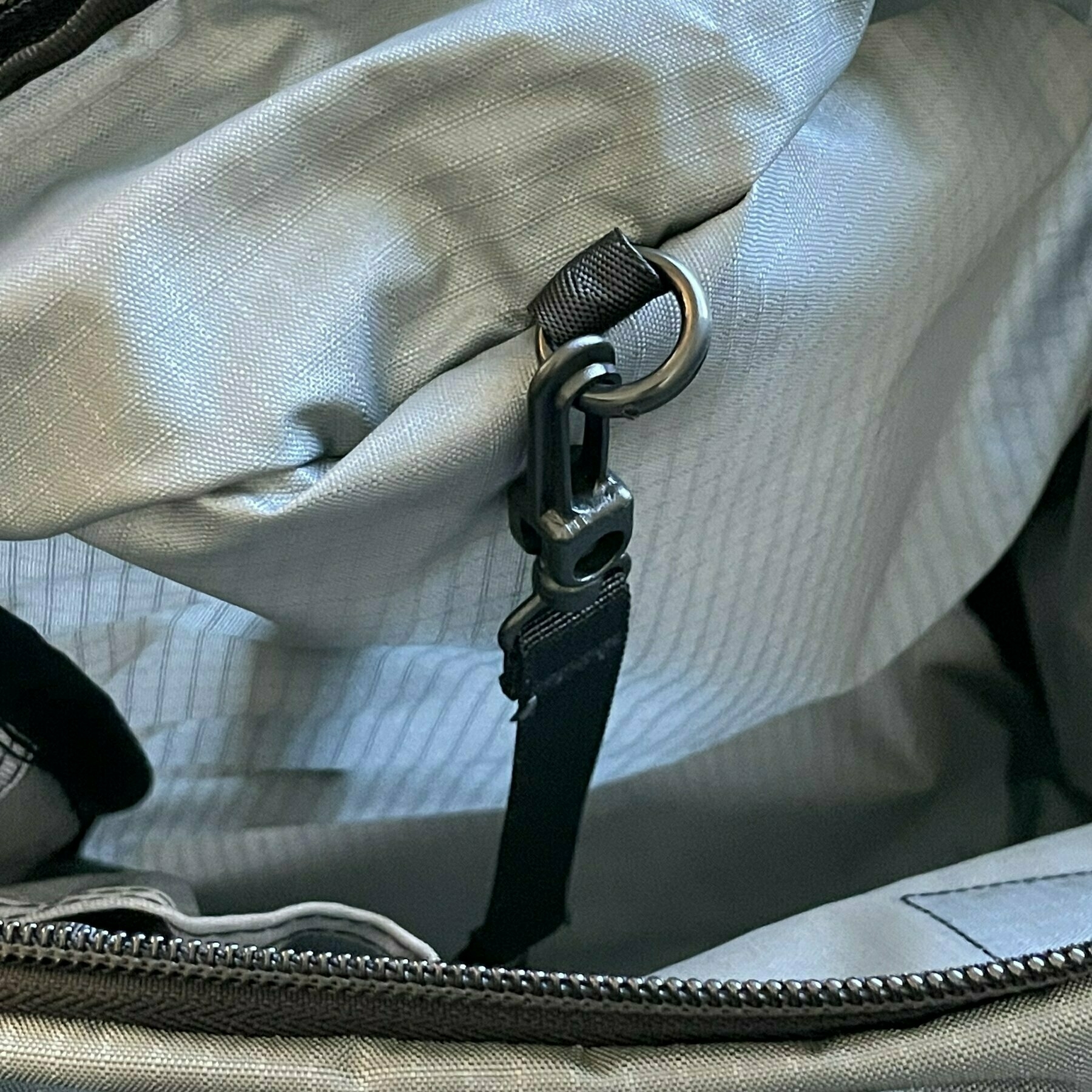
This bag also has compression straps to either shrink the bag for lighter loads (dimensionally), or to shrink down a fully loaded bag. This is both a blessing and a curse: the straps look great and work great. They also block the primary zipper for the body of the bag, requiring you to unclip the straps every time you want to open the main contents of the bag. They do not block the laptop backpanel pocket or the slimmer external front pocket, though, which is a nice design touch — this lets you grab pens/books/notepads/computer/whatever you store there that you might easily need access to while on the go and not at your hotel yet.
The Aer Travel Pack 2 carries like a breeze. It's very cushy, airy, and uncumbersome for most medium-to-heavy loads. I never tired of having on my back, and didn't bother buying the harness straps (though I do realize it's the smart thing to do for heavy loads). I'd say it sits normally on your back — you don't need to ride it high or do anything special. Just toss it on your back.
I really enjoyed using this bag. If I wanted to continue going down the route of one-bag, one trip, screw the luxury of more than 33 liters of space, I would never stop using it. But the siren call of a different kind of load out kit for traveling overrode my enjoyment of the one bag dream here. I have slight regrets in selling it, but at the same time, have no restraint in telling you that it is worth getting if you're stuck on deciding whether to go with this or the plethora of other (probably also good) bags out there, like Peak Design's 45L Travel Bag, the Pakt Travel Backpack, the Nomatic 40L, Evergoods Travel Bag 35L, Tom Bihn Aeronaut/Techonaut, or the Minaal Carry On. This is elite bag culture bullshit, sure, but I did my homework, and there you have it.
Pioneer has been building a special materials series of wallets since 2016, which is right around the time minimal wallets were hitting their stride. This was apparently a year before Trove released their seminal ultra-thin stretch/leather wallets, which have been a preferred champion for my usage over the years. But the material, thinness, and a year of COVID-19 (lack of need in using a wallet that can accommodate a lot of cards) had me tempted enough to order the Molecule Card Holder version from Pioneer. And I'm glad I did.
The premiere technical material blends that Pioneer uses for every one of its diamond-patterned wallets are the elite differentiators:
10DX
3PN
All of Pioneer's wallets have a 10-year warranty (which is incredible seeing as how many wallet companies don't bother with such a thing, though it pales next to Saddleback's 100 year warranty). Part of why they likely offer such a warranty is that their wallets use a stitching methodology they call FutureForm, which is a heat-fusing tech that "helps to reduce stitching and give [their] wallets a premium leather-like hand feel." It's geniuine, and it makes a huge different compared to other stitching in technical material wallets out there.

Overall, there isn't much to criticize. The everyday feel, thinness, and holdability is phenomenal and enjoyable. The three pockets (two short cuts on the outside, one primary deep pocket in the middle) are more than adequate for the number of cards I typically have on-hand in a modern, post-COVID environment (e.g., credit card, license, and debit card -- maybe a couple bills). It barely increases in girth when this load-out is in there, though it will of course get thicker the more you put in. I'd make the argument that this wallet could have a smaller overall footprint -- as you can see in the accompanying photos, it's a good 2cm larger than a typical card footprint. Perhaps this is by design, as a single folded US bill fits neatly into the main middle pocket (and would not/does not on wallets that conform to the exact size of a credit card, like the Trove). But even at its slightly larger size, it still pockets with ease and with minimal heft.
Without anything loaded in, the Molecule Card Holder measures 107mm x 74mm x 4mm, and weighs in at just 28 grams. Pioneer claims this one will hold 4-6 cards comfortably, but they have other wallet options for greater quantity needs. It's at once unremarkable to look at, with mostly hidden features, and the diamond-patterned shell is subtle at best on the 3PN color variants. But its shape, thinness, and extremely lux durability once touched immediately change your perspective.
The beauty and efficiency of keyboard shortcuts has mostly eluded me. While I've memorized native application shortcuts, and created a few dozen automatic text replacements in System Preferences, I never went deep on customizations.
One fine day, I decided to try Keyboard Maestro, a much-loved automation application for macOS by the developer community. I didn't fully grasp everything it could do, but I started to see the depth of programming often-conducted behaviors or maneuvers in my day-to-day work stream. All without having to learn AppleScript or another programming language – understanding sequential boolean operations is all that's needed.
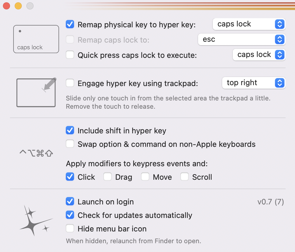
So I set up a few things that would help me establish processes like taking faster notes (foundational templates), open certain folders with hotkeys (to speed up file extraction/sharing), and do basic copy/paste work streams. More recently, I started seeing talk of this elusive "hyper key", which essentially is a way to map together all the modifier keys (command, option, control, and shift) as one holistic global key modifier. By doing this, it safeguards against interfering with other native applications' keyboard shortcuts and regular global modifiers. By virtualizing a hyper key, you get a fifth modifier key to rule over an entirely new set of shortcuts and automations. The trick is assigning this string of keys to a single key not currently in use.
Given that the F-keys are tricky to string together in a physical stroke due to their location on the keyboard (and harder still if you have a MacBook Pro with the Touch Bar), the obvious key to employ is the under-used Caps Lock. It's surprising this key still makes its way onto every keyboard layout – aside from easing the typing of serial numbers, legal agreements, and maybe labeling diagrams, it seems entirely anachronistic. I did some Internet sleuthing, and arrived at a number of ways to deactivate the Caps Lock key's primary operation and remap its usage. Upon perusing said search results, there are quite a few others out there who not only thought the same thing, but have built a myriad of instructions and even apps to accomplish this.
If you don't want to screw around with the more technical elements of this remapping operation, I suggest giving Ryan Hanson's App, Hyperkey, a try. He charges $5 for it, and makes a compelling argument that it might just be easier to have a simple method for remapping Caps Lock instead of the lengthier process of downloading Karabiner-Elements (albeit a more expansive keyboard customizer for macOS):
My goal with Hyperkey is to maximize a human performance gain while minimizing configuration and OS impact. Despite pre-existing solutions to this problem, I still can’t help but gravitate toward Hyperkey and this goal. This app has also been an initial testing ground for two ideas: Swiping one touch from the trackpad edge as a key press, and finding the simplest ways to remap keys.
Since I wanted to go the simple route, and use it with my already-paid for Keyboard Maestro, I threw five bucks at the situation.
Good thing, because it works phenomenally well. I've already built what many will likely find basic operations with the hyperkey, but have tremendously streamlined getting going with work in the morning and getting work out of the way for the evening and weekends, including:
I'm sure several more ideas will come to me, but even these in their simplest form, have been huge time-savers.
And while I haven't figured out a good use-case for this other option the developer included, it's worth noting:
...the checkbox for swapping option & command for non-Apple keyboards. This is actually the one other item that I have desired out of a key remapper, since the built-in macOS functionality is frustratingly laggy on one of my Microsoft external keyboards every time my mac wakes. I couldn’t help but add this in.
If you want to easily make much better use of the Caps Lock key, Hyperkey is a great gateway into allowing for a super-modifier key to pair with other more robust keystroke automation software. Who knows, maybe it'll work with the new Mac Shortcuts coming in macOS Monterey, too.
These past several years, I've been bouncing around a few technical-fabric apparel brands, seeking well-built, solid uniforms with thoughtful quality materials. It hasn't been difficult to find dozens of niche brands filling this space. But only Western Rise has fit the bill perfectly across all components of a minimal yet complete wardrobe.
My first foray was with Outlier, a New York brand drenched in radical ideas for hardcore fabrics, construction, and style. They've gathered a cultish following over the years, and their product line has ebbed and flowed, most dominantly from their iconic set (merino wool tee with slim dungaree pants), to such wildly idiotic inventions as the strongwool hide. Their pants are great. Their shirts are inventive (I really like my ramielust tee for summer temps).
I also dabbled in Ministry of Supply, whose mantra is maintaining an inventory of manageable clothing backed by science. So instead of referencing various ways of washing specialty fabrics (like Outlier), Ministry of Supply focuses on machine washable approaches to everything, even though they are heavy on technical, breathable fabrics. I picked up a great merino tee from them a few years ago, and have been sporting their perfectly-designed kinetic blazer for work/travel.
The brand that has aligned with my clothing preferences the most is an outfit out of Colorado called Western Rise. Their color sets are simple and consistent (blacks > blues > grays > greens), their catalog is tiny, but thoroughly meets the needs of a weekly and multi-functional uniform, and the fit of their clothes is better than anything I've had ("tailored," but comfortable).
Over the last year, I've picked up a few staples that have dominated what I wear day-to-day:
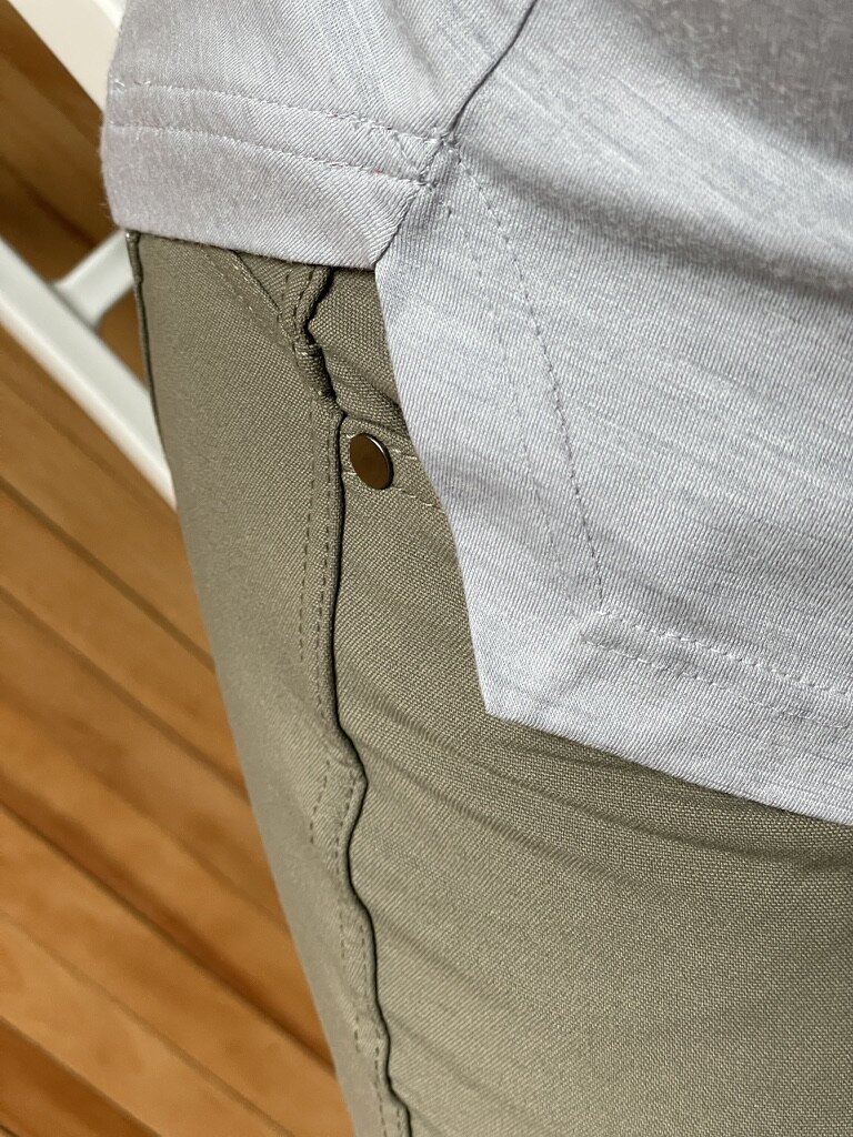
This was my first Western Rise purchase. I went for blue gray, a color perfect for matching the rest of their color spectrum.
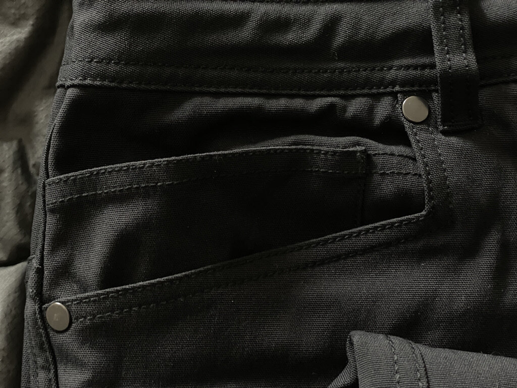
Right off the bat, these things fit wonderfully, true-to-size (they run S, M, L, you can target a size accurately since they have a cinched waist). Their 4-way stretch is incredibly pliable, the comfort is high, and the water/stain resistance is a major bonus. And as with most (all?) their products, they've very breathable, which makes them suitable for spring/summer wearing in the heat, and function stellar for things like kayaking (with quick-dry properties). The primary pockets are massive cavities, which is in most cases a good thing, but I tend to use the left-leg zippered pocket for my iPhone since it sits awkwardly in the larger primary pockets. The cinch tie and zipper pull on the side pocket are capped with tightened wax, which is 🤌.
The range you can get in these is incredible. They look nice enough to go out for a drinks, flexible enough to work out in on a cooler day, and comfortable enough to WFH in (or, sure, work in the office). I'd buy more, but this one works so well and resists the need to wash frequently, the value of one is more than enough.
This jacket is brilliant. It's super light-weight, comfortably manages temps anywhere from 30 Fº-55 Fº, has great side-slit pockets + a hidden inner zipped pocket + chest-flap pocket, and the fit is superb. Somehow you can manage to wear a tee, sweater, hoodie, or any combination therein, and the jacket doesn't constrict with the layers. Perhaps it's the leeway in stretch, perhaps it's just magic.
I've been wearing this non-stop in Minnesota's wildly fluctuating spring temps, and haven't had to break out a rain coat or a winter jacket for any of it. The AirLoft Shirt Jacket is a great use-case for this weather spectrum.
This truly functions like their claim — it's the jean "re-imagined". This one does a better job of feel/fabric mimicry than Outlier's Slim Dungarees (and has less of the slick-feel, which, depending on what you like, is a positive or negative). The AT Slim Pant does have a minimal technical fabric noise as you move in them, but it's part of the deal.
The fabric is heavier in the sense that it is more substantial than the other pants I've worn from Western Rise. It's not a heavier weight, but it feels more rugged, durable. These can take a beating. Like jeans.
A few bonuses to this vs jeans is that they are much more breathable, have a two-way stretch (which, admittedly, isn't obvious), and they also are water resistant (tried it, and it's an accurate claim). They also claim stain resistant, but I haven't had the accidental pleasure of running into issues there yet.
The one thing I've noticed about these and the Diversion pants are that they have some curious pockets. Main side pockets are great, completely adequate in size, and both have the "fifth" mini-pocket that isn't so mini on the right-side — it luxuriously fits an entire smartphone (iPhone 12 size tested here). While great, a fully-lined device in that pocket does constrict hand volume in using the primary pocket. Additionally, they have a secret zippered pocket on the back-right side, which is kind of a meh for me, but could be a blessing for others who still put a wallet in their back pocket. I could see sticking a $20 in there, and no one would be the wiser.
Extremely comfortable material (I'd argue even smoother, stretchier than the Spectrum Joggers). This is close to a default pant to wear day-to-day, but my only point of contention is that they run tighter and stiffer at the waist compared to the same waist size in the AT Slim. It's almost enough to encourage a size up.
Other than this, it's a near-perfect pant. Probably most suitable for an everyday chino/jean replacement, will operate as a great travel pant, and can be dressed up or down. As noted, it's got the 4-way stretch that adds immeasurable comfort to the wear and movement. Same water/stain resistance as you'll find in nearly all their products, and it's similarly breathable. It's been fine in cooler temps, and while I haven't had it for warmer months yet, if it's anything like the Spectrum Jogger, it'll be perfect. Cold sub-zero days may require a switch to the AT Slims.
Limitless Merino Button-down Shirt
I continue to wear a few really functional button-up shirts from Bluffworks, so there was some hesitancy in trying a new type of travel-worthy, wrinkle-resistant button-up/down shirt. Of course, I'm glad I did. Western Rise's take on this is great, starting with the differentiated material. Instead of Bluffworks' 94% polyester/6% spandex blend, we're talking nearly full Oxford knit merino. It has a welcome multi-way stretch, breathable material, and is surprisingly light-weight. As with nearly all merino, the material resists odor for days, meaning one may be all that's needed for a quick business trip.
The shirt design looks classic, fits tailored, has collar buttons for slinging a tie through if needed, one breast pocket, and doesn't run too long, so you can tuck it or wear it over the pant line, no problem. Bonus: these pack very tight, so there isn't much additional volume added when traveling minimally.
The only minor grievance I have is that the lower button on the two shirts I've got has a tendency to undue itself. This is hardly a complaint, but something I've noticed in the daily wear. It's probably my fault 🤷♂️.
Hunting the best tee is a never-ending quest. I’m happy to report that Western Rise has a formidable contender in the Cotton X Tee. Solidly constructed, heavyweight but stretchy as hell, and magically odor resistant (tested for several days), the this thing over-performs. The blend is 60% cotton, 35% polyester, and 5% elastane, creating a sweat-wicking, quick drying material that is pleasant on the skin and hyper-wearable. If I could only wear these every day, I would.
The merino tee is a much sought-after holy grail of shirts. While I haven't had the opportunity to try many, the travel/minimal packer/one-bag scene is ripe with recommendations that merino is the only way to go. Odor resistant, strong fibrous weaves, super soft feel, quick dry properties — this is what merino aims to provide. If you're only able to fit one or two shirts into your luggage, make it merino.
Western Rise's product here is good. It's an 18.5 micron single jersey cut, which means very breathable, very light, and dial up or down on keep you warm/cool depending on the weather. The fit is a tad looser than the equivalent size in the Cotton X Tee, which may just be the way they've decided to code this due to the fabric. It also runs longer than your typical tee, but drapes nicely. The length doesn't make a ton of sense to me, but I suppose it works well depending on your torso, and it should be noted that there's a decorative cut on the sides that adds some dynamism to the composition.
Overall, this works exceptionally well. The quality is high, it packs insanely small, and it'll probably last a long time.
If you're interested in trying Western Rise, you can get $20 off your first purchase — here's an affiliate link (full disclosure) to do so:
Otherwise, simply check out the site with any of the product links above. You can even try at home for $0 with their Try Now integration.
Good stuff.
[Includes updates after using One for four months; scroll to bottom.]
January 7th brought disappointing news to a small contingent of bank users in the US -- Simple, a clever fintech banking experience, informed users it was over. The email was blunt, pointing to BBVA USA (the current back-end housing Simple's deposits) as having "made the strategic decision to close Simple".
This was met with a resounding, gutteral sigh from several of us who had been around since the beginning days in 2009. According to the New York Times, Simple had acquired 20,000+ users and aggregated $200MM in transactions by 2013, likely catalyzing it to be acquired by BBVA USA in 2014. The draw of Simple was its experience -- thoughtful in every aspect, the bank was designed to be helpful to users managing their money. It set itself apart immediately from others in the space and, even to this day, has outclassed competitors in its holistic experience and feature set. (There is likely an obvious explanation why.) With Simple, you could:
Simple was, and will continue to stand as, the best banking experience ever designed. Alas, a good thing had to come to an end, evidently. When BBVA USA was acquired by PNC very recently, it came as no surprise Simple was getting shuttered. It competes directly with PNC Bank's other products, and likely interferes with brand building. We'll assume the acquisition was userbase and assets.
And so I, like many others, have been looking elsewhere. The banking and fintech landscape has changed significantly in this past decade, but seemingly has not changed much at all in what's uniquely on offer for banking solutions. An influx of new, flashy banking brands have cropped up in much the same way and variety that millennial DTC brands have been bootstrapped through Red Antler's identity marketing program. That includes the omnipresent Chime, but who offers few value propositions aside from early paycheck deposits (like many others now) and, at this time, a decent APY on savings (0.50%). But their fee-free and overdraft-free account programming isn't anything revolutionary. Many have this now. And it's not compelling enough to switch a discerning Simple user.
I've spent a good deal of time scouring Reddit, fintech industry sites, and Twitter to seek the best alternatives. There has been an enormous amount of other folks’ goodwill towards this research, and I'd like to point out one Reddit user in particular who has compiled a comprehensive comparison list of several alternative "neo-banks", alternative banks, and fintech software layers to traditional banking.
I finally found something that should work.
In all, there isn't a direct replacement for Simple. Nothing does what Simple has done for years, and there's only one bank that comes close: One Finance. But first... there are a couple solid contenders that could evolve in the right direction:
One Finance was appealing enough to try, and immediately made the most sense once inside the platform. A short summary of what works well and helps rationalize why I went with this alternative:
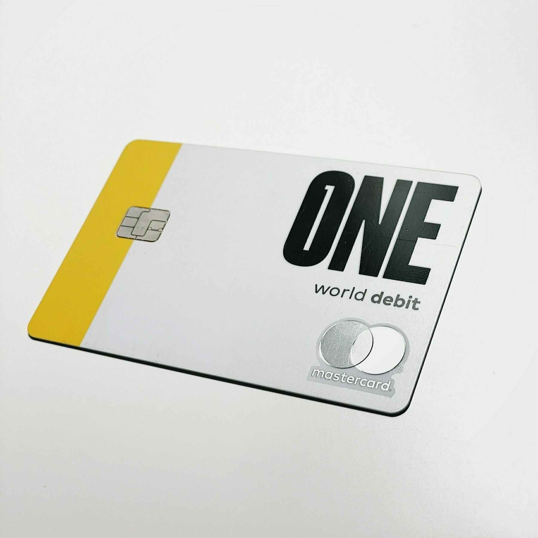
Overall, One Finance has an altruistic approach to banking, including a lot of the transparent, no-bullshit values that echo Simple's philosophy. It helps that quite a bit of talent leading One is from Simple (their CEO led Azlo, Simple's sister bank) and similar derivatives. It isn't perfect, though, and it has a lot to prove in the months to come in how efficient and capable they are in meeting their ambitious roadmap. It's missing a significant amount of core features, which is why I'd still recommend having a traditional bank as a contingency plan/hedge on needing to do "normal banking tasks". While several of these are on the imminent roadmap, One currently (Jan 2021) doesn't have check deposits, recurring funding of Pockets, outgoing wires, outbound cash app integration (only inbound), physical checks, data exports, search functionality, or editing transactions (categories, memos, etc.). They aren't dealbreakers if you can bear with the early stages of a company carving its way in an ultra-competitive industry, but time will tell if they can meet their lofty aims.
If you're interested in giving One a shot, try it via either of these links:
➔ Affiliate Link (if you're inclined -- you'll get $50 after an initial $250+ direct deposit set-up)
➔ Non-Affiliate Link to Sign Up
Since I opened an account, I've had several direct deposits from my salaried paycheck drop in (it truly does come a few days early due to the way they pull the trigger quicker than normal banks' ACH acceptance + transfer), have created a handful of Pockets (their version of envelope-budgeting), and set up payment structures with utility companies and investing firms where credit card payments don't work.
What I like:
Pockets. Simple, but also complex envelope-budgeting. You can share them with any other One user, and each one also has a unique account number, meaning you can securely share these with various companies you want to pull money from without risking security exploits or access to your entire account's funds.
Savings. A savings account with 1% APY (at this time) is unheard of. And the way the auto-savings works (a separate account for 3% APY with a max contribution of 10% of all direct deposits) is both a brilliant way to encourage and retaining savings habits, but also an incredible savings rate up to $25K).
Engagement. The team has been highly active on social media and answering thorough questions and feedback on One Finance's subreddit. It's a promising sign from an early start-up.
The team behind it. Ex-Azlo/Simple folks are contributing, and there have been initial promises that One won't face the same fate as Simple with a sell-off to a large national bank. 🤞
A transparent roadmap. This is excellent to see, and reassuring they’re committed to evolving the product over time, like most great software is. Why should the banking experience be any different?
What I don't like (but know will probably be solved for in their roadmap):
Lack of transaction search. [I'm using Monarch in the interim.]
Limited recurring transfer feature (monthly or every week/two weeks just don't cut it for how this should work). Astra does a superior job of acknowledging a deposit amount and moving xx or xx% to a designated place, but is delayed and clunky by comparison due to it being a third-party method and the fact that our current banking infrastructure is slow and cumbersome.
In a recent update on their roadmap, however, they are tackling this in what they’re calling the to their Money Movement update. So again, fantastic to see this be addressed, and so quickly.
Lack of authenticator app-based two-factor authentication (they have installed 2FA via text messages, and will be adding step-up authentication this summer, which is great).
Overall, I'm pleased with the switch and look forward to its future. They've already made good on a number of short-term roadmap promises. Here's a raised glass to them rounding out the feature set this year.
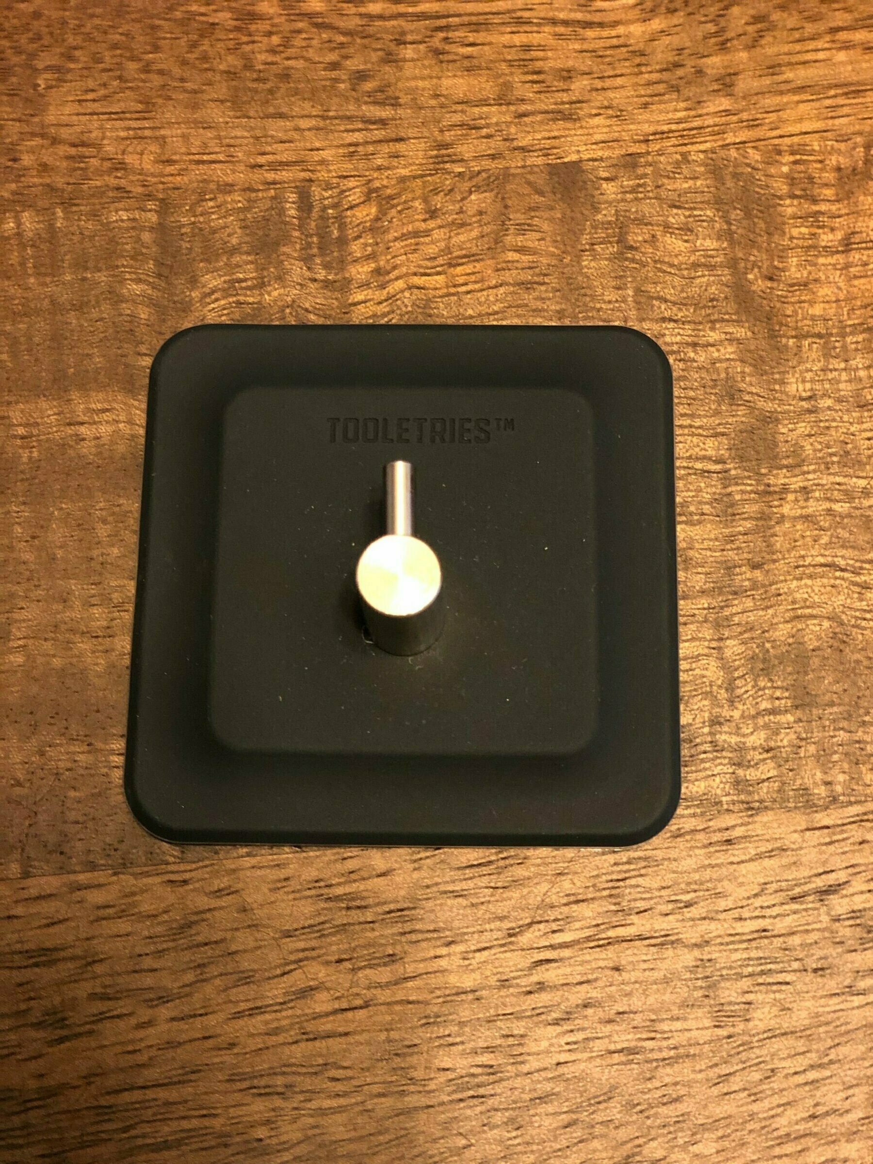
After stumbling upon these ingenious (maybe? Let’s give it a few months) shower storage designs from Tooletries, I ordered us up a kit. These objects are useful, practical, and excellently designed. I don’t know how long I’ve been looking for add-on shower storage that doesn’t suck (not long, let’s pretend), but it’s probably been ever since I had my first apartment in Chicago.
In the beginning... I came across a decent piece of tech from Simplehuman at Target several years back, and while it worked great, it had a few glaring issues that most of this equipment does:
It was cumbersome due to its constrained design and necessary adherence to the front of the shower below the shower head
As such, it hung off the shower head (which is fine, but it assumes you want your kit right in front of you under the shower — where plenty nastily-accumulating drippage happens); if you have a ceiling spout, obviously this doesn’t work.
The heights of the shelves do not accommodate all kinds of bottles and shower items you may have on hand, particularly anything 8oz (big buys from Costco won’t fit, unless you have room at the top near where the head hanger is). You don’t have to use it for bottles, but the shelf design assumes you’d be doing this, so...
The grated shelf system isn’t ideal for storing smaller items like razors or bobby pins (in my wife’s case), as they are wont to slip through the aforementioned grates. You get it.
These issues stack up to what I’d consider important checklists for shower storage in any context. You want it to accommodate key items (granted, shampoo/soap/conditioner bottles likely are always going to be troublesome). You also want it to be positioned where you’re going to need it based on how you like to take a shower. All showers are different, I imagine. You don’t even know how I shower, but still, let’s just say.
Get over the pun name. It describes their goods accurately. To be honest, it was difficult to dig up any kind of background on this company. It was recently curated by Huckberry, which I consider a legitimate outlet for discovery, so I’m confident it’s coming from a trustworthy source. But their site is half-baked, with several missing pieces of content (like FAQs and a proper list of their global stores). If you can get over this aspect of the product’s parentage, I guarantee that the goods themselves are rock-solid.
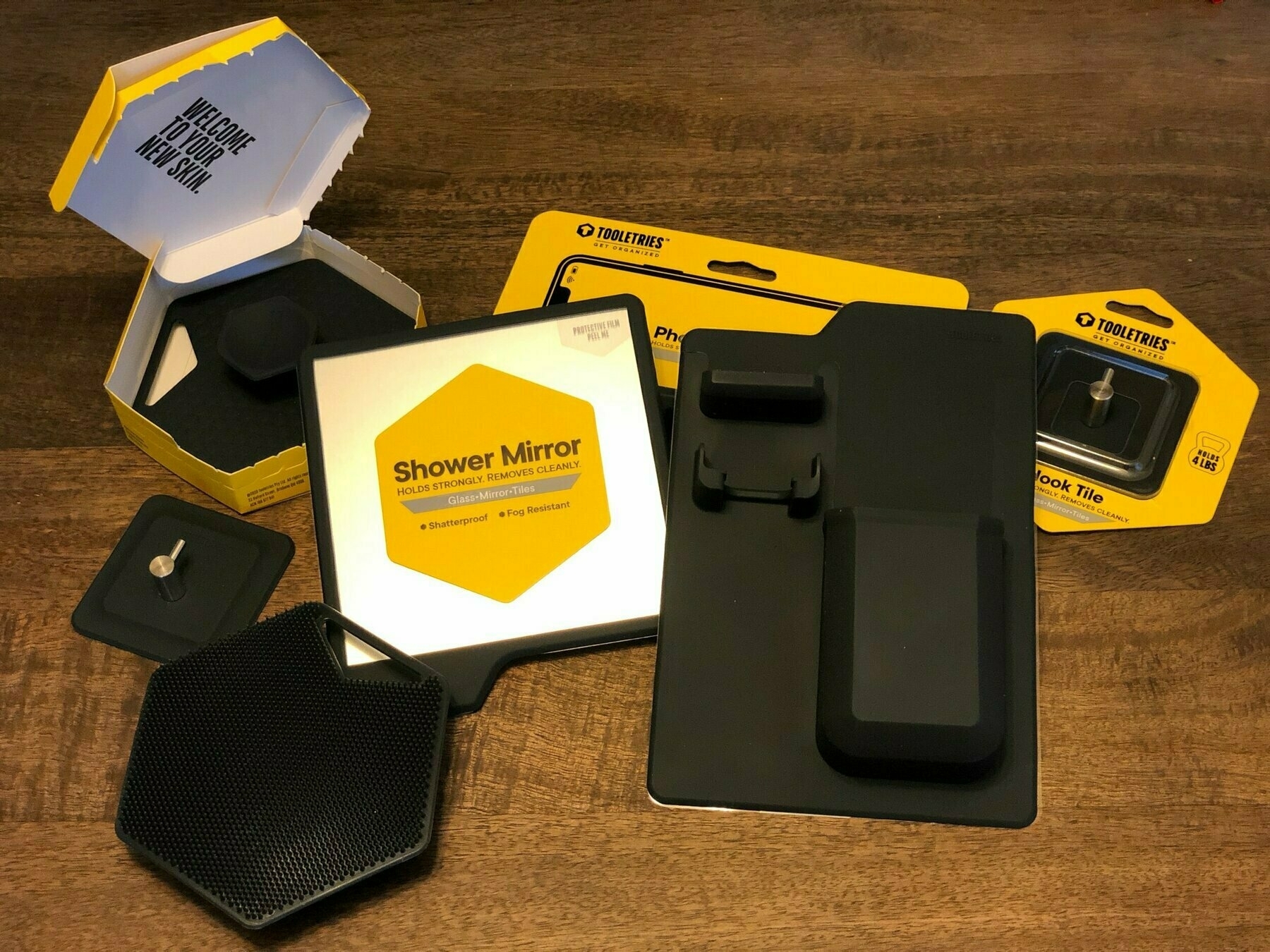
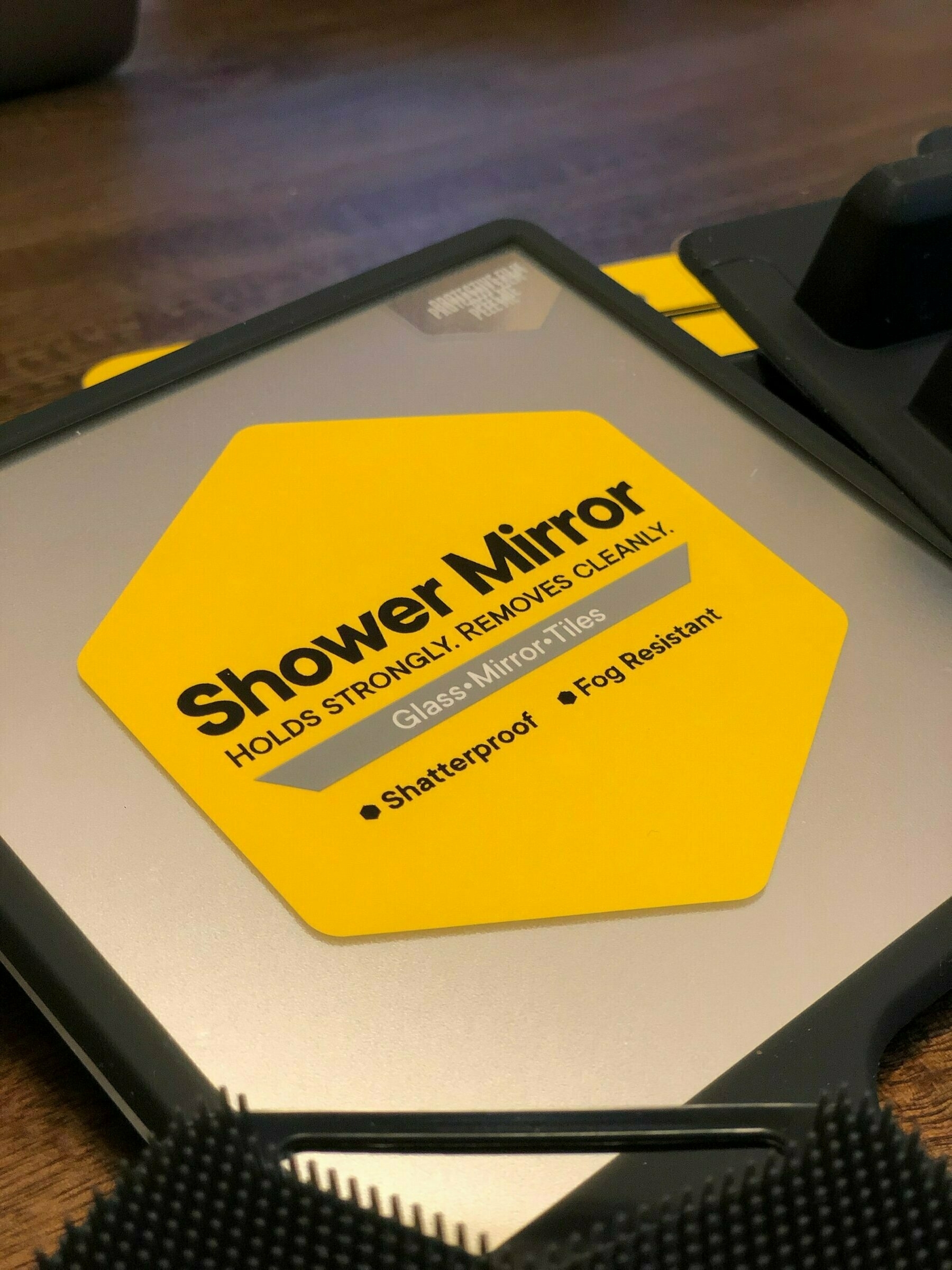
Their admittedly stale, male-oriented mantra is about believing that a bathroom is a “sanctuary” and a “place of calm and serenity… free from chaos and disorder”. Sure, I can agree with that, and I’m sure every gender could, too. What’s not stale is the design integrity behind these pieces. And whole thing doesn’t work without their 100% antibacterial silicone, extremely-adhesive sticking surface, and thoughtful design like anti-fog mirror and shelf drainage holes.
Let’s take a look at the kit I bought, and I’ll walk you through this.
Available here ➔ The Harvey and Oliver Set
I don’t shave. At least in the traditional sense. I use an electric razor on my haphazard bullshit beard, and I don’t do in the shower lest I get electrocuted. Which means this part of the kit is for my wife, who does shave, and like many, I conjecture, does it in the shower.
This might be the least impressive of the Tooletries items, but certainly serves a functional purpose if you need it:
It holds a traditionally-designed razor (my guess is it’ll fit 95% of them in it’s cubby drop-down holder), and also has a little rest for an extra razor, too. Which I suppose is convenient.
It also has a deep pocket for perhaps some kind of shaving cream or tube of something related to shaving or other shower antics. Honestly, it’s not a great shape, and would really only fit a 2-3oz lithe tube of liquid, nothing fatter. I’ve brushed my teeth a few times in the shower, and I’ll park my toothbrush in here between finishing and getting out. It’s about that size.
The mirror is cool. I’ve never had a mirror in a shower before, and while its use is limited (what would I honestly be doing that requires looking at myself... is extremely limited in a shower context). But, having it adds a surreal element to the daily cleanse (at least in these early stages). Maybe its use will manifest itself down the road. I don’t know. Either way, I’m keeping the fucking thing in there.
Available here ➔ - Body Scrubber and Hook
By far the most effective tool in the collection. I ordered two (one for my wife, one for me). Same two-toned options.
These things stick as well as the rest of the kit, and provide the (likely) most used component. They operate as replacements to loofahs or hand towels, whatever your previous preference in body-washing. Lather the soft-spiked surface area with body soap of any kind, and comfortably hold the joystick handle to apply the region across yourself while showering. Simple operation.
The surface area, while significantly different than a loofah’s swirly mess of fibers, does feel different at first: its areal spikes, diameter-y plane of existence is a combination of a towel and a loofah, and it makes perfect sense. Easy to rub that soap everywhere. It causes a bit of friction, which in my unprofessional observation, helps with sloughing off dead skin and priming the epidermis for some lovely cleanliness.
Available here ➔ - The Phone Holder
Yeah, this was a hesitancy buy. It’s weird bringing tech into the shower, but if the acoustics of your bathroom aren’t great (how many actually are?), then listing to music or podcasts is best with the phone with you. And since many modern devices are water resistant or proof, this is an obvious choice.
Its design is hefty — never once have I felt that it wouldn’t hold my phone’s weight. Its design suggests you lay the phone horizontal along its shelf, but you can flip it up vertical. It holds either way. In our paranoia, we usually stick a little piece of TP on the camera lens, but depending on where you place the Phone Holder, superstitious prying eyes probably aren’t going to be gazing at you easily.
Anyway. This was a good addition to the core kit. Fits in nicely with the rest of the pack. Provides a nice use in the morning or evening if you’re catching up on podcasts or looking for some soothing tunes to wake or subdue you.
I recommend the purchase(s) if you want to invest in something like this, haven’t found the right shower kit, and/or if the two-toned options match your shower aesthetic. The sticky mounts do actually work without having to permanently nail anything into surfaces that will rile up your anxiety. These pieces are functional, washable, and — hey! — movable, meaning you can constantly readjust their location. How about that. Flexibility.
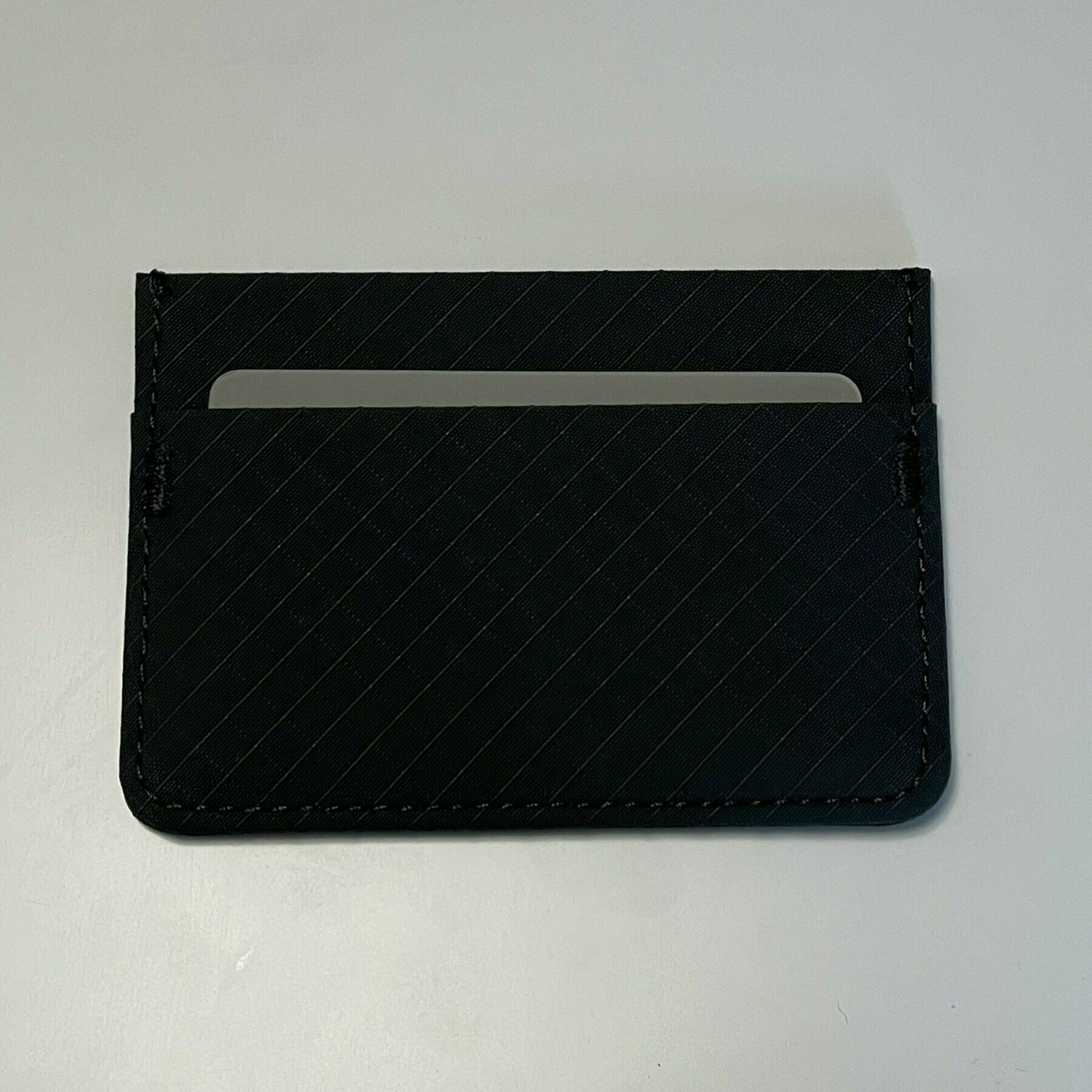
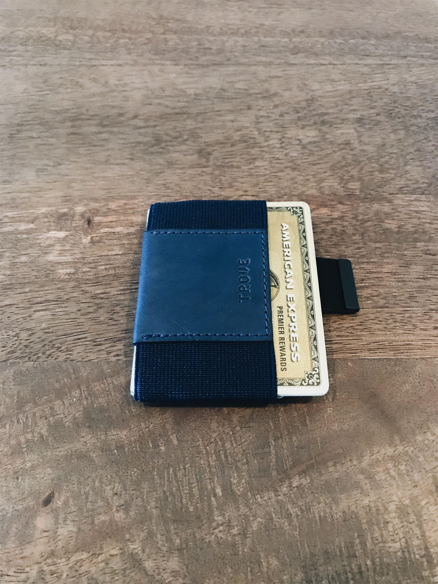
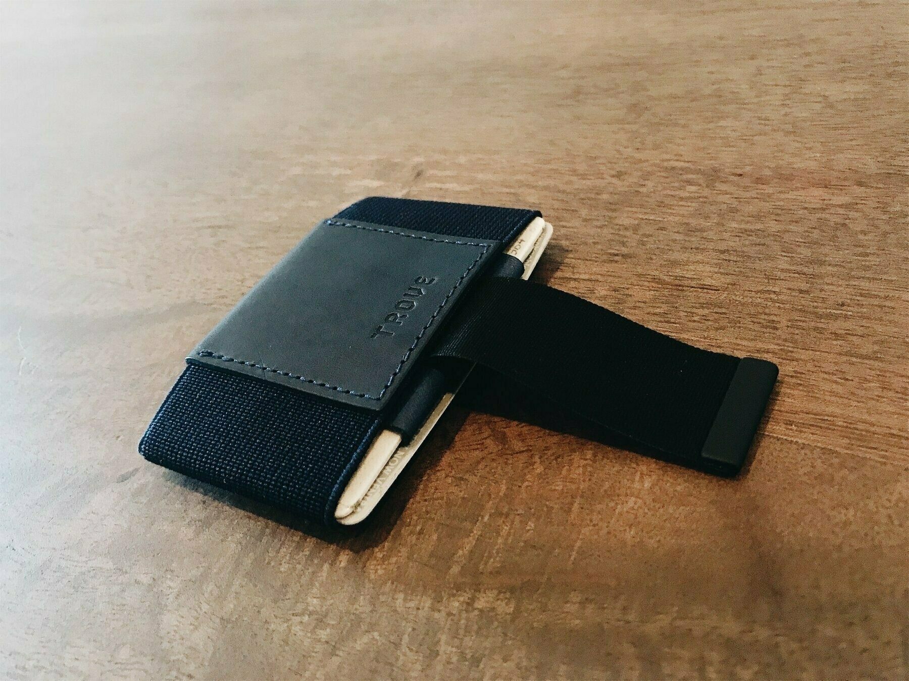
Been a while since I’ve tried a new wallet. After using the Trove wallet for years, a new cardholder release from Aer (a San Francisco outpost focused on sleek bags and accessories) caught my attention.
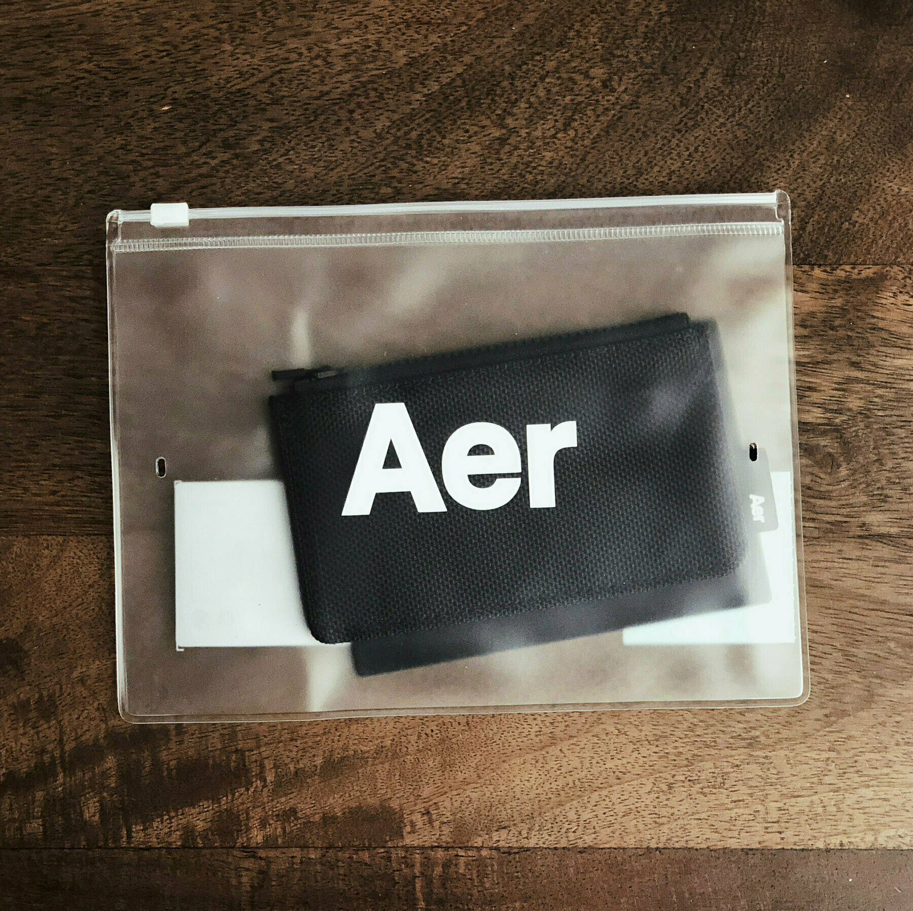
Wrought of 1680D Cordura ballistic nylon and lined with a microfiber interior, the smartphone-sized wallet is a handsome execution to both hold and look at, and functions well for day-to-day use. Several features set this apart from my default Trove:
The zippered pocket, while not new to wallets (Bellroy has plenty of options with it), is phenomenally well executed here. It's small and rests almost unnoticeably against the zipline, minimizing its footprint. I’ve been so used to triple/quadruple folding US cash that it’s a great convenience not to have to anymore. And the reduction of a keychain in the summer months (sans winter coat pockets) has been terrific. My only extra daily carry aside from this wallet and my phone is the occasional car dongle when I need to drive. That’s it.
<div class="sqs-gallery-meta-container">


</div> <!-- END .sqs-gallery-meta-container -->
Overall, the card’s quality build looks like it’ll hold up. The card slots are fine, though it’s much easier to pull out the top card than the others due to the thick-stitched rims (and I do miss the Trove Swift’s pull tab, which at first seemed unnecessary but has grown into a pleasant, tactile luxury). And the zippered pocket is a welcome change — while not elegant, it stores cash, keys, and a few extra cards while keeping the entire wallet profile fairly slim. For the reduction in additional EDC needs alone (especially with limited pockets in the summer), the Aer Cardholder is recommended, and could very well replace any ultra-slim wallet you have if you’re looking for the specific benefits it brings.
Trucking through modern television series is usually an exercise in exuberance or exhaustion, no matter how good or demanding a show turns out. Of all the substantial dramas, quick-witted comedies, and metaphysical laments, one show — a network show, of all things — captured my attention in a way that many shows haven’t: it was a joy to watch.
I’m talking about Michael Schur’s NBC show, The Good Place, a drama-comedy that came seemingly out of the blue, and since its first episode has been one of the easiest and most delightful shows on television. The writing is quick-witted enough, the material substantial enough, and the concept entirely metaphysical. How does a show capture so many things at once without being burdened by its own complexity?
Looking at Shur’s backlog of work is telling, I suppose. He wrote, produced, and directed a number of previously successful shows, contributing to many cultural milestones such as The Office (US version), Park & Recreation, Brooklyn Nine-nine, Master of None, and Saturday Night Live. He also dabbled in the Black Mirror episode “Nosedive” as its writer, one of the more ludicrous but pitch-dark comedy episodes of the future-shock Netflix series. But for The Good Place, a certain kind of nonchalance permeates its very soul. No one character dominates (though I would argue Kristen Bell’s Eleanor and Ted Danson’s Michael steal the spotlight), and the story is smoothly unwound over a sprint of 25 minutes per episode, each one ending in a credits sequence cliffhanger. The entire format begs you to binge watch without feeling bogged down in a mountain of episodes (each season squares off at just ten episodes a piece).
The Good Place is at its core a show about relationships among four key characters, and whose narrative tackles karma in a constructive and deconstructive way — all in an afterlife setting. The premise is keen on exploring absurdist situational humor, and is at its strongest with character interactions that take full advantage of the quickly-developed dispositions of each of the show’s stars. Michael operates as a kind of foil for everyone’s delights (and toils), sound-boarding off everyone's reality check of the afterlife's meandering eternity.
What perhaps helps set this show apart from many others competing for your attention is the colorful sets and nearly cartoonish narrative brokered through bubbly music, jovial cinematography, and dialogue bantering that exudes a PG-style appropriateness while nodding gracefully to a cleverer audience’s intellectualism. The Good Place sits in stark contrast to HBO’s dreary, somber The Leftovers, but intriguingly both share similar stretches of exploratory existentialism. Of the two, I certainly feel better after finishing an episode of the former.
In a cluttered world of show choices — many of which are exceedingly excellent — The Good Place stands out for its unusual territory and easy format, and has something almost everyone can find delight in.
My wife recently jetted over to Iceland for a quick few days with her sister and a friend. When she arrived back, she left a few goodies for me, one of which was a curious, “handmade” concoction called Smoked Lava Cheese. Though I won’t claim I’m a connoisseur of cheese by any stretch, I would consider myself an enthusiast for the age-old custom of melting a pile of cheese into a merged form and eating with a fork. This may sound strange, or maybe you’ve done it (either way, I recommend doing it, now?), these little circular cheese bites remind me exactly of this practice. Except in portable, snack form. And that’s a good thing.
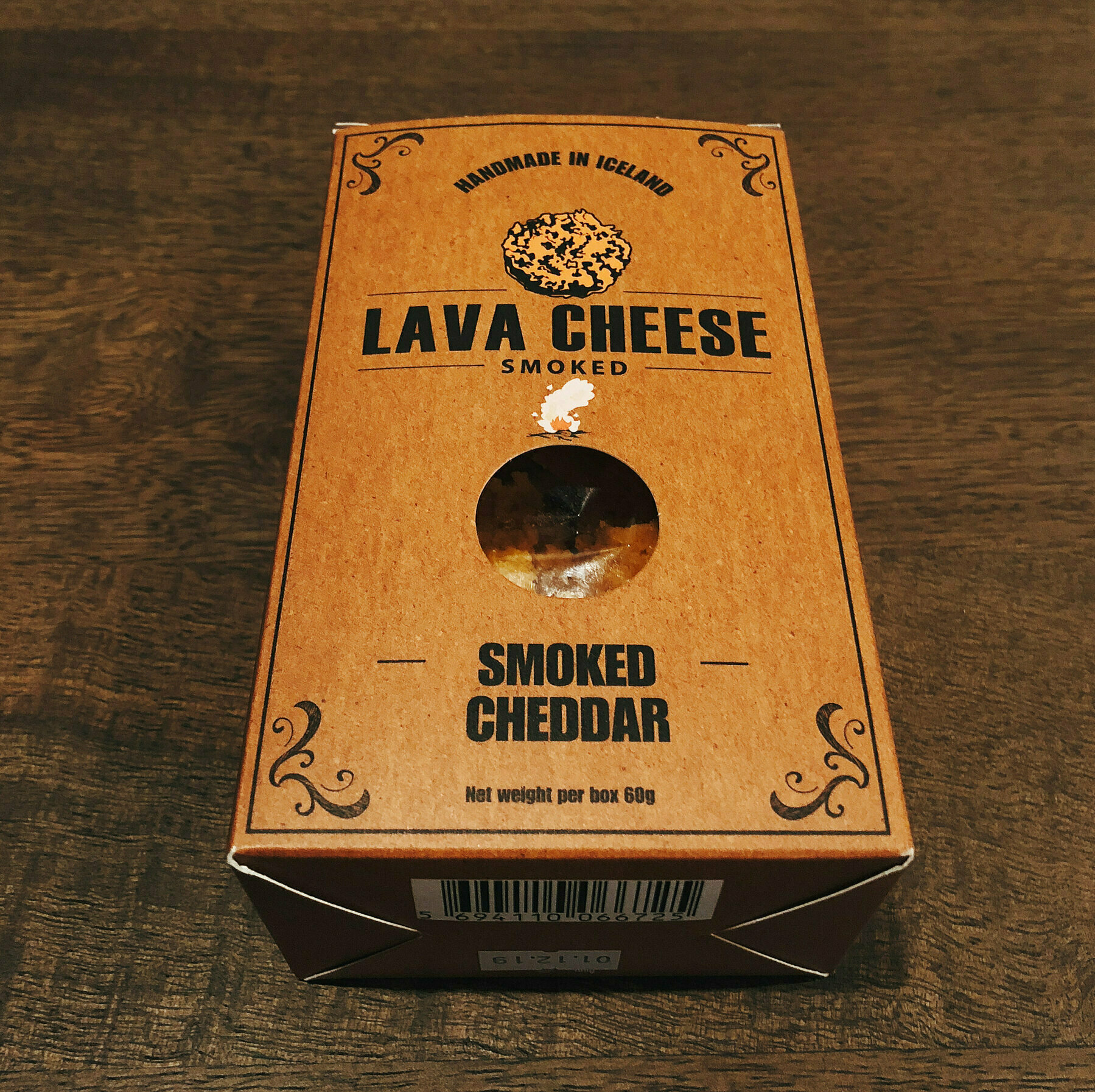
An Icelandic snack made from “pure” cheese, Lava Cheese is a brand that began in Iceland back in December of 2016, engineered by the founders Guðmundur Páll Líndal and Jósep Birgir Þórhallsson. As they state in their origin story:
The idea of a snack made from pure cheese came to us when we realized the best part of a grilled cheese sandwich is the melted cheese which hits the grill.
So right you are. I’ve always loves the crunchiness of the slightly hardened cheese bits from microwaving or oven-heating nachos (the shredded pieces that missed the tortilla chips and get a heat-flash during the warm-up), which gave me the idea of doing this when I was a kid. Skip the chips and just toss a pile of shredded cheese on a plate, microwave for 1:30, and there you go. Pure cheese. I’ve since migrated to using a small egg-sized pan to do the heating work, and at this age, it’s only once and a while. But… Lava Cheese. These Icelandic guys came up with a few variations, and I’m very thankful Ashley brought me home a box.

Since the cheese has been “smoked”, there is a slightly different flavor than when I’d do it. You can feel the hardened cheese texture with your tongue, which nails the first part of the idea of crispier cheese. I suppose, according to the company’s naming convention, this texture reflects the Icelandic lava fields. I’m terrible at describing tastes, so from here, you’ll likely experience a harsher aroma of cheddar, and a sharper association with the cheese you’re likely most familiar with, just restructured in harder, less dairy-like form. It delivers, though, and I have to imagine it’s a better snack than some faux bullshit cheese flavorings from Cheetohs or whatever other hell-spawn snack food from PepsiCo/Nabisco/Mars.
While I was able to enjoy the Smoked Cheddar version, I found that after researching the company’s other products, they also have a Crunchy Cheese series that includes Licorice Root and With Chili. The largest hurdle here is that line of snacks is only available at retail in Iceland, though they hint that new locations are coming soon. I certainly hope so, as I can attest to the magic of this stuff, and think it would do well in any other country on the planet. In the meantime, fry some cheese on your own, toss bacon in there, whatever it takes — it’s an easy, decadent, go-to late-night snack.


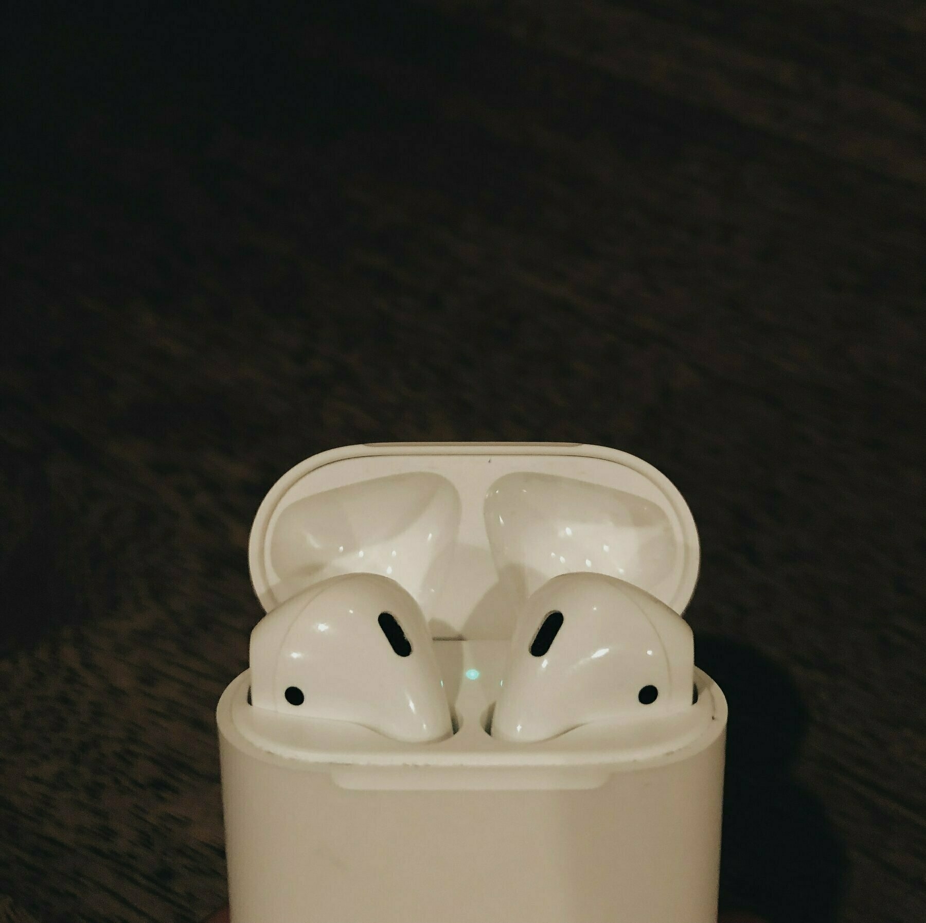
While the unveiling of Apple’s AirPods at last year’s September iPhone 7 event was met with both awe and meh, it’s one of those products that you have to use to appreciate. Ignore the aesthetics and your assumptions regarding their audio output quality, and instead fixate on:
While all these points of contention are not deal breakers for any traditional (or even wireless) headphones or earphones, they do illuminate the possibilities of completely wire-free ear buds and new kinds of audio platforms.
Since it’s been over a year since Apple and other companies like Bragi have released this new kind of earphone (“truly wireless” seems to be the current moniker for them), a lot has been said, written, and discussed about their usefulness and application. I’ve only had the AirPods for the latter half of 2017, but I’m ready to provide a perspective on them.
Some perceptive technology writers have indicated Apple’s master strategy with personal devices is shrinking and handing-off capabilities from one device to another in its ecosystem. Whether that will come to its full realization, the AirPods function exceptionally well today as truly wireless earbuds, and their bridge to Siri expands their convenient usefulness exponentially. Here’s what I like about them:
The AirPods aren’t without issue, though I must say for a first generation Apple product, it’s about as good as it gets. The last time they nailed an accessory so well the first time was probably the original AirPort WiFi router. Here’s a list of things I’ve noticed after using them for several months that derail them from perfection, but could be iterated via improvements in future versions.
AirPods are my favorite Apple product of the last few years, and have already become my second-most used device next to my iPhone. They are great for music while quietly getting ready in the morning, the perfect companion for my morning commutes listening to The Daily and The Intercept, and a pleasure to pop in for the evening jaunt home listening to whatever’s left in my podcast queue. I’ll even slip them in a few times during the day at the office to catch a quick track or two while cranking through emails. While I prefer using my Bose QuietComfort 35s when flying (since they cancel out the miscellaneous noises in-flight), I have used the AirPods a few times with the wife while traveling and watching a movie together, and they work just fine as long as the volume is cranked.
Highly recommended.
You can pick them up at [Amazon for $160][4].
The team behind what I've called (and remain firm on) the best slim wallet available have taken to Kickstarter to rev up funds for the next phase of its wallet, which they call Trove Swift.
The fundamentals of the original wallet remain intact:
What's different, however, is one of the available slots access to stored cards. As the creators state on their Kickstarter page:
Our backers and customers over the last three years have given a lot of feedback on the TROVE Wallet, they love the versatility of having 3 separate compartments, the quality of materials and workmanship and the compact and minimalist aesthetics. The TROVE Swift retains all of the qualities our customers love about the original wallet and adds a quick access pull-tab. We know everyone has that one card that they use everyday more than others, and we wanted to improve the speed and accessibility by adding the Swift pull-tab.
To confirm, the single, obvious differentiation between this version of the Trove wallet is the pull-tab. I was actually surprised by this when they graciously sent me a review unit. So let's get this out of the way: this is an impressive pull-tab. They summarize having tested several different materials for the ribbon and the pull-tab itself, finally landing on a union of polyester ribbon and coated metal tab. The ribbon feels like a micro-sized version of a belt buckle of the smoothest variety, and the feeling it provides when you glide it out of its resting place is a tactile pleasure. At 0.3mm thick, it's indecipherable as part of the wallet's in-pocket feel, and the tab itself only juts out slightly once a card or set of cards are placed in the one slot it functions in.
As a functional pull-tab, it far out-performs and out-feels the pull-tabs in Bellroy wallets, and a week in, feels entirely up to the task of long-term viability.
But is a pull-tab what the Trove needed?
Honestly, it brings nominal value to the wallet's design and functionality. It's not unwanted or unwarranted -- the feature is squarely about improving accessibility of a favorite set of cards. But of the two core slots with easiest accessibility of cards, neither caused any problems pulling the cards out in the original version of Trove (those front-facing cards in a stack prodded out just enough to easily grab with a finger). The more difficult-to-access single-slot (I'll call it the slot on the "bottom"), is actually where I think a pull-tab would have been more useful. This slot is typically where I dump my RFID office access card and another one or two rarely used items. But because of the tightness of the wallet, that tends to be where it's a little more difficult to stick a finger in and extract a card.
Where the pull tab does benefit the user is when you need to extract cash. While I usually don't carry any currency, if I do, I always fold it three or four ways to fit into one of the two easier "top" slots, and jam it into the crevice. With the cash resting against a card in the pull-tab slot, the feature works great -- the cash pulls out swimmingly.
Overall, the Trove Swift is an excellent iteration on what I continue to deem the best slim/minimal wallet you can buy. Whether you care for the pull-tab or not, Trove still is the right choice.
Growing up, a summer seldom went by that didn't include copious amounts of steaks, hot dogs, and burgers sizzling on a propane-powered grill out on the deck. My Dad was a fastidious griller, and those afternoons or evenings when grilling was our main meal, it served as fun break from the usual stove or fridge-spawned dinners.
It’s been years — well over a decade — since I’ve been able to truly grill after my move to Chicago. My roommate/buddy and I actually bought a smallish Weber grill back in 2013, but it was dinky and powered by a camping-sized propane canister. Now, having just moved to a new apartment with a fairly large deck just this past month, we lucked out to receive an early wedding gift from my parents — a Weber grill. Specifically, we are talking about the highly-reviewed Weber Spirit E-210. The next week was very exciting.
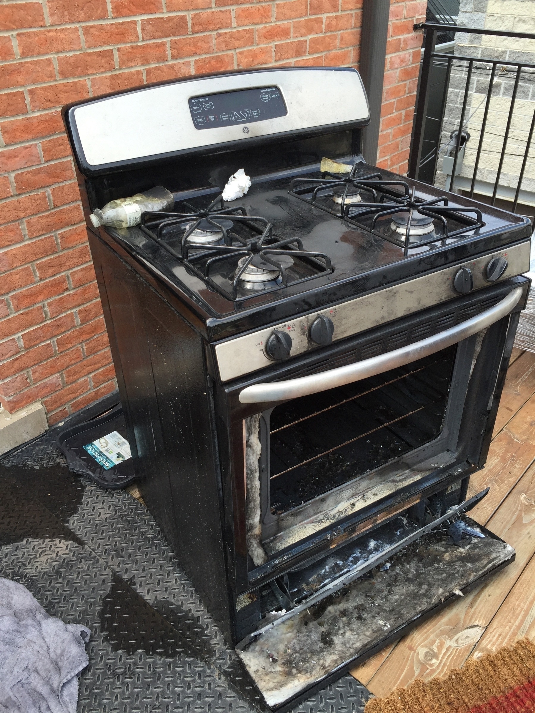
It’s worth noting that about three days into moving into our new place, our unit’s stove exploded. We’d been preheating it for a meal and things went haywire (General Electric should be ashamed of whatever model was installed at our apartment — the model number was burned almost completely off, so I can’t publicly slander them as accurately as I’d like). So as you’d expect, we were hankering to fix something heated to eat. Enter: the grill.1
My Dad had it ordered at the Home Depot not too far from my apartment, so I took the car over one weekend and loaded that sucker in the backseat. Amazingly it fit laying horizontal in the backseat, pre-built at Home Depot (which I’m thankful for, because I probably wouldn’t have had the patience to put it together the next day). I had to leave it in the car overnight anyway, because I needed Ashley’s assistance getting it out of the backseat and up the two flights of stairs to our deck. This, of course, happened the next day.
Once this whole thing was set up, it was fairly straightforward getting it to work. The only concern I had was hooking up the LP tank. For some reason, the first tank I had challenged me with a faulty valve (the thing wouldn’t turn to open), so I had to return it to Home Depot for one that worked. And it did.
Designed for the space-conscious, the Weber Spirit E-210 is a great fit for tight spaces. While our deck is fairly large, I can’t say the next place we rent (or buy) will have as spacious a layout — this grill should fit snug into almost any city deck. It comes with two metal side-tables that fold down (making it even more compact). For reference, it measures 45½ H-by-50 W-32 L-inches. Two top-ported linear burners output 26,500 British thermal units (of which, I’ll admit, I know little about), but it does quickly heat the 360 square inches of cooking surface area. And since we’ve already had people over to grill with us, I can say that the cooking surface accommodates meat and veggies for 3-5 people.
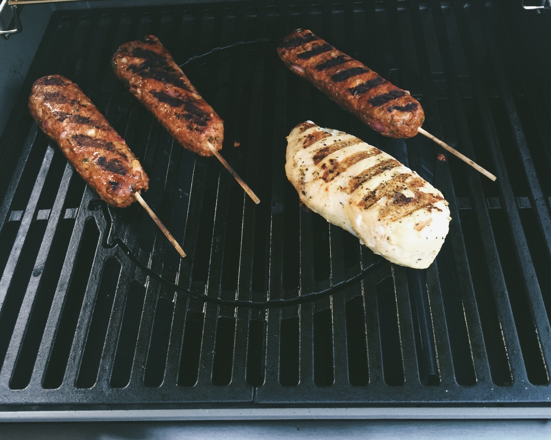
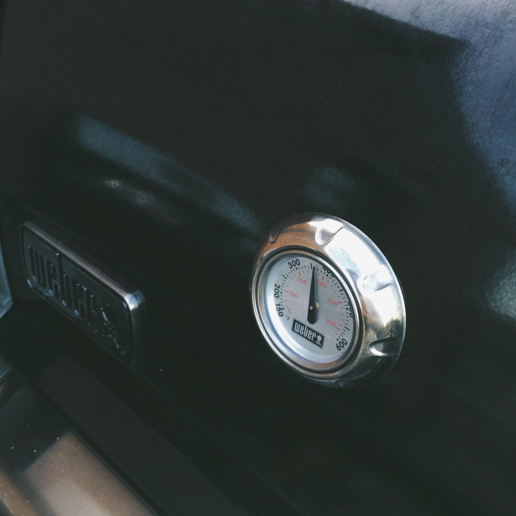
The controls are deceptively simple. Twist the left knob to kickstart the crossover electric ignition (which does require a AA battery, included with the grill), and flip the second knob if you want to crank the heat up for some high-degree cooking. While I haven’t pushed it to the limits, I’ve heated it fairly hot at around 475 degrees, and it only takes a few minutes to reach that cap. The porcelain-enameled, cast-iron grates are very easy to clean with a steel-bristled brush, and the middle center grate pops out with ease. Weber includes a cast-iron pan to replace it if you’re in the mood for cooking anything inside it (like cast-iron pizza or veggies), and there’s even an add-on pizza stone if you’re ambitious. There are some neat additions to this grill, though how neat is hard to say since I haven’t used any other grill. Weber has what you could call burner shields (they call them Flavorizer Bars) which sit like long pyramids over the burners and prevent food drippings from sizzling directly on the flames. The bars also allow for close proximity smoke to raise up right under your burger and hot dog meat to, I guess, simulate a charcoal-like flavor (hence Flavorizer). Who knows how gnarly this is — all I know is that you make a mean burger on this thing, and sure, it takes kind of charcoal-smoky.
Some other nice details:
I can’t complain about anything related to this grill. While I don’t know too much about the material build of it (I’ve read that it is primarily made of enameled steel, something “Weber is very good at”), but based on using it almost every single day for two weeks straight (remember, no stove!), the thing hasn’t stuttered or disappointed once. As usual, I’ll probably update this review in six months or a year to check in again (included its winter use in Chicago).
If you’re scouting for a compact, powerful little grill, the Weber Spirit E-210 won’t let you down.
→
It's been a while, but I'm back at the wallet reviewing game. This time we have a marvelous new entry with a fresh material concept that hasn't been represented in many of the slim wallets I've tried over the years. It's also a bifold wallet, which aside from a few Bellroys, is not a particularly popular build choice when it comes to slimness targets. The good news is: SlimFold Wallet delivers despite a couple design peculiarities.
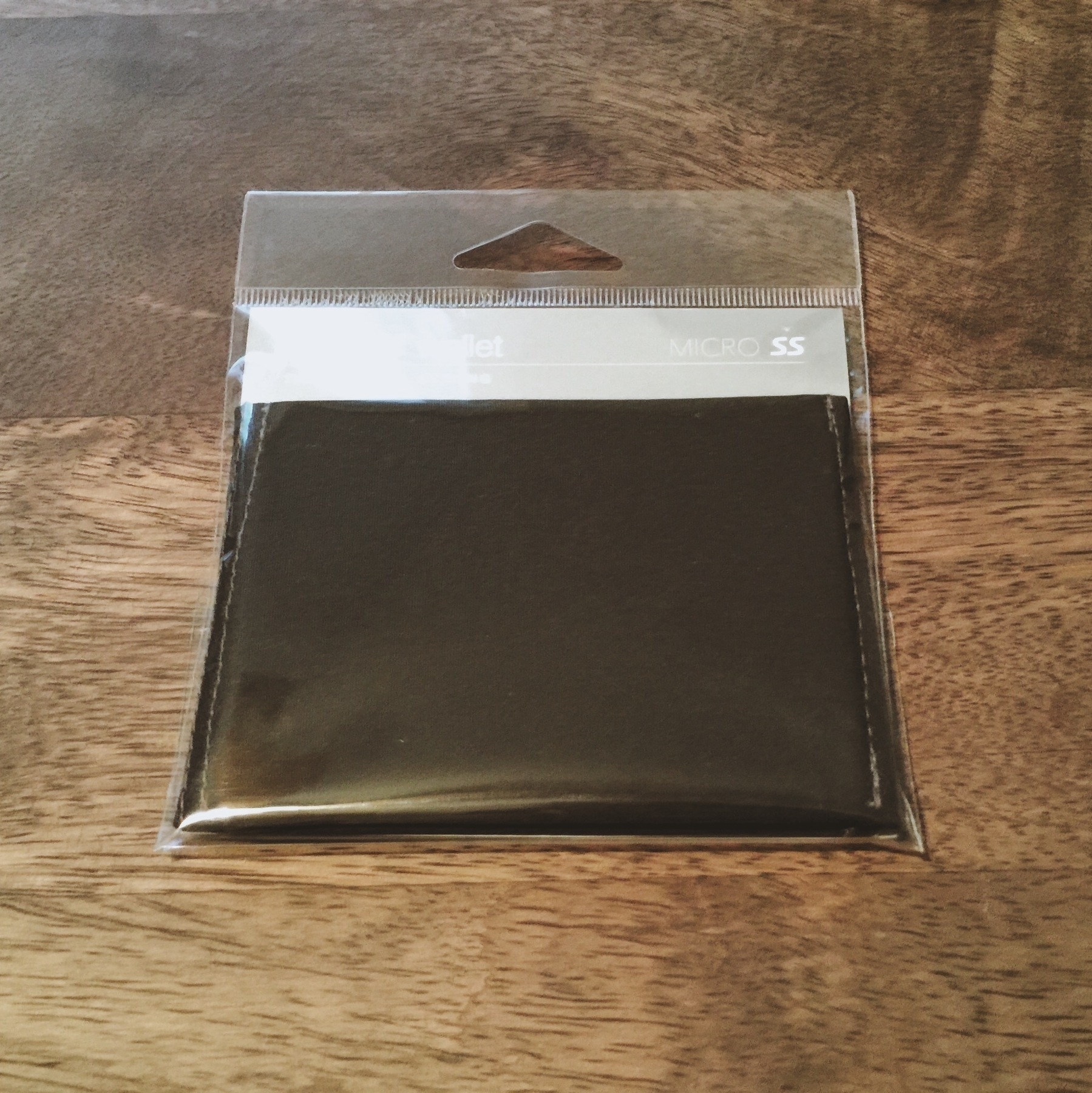
The SlimFold Wallet arrives in a sealed plastic slip. This is the first of any trendy wallet I’ve seen arrive in such packaging, and it was a bit off-putting. Cheap, plastic wrap with a peg hole under-represented the wallet as uninspiring; it could be hung on any department store shelf like the rest of them.
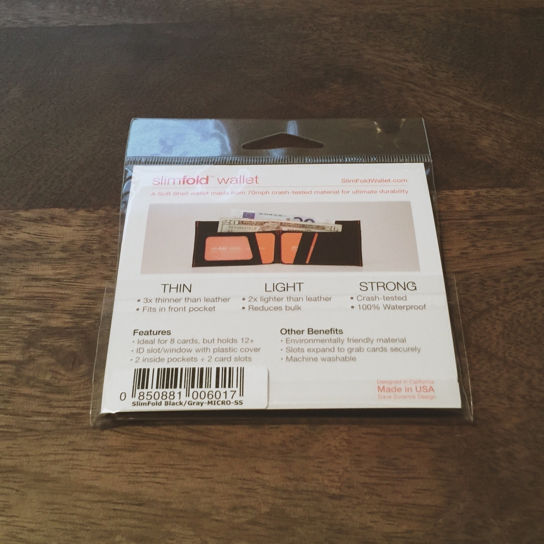
Opposite the front of the packaging, the insert inside the plastic stated a number of SlimFold Wallet tentpole features, including its thinness (“3x thinner than leather; fits in your pocket”), lightness (“2x lighter than leather; reduces bulk”), and strength (“crash-tested; 100% waterproof”). In addition to all its compelling features, the material is also machine washable.
Great. I'm intrigued.
Plastic packaging aside, these were features I hadn’t seen unified into one wallet before. My current go-to wallet, the Trove, is wrought from a thick elastic band paired with leather. While a fantastic wallet, it’s definitely not waterproof, and I certainly wouldn’t wash it in a machine (or by hand). In contrast, the SlimFold Wallet material used is also lighter and thinner than any of the elastic-band based wallets I’ve tested before it. For all the compactness of the Trove and Supr Slim wallets, and even though the SlimFold Wallet is bifold, its standalone material is thinner and lighter.
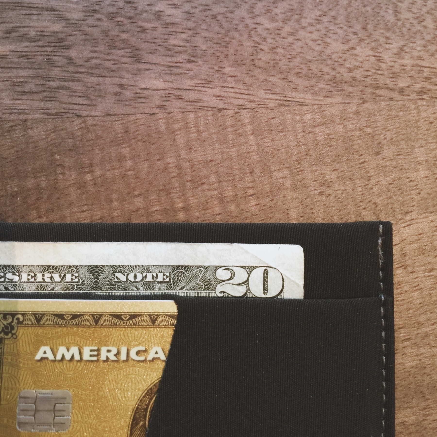
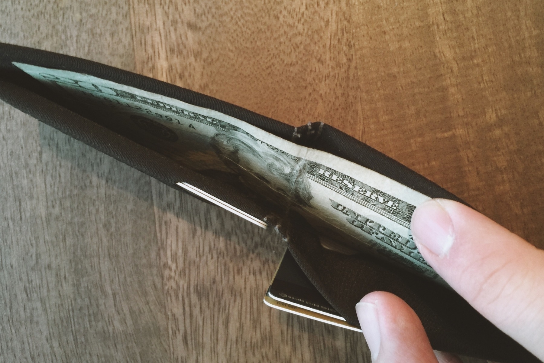
When you pry it from its casing, the wallet is surprisingly light and compact. It also opens and lays completely flat, which is an affordance I’d never seen before in a bifold wallet. The wallet's composition is built from one long piece of thin, fabric-like material (they call it Soft Shell), and stitched and cut together in a clever way. There is one opening for full bills (no more quad-folding my dollars like an idiot with the Trove, one “ID slot/window” with plastic cover on the left side, and two slide-in slots on the right side.
Since the material is so thin and light, the designers decided to reinforce the wallet with plastic inserts against the back wall (where you can store either cash or more cards). Optically, these inserts don’t draw attention to themselves, but feeling them and knowing they’re there makes the wallet feel jankier than it is. You can remove them, but the wallet begins to look and feel like a deflated balloon, mostly because the inserts keep the wallet a certain size and regality, and without them, the top of the wallet flimsily folds over the stronger, card-enforced body. With both inserts in and the wallet loaded in all its slots, the wallet does not open as naturally (or as wide) as you’d expect when looking to pry out dollar bills, and it no longer lays as flat when closed. But with a reasonable number of items in there, it looks and sits just fine.
Aesthetically, the wallet is true minimalism. The color is black and without texture, the slot cuts inside have no ornamentation, and the only branding is a small “slimfold” logo pressed on the lower-right inside slot. The only knock against it is the colored stitching, which can be seen along the bifold seam in the back, and along the vertical sides at the opening of the wallet. Using black stitches would have hidden the constructed nature of the wallet, and avoided the distracting, slightly slanted stitch lines. It’s a small thing to note, but it does draw away from an otherwise precisely-crafted product.
In terms of utility, SlimFold Wallet claims to be ideal for eight cards, but will hold up to twelve. For context, my current load out for the SlimFold Waller is the following:
If you count my office card as two, since that’s about the weight/thickness of it, you could comfortably say that seven cards is about the best it can do before feeling like a normal, fat wallet. I hardly ever carry cash, but a few bills inside don’t add too much thickness to it, but after several bills (or more cards), the wallet’s tolerance for laying as flat (when closed) on a tabletop shortens. (This is really the measure of slimness I’m grading it against, since it’s up against non-folding wallets of a similar competitive arena.)
It took me a while to re-acquaint myself with a bifold wallet, as it’s a style I hadn’t carried in over 10 years. Luckily, the material itself was thin enough for me not to notice while walking around with it in my preferred front-left pocket. Since the size is larger than the Trove, and the cards inside aren’t so tightly condensed, the wallet actually feels like it lays flatter against my leg. Without a proper comparison to every bifold wallet in the world, I can say it's the thinnest design for a bifold I've ever seen and used.
Though the wallet is slim and unobtrusive, there is one design choice that is noticeably a nuisance, albeit minor, to every day use: the card slots. It seems so obvious at first, but it actually took a full week of use to pinpoint it: The front panel card slots (the most used ones) face each other across the wallet's fold. Nearly every other bifold wallet positions the card slots upward (for vertical insertion and extraction); the SlimFold Wallet, however, requires you to load them horizontally. This causes an issue with the agility of every day use: you have to open the wallet completely to extract a card. With other bifold wallets, extracting a card is as simple as partially opening the wallet and sliding a desired card out of its slot. With the SlimFold, you need to either lay the wallet open flat in your hand, or fold it back on itself and then slide the card out. Again, it's a small inconvenience, but it's enough of a change in pace that it's noticeable. And while you could argue this is actually a more secure way to keep the cards from unintentionally slipping out, that never seems to be a problem.
The other complexity added to this layout is stacking cards in the slots. The right-side slots are designed in such a way that if you grab the rear card (I store two in each of the “horizontal” slots), it becomes difficult to navigate it back into the rear slot after use since the slots are cut from the same sheet of material. I'll quickly try to do it while I'm getting past a register or bus terminal, and the card will often hit the inseam of the slots (that optically separates the two horizontal slots, when it’s really just an aesthetic card slot separator bar of the same material sheet), or just tuck in right behind the first card in its same slot. It sounds inconsequential, but in use, it is slightly slower than top loading cards vertically into the same slot.1
Other than extracting items out of the wallet, its daily use is pleasurable. The wallet is unobtrusive, lightweight, and easily slides in and out of your pocket. The Tyvek® MICRO does not pick up lint or other pocket debris like some elastic wallets do. And overall construction is durable enough for any amount of beating (I'll remind you that they state it's been crash-tested). In summary, the SlimFold Wallet functions as it should -- use it for commuting and paying for things, otherwise keep it in your pocket.
The Soft Shell SlimFold Wallet is available on their website’s store for $45; paying $3 more will get you an RFID-enabled version. You can also purhcase it on Amazon.
The SlimFold Wallet is the right choice if you're looking for a slim, tightly constructed wallet with waterproofing and tear-resistant design. If you're looking for sleek, fast management of cards, I still recommend the Trove as the go-to slim wallet.
I received word from the manufacturer that they are planning to revamp the packaging, addressing my initial concerns regarding first impressions with basic plastic wrapping.
They also have been sampling a version of the black wallet with black stitches, which they plan. To introduce soon. This will alleviate visual distinction of the stitches, contributing to an overall seamless integrity.
Lastly, I misspoke about the material used in mine (and have subsequently updated my review accordingly). SlimFold wallets come two different materials:
The one I reviewed was the Soft Shell, which is the thicker of the two but provides more durability.
Lastly, while the one I reviewed does feature the inside slots open towards the center (making them more secure, as I had mentioned), there is also a model that features vertically open slots to slide cards out the top.
Full disclosure: I was given a review model of the MICRO Size Soft Shell model from the manufacturer; this gesture did not impact my perspective on the wallet in this review.
How do we deal with the fragility of life? How do we cope with lost love and lost family? How do we contend with the forces of nature, the forces of mortality? It took some patience, and some diligence, but I powered through the first season of HBO’s The Leftovers through all the perceptively melancholy, depressing episodes to get here: season 2.
If you for some reason don’t know, HBO endorsed and funded the creation of a series based on American author Tom Perrotta’s novel about the sudden disappearance of two percent of the world’s population, and the events that followed in a small town. That’s actually all you need to know. This series isn’t necessarily about a post-apocalyptic struggle for characters traumatized by a single, life-defining moment; rather, the series in an introspection on pathos and how to interpret the unknowable: through theological or logical reasoning. To build a show respectful of both disciplines of thinking, whilst furthering the development of characters and theme, is quite an accomplishment for show runner Damon Lindelof (yes, the same Damon Lindelof who brought us Lost).
<div
    class="
      image-block-outer-wrapper
      layout-caption-below
      design-layout-inline


    "
    data-test="image-block-inline-outer-wrapper"
>


    <figure
        class="
          sqs-block-image-figure
          intrinsic
        "
        style="max-width:100%;"
    >


      <div


          class="image-block-wrapper"
          data-animation-role="image"
data-animation-override
      >
        <div class="sqs-image-shape-container-element


          has-aspect-ratio
        " style="
            position: relative;

              padding-bottom:20.55137825012207%;

            overflow: hidden;-webkit-mask-image: -webkit-radial-gradient(white, black);
          "
          >

              <noscript><img src="https://cdn.uploads.micro.blog/25423/2023/018b5c32b1.jpg" alt="" /></noscript><img class="thumb-image" src="https://cdn.uploads.micro.blog/25423/2023/018b5c32b1.jpg" data-image="https://cdn.uploads.micro.blog/25423/2023/018b5c32b1.jpg" data-image-dimensions="1197x246" data-image-focal-point="0.5,0.5" alt="" data-load="false" data-image-id="566fab9e05f8e2da90829a93" data-type="image" />

        </div>
      </div>


    </figure>


</div>
And this is coming from a guy who drops more shows than I’ve finished based one or two perceptively poor episodes, never to return or give it a second chance. Oddly enough, I made it through the entire first season of HBO’s The Leftovers without giving up, even though I came close to ditching after season one’s relentless string of depressing narratives. And I’m really glad I stuck it out: Season two is an incredible ten episode arc that rivals the best shows I’ve ever seen.
The first season of Damon Lindelof’s mystery box series needed to set the tone and stage for the myriad of themes it sought to explore: foremost grief, but also love, pain, family, loss, connection, spirituality, and religion. And while packaged well, the first season seems disjointed — there wasn’t an underlining narrative arc that binds the story from episode one to episode 10. This is partly why season two was such a shocking experience. From the rebooted credit sequence (absolutely astounding in its simple artistic design with a meta song mockingly drumming in the background) to the wild opening segment of a cavewoman’s struggle in episode one, to the beautiful round-table close, the narrative arc is perfect and the execution extraordinary. My love for this season could also stem from my soft spot for transcending narratives that explore human existence, rationale, and being, but even without that as a reason to explore its story, The Leftovers is a spectacle to behold, albeit its composition in subtle strokes.
Season two also solidified an expectation for the show, and fulfilled an achievement Lindelof had been seeking ever since embarking on Lost back in 2004: this show (and that one) seeks to explore the nature of our connectedness with each other here on earth, even through the unexplained phenomena of life, death, dreams, and the spiritual realm. When JJ Abrams and Lindelof first explored this notion in Lost, they built a complex, overbearing mess of mysteries conjured along the way, and were never able to satisfactorily pay it off. For all its dramatic heaviness, Lost was predicated on its mysteries — a trickling of questions, clues, and cliffhangers stringing one episode to the next with a slow burn of answers over 121 forty-five minute segments. But even Lindelof admits that the audience was too smart for this underpinning of the series, and eventually Lost disappointed because it actually wanted to focus on something other than the jumbled mess of plot holes and mysteries that gradually were shat on by ambiguous (or non-ambiguous) answers and revelations. On the other hand, The Leftovers has proven that it is not predicated on its greatest mystery (why and what happened to millions of the world population, who seemingly vanished all at once at the same time on October 14); rather, it is predicated on the underlying relationships and questions of being through thematic explorations of the struggle of life.
<div
    class="
      image-block-outer-wrapper
      layout-caption-below
      design-layout-inline


    "
    data-test="image-block-inline-outer-wrapper"
>


    <figure
        class="
          sqs-block-image-figure
          intrinsic
        "
        style="max-width:100%;"
    >


      <div


          class="image-block-wrapper"
          data-animation-role="image"
data-animation-override
      >
        <div class="sqs-image-shape-container-element


          has-aspect-ratio
        " style="
            position: relative;

              padding-bottom:42.92527770996094%;

            overflow: hidden;-webkit-mask-image: -webkit-radial-gradient(white, black);
          "
          >

              <noscript><img src="https://cdn.uploads.micro.blog/25423/2023/5d6f001762.jpg" alt="" /></noscript><img class="thumb-image" src="https://cdn.uploads.micro.blog/25423/2023/5d6f001762.jpg" data-image="https://cdn.uploads.micro.blog/25423/2023/5d6f001762.jpg" data-image-dimensions="1258x540" data-image-focal-point="0.5,0.5" alt="" data-load="false" data-image-id="566fadb8c647ad0f11dd29f8" data-type="image" />

        </div>
      </div>


    </figure>


</div>
Sure, you could argue Lost attempted to do this the entire time, but that’s not the reason any of us were watching the show. We wanted to know what happened next in the unfolding of the overall mystery of the island and its supernatural impact on all the primary characters. But not once during season two of The Leftovers did I feel I needed a clue or answer to its stage-setting mystery; neither did I feel the need to necessarily receive an answer for all the other narrative arc questions that cropped up (mostly because season one set the expectation that I oughtn’t get an answer), so it was delightful to see the narrative threads (even the foreshadowing of episode one) perfectly ladder into the final few episodes to complete the story. There are still unanswered questions, but they don’t matter nearly as much. Now that the ground rules have been written, they are fully explored and enriched in season two: you care more about the characters, the balance of interpretation between the spiritual and the pragmatic, and the delicateness of life as we perceive it.
Are there forces moving us through life? Do we believe in them to reassure ourselves, to justify our actions? Do we not because it’s illogical? And does it matter? In some ways, the answer to these thoughts about ourselves and about the world of The Leftovers is perfectly colored during every Season Two episode by the new credits sequence — and the spectacularly chosen theme song “Let the Mystery Be” by Iris Dement. The refrain rattles thus:
“Everybody's wonderin' what and where
They all came from
Everybody's worryin' 'bout where they're gonna go
When the whole thing's done
But no one knows for certain and so it's all the same to me
I think I'll just let the mystery be”
Our characters travel through misplacement, abandonment, death, purgatory, revenge, misunderstanding, assumption, psychosis, and, through it all, familial love. The Leftovers has become a thesis statement on spirituality — can we rationalize tragedy, loss, and love through theology, or through the explicit actions of humans beings and their impact on one another, regardless of supernatural divination? Can anything truly be explained?
The Leftovers season two’s greatest ally in its conviction is its open-mindedness: there isn’t a right or wrong, true or false binary explanation for any of the events that transpire. You watch characters do awful things to remind the rest of the population that they are not safe regardless of the mathematical perception of safety based on what we think we know about the Departed; you watch characters seemingly die and resolve their purgatorial predicaments; you watch as the world burns and family perseveres. There are no easy answers with The Leftovers (or questions, for that matter). But if you watch both of the series’ current seasons, you will have a more informed lens through which to gaze at life's tectonic shifts of emotion and tragedy.
Back in February, I backed a Kickstarter project with a mission to remake the iOS keyboard. Unlike other third-party keyboards, this one specifically was taking charge for Apple devices only. When I gave them the five bucks or so it cost to back the project, I felt that this was a unique proposition, and was excited by the notion of a focused keyboard replacement (so many other third-party keyboards were and continue to be built for all operating systems, you'd think a focused app would take advantage of its core system better than one that wasn't).
And so the year went by until right around June when they offered a beta download for backers of the Next Keyboard project. I usually don’t test or run betas in lieu of a near-delivered product, but I was excited to try it out (I haven’t tried any other third-party keyboards on any of my devices before). Installation of Next (and any other keyboard) is a bit wonky. For the beta, they essentially provided instructions in the app proper, and the functioning keyboard wasn’t activated until you went into the Settings app > General > Keyboard and added it manually. (Apple could definitely improve this process in the future — it’s not a fault of the developers.)
Once installed, I gave it a whirl. That whirl lasted about five minutes as it was completely breaking the iOS experience with blank keyboards, preventing spotlight usage, etc. I uninstalled it immediately and decided to wait until the newer version came out.
And then the newer version came out a few months later. Went ahead and downloaded the app again. Same instructions, more or less. Did that. Added it. Wah-la. Much better already. The app transforms into a marketplace and provides all the settings for configuring your keyboard. Something I wasn’t anticipating (probably because I stopped following updates) was the ability to change the theme of the keyboard so fluidly. Nearly a dozen themes exist today, and I’m sure more are planned for the future. They all look great.
In addition to themes are stickers. If you’re familiar with Line or WhatsApp or apparently now Facebook Messenger, stickers are larger-than-emoji sized images that can be used when communicating with others — which is probably only done in a messaging or social media app. These stickers were free, but I’m assuming this is a marketing arena made to generate revenue, so the more sticker packs they come out with in the future, the more they’ll likely have the propensity to charge for them.
With all this being said — how does the actual keyboard function now that it’s been officially released? (That is, of course, the most important component of arguably one of the most important functionalities of a mobile device). To be honest, it’s a mixed bag. Here’s the rundown the of things Next does right, and where it has some misses.
Unfortunately, for all the great things Next does right, it has some major shortfalls:
Overall, the Next keyboard is a tremendous effort in squeezing a lot of functionality in a great, well-designed keyboard. Whether by its manufacture or through limitations in the iOS SDK, however, its problems outweigh its benefits and I can’t rightly recommend it until those technicalities are dealt with.
Let’s hope that the incremental improvements in iOS 9’s keyboard for iPad reinvigorate the third-party keyboard market to improve designs and functionalities (and prompt Apple to fix issues inherent in their SDK) so that we can continue to see improvements to the way we interact with our devices.
My new go-to, English-made wallet Trove has released a few more products over the past month, adding to their ecosystem of mostly integrated hardware. Since I had the equivalent of 20 GBP taunting me in my debit account, I bought both. A mere five days later, Royal Mail delivered them to my Chicago doorstep1.
<div
class="
image-block-outer-wrapper
layout-caption-below
design-layout-inline
"
data-test="image-block-inline-outer-wrapper"
>
<figure
class="
sqs-block-image-figure
intrinsic
"
style="max-width:2369px;"
>
<button
class="
sqs-block-image-button
lightbox
"
data-description="<p>(Pictured above: Trove Cable Clip)</p>"
data-lightbox-theme="dark"
>
<span class="v6-visually-hidden">View fullsize</span>
<div
class="image-block-wrapper"
data-animation-role="image"
data-animation-override
      >
        <div class="sqs-image-shape-container-element


          has-aspect-ratio
        " style="
            position: relative;

              padding-bottom:100%;

            overflow: hidden;-webkit-mask-image: -webkit-radial-gradient(white, black);
          "
          >

              <noscript><img src="https://cdn.uploads.micro.blog/25423/2023/93be40c7f0.jpg" alt="(Pictured above: Trove Cable Clip)" /></noscript><img class="thumb-image" src="https://cdn.uploads.micro.blog/25423/2023/93be40c7f0.jpg" data-image="https://cdn.uploads.micro.blog/25423/2023/93be40c7f0.jpg" data-image-dimensions="2369x2369" data-image-focal-point="0.5,0.5" alt="(Pictured above: Trove Cable Clip)" data-load="false" data-image-id="55a160b2e4b0852c3f77b637" data-type="image" />

        </div>
      </div>

        </button>


      <figcaption class="image-caption-wrapper">
        <div class="image-caption"><p>(Pictured above: Trove Cable Clip)</p></div>
      </figcaption>


    </figure>


</div>
So what’re the latest products? The Trove Cable Clip, a fairly straightforward leather product for clipping things together and the Trove TAG, a more complicated product that has three specific wallet-enhancing features.
As the name suggests, this is a clip. It costs £5.00, which seems perfectly reasonable for the build quality if you live in England, but it comes out feeling overpriced when you order with US dollars. Here’s a quick rundown of my initial thoughts:
Compact size that could be a good or poor choice for use depending on your other hardware. The Cable Clip fits snugly into the housing of the Trove wallet, but it would have been nice to see the dimensions on the product page — I wasn’t thinking very clearly when I ordered it (probably a drunk purchase), and it ends up that it does not clamp together the way I hoped it would around my RHA headphones. This is probably because the RHA earphones I use comprise thicker, stiffer cabling than the example Apple Earbuds used in Trove’s marketing. When I tried fitting the Apple Earbuds in the clip, it worked perfectly (I didn’t need to clip a half of the loop as I did with the RHA’s — see image above).
<div
    class="
      image-block-outer-wrapper
      layout-caption-below
      design-layout-inline


    "
    data-test="image-block-inline-outer-wrapper"
>


    <figure
        class="
          sqs-block-image-figure
          intrinsic
        "
        style="max-width:2411px;"
    >


        <button
            class="
              sqs-block-image-button
              lightbox


            "
            data-description=""
            data-lightbox-theme="dark"
        >
          <span class="v6-visually-hidden">View fullsize</span>

      <div


          class="image-block-wrapper"
          data-animation-role="image"
data-animation-override
      >
        <div class="sqs-image-shape-container-element


          has-aspect-ratio
        " style="
            position: relative;

              padding-bottom:100%;

            overflow: hidden;-webkit-mask-image: -webkit-radial-gradient(white, black);
          "
          >

              <noscript><img src="https://cdn.uploads.micro.blog/25423/2023/1a29151e91.jpg" alt="trove-cable-clip-with-wallet" /></noscript><img class="thumb-image" src="https://cdn.uploads.micro.blog/25423/2023/1a29151e91.jpg" data-image="https://cdn.uploads.micro.blog/25423/2023/1a29151e91.jpg" data-image-dimensions="2411x2411" data-image-focal-point="0.5,0.5" alt="trove-cable-clip-with-wallet" data-load="false" data-image-id="55a160f5e4b0037ee2c3c97b" data-type="image" />

        </div>
      </div>

        </button>


    </figure>


</div>
While the size is nice — it appears much smaller than competitor cable clips (due it needing to fit into the Trove wallet for storage, as needed) — it also could be seen as a hinderance. As mentioned above, it won’t work with larger earbuds or thicker cables, but most cables like short USB and Lightning ones, should be fine inside its clamp.
The Trove Cable Clip functions exactly like you’d image it to. As noted about its size, you just need to slip whatever clump of wound cable (or anything else you want to clip, for that matter) into its Veg-tanned Italian leather and clamp down the buttons. That’s it. That’s all it does. It’s a cable clip.
Since it's sized for the wallet, there’s the option of slipping it into your wallet to store while you’re using your earphones or other cable. In practice, however, I noticed that you need to have a smaller inventory of cards in the wallet because — depending on your setup — the Trove Cable Clip can cause some pressure against the other cards, bending the overall wallet to its will. This isn’t a problem if you only use a couple of the slots (configured so that there are three proper “slots”), but if you have a lot of cards in there, say six or seven, the thickness of the cable clip’s buttons widen the wallet considerably. It also doesn’t align with Trove’s role in minimizing your wallet and inventory, but then again, you don’t need to put the thing in your wallet when you’re not using it.
Like with the Trove wallet, the clip is made using the same kind of leather that’s found in the squared leather portion of their main product — the part that holds everything together. And as with the wallet’s leather, it’s genuine and solidly wrought. Though I’ve had the clip a short while, I imagine its longevity to be in line with any pure leather product: quite a while.
The product has a few adornments to note: the Trove branding is visible on the outside of the clip design, subtly embossed into the leather, and their “Reverse the Rules” tagline, along with a link to their site, adorns in the inside (which is never visible when you’re using the clip. It comes in a variety of colors, including black, blue, brown, green, grey, lime, orange, and a smattering of others. I’ve only seen one in person, and it matched my expectations of the colors seen on the site.
When I received Trove’s email announcing the Trove TAG, it took me a while to actually understand what they were peddling. Recognizing the increased technological complexity of the world around us when it comes to using debit and credit cards — contactless payments, card skimming technology — the company has attempted to add flexible intelligence to analog hardware. The Trove TAG is marketed as three products in one, and does, in practice, solve the issues that can stem from these real-world issues.
<div
    class="
      image-block-outer-wrapper
      layout-caption-below
      design-layout-inline


    "
    data-test="image-block-inline-outer-wrapper"
>


    <figure
        class="
          sqs-block-image-figure
          intrinsic
        "
        style="max-width:2270px;"
    >


        <button
            class="
              sqs-block-image-button
              lightbox


            "
            data-description=""
            data-lightbox-theme="dark"
        >
          <span class="v6-visually-hidden">View fullsize</span>

      <div


          class="image-block-wrapper"
          data-animation-role="image"
data-animation-override
      >
        <div class="sqs-image-shape-container-element


          has-aspect-ratio
        " style="
            position: relative;

              padding-bottom:100%;

            overflow: hidden;-webkit-mask-image: -webkit-radial-gradient(white, black);
          "
          >

              <noscript><img src="https://cdn.uploads.micro.blog/25423/2023/539742f887.jpg" alt="trove-tag-in-wallet" /></noscript><img class="thumb-image" src="https://cdn.uploads.micro.blog/25423/2023/539742f887.jpg" data-image="https://cdn.uploads.micro.blog/25423/2023/539742f887.jpg" data-image-dimensions="2270x2270" data-image-focal-point="0.5,0.5" alt="trove-tag-in-wallet" data-load="false" data-image-id="55a16144e4b0bdc9ce0bea99" data-type="image" />

        </div>
      </div>

        </button>


    </figure>


</div>
The leather-wrapped, card-sized slab does the following:
<div
    class="
      image-block-outer-wrapper
      layout-caption-below
      design-layout-inline


    "
    data-test="image-block-inline-outer-wrapper"
>


    <figure
        class="
          sqs-block-image-figure
          intrinsic
        "
        style="max-width:2241px;"
    >


        <button
            class="
              sqs-block-image-button
              lightbox


            "
            data-description=""
            data-lightbox-theme="dark"
        >
          <span class="v6-visually-hidden">View fullsize</span>

      <div


          class="image-block-wrapper"
          data-animation-role="image"
data-animation-override
      >
        <div class="sqs-image-shape-container-element


          has-aspect-ratio
        " style="
            position: relative;

              padding-bottom:100%;

            overflow: hidden;-webkit-mask-image: -webkit-radial-gradient(white, black);
          "
          >

              <noscript><img src="https://cdn.uploads.micro.blog/25423/2023/6888f70f71.jpg" alt="trove-tag-front-side" /></noscript><img class="thumb-image" src="https://cdn.uploads.micro.blog/25423/2023/6888f70f71.jpg" data-image="https://cdn.uploads.micro.blog/25423/2023/6888f70f71.jpg" data-image-dimensions="2241x2241" data-image-focal-point="0.5,0.5" alt="trove-tag-front-side" data-load="false" data-image-id="55a161ebe4b0037ee2c3cd03" data-type="image" />

        </div>
      </div>

        </button>


    </figure>


</div>
Specifics about the actual materials used in the Trove TAG are oddly omitted from the site, but it’s apparent that they are using some kind of vegetable-tanned leather (similar to the wallet and cable clip material) around the hidden, interior RFID-blocking card. The design is classically analog, with stitching around the border, and gold-stamped branding on one side, and embossed instructions (for TAG discovery) on the other.
I picked up a yellow and black one to match my Factory Edition Trove Wallet, but it comes in a slew of colors that match with the other wallets and cable clips in their current hardware line, including embossed text colors of aqua, blue, orange, pink, purple, and red. Each model will run you £15.00.
<div
    class="
      image-block-outer-wrapper
      layout-caption-below
      design-layout-inline


    "
    data-test="image-block-inline-outer-wrapper"
>


    <figure
        class="
          sqs-block-image-figure
          intrinsic
        "
        style="max-width:2372px;"
    >


        <button
            class="
              sqs-block-image-button
              lightbox


            "
            data-description=""
            data-lightbox-theme="dark"
        >
          <span class="v6-visually-hidden">View fullsize</span>

      <div


          class="image-block-wrapper"
          data-animation-role="image"
data-animation-override
      >
        <div class="sqs-image-shape-container-element


          has-aspect-ratio
        " style="
            position: relative;

              padding-bottom:100%;

            overflow: hidden;-webkit-mask-image: -webkit-radial-gradient(white, black);
          "
          >

              <noscript><img src="https://cdn.uploads.micro.blog/25423/2023/10d91d3099.jpg" alt="trove-tag-attachment-corner" /></noscript><img class="thumb-image" src="https://cdn.uploads.micro.blog/25423/2023/10d91d3099.jpg" data-image="https://cdn.uploads.micro.blog/25423/2023/10d91d3099.jpg" data-image-dimensions="2372x2372" data-image-focal-point="0.5,0.5" alt="trove-tag-attachment-corner" data-load="false" data-image-id="55a161cae4b02ee06b27996e" data-type="image" />

        </div>
      </div>

        </button>


    </figure>


</div>
These are two unnecessary additions to the already fantastic Trove Wallet, but if you’re looking for added usability, they both are well-built products that perform exactly as intended.
The Cable Clip is a great little investment if you need something like it. My only caution is make sure you have an understanding of its dimensions (it’s about 5 x 8 cm) and how that will wrap around whatever cable you plan on using it with — it has a fairly small loop.
The Trove TAG is a new kind of product that has great benefits if you need them. For me, using the Chicago CTA everyday for commuting, it’s an easy purchase — I have a debit and credit card in my wallet along with the Ventra transportation card, and putting my two payments cards against each side of the TAG prevents them from accidentally getting charged when I lazily press my whole wallet against the bus or train contactless payment machine. In this case, it’s convenient to be able to do this knowing only your transport card will be used. The TAG also wards off any fear that card-skimming assholes can’t extract your precious bodily card data. If you carry around more than two cards you’d like to target with the TAG, you will have to buy another TAG for every one or two additional cards beyond your first pair.
The tracking ID feature and the anchor are less interesting to me. For tracking to work, you need to subscribe to Trove’s service at £5.00/year (after the first year being free), and rely on whoever finds your wallet or luggage or whatever you attach it to actually report it in. The Trove tracking subscription sign-up isn’t as intuitive as it ought to be, either, and it’s actually very hard to find on the site (it’s linked to through a simple blue, in-text link instead of a masthead navigation link). And the anchoring thing just isn’t something I’d use unless I had an extra TAG to attach to my backpack in case it was left somewhere.
Overall, Trove continues to impress with a cool set of products all tied to its ecosystem around its minimal, functional, and what I’ve called The Best Slim Wallet, with the benefit of each product working perfectly in isolation as well. If they sound like something you need, they come recommended.
I was three hours from wrapping up a ridiculously long week of work, adjusting my posture in the seat of my chair, when I really started feeling like seeing a movie after shutting off the computer and saying “fuck it” to a dozen outstanding to-dos. My girlfriend was working the evening shift, so the gameplan was to tell her I was seeing either one of two movies out of the sorry-ass selection in theaters this month, and that — I hoped — neither one would be too extraordinary so as not to ruin the notion that we only see good movies together. (I already biffed on this last year when I saw both Birdman and Boyhood without her.)
At the time of checking, I had Kingsmen and It Follows to choose from, because, honestly, there seemed to be nothing else worth dropping $12 on. A cursory glance at Metacritic put them both around the same temperature from critics (70-80), which was good enough for me. I’d seen a few trailers for Kingsmen, and both of them were so different from one another it was hard to gauge exactly what kind of film it would be — somewhat serious action film, or goofy/spoof take on James Bondish British espionage? I hadn’t seen the trailer for It Follows, but assumed it was some kind of American teen horror flick with a guy stalking some innocent person (with fairly high praise from the few snippets I’d glanced through). The poster was refreshing (no red text used!), but still I didn’t read a proper description of its plot or watch the trailer. Both were queued up for around similar times at 7:00, so I returned to work, waiting for the day to end.
After trying to trudge through the rest of my work, I ended up staying later than I should have. Now the options changed — only It Follows was available for viewing at 8:20, the most practical time at this point, so I decided to do that. I made a quick stop for reasonably priced water and a chocolate bar at Whole Foods, then lugged my laptop-ridden backpack up the AMC River East stairway and bought a ticket and medium popcorn for a movie from which I had no idea what to expect.
The opening shot was enough to sell me on the next hour and a half: A young woman bursts out of a Michigan suburb home along a quiet neighborhood street in some kind of lunatic hurry, clacking along in heels across the street, abruptly saying something to her dad, who meets her at the entrance of another house, running back out, leaping into a car, and furiously driving off. All one long, somehow claustrophobic shot. And it wouldn’t be the last of this kind of marauding, dreadful camerawork.
It was at about 15 minutes in when I realized my girlfriend was going to be annoyed — this was clearly a great film already, and she was missing out. But I kept stuffing buttered popcorn in my mouth and stressfully enduring minute after minute of the film until at about 10:15 when I was finally relieved to see the credits commence.
No, this isn’t a review of It Follows. But if you want the short of it, I highly recommend seeing the film. My favorite of the year so far. Instead, I want to say a little something about the joy of seeing a film without having subjected yourself to any kind of information about it. There are a rare few times when this has happened in the past. Most recently, we saw St. Vincent in a last-minute film switch at the theater, and neither of us knew what the film was about, aside from the assumption that it starred an old cranky Bill Murray. It ended up being quaintly entertaining, and destroyed the film we piggy-backed off it (the horrible Mockingjay). Aside from that, it’s usually random picks on MUBI that I find myself flipping on a film without any preconceived knowledge. Rather than having an idea of what the film may be about or what its tone may be like, you watch it unravel with unspoiled anticipation.
Just think about it. You don’t know who any of the protagonists are, what environments they will at one point encounter, no sense of music — which can drastically alter the timbre of the film’s feel and movement — and you certainly, most importantly, don’t have a sense of what the film is even about. Going into a horror film, of all genres, without knowing what to expect was rewarding in a way most of the films I’ve seen on MUBI haven’t been. It Follows wasn’t some foreign indie film that took a strange direction (like Kim Ki-duk’s 2006 Korean film, Time — wow: weird and recommended, too). It Follows an American-made horror flick hidden in the outskirts of Detroit, an unnerving score by Disasterpeace (whose work spans synthy-electronic videogame OSTs), and an unsettling sense of time-space discontinuity (it’s hard to reference any props in the film as an indication of when this film actually takes place).
So yes, I recommend seeing It Follows. I’d also recommend seeing more films without watching their trailers. The spoiler-laden fad of showing two and a half minutes of film is, unfortunately, the state of the film industry right now, and it’s hard to avoid accidentally seeing a trailer when they pin twenty minutes of them before your screening at the theater. But, perhaps, you can try this at home. Perusing Netflix. Or iTunes, or whatever. Watch an old flick without reading its description. Or one that you’ve heard of but know nothing about. It’s refreshing. It’s surprising. And even it’s a terrible movie, you at least didn’t have a sense of what you’d be in for until after a few hours of unblemished time passes.
And seriously, don’t watch the trailer for It Follows. It ruins part of the fun of the film, and certainly doesn’t set the tone right at all for what you’re about to end up of loving.
I've finally found it. After years of seeking the most minimal, functional, and succinctly designed wallet for everyday use, a team of masterclass manufacturers in England delivered. That wallet is called Trove.
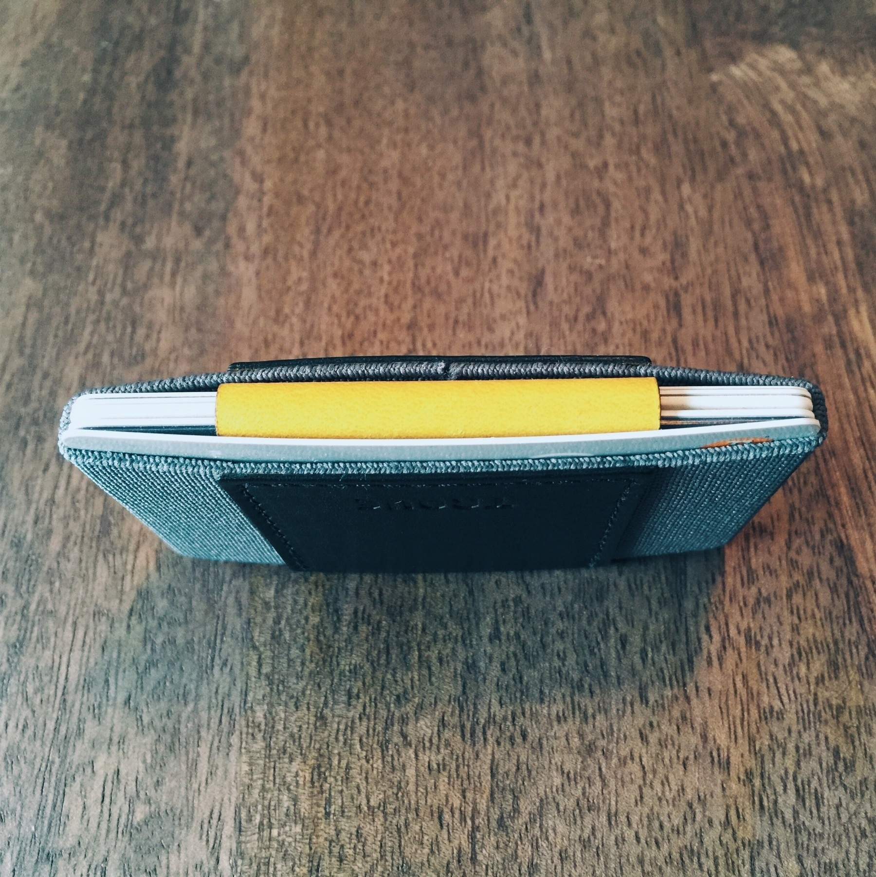
What sets the Trove apart from its predecessors and competitors is its versatility. While others have set out to design very minimal wallets, they all typically follow the same set of rules: thin, monotone materials that feature one slot into which you dump all your cards. That’s it, right? That’s apparently how everyone who got into manufacturing wallets decided to execute the minimal concept. Perhaps after several years of backing these endeavors on Kickstarter, reading others’ experiences with wallets, and actually using them daily, folks are starting to realize this isn’t the best design. If you’re going to use a wallet like this every day in every circumstance, it’s helpful to be able to organize the kinds of things you put in it. And that’s not just me trying to be classy — functional design for something like a wallet should really come down to these two things:
The other wallets don’t allow for these kinds of luxuries (and I mean luxuries in the ludicrous sense that most all wallets up to this “minimal revolution” have featured these kinds of things as defaults). So let me break down why I think the Trove is the best of its class:
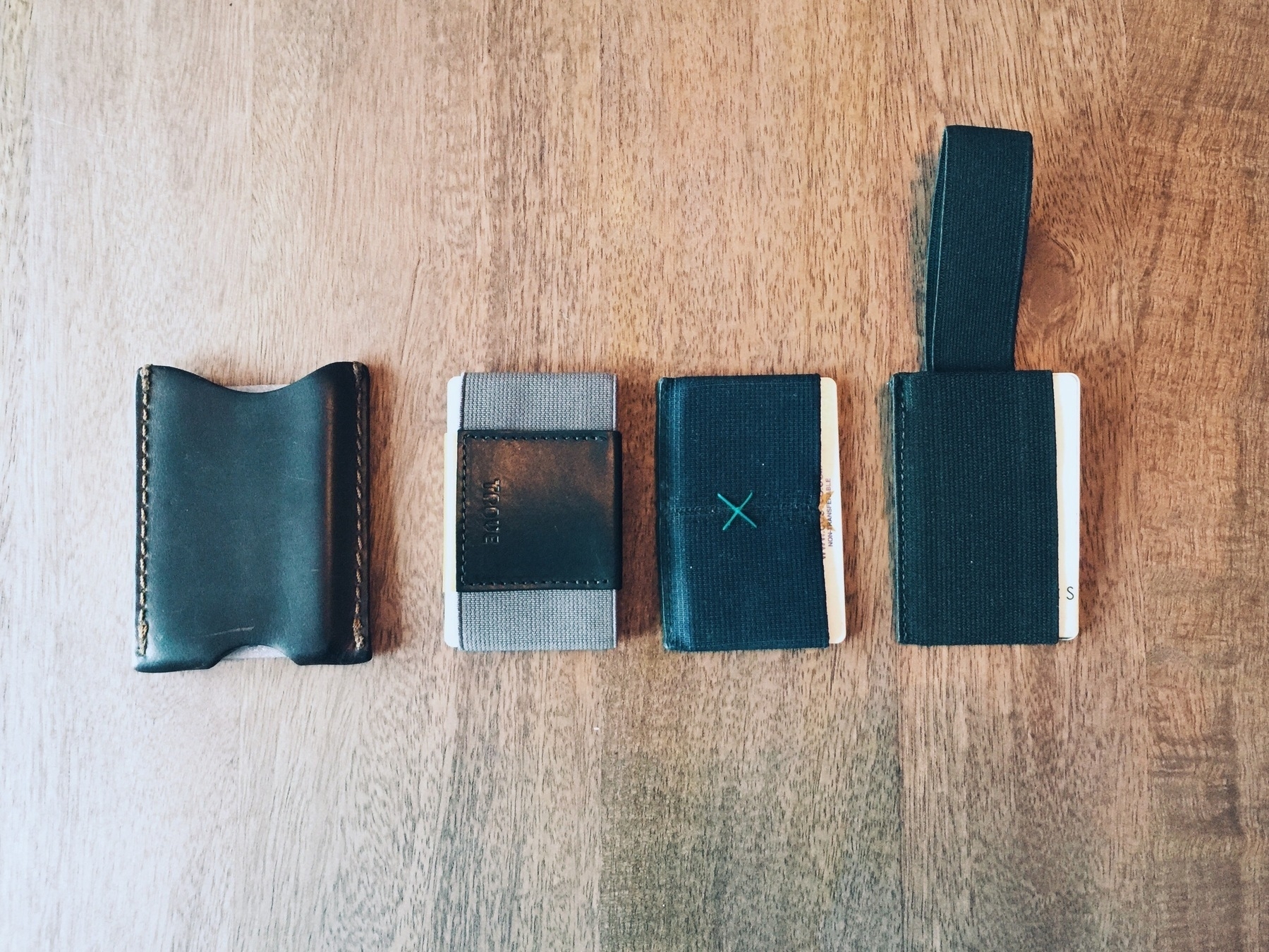
The Trove and its competitors (from left to right): Saddleback Sleeve Wallet, Trove Factory Edition, Supr Slim Wallet, and Snapback Wallet 2.
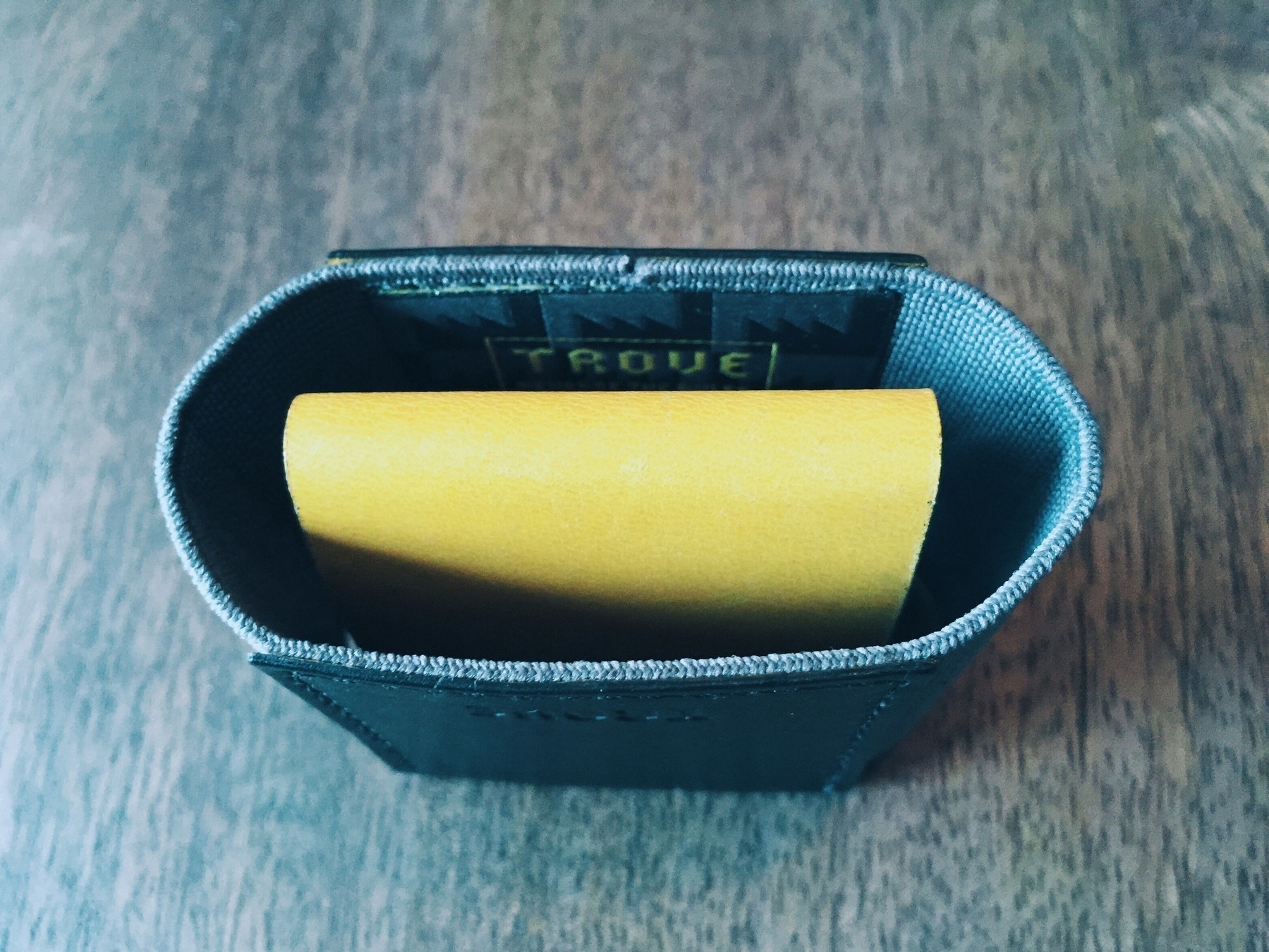
It's a slim wallet. If you've been playing this game for a while, you know what to expect. The biggest differentiator here, however, is the versatility (and dare I say customization) of the Trove’s dividable design.
Instead of retracting a block of stacked cards every time you need to dig for a card that isn't easily available on either end of the group, you can selectively position your most-used cards on the ends of the main compartment as well as the dual slots made available when the wallet is configured with two main slots (inner leather strap tucked in).
It’s small, it’s convenient, it works.
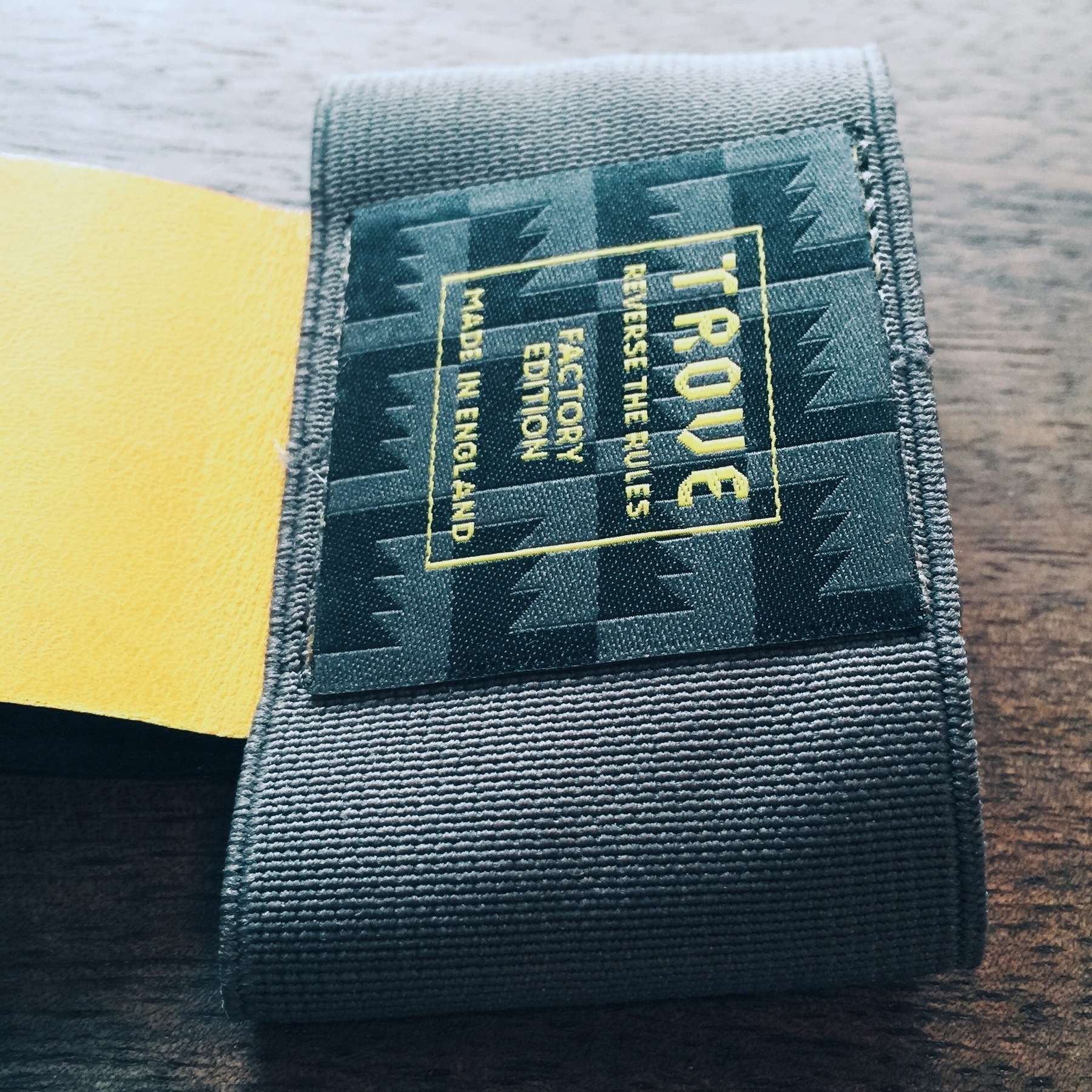
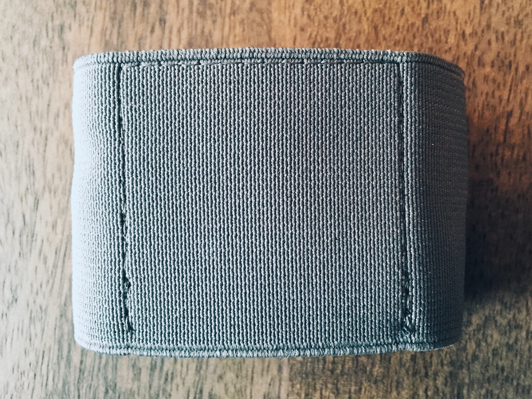

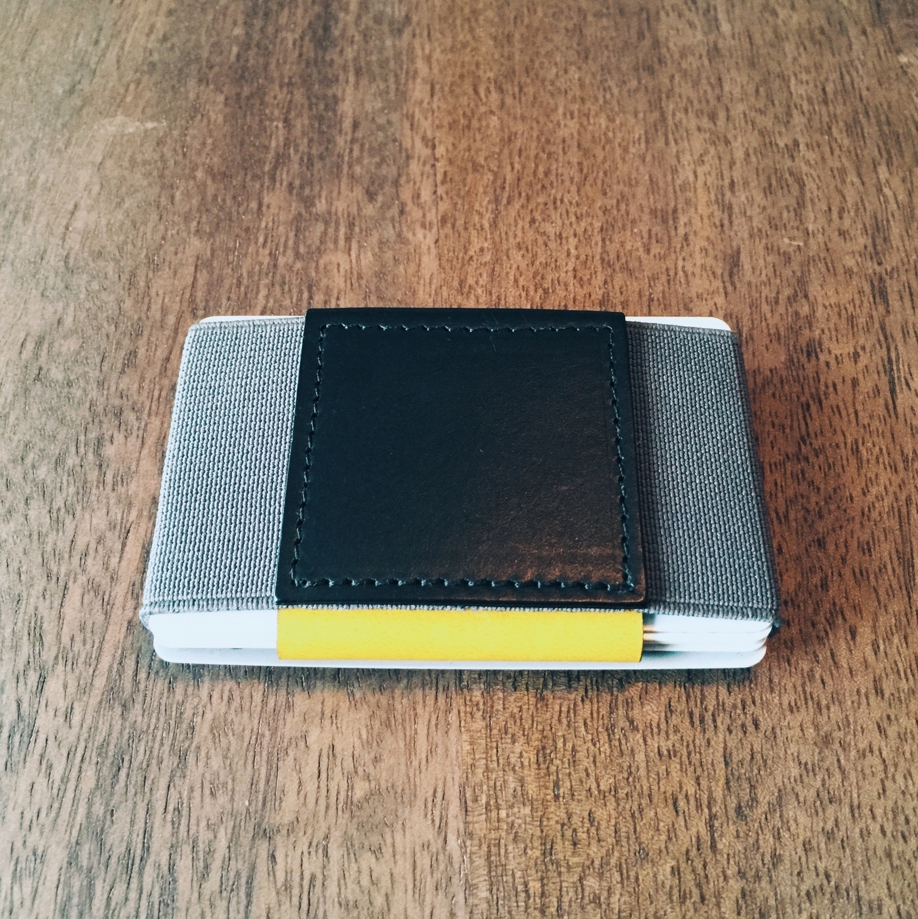
At the time of purchase, the Trove is featured in several different color configurations. While this isn’t unique to the Trove, it does seem to have a much larger selection of colors and tones than its competitors. If this kind of thing is important to you, by all means it’s another reason to take make the purchase.
I decided to go with a limited edition version (number 378 of 500) that they dubbed the “Factory Edition”. There were a few other color combinations I liked, but the yellow, gray, and black is a killer look for its design.
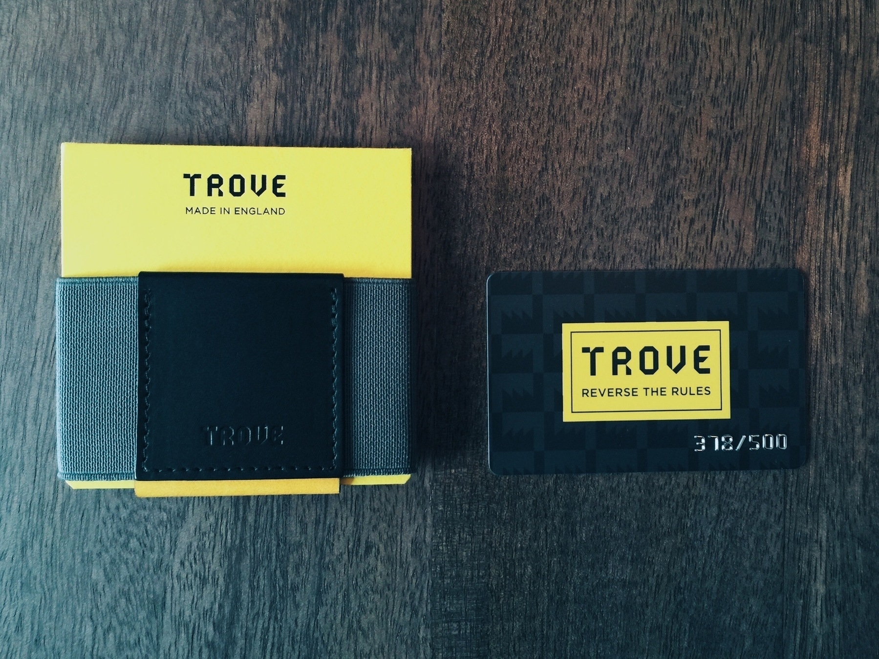
As of January 2015, the Trove is only available for purchase on their website shop. The basic models retail for £30, while the Factory Edition is currently priced at £35. It ships from England, so there is an international shipping fee if you’re from the States or elsewhere. I was lucky enough to catch their free holiday shipping, which extended a bit past the New Year.
If this review wasn’t effective enough to incentivize you to make the purchase — or at least sock it away on a wish list — then keep using whatever you’re used to and try, try so very hard to forget the incredibly functional design benefits of the Trove while you wither away in misery with torn currencies and daily card extraction embarrassments by way of unorganized single-slot wallets for the rest of your life.
Trove ran a successful Kickstarter campaign to promote their latest wallet iteration, the Trove Swift. I was lucky to get a review unit and have assessed the Swift product here.
For the longest time, I've distanced myself from big phones and phone cases, but last year I decided to order the iPhone 6 Plus, a 5.5" behemoth that quickly won me over. Having used it daily for the last several months, it does indeed continue to delight. But as I put it through its paces, my daily use of the device unearthed an unforeseen problem: the phone is one slick device. And I mean that literally -- when extracted from a pocket, the thing unconsciously attempts to slip out of your hands and commit hardware suicide against the ground.
I had two choices, apparently: Handle with obsessive delicacy, or buy a case with less of a slick surface.
While I’ve never cracked or damaged any iPhone I’ve owned, one day in December I opted for buying a case while I was shopping with my girlfriend and her sister at Target. While they were off shopping for gifts, I jaunted towards the electronics section. Initially, I hoped to find some decent PS3 games on post-holiday sale, but the leftover stock wasn’t worth picking over. What other purchases had been nagging at me? That damn case.
Up to this moment, I had been debating getting a case — ever since the first couple weeks of my iPhone 6 Plus use. And so I wandered over to Target’s pitiful mobile section, eyes darting through peg after peg of over-designed car chargers, chunky plastic cases plastered with flowers and sports logos, strange car-mounting solutions, and a jungle of cables. Target is probably the last place I’d look for something to outfit an Apple-designed product, but I’d been doing research on basic cases, and the Apple-branded leather case had received fairly wide-spread approval from the network of bloggers and reviewers I respect. I figured they’d at least carry a few colors of the Apple-made one. At this Grand Rapids, Michigan location, they only had two cases for the iPhone 6 Plus left in stock, and in only one variant: black. I was hoping to snag the dark-navy blue one, but black would have to do — especially since I’d convinced myself I was going to buy this that day.
<div
    class="
      image-block-outer-wrapper
      layout-caption-hidden
      design-layout-inline


    "
    data-test="image-block-inline-outer-wrapper"
>


    <figure
        class="
          sqs-block-image-figure
          intrinsic
        "
        style="max-width:2313px;"
    >


        <button
            class="
              sqs-block-image-button
              lightbox


            "
            data-description=""
            data-lightbox-theme="dark"
        >
          <span class="v6-visually-hidden">View fullsize</span>

      <div


          class="image-block-wrapper"
          data-animation-role="image"
data-animation-override
      >
        <div class="sqs-image-shape-container-element


          has-aspect-ratio
        " style="
            position: relative;

              padding-bottom:100%;

            overflow: hidden;-webkit-mask-image: -webkit-radial-gradient(white, black);
          "
          >

              <noscript><img src="https://cdn.uploads.micro.blog/25423/2023/f5cd379ed8.jpg" alt="back of iphone 6 plus with black apple leather case" /></noscript><img class="thumb-image" src="https://cdn.uploads.micro.blog/25423/2023/f5cd379ed8.jpg" data-image="https://cdn.uploads.micro.blog/25423/2023/f5cd379ed8.jpg" data-image-dimensions="2313x2313" data-image-focal-point="0.5,0.5" alt="back of iphone 6 plus with black apple leather case" data-load="false" data-image-id="54b1a31fe4b0dfd3c7670529" data-type="image" />

        </div>
      </div>

        </button>


    </figure>


</div>
So what’s it like in action? After wresting it open from its super slim packaging, putting it on was as easy as aligning the edges of the case against the back of the phone and pressing the two together. It softly absorbs the device with more of a sigh than the usual plasticky click, and the iPhone just sits snug in the case’s real-leather cradle. That’s it.
Here’s my rundown of the device, to save you paragraphs of a typical review:
Pros:
Cons:
<div
    class="
      image-block-outer-wrapper
      layout-caption-below
      design-layout-inline


    "
    data-test="image-block-inline-outer-wrapper"
>


    <figure
        class="
          sqs-block-image-figure
          intrinsic
        "
        style="max-width:2247px;"
    >


        <button
            class="
              sqs-block-image-button
              lightbox


            "
            data-description=""
            data-lightbox-theme="dark"
        >
          <span class="v6-visually-hidden">View fullsize</span>

      <div


          class="image-block-wrapper"
          data-animation-role="image"
data-animation-override
      >
        <div class="sqs-image-shape-container-element


          has-aspect-ratio
        " style="
            position: relative;

              padding-bottom:100%;

            overflow: hidden;-webkit-mask-image: -webkit-radial-gradient(white, black);
          "
          >

              <noscript><img src="https://cdn.uploads.micro.blog/25423/2023/0756ec4db5.jpg" alt="close up of apple black leather case on iphone 6 plus" /></noscript><img class="thumb-image" src="https://cdn.uploads.micro.blog/25423/2023/0756ec4db5.jpg" data-image="https://cdn.uploads.micro.blog/25423/2023/0756ec4db5.jpg" data-image-dimensions="2247x2247" data-image-focal-point="0.5,0.5" alt="close up of apple black leather case on iphone 6 plus" data-load="false" data-image-id="54b1a33fe4b0531e1f851963" data-type="image" />

        </div>
      </div>

        </button>


    </figure>


</div>
In short, the Apple iPhone Plus Leather Case works honorably as both a protective wrap for the very large phone, and as a way to more confidently handle the device.
The last few months have seen an enormous amount of activity around mobile payments. This has mostly stemmed from the launch of Apple's new iPhone 6 and iPhone 6 Plus models, both featuring NFC (near field communication), a wireless contact mechanism for interacting and executing payments with retail hardware. And, of course, the payment service (for which that NFC technology is integral) they've dubbed Apple Pay.
As one of many early adopters, I was excited to try this out. Sure, while the hardware and feature has been around for a few years -- primarily employed by Google Wallet and Android devices -- I've never seen one actually used (except very embarrassingly in an episode of Fringe), and I haven't owned an Android device. So it was high time I gave it a whirl with my new iPhone. Besides, after having read enough to feel informed about the technology behind Apple Pay, it appears that it is the most secure way available to normal users to make transactions either online or in-store. So there was really nothing stopping me from heading downstairs in my office building to the frighteningly close McDonald's to buy myself an afternoon coffee.
My experience was delightful. Aside from having to waft in the microwave airs of the fast food kitchen, the whole thing went without a hitch. I ordered my coffee, watched as the payment terminal on the counter in front of me glowed blue, and simply held my iPhone within an inch or so of it. I didn't even push the home button to initiate it; rather, I instictively had my thumb resting on its surface (e.g., the TouchID surface), and the terminal communicated immediately with the iPhone. The screen lights up, shows your credit card on file with Apple Pay, and a small TouchID logo with a fingerprint is visbile, promptly capturing your finger's unique signature. Once it's done (and if you have a new iPhone, you know how quickly this actually happens), a little check mark animates and that's it. Payment complete.
It took me a paragraph to write that, but the whole experience takes less than a couple seconds. My experience at McDonald's has been the fastest -- there aren't any PINs to punch in or signatures to be etched; just hold the phone up with your finger on the home button. My experience at Walgreens has been similarly quick, but they do prompt you with a donation option on the payment terminal's screen. Not a huge deal since I've been used to this (having shopped there a number of times before), but Apple Pay makes the process much faster. (I recall before there were about three to four screens you had get through to completely check out.)
Overall, Apple Pay has been a wonderful feature of the new iPhones. While it's nowhere near ready to replace a wallet, it does make the experience of shopping in the few stores that support NFC terminals better than anything before it (shame on retailers like CVS who actively shut off their NFC terminals because of the MCX/CurrentC kerfluffle, screwing over both Apple Pay and Google Wallet users). With pending Apple Watch support for early 2015, the process of paying for things while out on a run or a quick jaunt down the street will be exceptionally secure and enjoyable moving into the future.
On a last note, it seems that there isn't a very good canonical source for all the retailers who can support (or who will support) Apple Pay and Google Wallet. As such, I've compiled a separate page -- Apple Pay Retailer List -- for your reference. I'll try to update it moving forward until, hopefully, enough stores support it that it won't be an issue. If you're looking for a terrific overview of Apple Pay, MacRumors has an extensive reference guide.
Leaving a movie theater thoroughly entertained is usually rare. Or perhaps my opinionated tendencies have gotten the best of me. I’ve been let down more than often than not over the past few years, and it has cost me far too many buttered popcorn bowls. I can happily say, however, that 2014 hit the mark on several occasions, and most notably with Edge of Tomorrow, a film that was unfortunately marred by horrible marketing and tragic failure at the domestic box office. But Tom Cruise and Emily Blunt’s sci-fi foray joins the ranks of other hugely enjoyable, critically- and fan-loved vehicles that fell short only in making money in theaters. You could lump in there such flicks as the recent Dredd 3D and canonized classics like The Shawshank Redemption and Blade Runner. Yes, that’s good company — and rightfully so.
Having arrived on video and DVD/Blu-Ray just this past month, Edge of Tomorrow (or as Warner Bros. recently decided to mutilate further, Live, Die, Repeat: Edge of Tomorrow) stands as one of the few movies I’ve added to my personal collection amidst the infinite libraries of video streaming services. But back at the beginning of this year, when I saw the original trailer (and subsequent trailers), I wanted nothing to do with the film. It came off having the same tired aesthetic of every other heavily-saturated action movie trailer, and the plot concept of “live, die, repeat” was thwacked over your head with smarmy text and thudding music. Not the kind of trailer to pique your curiosity, but for all that is holy, this movie should have been marketed to pique your curiosity. It’s too damn clever and enjoyable in execution to have a studio obfuscate it, especially when no other action film released this year can steadily stand against it in execution.
But one look at its box office performance and you would guess that poor marketing killed it commercially. Netting a paltry $100 million domestically against its $178 million budget isn’t going to please Warner Bros. much. Granted, it earned over $269 million in foreign box office receipts, but that’s not the story we usually hear. Advertising for off-beat movies can be tricky, but it can be done (just usually not well with big studio stakeholders). What actually turned around my perception of the film (which was badly bruised by trailers) was the phenomenal reception from critics and fans. Rotten Tomatoes had an aggregated 90%, and Metacritic reported a 71% — neither are poor numbers, especially for a purely action film, and it’s remarkable the positive momentum couldn’t keep filmgoers getting into theaters and going back.
Sure, Tom Cruise has been battered around publicly for years, but when has his film performances ever disappointed you? Exactly. He’s perfect for the role of Major William Cage, an officer in a near-future army who has never experienced live combat. He’s forced into a mission against an alien invasion that ends in catastrophe — killed within minutes of making his landing on a beachfront against the enemy, and soon finds himself in a time loop that initiates after death. Compare it to Groundhog Day all you want, but it shares little in common with that movie’s shtick and more in common with some of the the best-paced comedies and action films of all time.
You’d think the concept of living, dying, and repeating would get old, but director Doug Liman edited the film to near perfection. He builds on every repeated sequence, coloring in Tom’s and Emily Blunt’s characters, time-leaping through narratives at just the right moment so as not to tire the concept, and crescendoing in a finale sequence that culminates in dread and fear after having suppressed those emotions throughout the first two-thirds of the film.
If you have yet to see this film, I encourage you to do so. It’s available on Amazon and iTunes for renting and purchase.
When I originally saw the pre-release poster for the documentary Jodorowsky's Dune on a February visit to the Music Box theater in Chicago, I was excited. The prominant visual -- a colorful, wildly insectoid starship design -- immediately captured my interest. The subject matter, paired with a director with whom I've only once been aquainted via Holy Mountain, intrigued me all the more. I didn't even know anyone else had attempted to bring Dune to the big screen, let alone failed. I made a note to see the film in theaters, but alas, didn't get around to seeing it until a few days ago. But even several months post-release, the film satisfied most of my appetite for what it had teased earlier this year.
But let me back up a bit here. First things first: Dune). Written in 1965 by American author Frank Herbet, Dune is often claimed (and probably statistically so) as the world's bestselling science fiction novel. Though I'd retrospectively consider myself fairly well-read in science fiction, I actually did not read Dune growing up. I remember buying a copy of it when I was in high school at the Ridgedale Barnes & Noble, which was my suburban destination for collecting all my books when I lived in Minnesota. I'm sure I bought it alongside a few other novels that, for whatever reason, took precedence. Ever since, it fell by the wayside, traveling with me to college in Chicago, sitting smugly on that black little bookshelf, and subsequently making its way to each and every apartment thereafter. I remember reading through a few chapters on a number of occasions over the years, but kept putting it down in lieu of something else. Perhaps I just didn't want to delve into something I anticipated to be overly complex and challenging, or perhaps it just wasn't the right time. So I kept putting it off.
Until I saw the poster for Jodorowsky's Dune. Why that set me off on scouring through my bookshelf and diving right into the first book (of the canonical six), I'll never quite know, but I tore through it I did. Up to that point, the only exposure I had with Dune was David Lynch's much-derided adaptation from 1984, and this was probably more than fifteen years ago. I saw it with no context and as much as I can remember, it was awful — especially compared to the popcorn sci-fi of Star Wars. The book, however, is turned out to be phenomenal, and as you can imagine, I immediately continued reading through the subsequent books in the series. It's one of those tales that grows better with its sequels, both holistically and individually (yes, I think some of the sequels are better than the first one, which, in retrospect, is really just a prologue to a grander story). My memory tells me that David Lynch's film is a loose, semi-unfaithful adaptation of the book, but I'm definitely going to re-watch it now with more informed context. Knowing the complexities of the book, I see why cinematically adapting it, or its sequels, is a monumental challenge.
All the more reason I came to watch the documentary, Jodorowsky's Dune, with enthusiastic optimism. If there's one guy that actually could pull off the more spiritual, metaphysical elements of the book, it's Alejandro Jodorowsky. A Chilean-French filmmaker and, let's be honest, all-around artist (he acts, he writes, he conducts music, he even produces comics), Jodorowsky is best known for his surreal films El Topo and The Holy Mountain. Like reading Dune, it took me a few tries to get through The Holy Mountain. Surreal is definitely the right way to describe it -- watching that film gives you the impression Jodorowsky never really understood the norms of film language (e.g., how to build cohesive sentences like other filmmakers). Instead, he created experiences to be felt through film -- like the poetry-version of stringing together words. The most similar experience I've had in watching a film in recent years is Jonathan Glazer's Under the Skin (highly recommended, one of the best of 2014), which follows a flowing, experiential pace of visuals and light storytelling. The Holy Mountain moves at a bizarre pace, throwing colorful scenes, characters, and situations for you to mull over for weeks after watching (a footless, handless dwarf, flies covering a face, a man pooping gold, a wax statue sent into the sky with balloons). Fun, memorable stuff.
So again, this is the guy who apparently wanted to tackle science fiction's biggest story. But rather than focusing on the heart of what makes Dune so visceral in the telling, it instead rewards audiences by unexpectedly capturing the beautiful plight of a dedicated artist who loves his craft and has unbridled enthusiam for film. He states early on in the film that he never read Dune before deciding on doing the film (he said a friend told him the book was fantastic and that was all it took -- that would be his next film!). I'm not sure if he actually ended up reading even after he started production on it, but I can say this: he had a propensity to identify an amazing cast of actors, producers, and artists to contribute to the film. Salividor Dali, Orsen Welles, Mick Jagger, H.R. Giger. You can see where this is going.
And as you'd expect, he had high hopes for his version of Dune, regardless of how much or how little it connected to Frank Herbert's original story. After a while, I gave up on caring how far from the original story he drifted and instead just sat back to enjoy the unwavering dedication to his fantasy. In doing so, it's clear that he seems to have captured the spirit of Dune on a visually astounding level. In his own words, he wanted to create "a film that gives LSD hallucinations -- without taking LSD"; after seeing the proof across 3,000 illustrations, storyboards, reference materials, and script snippets, I have no doubt this film would have felt like a jolt of something ethereal. He tasked his carefully curated artists with the creation of ships and landscapes that, while never featured or alluded to in the book, capture a creative depth beyond Herbert's original universe-building. In a sense, this is what every author secretly hopes a cinematic adaptation of his or her novel amounts to: inventively taken in a direction suitable for film. This one in particular was so and so dramatically different from the source material, it would have been like seeing Dune written by another dimension’s Frank Herbert.
But there were some truly remarkable concepts Jodorowsky attempted to pull off in addition to the radical interpretation — things that film enthusiasts will greedily enjoy seeing unfold via storyboards. Take, for instance, the opening sequence that he wanted to achieve: a continuous shot longer than Orson Welles' Touch of Evil sequence; a shot that by the looks of the original storyboard would have been nearly impossible to pull off in the 70s. It's a shot that essentially traverses an entire galaxy, flying by battles, pirate raids on spice transport ships, asteroid fields, eventually leading all the way to a close-up on two figures. Ambitous stuff -- only recently have films attempted to create something like this, and, of course, they rely entirely on computer generated imagery.
While the film is a terrific homage to artistry and the madness that drives it, its commentary on the influence of Jodorowsky's work on the Dune production is presumptuos. Towards the end of the documentary, its creators -- not Jodorowsky -- make bold assertions about the work on Dune influencing nearly everything that followed it, including Star Wars, Flash Gordon, Raiders of the Lost Ark, and Contact. While I'm sure the production book made its rounds in Hollywood, it likely didn't have that great an influence over the visual direction of what we now know as classic blockbuster pictures.And especially the integrity of equally imaginative creators. If anything, it helped ground some of the bolder ideas that folks like George Lucas and Steven Spielberg struggled to convey in those early years of selling their ideas to studios.
As it stands as a documentary and an homage to the filmmaking process, Jodorowsky's Dune is still an exceptional achievement. I have newfound respect for the director as an artist, as well as for the creators of the actual documentary -- the film has great rhythm, and does a fine job bringing old production illustrations to life in attempting to convery the imaginative reaches of Jodorowsky's grandest vision. We can only hope that someone picks up the spiritual torch and shepherds something akin to taking LSD to the big screen in the near future.